IKIGAI RESTAURANT
Ikigai is a Japanese/Fusion style restaurant based in Bruges (Belgium).
Their food is a modern take on traditional asian classics.
Their food is a modern take on traditional asian classics.
For their new brand identity, I came up with the name Ikigai, as it goes back to human values and bringing people together, which was very much needed in the year of 2020.
The tagline 'It takes big bowls' refers to the adrenaline and the risk we all took working on such a big project during the Covid situation.


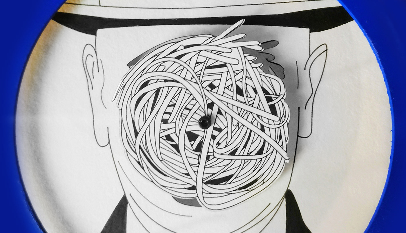
Just like their food is a modern twist on traditional classics, I aimed to do this with the visual language.
I wanted to show the world their human quality with a sense of humour.
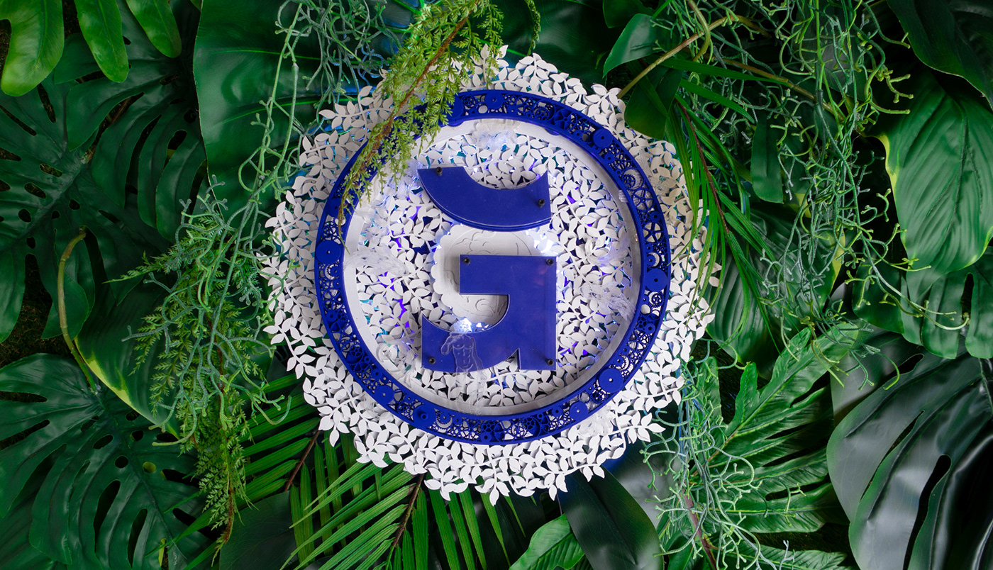
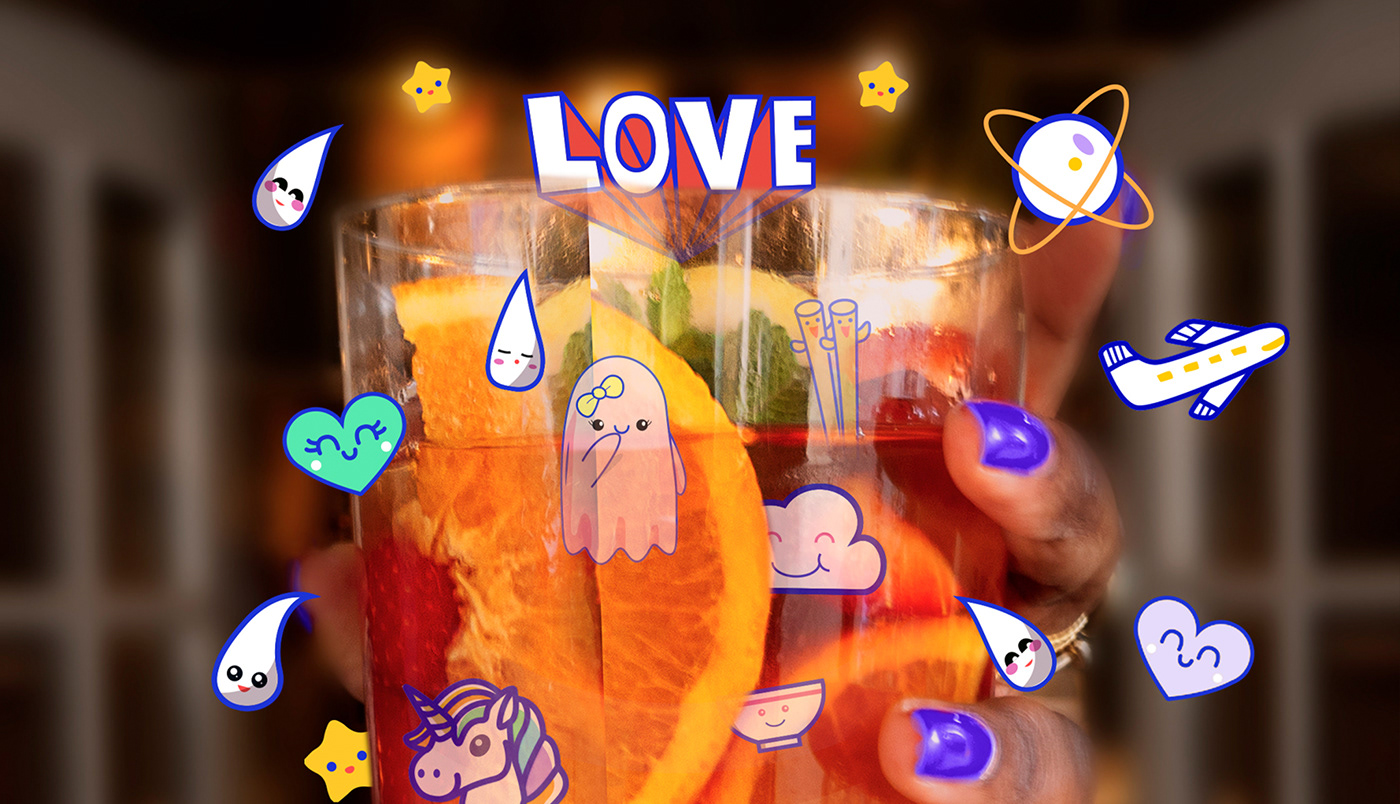
With that in mind, I took inspiration from the traditional blue & orange that have roots in cultures all over the world. Balancing with intricate traditional and "kawaii" digital illustrations, with a bold typeface and funky copywriting to establish a playful tone of communication.
All of the above combined create an identity that is flexible, playful and full of surprises. I also helped suggest interior design choices such as colour and ambiance (bohemian style) and added a set of unique Ikigai branded artworks for the interior of the restaurant.
Eating at Ikigai is delightful and unusual.
Eating at Ikigai is delightful and unusual.


We play - We dream - We have fun - We @*!# around - We are Ikigai
To see more of Ikigai:
Ikigai's Instagram
Ikigai's website
To see more of the making of Ikigai:
Paper & wood cutting illustrations
Acrylic portrait painting
Creative Direction: Nabil Nezzar
Production: Nabil Nezzar
Brand Strategy : Nabil Nezzar
Copywriting : Nabil Nezzar
Illustrations : Nabil Nezzar
Animation : Nabil Nezzar
Photography Lifestyle Shots : Nabil Nezzar
Photography Product Shots : Nabil Nezzar
Photo Assistant : Kenny Cornelis
Social Media Strategy : Nabil Nezzar
Website Development : Nabil Nezzar
Brand Strategy : Nabil Nezzar
Copywriting : Nabil Nezzar
Illustrations : Nabil Nezzar
Animation : Nabil Nezzar
Photography Lifestyle Shots : Nabil Nezzar
Photography Product Shots : Nabil Nezzar
Photo Assistant : Kenny Cornelis
Social Media Strategy : Nabil Nezzar
Website Development : Nabil Nezzar


