


"Beauty is the harmony of
purpose and form."
·
Alvar Aalto,1928
purpose and form."
·
Alvar Aalto,1928

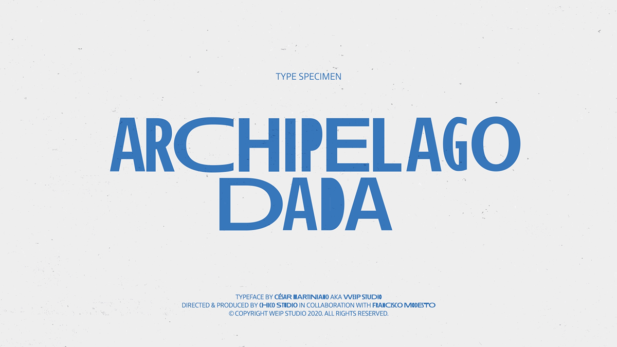
César Martiniano, an Azores-based graphic designer and artist, invited us to design and animate a 2D motion graphic video for Archipelago Dada, a dynamic sans serif type inspired by the Azores islands. We ended up developing an excellent promotional teaser that was crafted from scratch using different character weights and eases.
Archipelago Dada was a research written by César Martiniano, supervised by Pedro Amado, who aimed to design a sans serif type with humanistic characteristics, exploring the contextual alternatives of OpenType technology (namely the layout features) to create an expressive and dynamic type, inspired by artistic movements such as Visual Poetry, Dada and Futurism.
Graphic & Motion Design: Francisco Modesto
Client: César Martiniano, Founder of WEIP Studio
Product: Archipelago Dada

Taking the type expressiveness to the next level
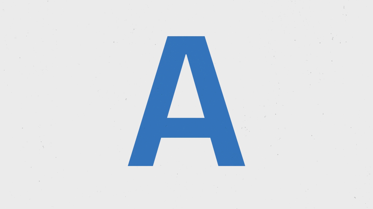
Archipelago Dada was idealized to be a custom font for Designers with artistic properties related to Visual Poetry, Dadaism and Futurism. Inspired by the Azores archipelago, a collective of nine volcanic islands with different proportions, the idea was to translate that geographical scale of the islands to a sans serif typeface, in which, each word would contain variations in the width for each letter. These creates a composition of archipelagos (words) and their islands (letters), alternating character widths.
Archipelago Dada was idealized to be a custom font for Designers with artistic properties related to Visual Poetry, Dadaism and Futurism. Inspired by the Azores archipelago, a collective of nine volcanic islands with different proportions, the idea was to translate that geographical scale of the islands to a sans serif typeface, in which, each word would contain variations in the width for each letter. These creates a composition of archipelagos (words) and their islands (letters), alternating character widths.
Through research and case studies within the theoretical framework, César concluded that was possible to execute the concept through the usage of a contextual editorial alternative tool that emphasizes the width variations of the letters and words which consequently could relate to an expressive movement in typography.
The studio took all this knowledge and created an animated narrative behind the process and inspiration of the type. Emphasizing the different width variations with quick and dynamic transformations that deepen the expressiveness of the type. The art direction was designed to be as rough sketch texture aesthetic since César is known for his design and graffiti work at Weip Studio.


“Through the animated video created by Francisco Modesto, it was noticeable that despite this type was designed for an editorial printing medium, when animated it gained a whole new dynamic that I didn’t expect, making it much more attractive.”
·
César Martiniano. (2020) Archipelago Dada, A humanist sans serif font expressive visual compositions.
César Martiniano. (2020) Archipelago Dada, A humanist sans serif font expressive visual compositions.


