

PROJECT INFORMATION
KETO is a new coffee brand from the city of Florida, Orlando, United States. Which will be started by young people who are enthusiastic about coffee and food and beverage, the owner wants this new brand to stand out and stand out from other cafes. Therefore, a key point is needed to differentiate value from competitors.
CHALLENGE
CHALLENGE
The coffee market in Orlando is currently very weak, it is difficult to find a differential in terms of product.
In terms of design, like most brands in orlando, business owners pay less attention to brand identity design. Even so, this is a challenge in itself on the design side as the key to differentiating value from the competition.
SOLUTION
In terms of design, like most brands in orlando, business owners pay less attention to brand identity design. Even so, this is a challenge in itself on the design side as the key to differentiating value from the competition.
SOLUTION
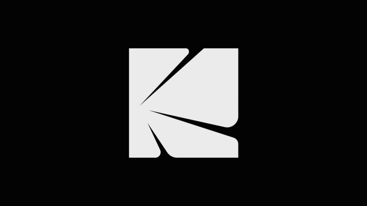
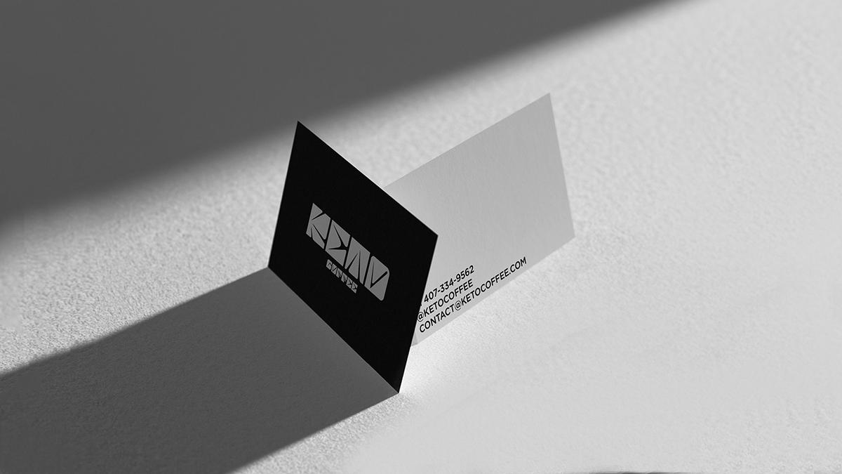
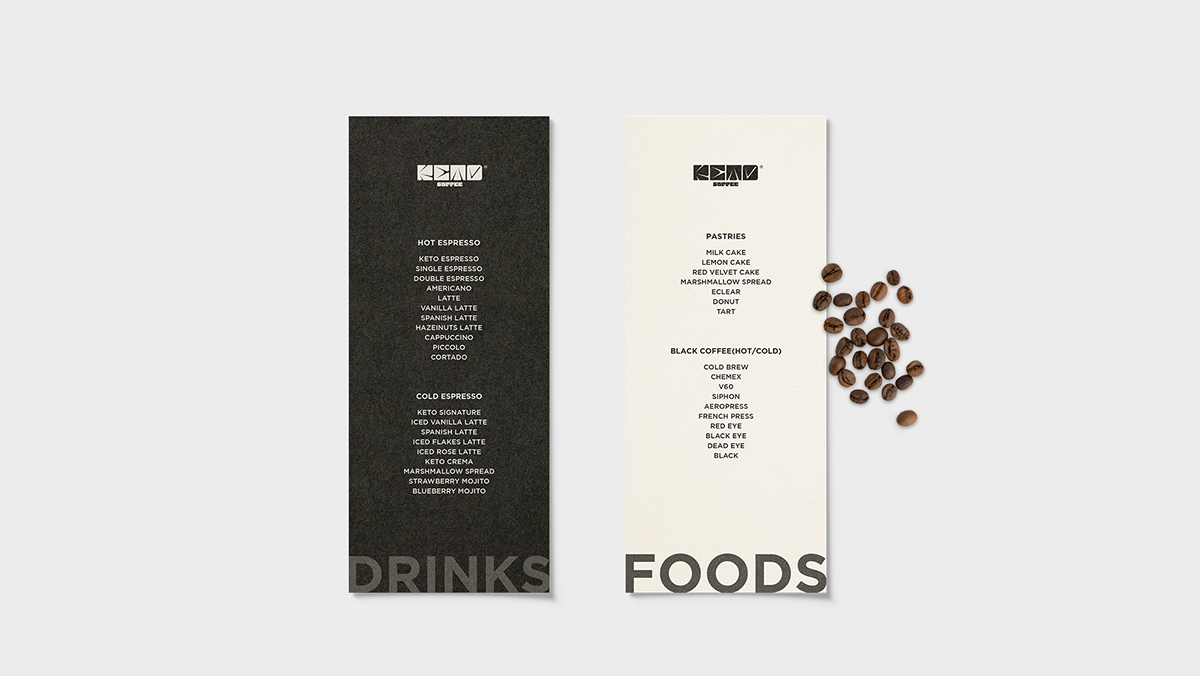
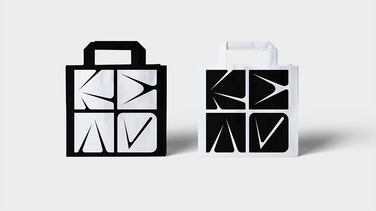
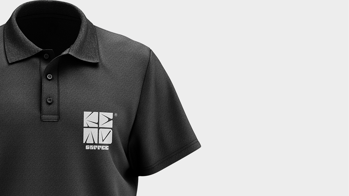
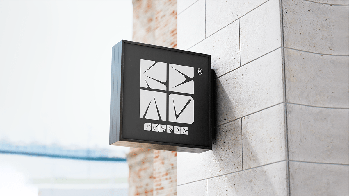
We chose the word mark as the KETO logo.
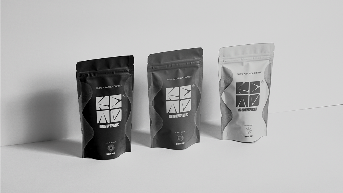
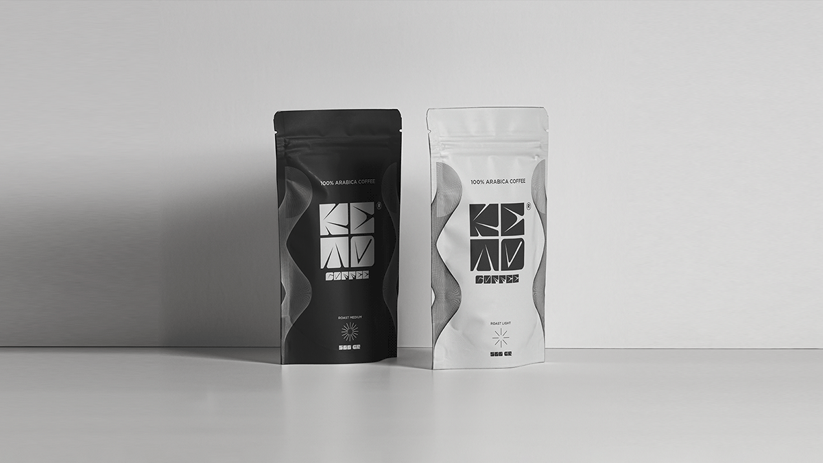
The colors were chosen according to the personalities of KETO, Premium and Exclusive.
The colors were chosen according to the personalities of KETO, Premium and Exclusive.
We chose SK Quadratica as the font for Keto, this typeface is unique, with a very strong personality and present in each character of the letter.
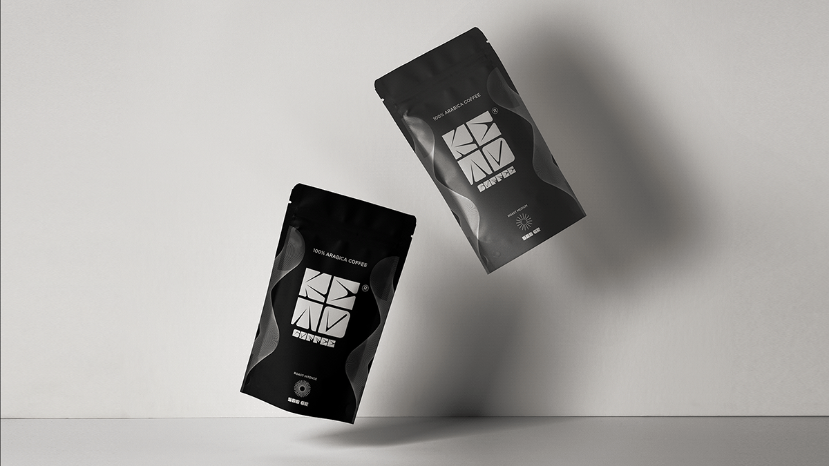
In packaging design, we decided to represent the coffee roast in a different and unique way. To give more personality to the package, we created an illustration that represents smoke in an abstract way.
In packaging design, we decided to represent the coffee roast in a different and unique way. To give more personality to the package, we created an illustration that represents smoke in an abstract way.


*Project featured in World Brand Design Society*
Thank you!
Follow me on instagram.


