

FONG KEI BAKERY PACKAGING
Client: FONG KEI BAKERY
Type: Packaging, Promotion, Branding
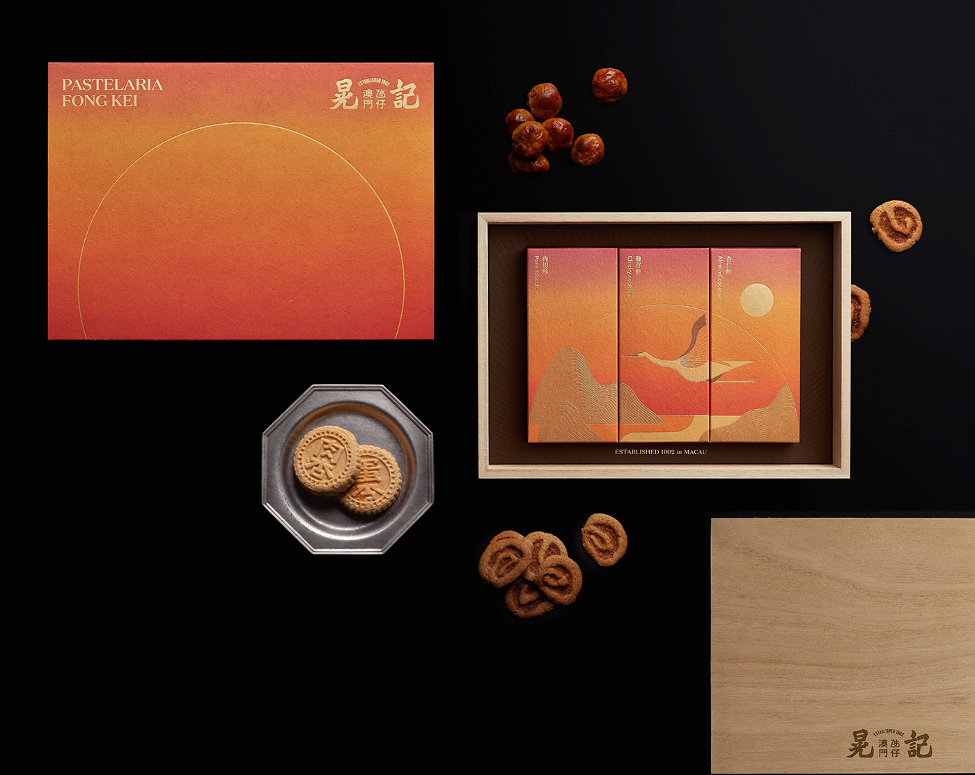
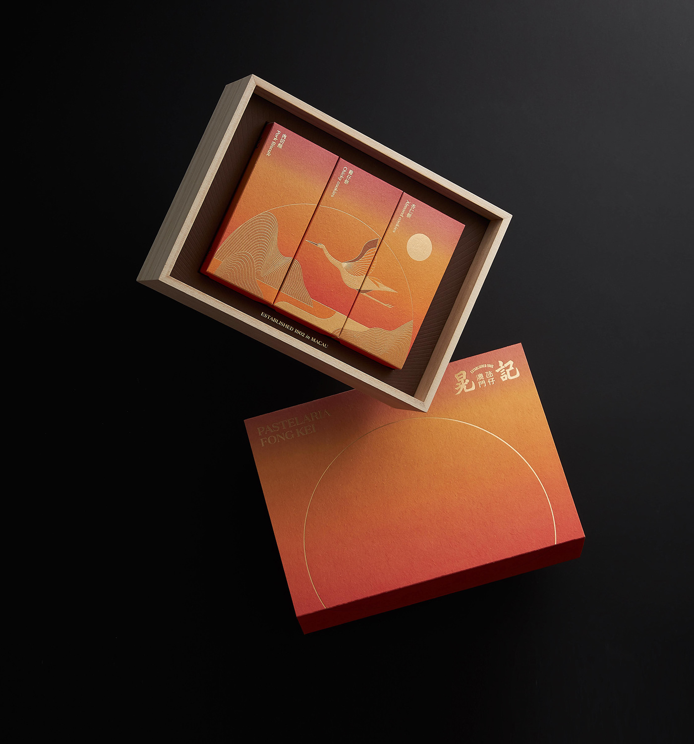
The owner of FONG KEI Bakery, a traditional bakery that has been running for over 110 years in Macao, commissioned us to design a gift box with the brand’s three signature products inside.
We drew inspiration from the first character of the brand’s Chinese name. It can be broken down into another two characters that mean sunlight when read together, so we adopted “sunrise” as the theme of the design. The gift box features, on its cover, a gradient background that evokes the changing color of light during sunrise and a semicircle symbolizing the ascending sun. The symbol implies an endless cycle of life and a wish that the brand will continue to shine.


The packaging is a wooden box handmade by a local carpenter, communicating the value of the brand’s handcrafted products. Inside the box is an exquisite picture formed by three smaller ones printed on the cover of the brand’s three classic products lying there.
The crane in the picture stands for longevity in Chinese culture, echoing the century-old history of the store. That it flies at sunrise signifies the promotion and revival of Chinese traditional food-making techniques.


Photography by Mo Chien


