

STUDENT WORK: La Fontana Siciliana, a Sicilian restaurant in Seattle, is looking to redesign their logotype. La Fontana means “the fountain” in Italian referring to the beautiful fountain at the entrance gate of the restaurant. Being a unique characteristic of the restaurant, the logotype focuses on this attribute by creating a flowing ligature between the “f” and the “o.” The script typeface compliments the water flow through the ligature of letters. In general, the new logotype maintains the elegance of a traditional Italian restaurant while modernizing the typeface for a younger target audience. (This was a fictional logo created for a school project).
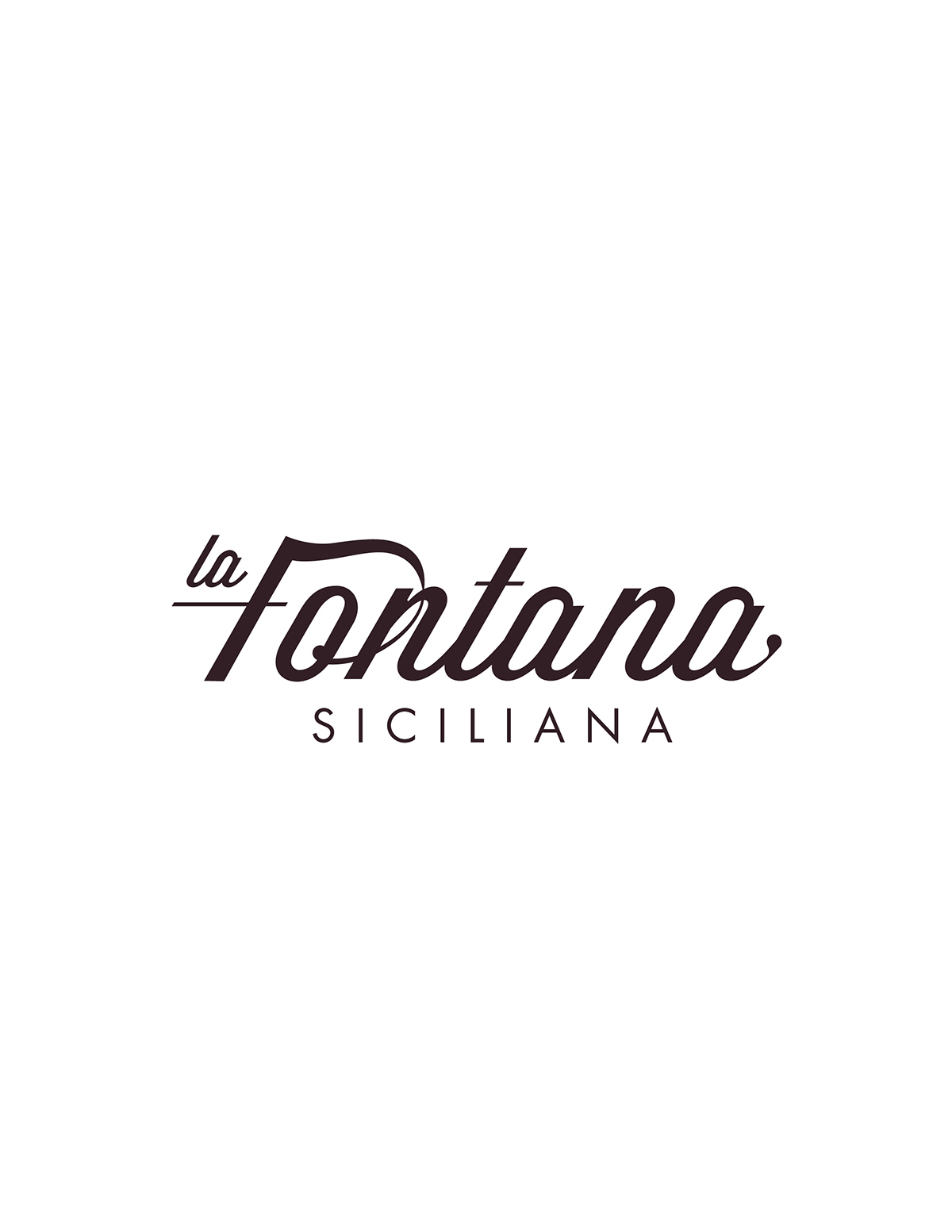


La Fontana Siciliana, a Sicilian restaurant in Seattle, is looking to redesign their logotype. Located in the Belltown neighborhood, La Fontana is in a hip up in coming area, surrounded by people in their late twenties and early thirties. Referring to modern and popular typefaces such as Wisdom Script and Futura, the new logotype is aesthetically designed to draw upon a younger crowd. The restaurant’s interior contains rough aesthetics; heavy brick and plaster walls complimented by wooded floors surround dinning tables, calling for a more simplified logo absent of elaborate characteristics. In addition, La Fontana means “the fountain” in Italian referring to the beautiful fountain at the entrance gate of the restaurant. Being a unique characteristic of the restaurant, the logotype focuses on this attribute by creating a water-like flow between the “f” and the “o.” The script typeface also compliments the water flow through the ligature of letters. In general, the new logotype maintains the elegance of a traditional Italian restaurant while modernizing the typeface for a younger target audience.
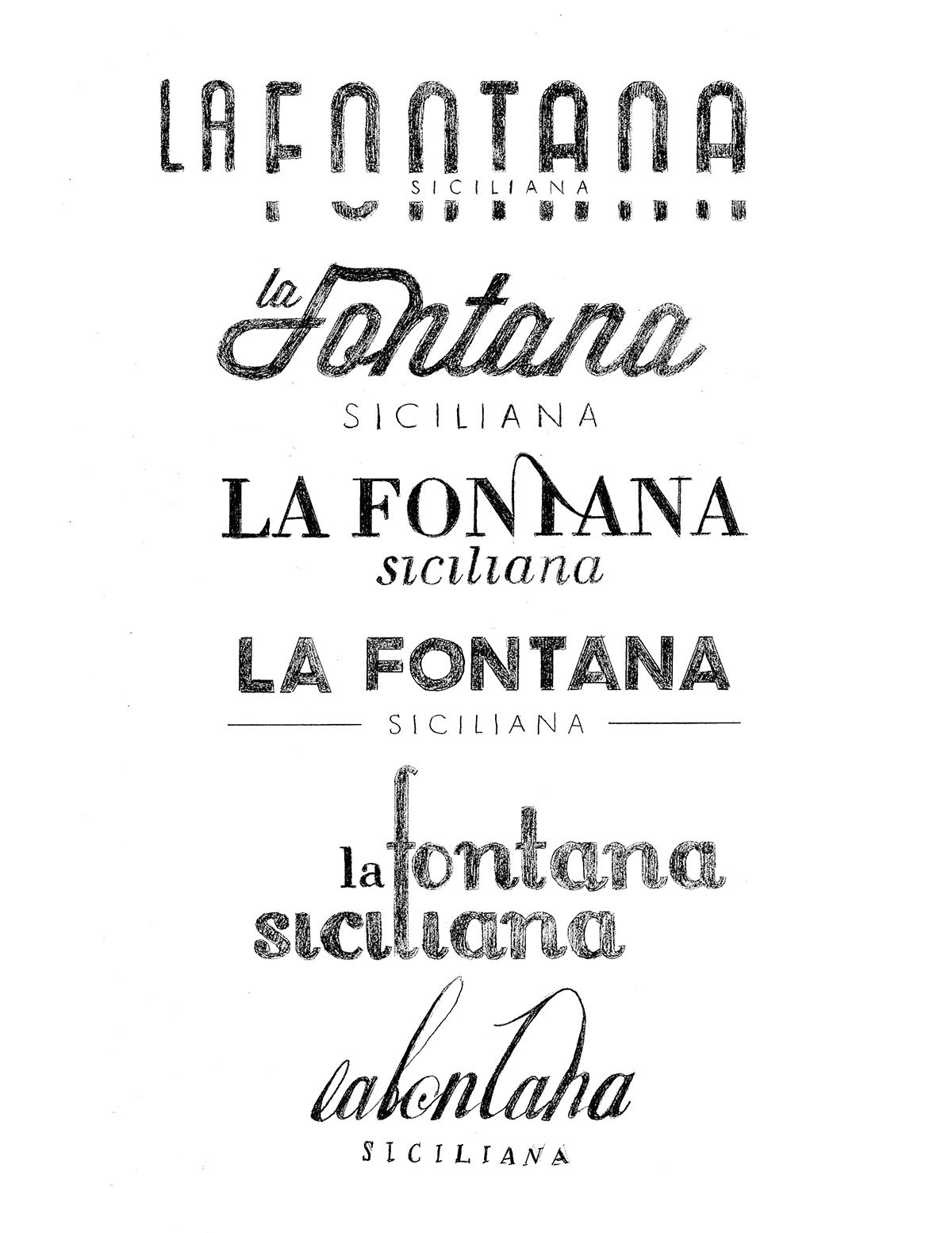
Basing the logotype from Wisdom Script, the top line of La Fontana uses the adjusted typeface to reflect a contemporary script trending within the alternative audience. “La” is placed snuggly on the crossbar of the “F” where the two words are able to read as one and where the small size of “La” does not steel emphasis from the importance of “Fontana.” The top stroke of the “F” on Fontana extends outward and falls down into the swash of the “o” creating a waterfall motion for the eyes of the viewer to follow. Starting thick and diving into a thin weight, the stroke settles smoothly into the top of the “n” creating an unique formation without disrupting the flow of the characters. Each letter weight has been slightly thinned from the original stroke weight of the Wisdom Script font. In addition, the stress of the characters has been exaggerated to create contrast within the letter forms, veering away from the similarity of Wisdom Script developing a more original logo piece. In order to adjust the stress and extend the height feeling of the word Fontana, the counters of the lowercase letters were lengthened slightly. The tail ligatures on each lowercase letter were thinned nearing the letter to the right and expanded near the attached letter to the left adding more contrast between the connection of the letters as a whole. To compliment the stoke weight of the word “sciliana” laying below, the crossbars on the “F” and the “t” were also drastically thinned. “Siciliana” rests below “LaFontana” sturdying the motion filled text. Siciliana embodies the font Futura Book with high kerning to contrast with the script font and present a contemporary sans serif. A dark brown/ purple color was chosen to be applied to the logotype, accomodating the interior colors of the restaurant and establishing the upscale ranking of the reataurant.


