
Siesta. Every day!
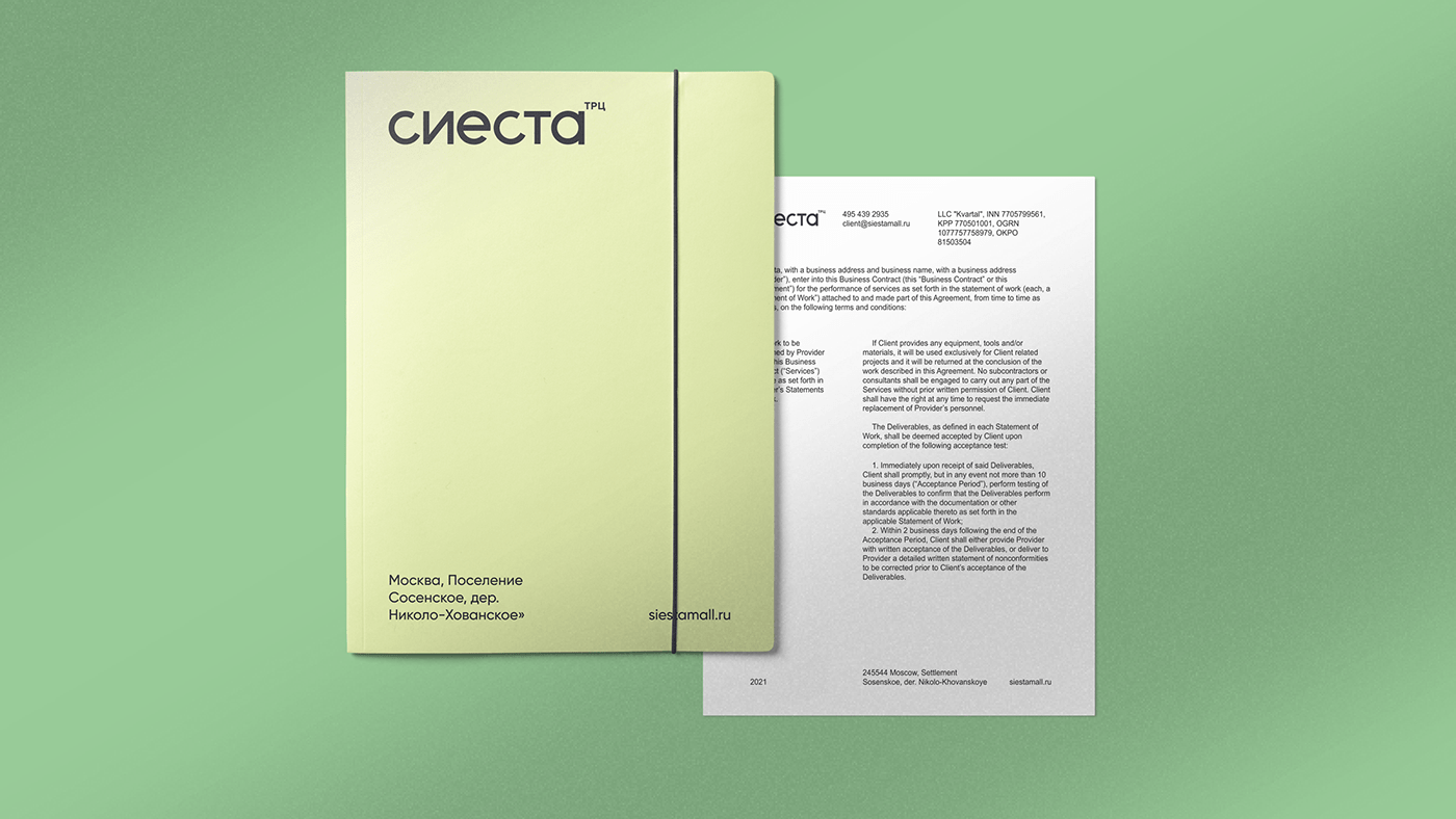
Siesta (rus. “Сиеста”) is a shopping mall located in New Moscow. In the years ahead it will be a magnet for local residents to escape from routine and have a comfortable rest. The agency was challenged to design naming, visual identity, and communication of the shopping center.
Analysis of the surrounding areas showed a dominated Spanish theme: RC Spanish Quarters, Cervantes Street, Magellan Avenue. When working on the project, it was decided to maintain the area positioning so the new project was not against the theme style and even could complement it.
Naming is based on the Siesta Spanish tradition – that is a work break for a quiet rest. These conceptions match well with the values of the shopping mall and made a base for requirements of the brand's visual identity and communication system.
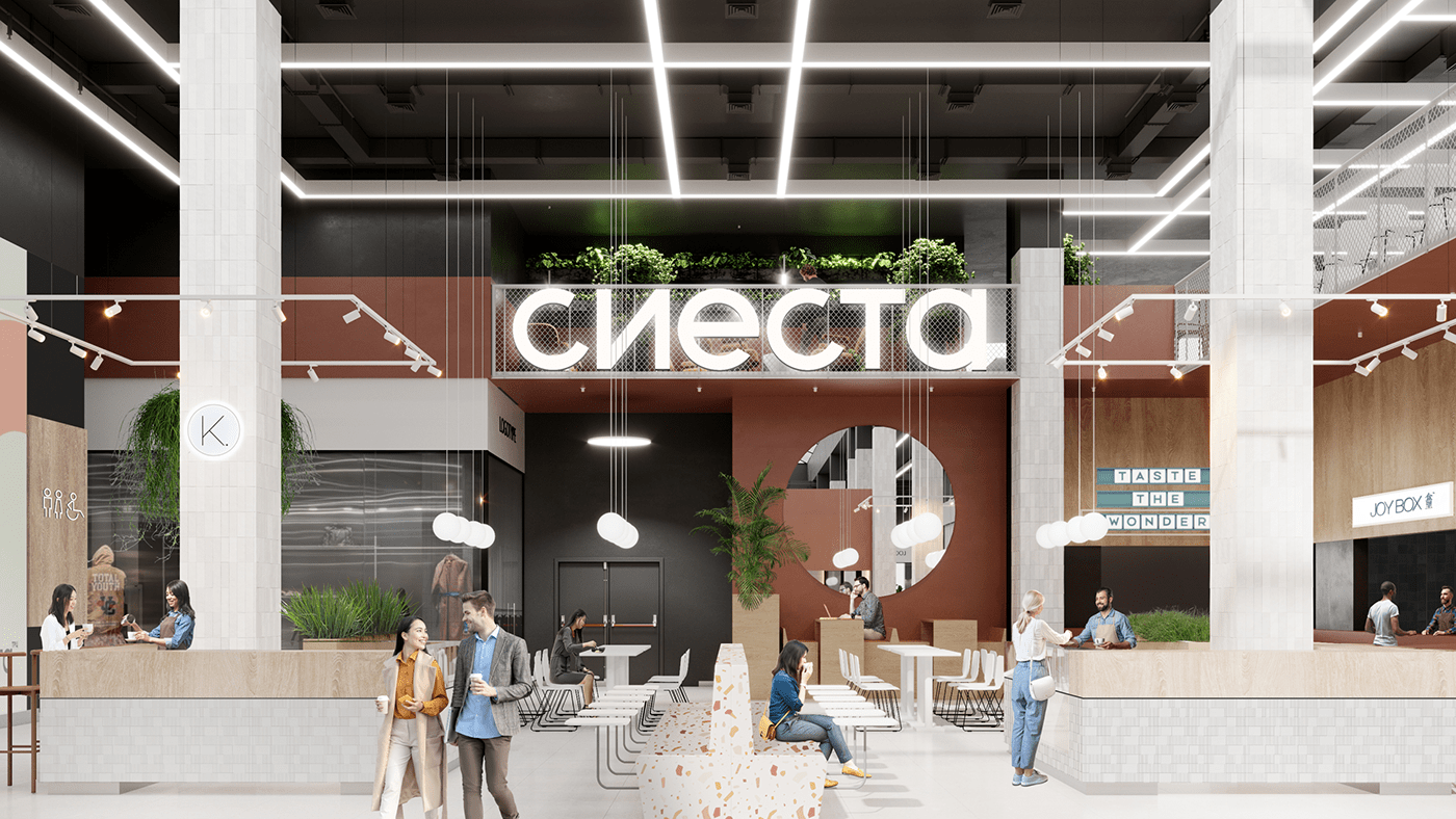
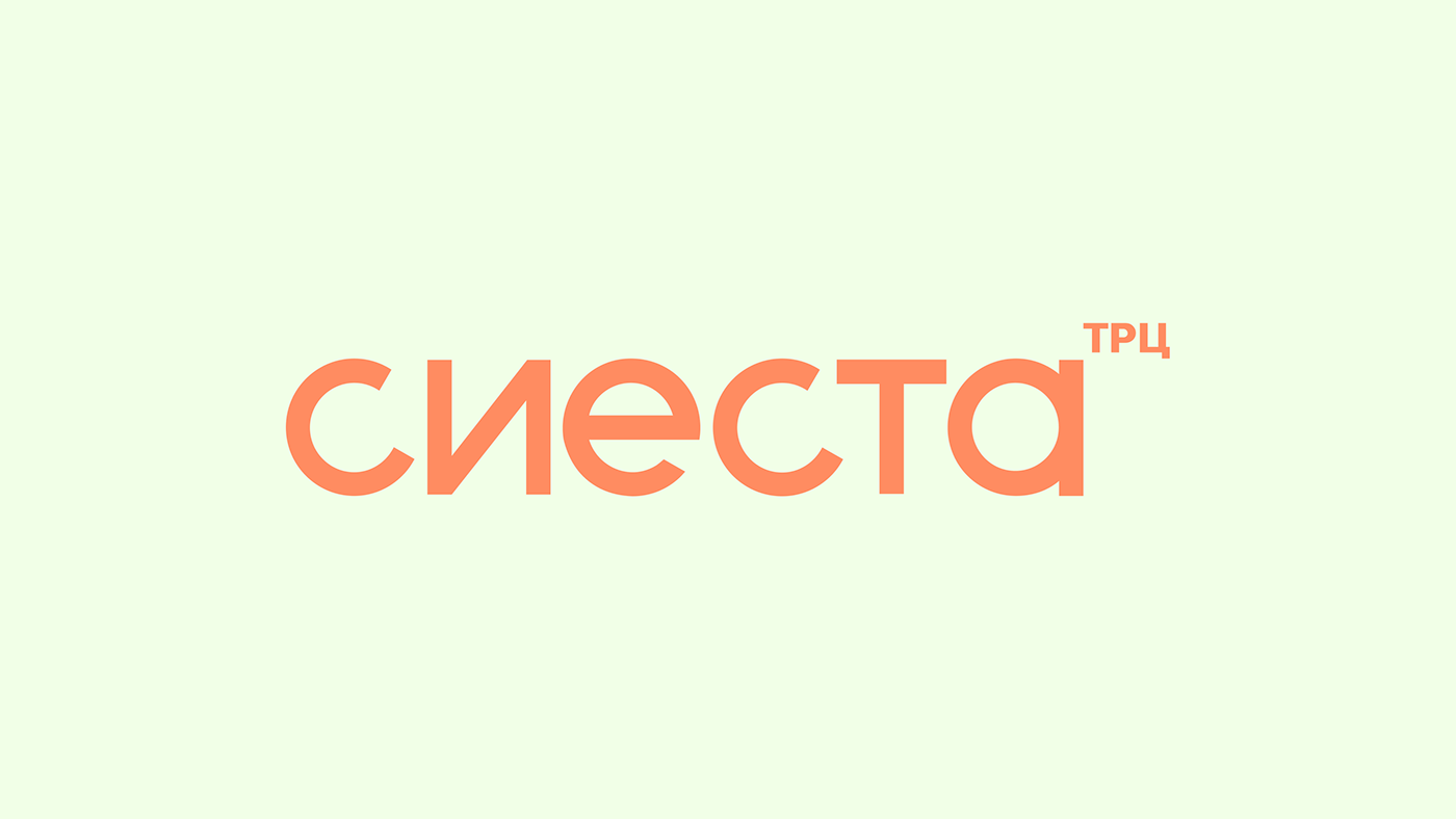
“The Big Siesta” in Spain lasts from 1 pm to 5 pm. Using a 4-hour sector of a circle, we developed the outline of the logo and chose Gilroy as the brand typographic typeface – a modern geometric grotesque. The logo perfectly scales from small formats of communication materials to large signs on the facade.
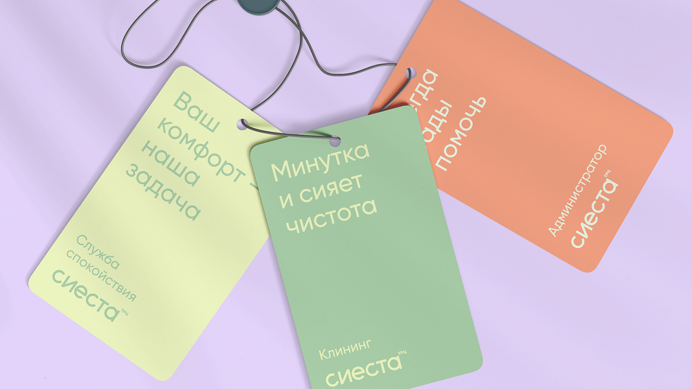
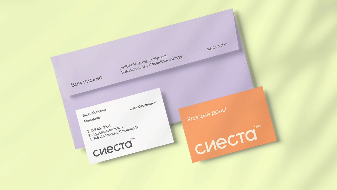
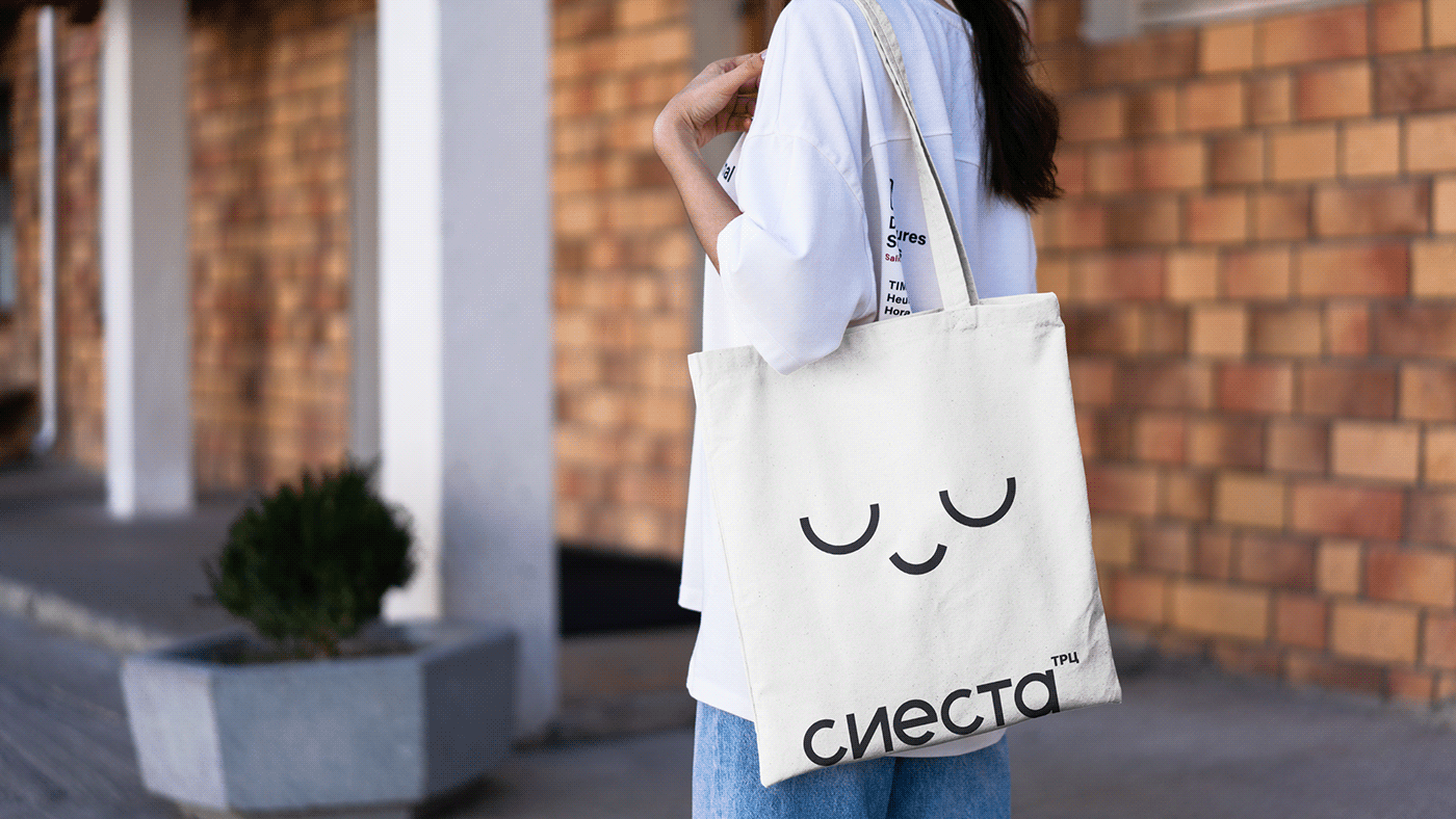
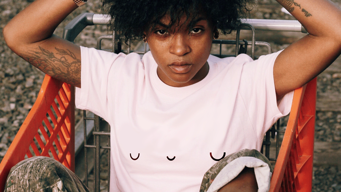
Pastel shades emphasize calmness, kindness, and brand serenity, creating a pleasant atmosphere and friendly communication. The system of combinations will help the company staff to work correctly with the corporate brand palette.
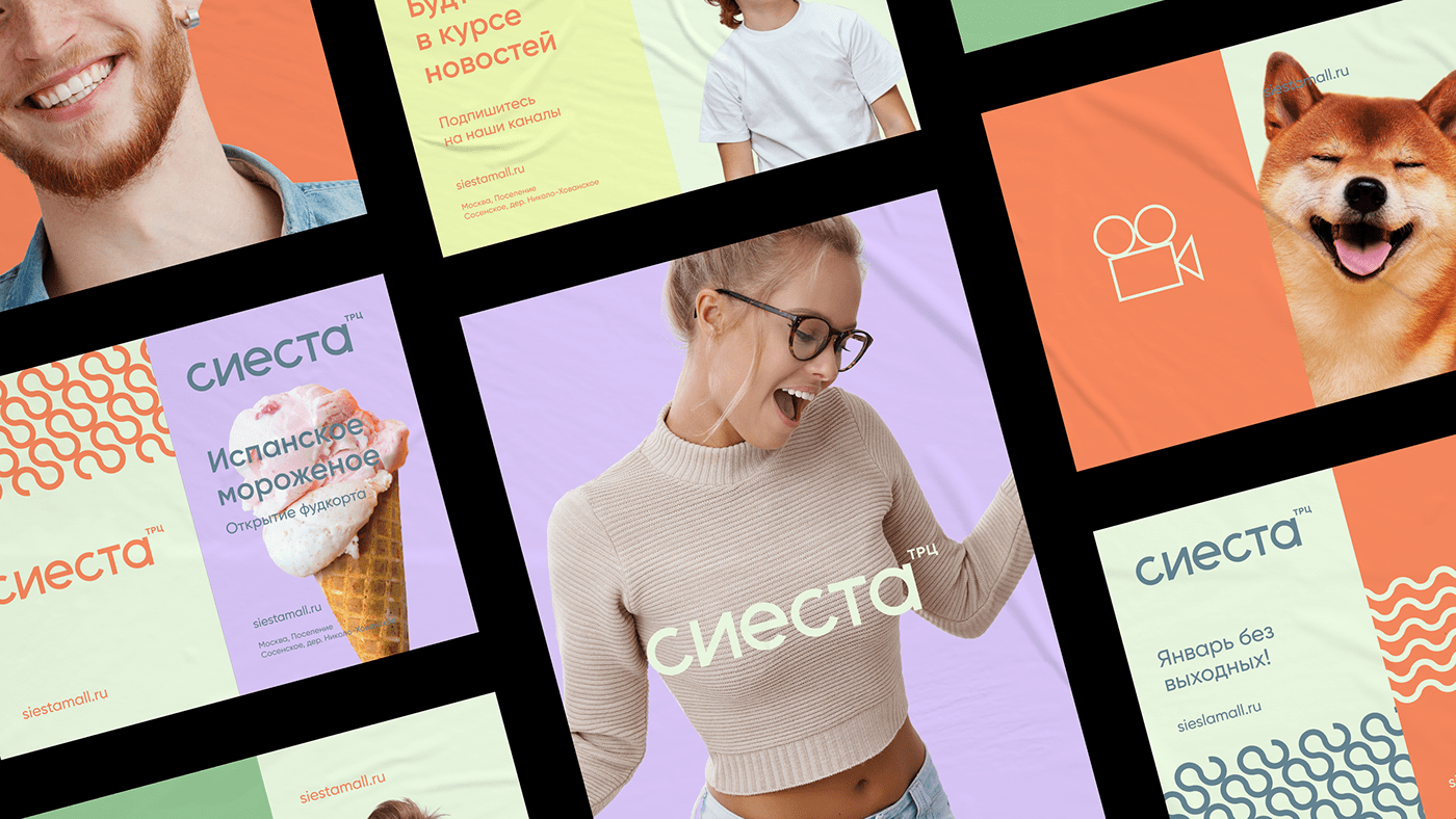
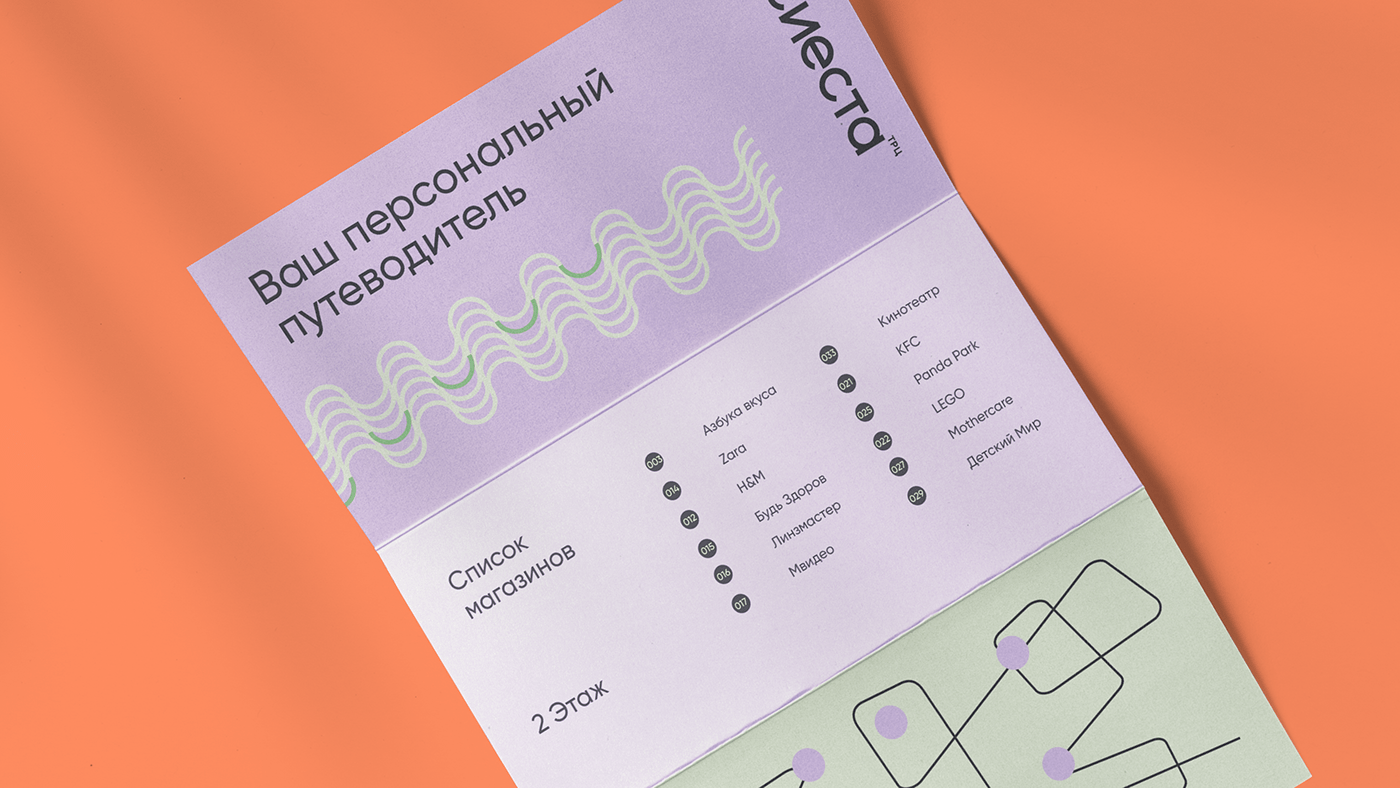
The visual language of the brand contains 4 types of patterns with a breakdown by applications: horizontal and vertical. The basis of the pattern is the same 4-hour sector which is the dominant feature of both the visual style and the verbal identity.
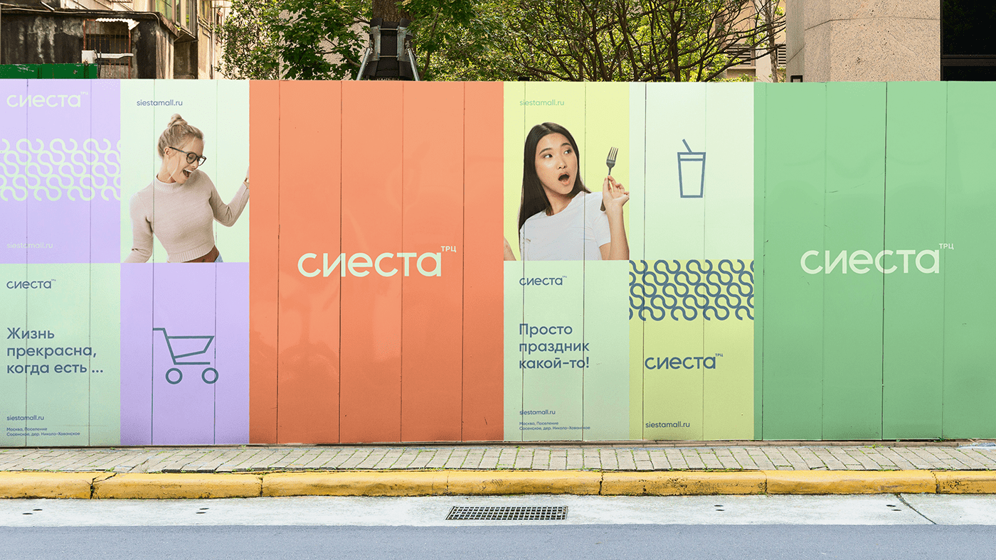
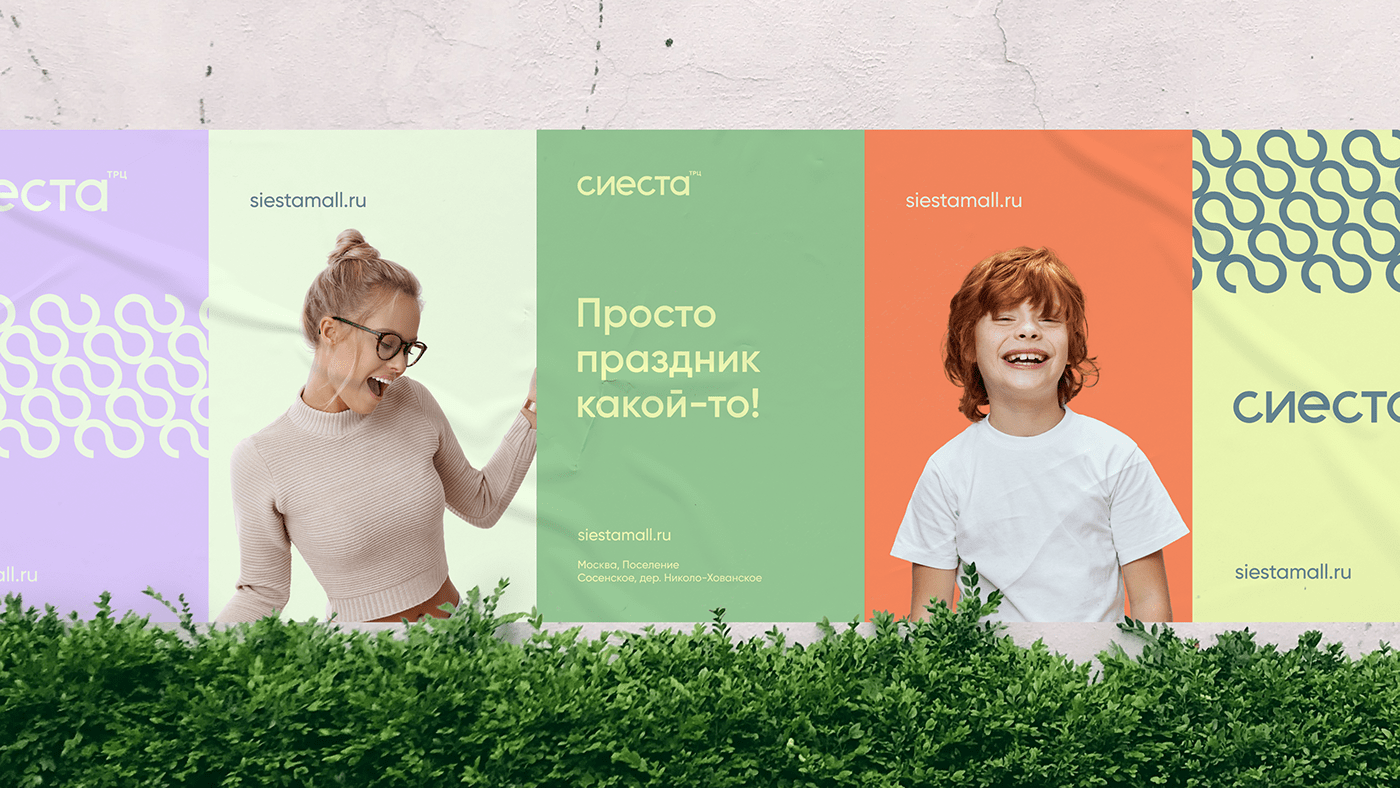
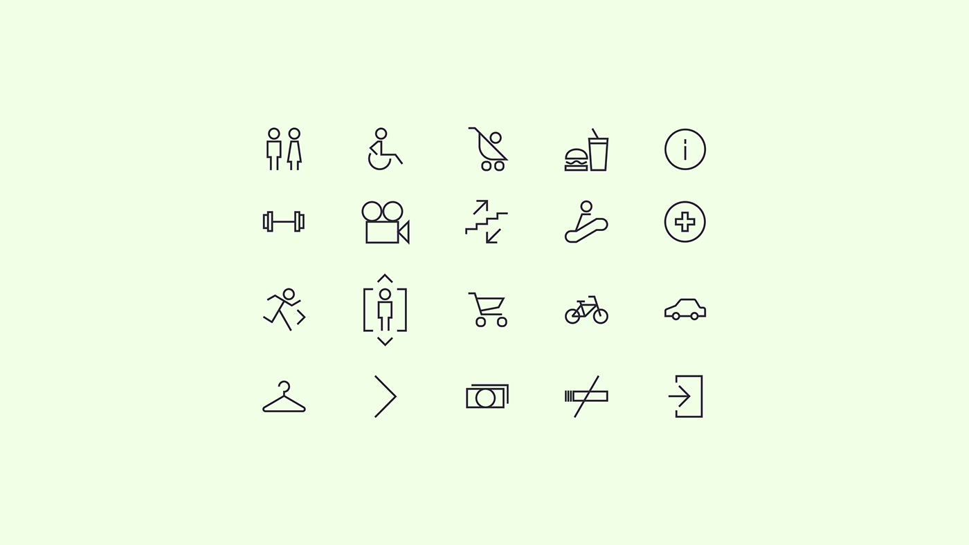
For communication materials, there is a series of key carriers developed based on the dynamics of the pattern; each visit to the shopping mall will differ from the previous one. When designing marketing materials, we were focused to make them continent in design, so they could better fall in line with business objectives.
The communication tonality simplifies the brand identity by focusing more on verbal messages and a beneficial attitude so as to make you feel satisfied like after having a good rest when visiting the shopping center.

Having moved to the end of the brand work, we provided a digital concept of the prospective shopping mall where a visitor through the application gets access to the services of all vendors, makes personal scenarios of his/her visits and goes shopping with one shopping cart.


