


SUPER MATCHA
Brand Strategy & Identity Design
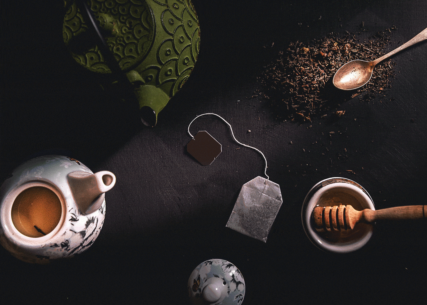
Super Matcha is a contemporary matcha brand for millennials. The history of matcha lasted for about 1,300 years. The traditional image is established by the older generation, which resulted in the existing tea culture for the few. Super Matcha's brand mission is clear; 溫故知新, which means ‘gain new insights by exploring the past’. 'Functional intuition' has been a valuable keyword to Super Matcha to convey tradition to the modern era.
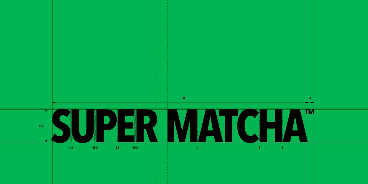
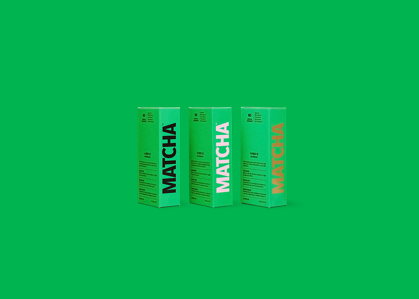
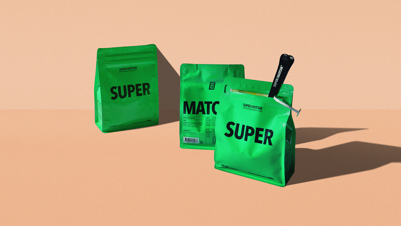
"Why Should I Drink Super Matcha?" is abbreviated to five alphabets for each SUPER, on naming, slogans, and all visuals so the information can be straightforward.
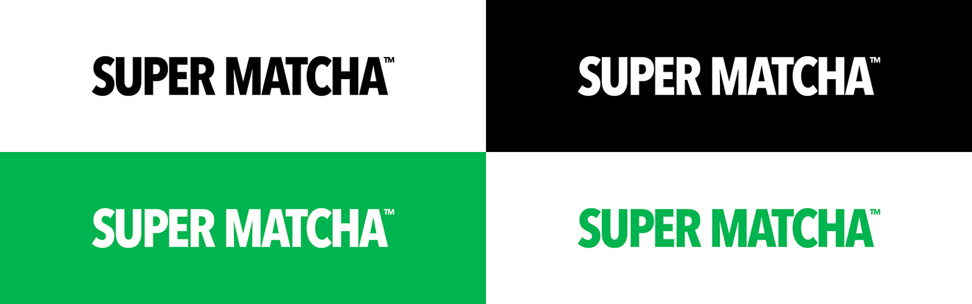
It also actively reflects the original green color of matcha in the package system, creating a new "healthy and enterprising" persona to break away from the static image of the existing matcha and convey its functional power as a superfood.


Brand Management & Design: HIT THE TEA
BI & Package Design System: HIT THE TEA
BI & Package Design System: HIT THE TEA
-
Creative Direction & Design: Hyejin Sung
Brand Strategy & Copywriting: Hyejin Sung
Application Design: Eunjeong Kim, Soohyun Hwang
Application Design: Eunjeong Kim, Soohyun Hwang
Photography: LCC Studio, Studio Unravel
© HIT THE TEA


