


Project Overview
Geworin tab, released in 1977, has taken place as Korea's favorite pain reliever and first aid medicine for 40 years. From April 2020, the project aimed to further grow the brand status as the representative Korean pain reliever by replacing the old image with young and new and integrating the visual to express the effect. We established the unique design direction of the Geworin tab while holistically considering the present brand status, features of the product, and target customers. Enhancing the brand image that has been grown to fit the needs of customers and the trend of now, and neglecting the identity as Geworin tab that was the same for 40 years, We want to reflect the renewed feature of the Geworin tab to the design symbolically.
Graphic Motif
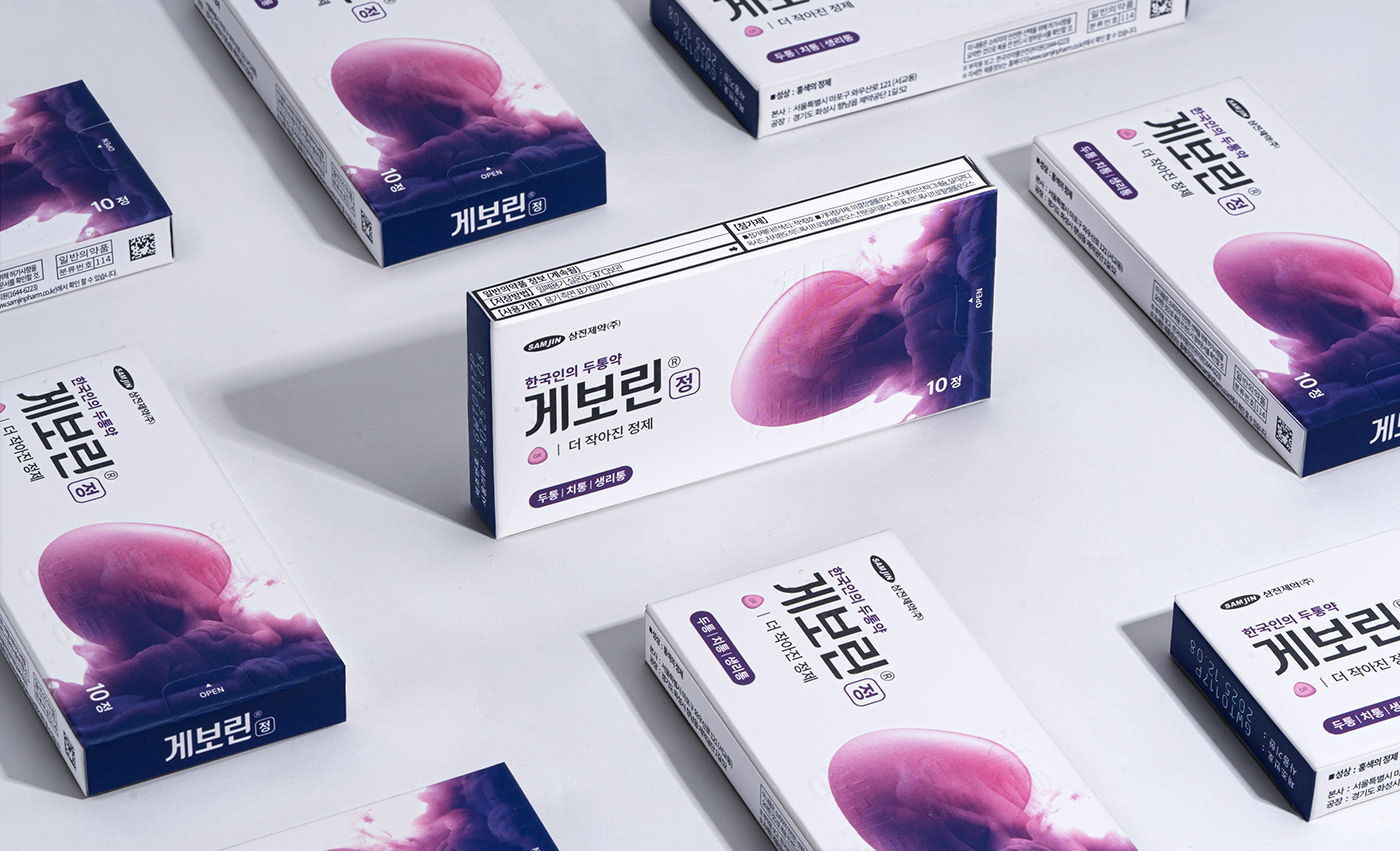
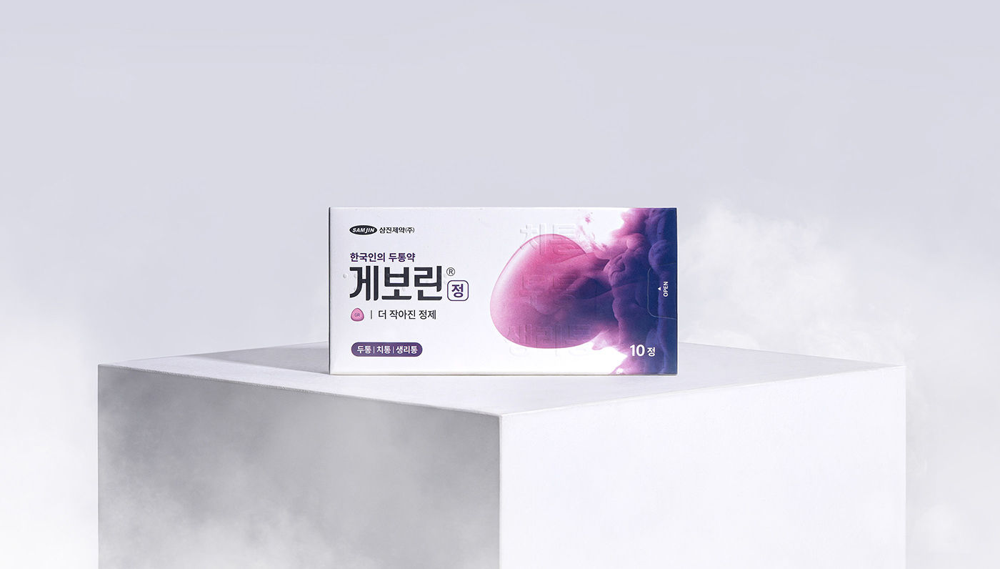
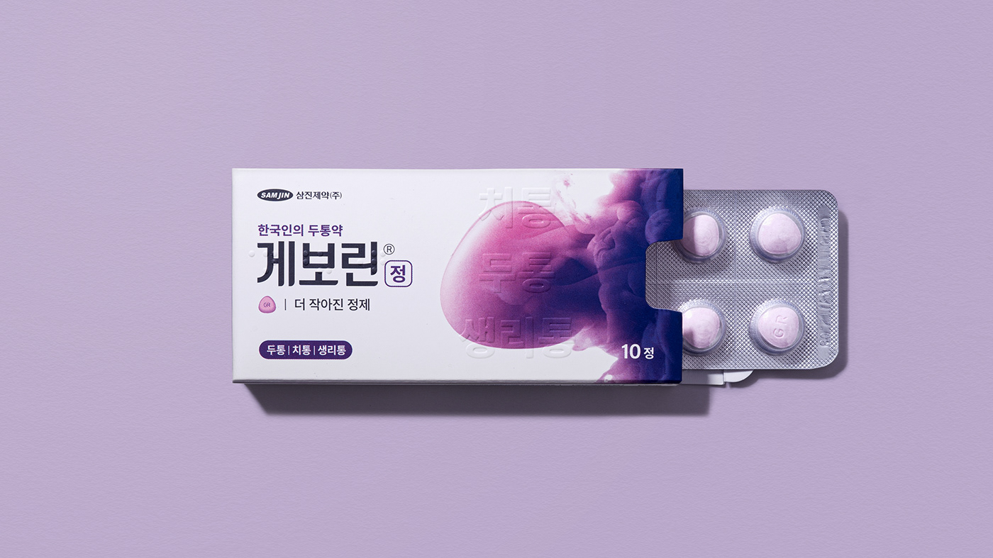
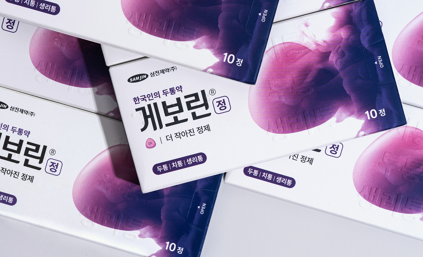
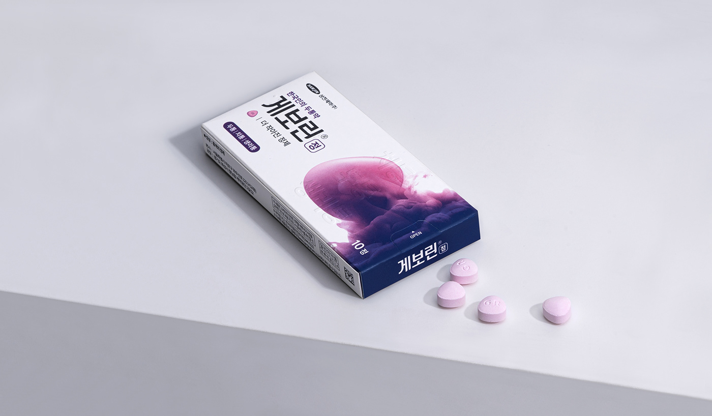
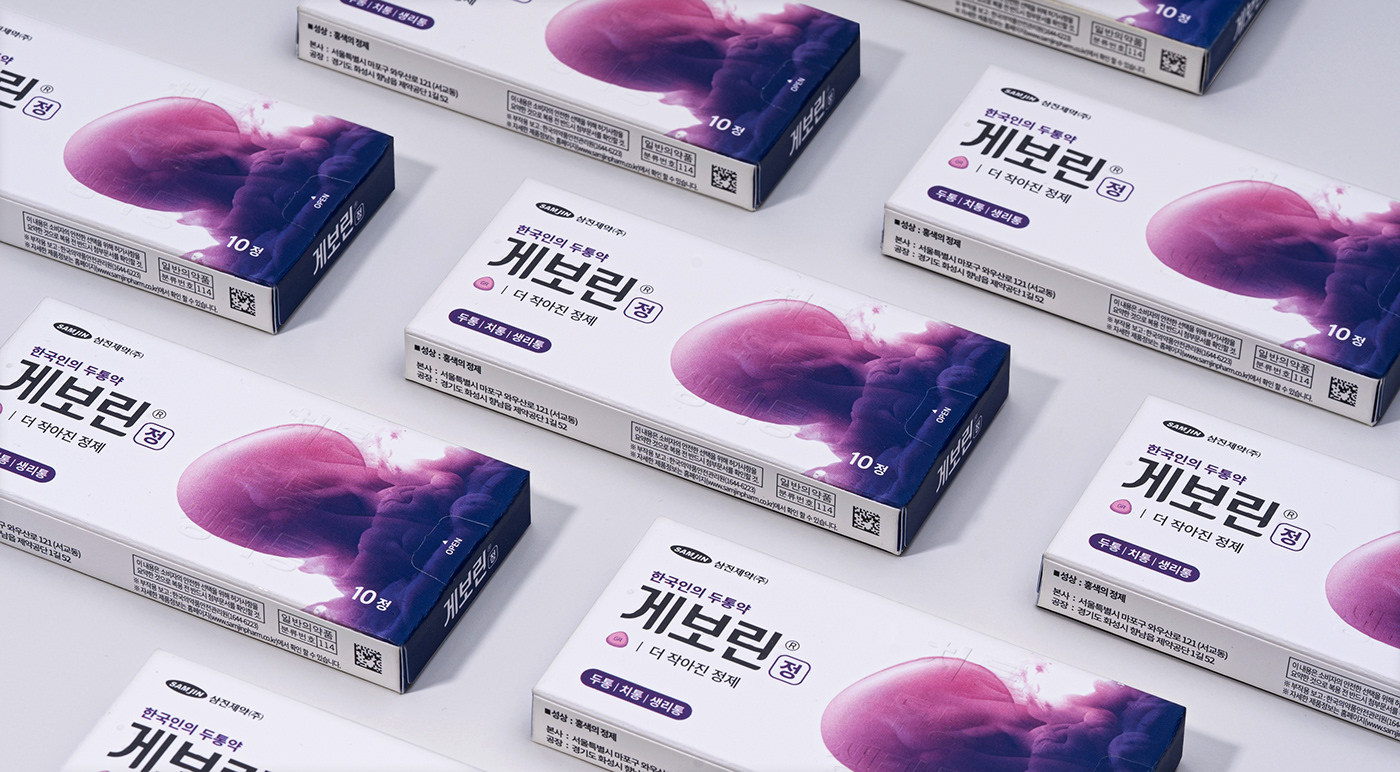
Geworin tab is a brand beloved by Koreans for over 40 years. The form and color of the pill left a mix of diverse memories to customers. We utilized this and built a strong brand identity. As a result, we enhance the symbolism and develop the new intuitive visual motif of Geworin tab.
Brand Logo
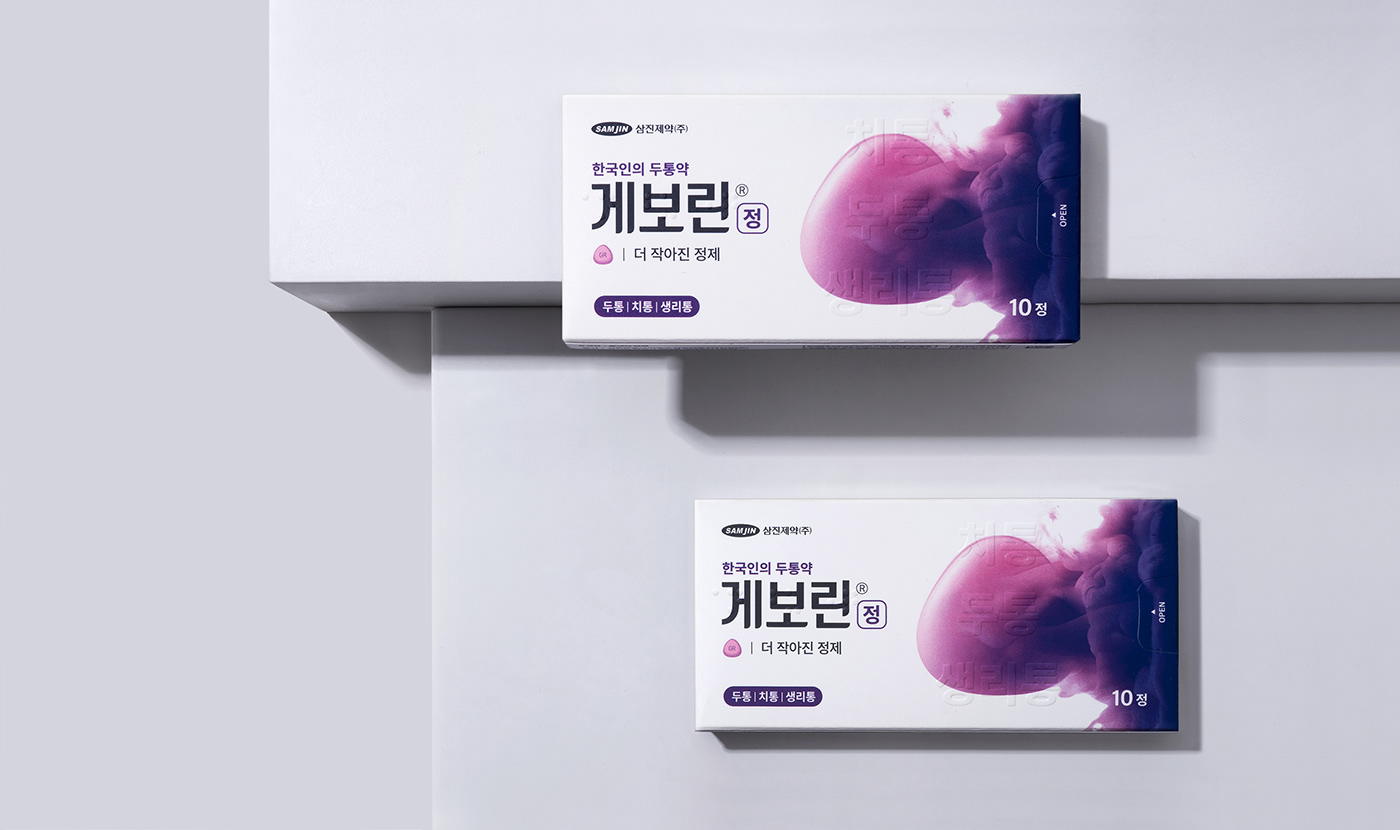
With the previously established logo system of Geworin tab, we made a more stable BI. The logotype in bold gothic emphasized the reliable brand image. Also, the Rounded finish at the end of the typography shows a friendly mood as Korea's favorite pain reliever.
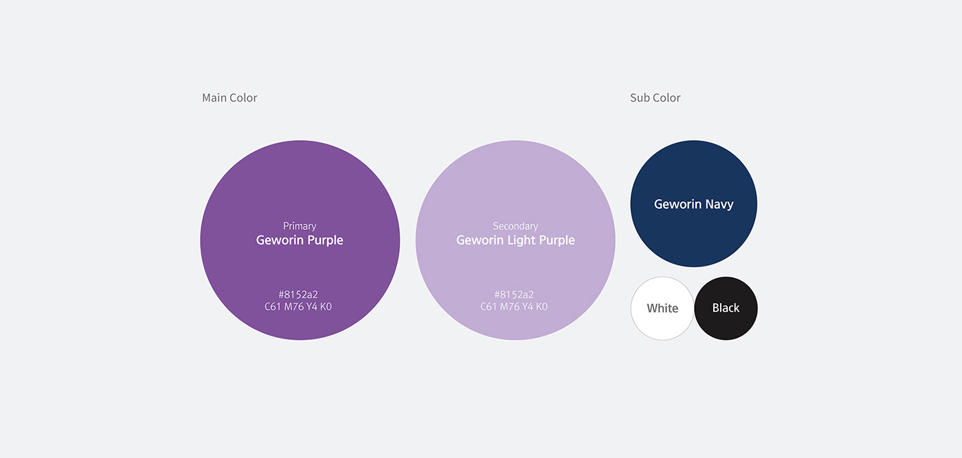
Color Palette
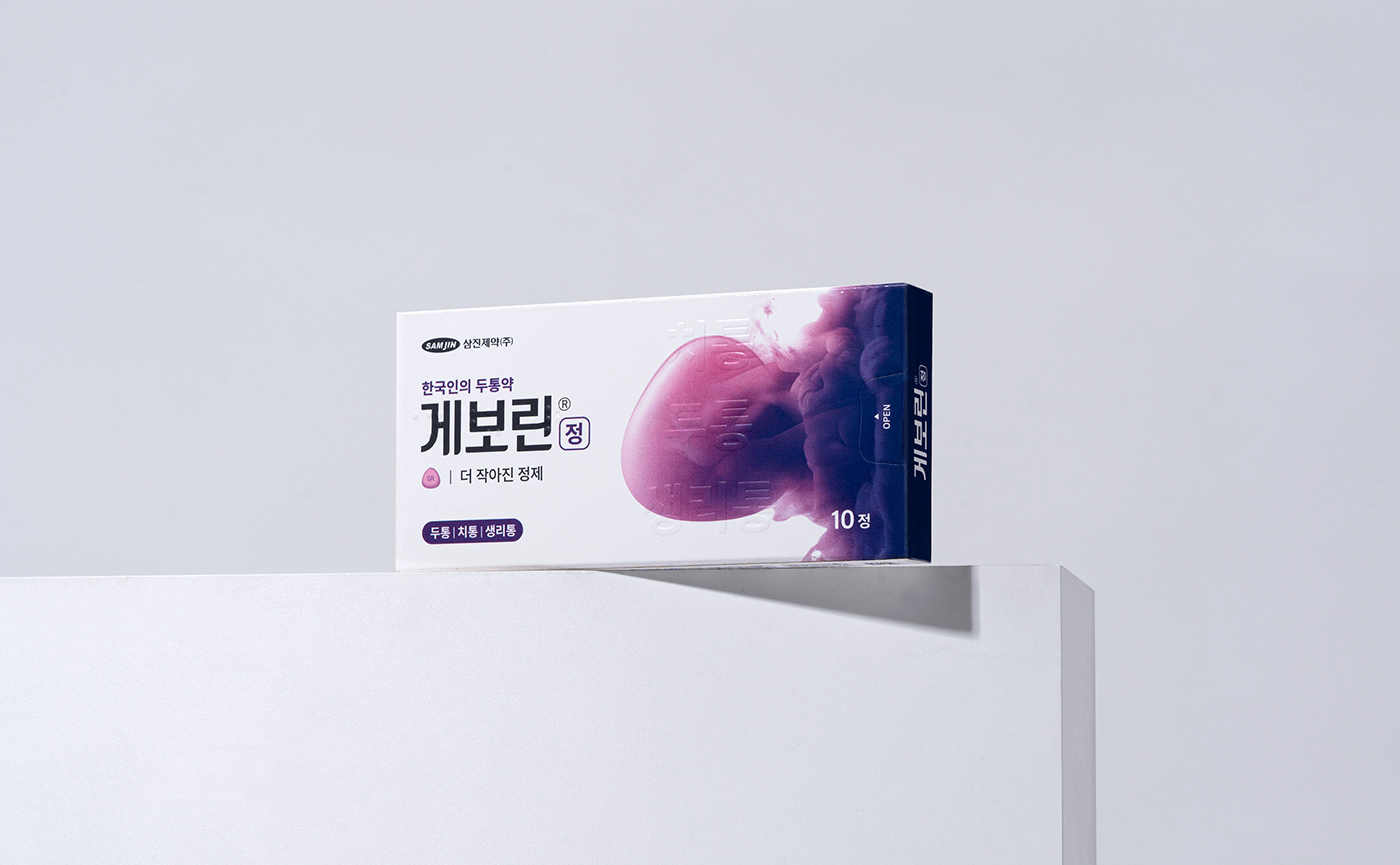
We developed the brand color, Geworin purple, by decreasing the color tone of the previous brand purple color to make it stable and feel more trendy. In addition, The gradient color directly/ indirectly expresses the permeation of the pill to promote a rapid effect of the product.
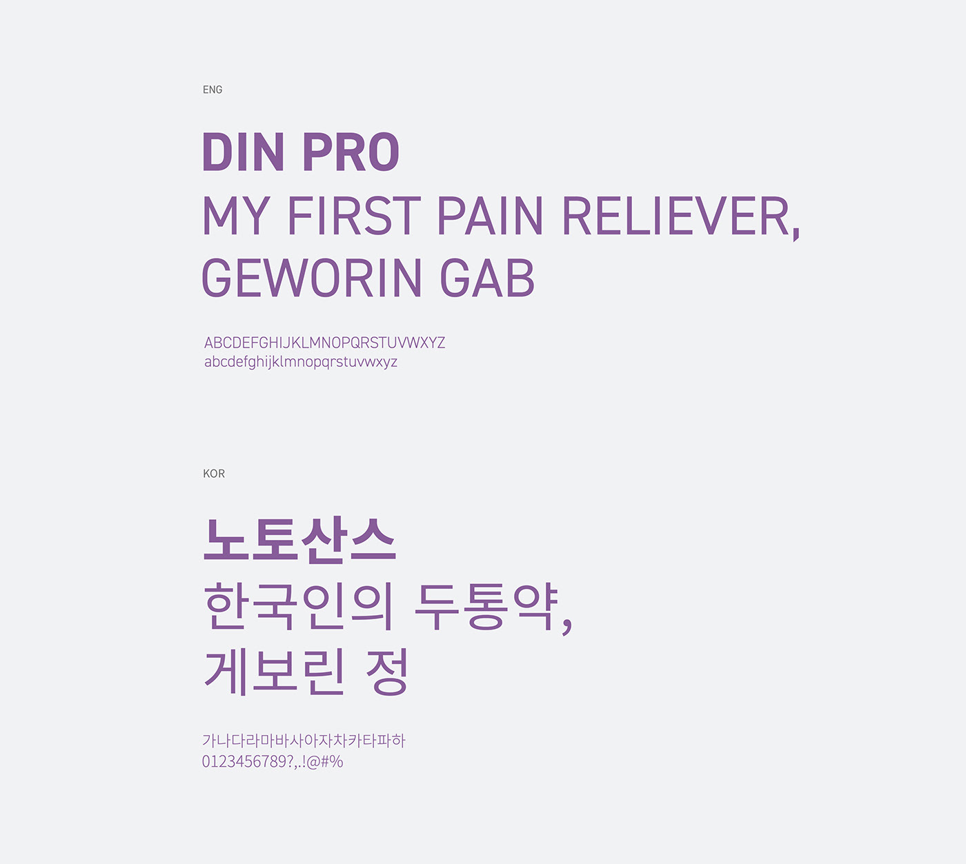
Typography
The brand font of the 'Geworin tab' delivers a constant brand identity. It uses Korean NOTO sans and English DIN pro that features high readability and is quite similar to the brand logo in an aesthetic way.
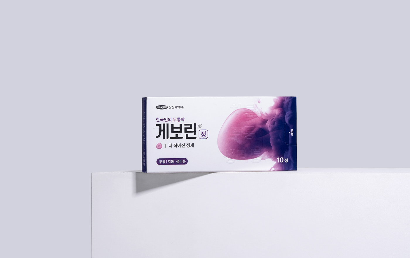

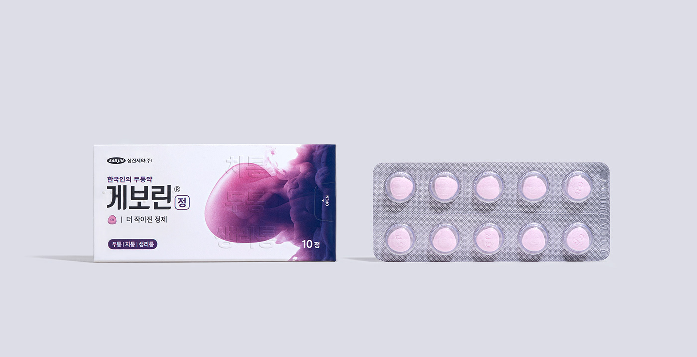
Package Design
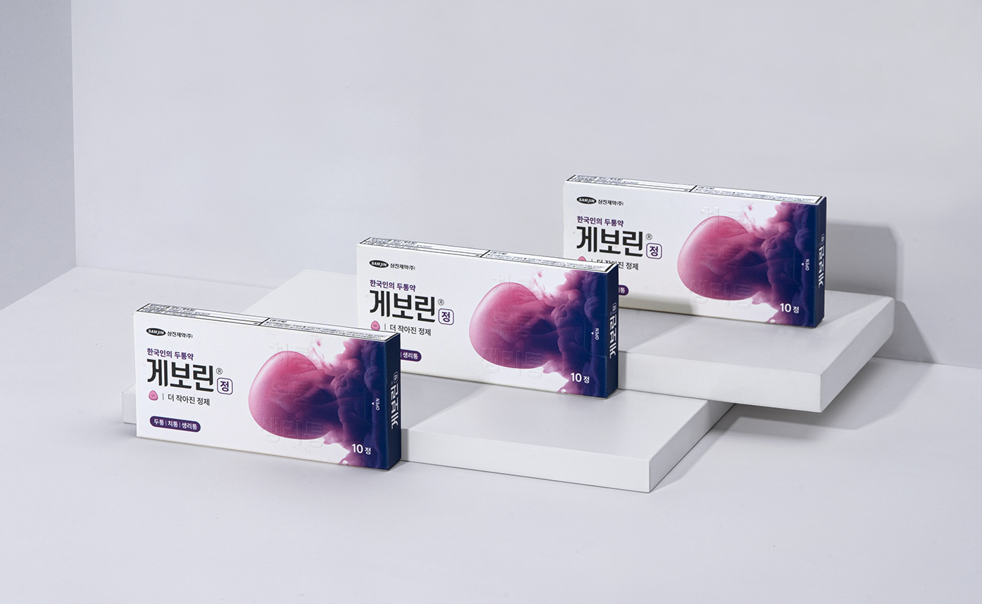
We Separate the graphic and communication design area in the package design. Hence, it delivers the exact information to users while leaving the impression of the reliability as medicine brand and professional image of the brand rather than only a reflection of the brand identity. A grid system strengthens the symbolism and enhances information recognition by separating the brand identity graphic and product & brand information.


Geworin Tab Pharmaceutical Brand
Package Design
© 2021 GRAFY DESIGN
-
More Project


