About SwinhoeTW
In a severe epidemic, people everywhere are facing challenges in life and work. Based on the experience of living abroad, the manager decided to establish "SwinhoeTW" in the precarious 2020. The "Swinhoe" from Taiwan, out of cherishment and pride in his hometown of MIT food, decided to spread his wings to Dubai, share high-quality food with friends in the Middle East, heal people's hearts through healthy and delicious ingredients, and become a series of two places. At the same time, it plays the role of a social enterprise that makes good use of Taiwan’s food resources.
嚴重疫情下,各地的人們都面臨生活與工作上的挑戰。主理人透過旅外生活的經驗,於風雨飄搖的2020年決定創立「藍鷳」。來自台灣的「藍鷳」,出於對家鄉MIT食品的珍惜與驕傲,決定展翅飛向杜拜,將高品質食品分享給中東的朋友,透過健康美味的食材療癒人心,成為串連兩地的角色,同時扮演著妥善利用台灣食材資源的社會企業。

visual identification system
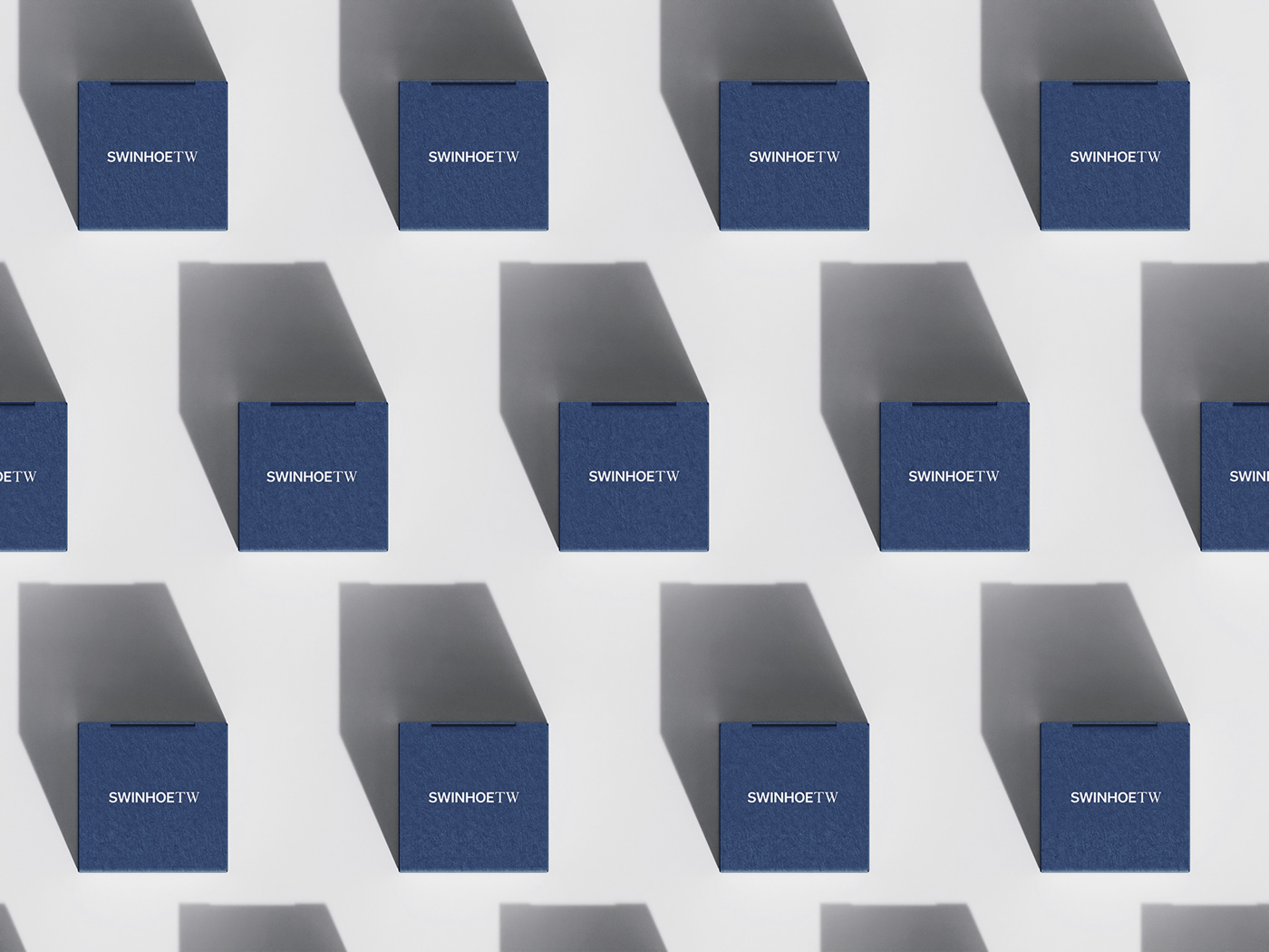
SwinhoeTW takes the international brand as the goal and introduces SwinhoeTW, which is Taiwan's high-quality products,The brand emphasizes delicate texture, and conveys product safety and professionalism, emphasizing the brand's values of paying attention to channels and consumer perception. We combine a calm black body with a meticulous serif body to convey the brand's brand tone that is both safe and exquisite. The color is dark blue, which not only gives people a sense of calm and neatness, but also echoes the color of the blue pheasant.
SwinhoeTW以國際品牌為目標,導入台灣優質產品的SwinhoeTW,
品牌著重質感細膩,並傳達產品安心、專業,強調出品牌注重通路以及消費者感受的價值觀,我們將沈穩的黑體與細緻的襯線體組合,傳達品牌既安全又精緻的品牌調性。色彩選用深藍色,不僅帶給人沈穩俐落的感覺,同時呼應藍鷳的顏色。
Auxiliary Graphics
The applied graphics use geometric graphics as the brand to emphasize the visual impression and enrich the presentation of the trademark. The graphics symbolize the spirit of the brand and can be freely arranged in various extension designs.
應用圖形以幾何圖形為品牌強調視覺印象,豐富商標的呈現, 圖形象徵品牌精神,可自由排列於各項延伸設計品中。


專案類型 Type | 品牌 Branding
專案年份 Year | 2021
客戶 Client | SwinhoeTW
製作單位 Production | K9 Design
藝術指導 Art Director | Kevin Lin
設計 Designer | Ya Fei Yang


