


MONOCHROME™ is the first and only brand that actively promotes oversized fashion and uses this concept as a key direction in the creating process of its collections.
Our acquaintance with MONOCHROME began with the product shooting of their collaborative collection with PANTONE Color of the Year 2020. Eventually it turned into a full rebranding: visual identity, font, packaging, communication materials, website have been completely reconsidered and now are visually consistent with the brand’s standards and quality.
The Base. Font
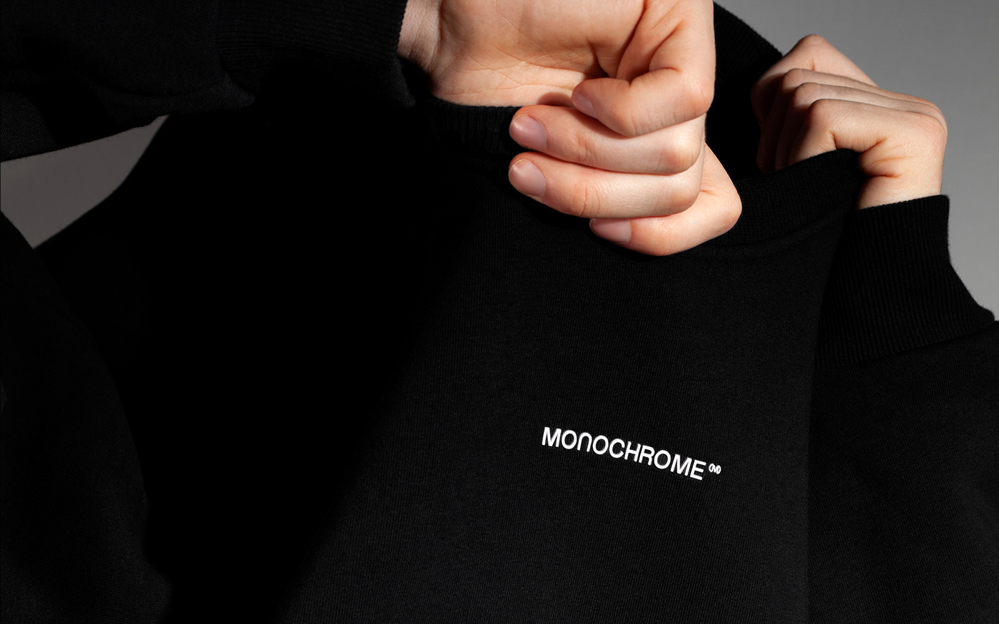
While setting the task, the client had only one request: not to change the logo under any circumstances, since it completely satisfied the company. The logo was already well recognizable and stayed present in the most salient places on all of the objects including the hoodies and sweatshirts. This turned out to be a big challenger for us. We would not be F61 AGENCY if we didn't see this as the exact point to aim at.
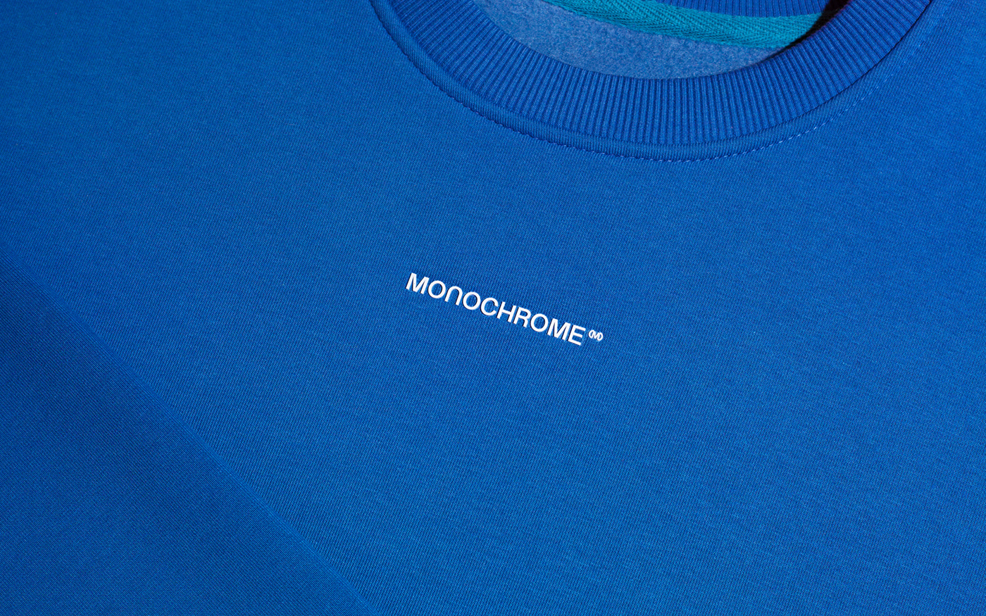
Like the brand itself overgrew its own concept of sweatshirts and hoodies into a nontrivial oversized fashion, we wanted the logo to reflect this growth and changes as well. So, we allowed the font of the logo to become larger and bolder, but not to the point of insolent.
Just then our goal became even more ambitious — we decided to go deeper and develop a custom font for the company. Since the idea of oversize is a hypertrophied size, we decided that the font should also become ALL CAPS to match the brand’s DNA. We translated the essence of the brand into the language of typography by making it recognizable not least through a suitable degree of strangeness and by using the shapes of some lowercase glyphs.
We presented the client with something that they weren’t expecting. To our delight, the only question that came up after the presentation is how quickly the ideas for the brand identity could be implemented.
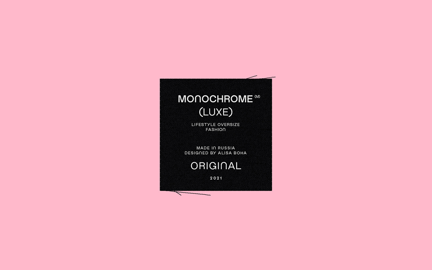
MONOCHROME SANS
Unicase font (Cyrillic + Latin) designed to fill the space and to slightly break the rules in order to reserve the right to be unique in the fashion industry and among a large number of the brand imitators.
We wanted to show that MONOCHROME™ can communicate in its own language — all information including the company name can be typed using the font, which makes it convenient to insert the logo right in the text. The font has a main Regular style and an additional Medium for slight text accents that we used to create a hierarchy in the brand’s lines and layouts structure. In the future the font may evolve and undergo some changes or have additional styles, etc.
The basic layout principle is the text left alignment and placement of an emphasis (logotype, line name, etc.) right in the center of the layout. We also offer an opportunity to use the font freely and try other layout options. The bottom line is that the message is already based on the brand identity — the bespoke font.
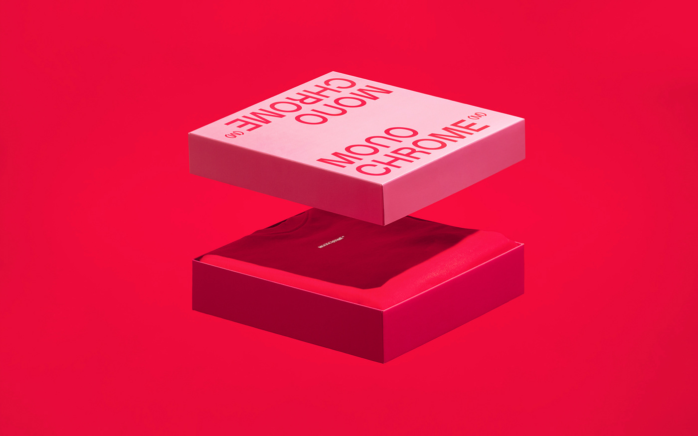
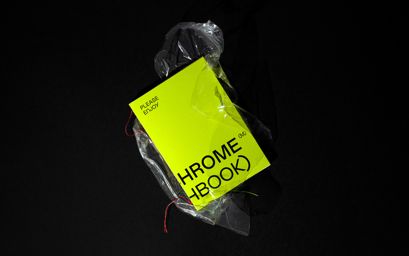
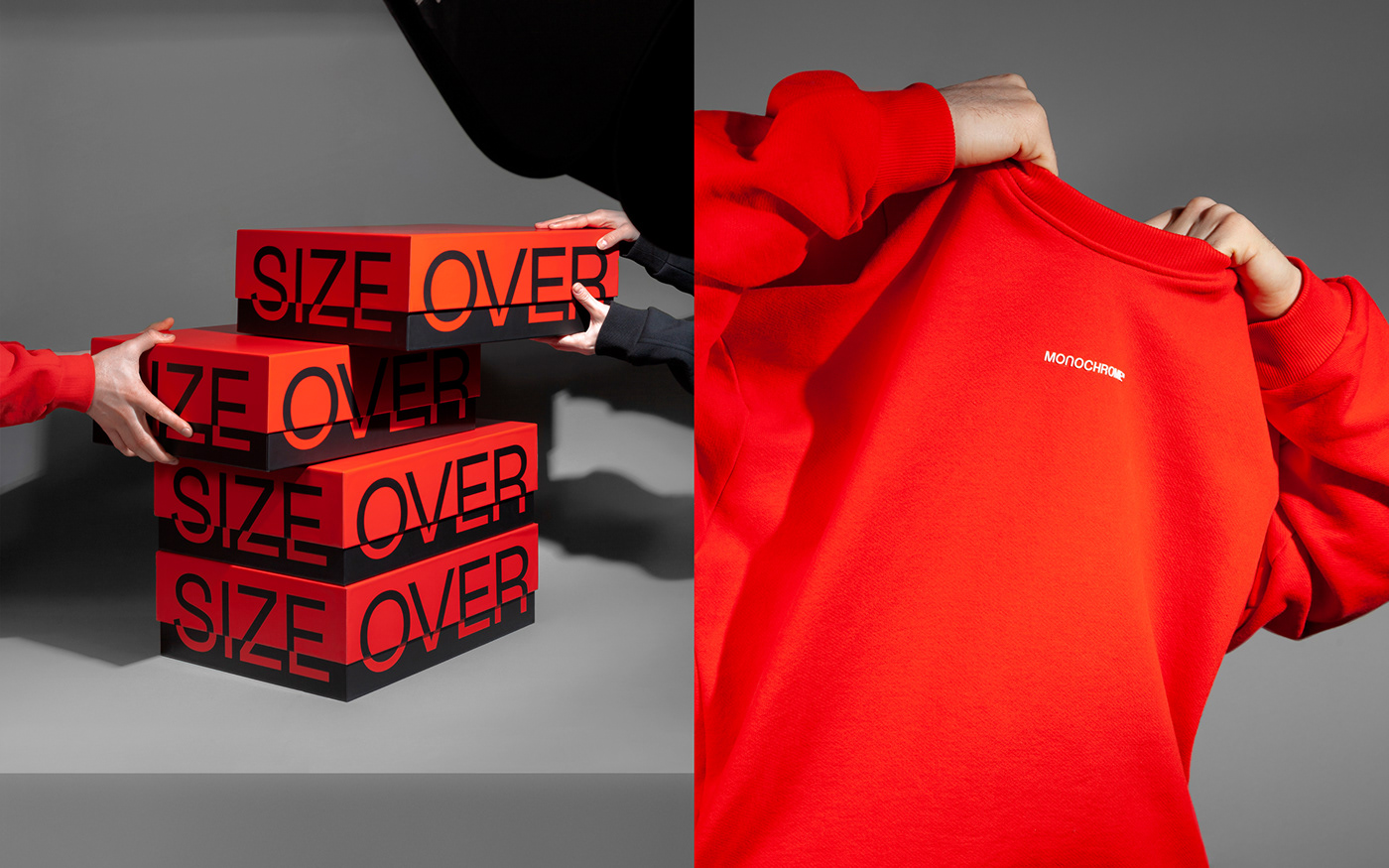
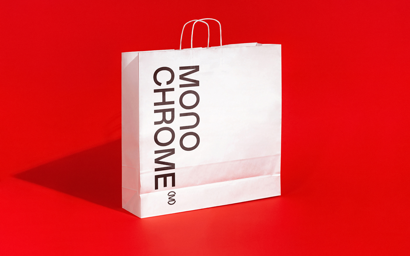
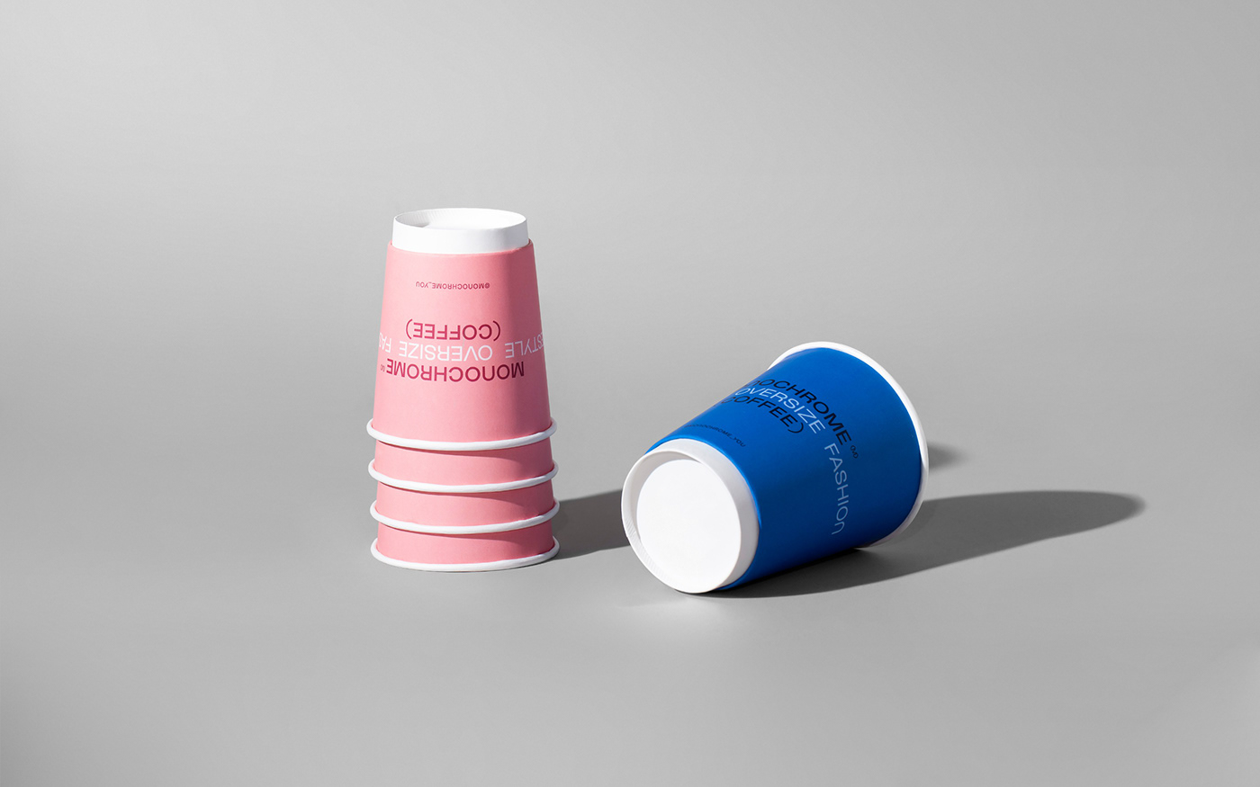
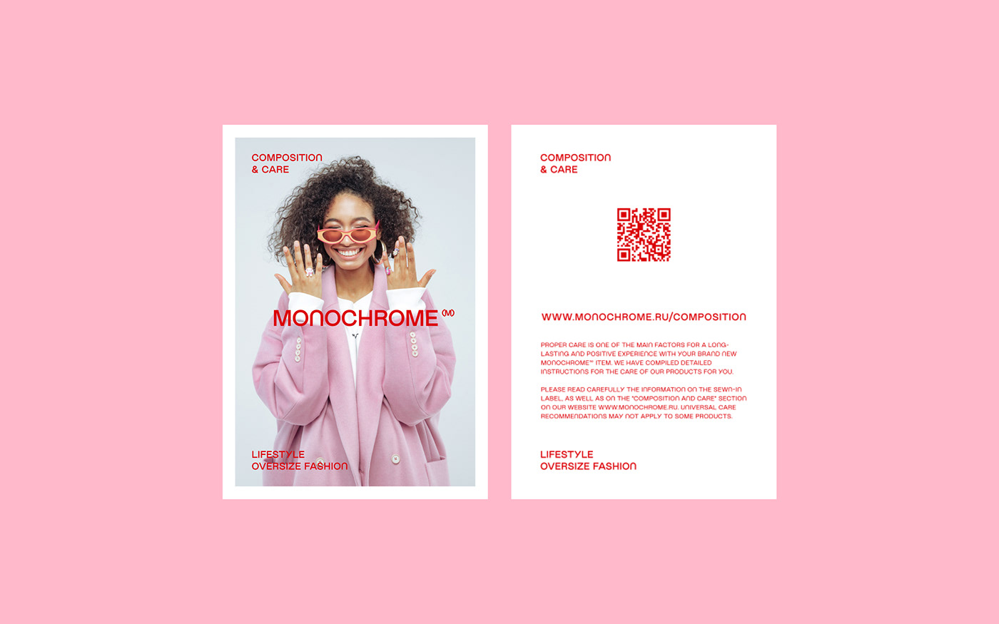
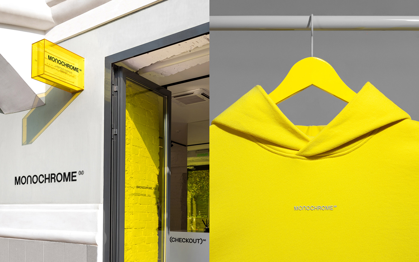
Packaging
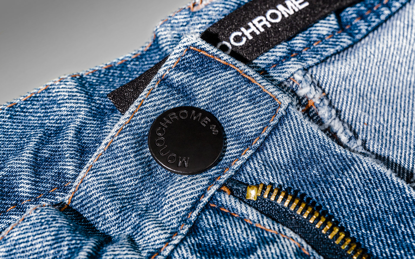
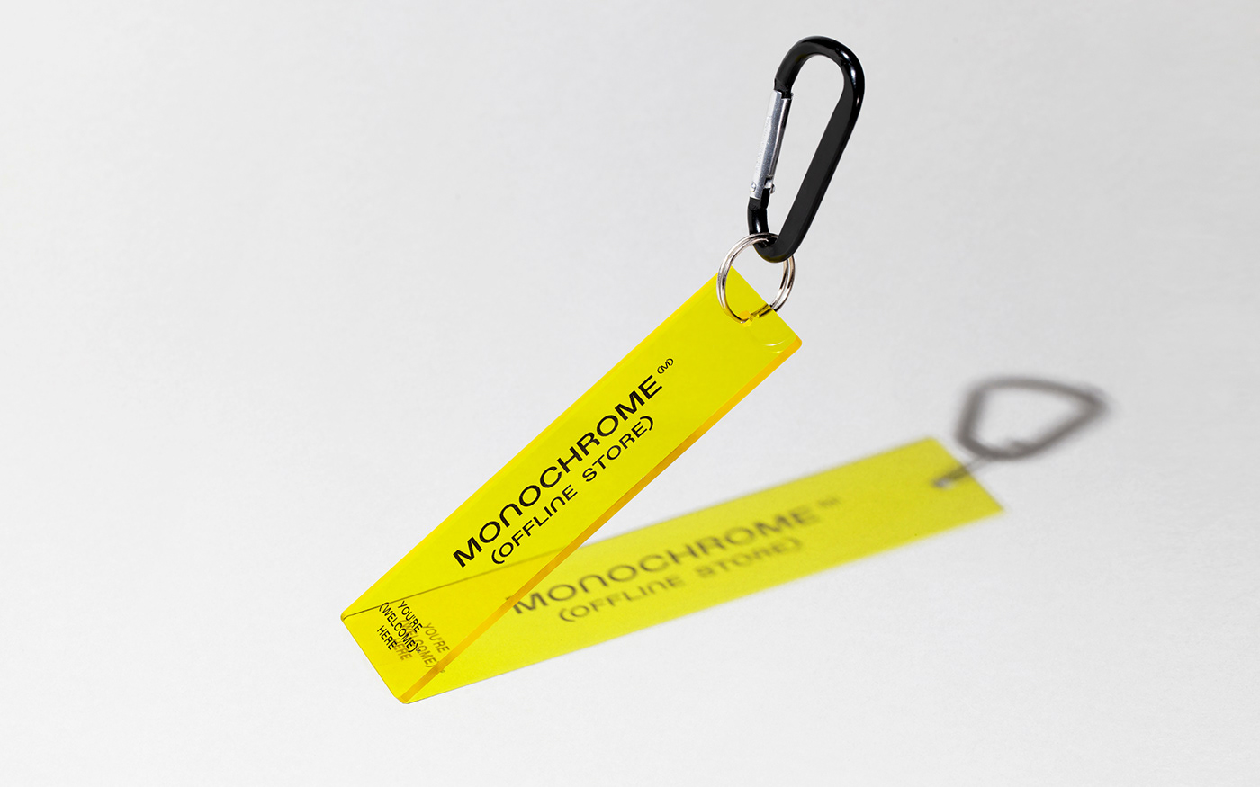
The brand wanted to get a new design for the packaging to make it match the product quality level. Sure enough, the font (and its variety in combination with the bright colors) became the central character of the packaging. The MONOCHROME ™ box evolved into an enviable trophy with a memory of a purchase that one wants to come back to. Design of the brand’s shopping bags is made in such a way that it divides a bag into two parts: one is basic white while the other is transparent and uses the bright color of the products themselves. All the additional materials — tags, composition & care card, offline store packages — everything is united by the custom-made font.
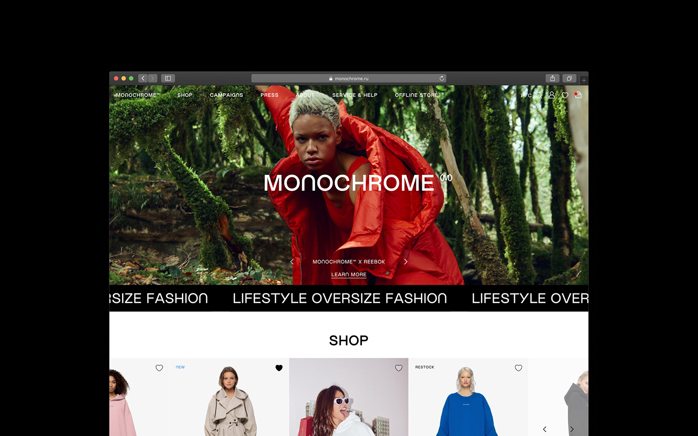
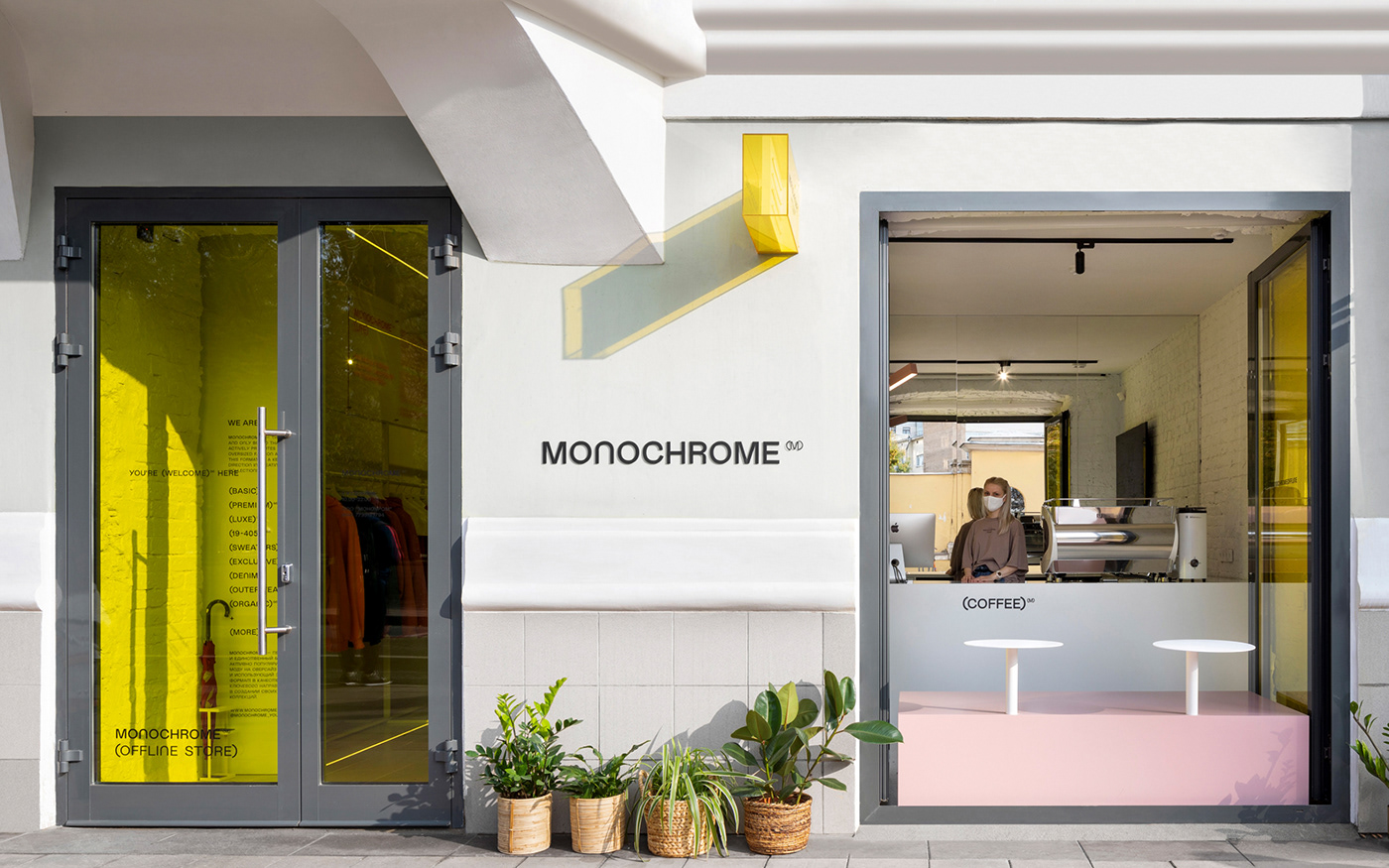
Website https://monochrome.ru/
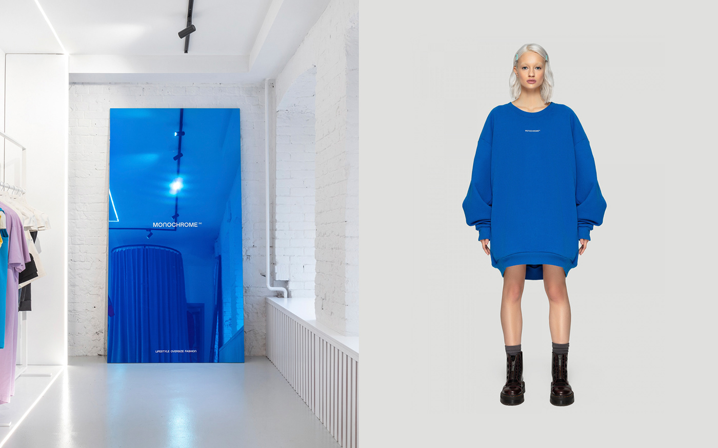
An important step for us was the website design. We realized that to just make it look pretty wouldn’t be enough. We aimed to develop a high-quality e-commerce tool that would be able to present the product not only in the image way (the brand’s Instagram account does a great job for this), but to make the process of selection and purchase memorable and sleek. The site design is based on user-friendly cards displaying collections and specific products with the large text accents of the signature font.
F61 AGENCY has shown the strength of graphic design as a comprehensive tool for building MONOCHROME™ brand recognition and customer desirability. Along with growth and value changes within the company, the new visual identity demonstrates MONOCHROME™ as a fashion brand with its own voice, which the industry can't ignore.
MONOCHROME:
Project manager - Anna Ustinova
Creative director - Alisa Boha
CEO - Nikolay Bogdanovich
F61 AGENCY:
Art Direction - Sergey Poluhin, Lana Lomakina
Designers - Sergey Poluhin, Lana Lomakina
Typography - Sergey Poluhin
Object photography - Lana Lomakina
Photographers from the client's side:
Fashion photography — Andrey Golovchenko https://www.instagram.com/photo.buro/
Alena Nikiforova https://www.instagram.com/sunny_blossom/
Interior photography — Ivan Erofeev https://www.instagram.com/ivaan_erofeev/


