
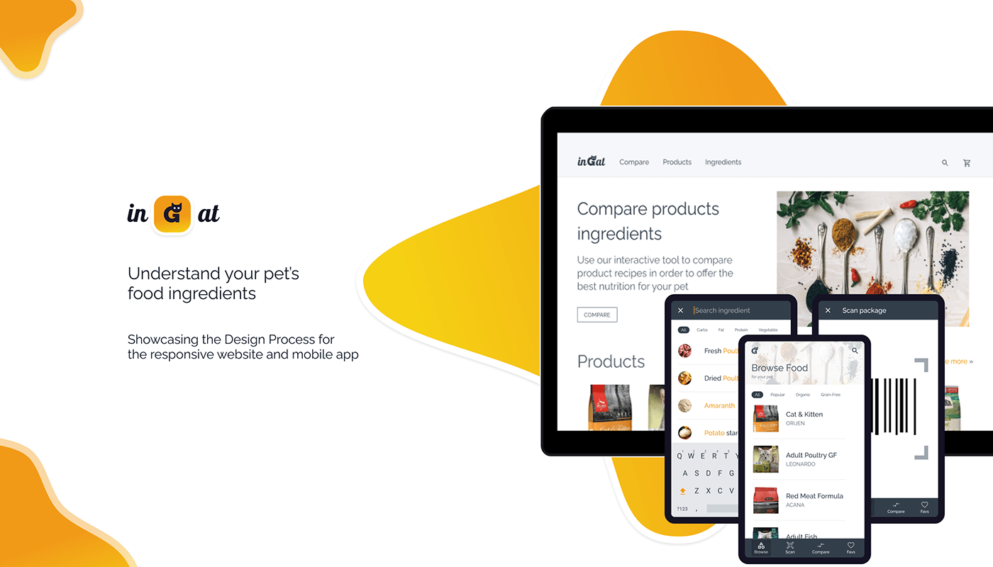
inGat
Understand your pet’s food ingredients
—
Personal Project, Design Process, Interaction Design, Graphic Design, User Research
—
About the project
inGat wants to help people understand more rapidly the ingredients found on the cat food packaging.
inGat is a fictive use case I've explored during Google's UX Design Professional Certificate courses. The project prompt was randomly generated.
—
role
In order to prepare the deliverables for the course, I've acted as an Interaction Designer, Graphic Designer, and User Researcher and showcased a typical design process.
—
Timeline
Apr - Jun 2021


—
Problem
First-time pet owners don’t have experience with cat food ingredients and feeding requirements.
—
Goal
Design an app (& responsive website) where the list of ingredients is easy to scan, filter, and understand.
Understand • Empathize
CONTEXT
CONTEXT
—
The COVID-19 Pandemic has seen a surge in pet adoptions, having a lot of first-time pet owners not knowing what type of food they should buy for their pets.


The main pain points identified by the research are:
1. Composition Confusion
The presence and total percentage of a particular ingredient in the composition is ambiguous.
2. Appropriate Diet
Depending on the age (kitten, senior) and activity level (active, neutered, illness) of the cat there are several recommendations.
3. Ingredients Details
Ingredients are not described, missing details about food type, usefulness, source, allergies, etc.
4. Special Feeding Requirements
Some cats have feeding particularities like lactose intolerance, allergies, or just food preferences.
Understand • Define
SCENARIO & PERSONA
SCENARIO & PERSONA
—
“Eva is a first-time pet owner who needs a way to visualize and compare cat food product’s ingredients because this way she would buy the best food her cat wants and needs„


Understand • Empathize
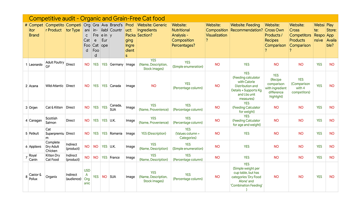
COMPETITIVE AUDIT
—
Analyzed 8 direct and indirect cat food competitors focusing on the European area and Grain-Free food category. Competitive Audit Link
The main weaknesses identified were:
• lacking dedicated mobile applications,
• missing visualizations for the ingredients and
• missing comparison between same or cross-brand products.
The conclusion was to iterate and provide a design for both a mobile application and a responsive website.
Explore • Ideate
SKETCHES: App
SKETCHES: App
—


Explore • Ideate
WIREFRAMES: App
WIREFRAMES: App
—
Materialize • Test
Usability Testing ANALYSIS & INSIGHTS: App
Usability Testing ANALYSIS & INSIGHTS: App
—
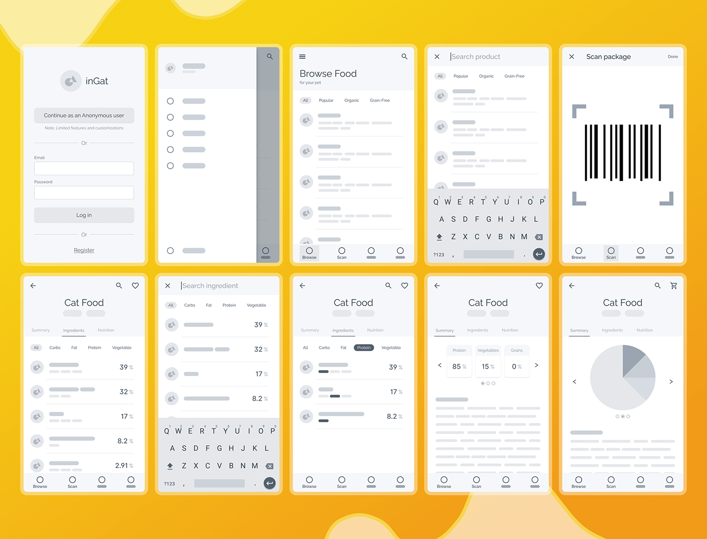
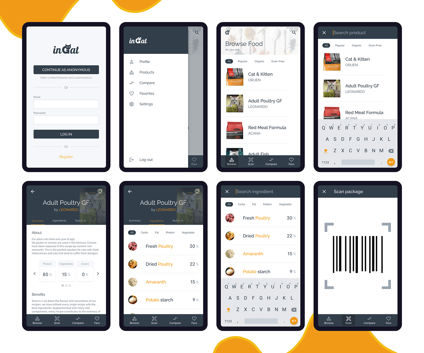
Explore • Ideate
MOCKUPS: App
—
Materialize • Implement & Explore • Ideate
Information Architecture & SKETCHES: Responsive Website
Information Architecture & SKETCHES: Responsive Website
—


Explore • Ideate
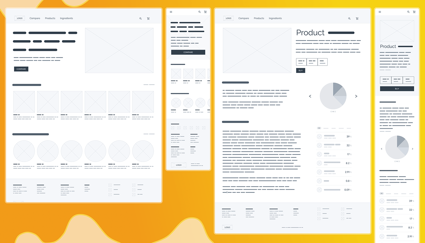
WIREFRAMES: Responsive Website
—
Explore • Ideate
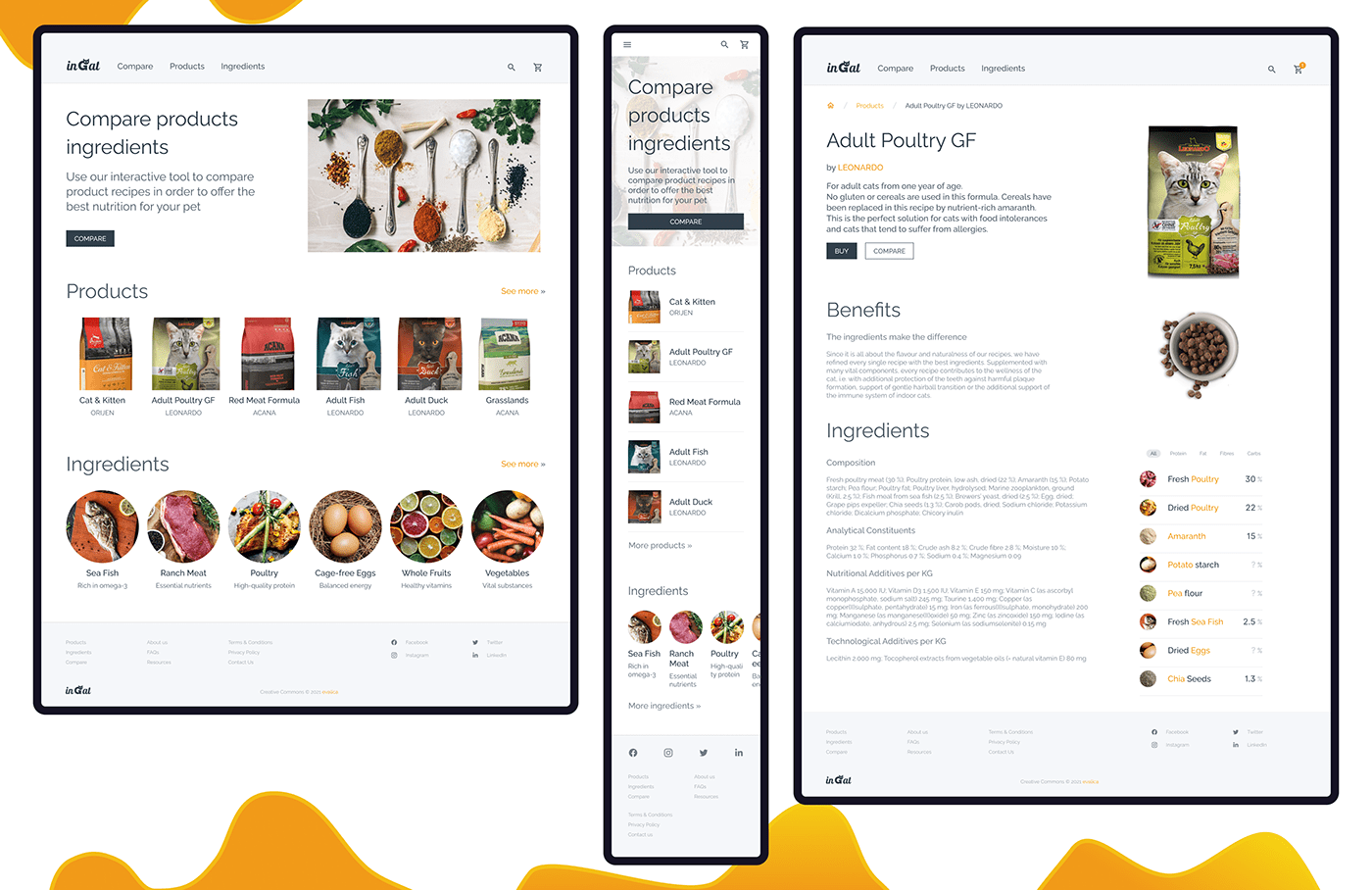
MOCKUPS: Responsive Website
—


Materialize • Implement • Design System
COLORS & Typography & Branding
COLORS & Typography & Branding
—


Materialize • Deliver
SLIDE DECK
—
Materialize • Deliver
PITCH DECK
—


Takeaways
KEY LEARNINGS
—
I was pretty excited to go through the material the course provided in order to see how it was structured and designed. On our day-to-day projects, we hardly go through the entire design process and we usually skip steps to accommodate constraints or just preferences. Usually working on smaller teams, I mainly focus on visual and interaction deliverables (sketches, wireframes, prototypes, and testing), but I really liked dedicating more time to doing some proper research for this project. Following the process usually saves you time in the long run.


