

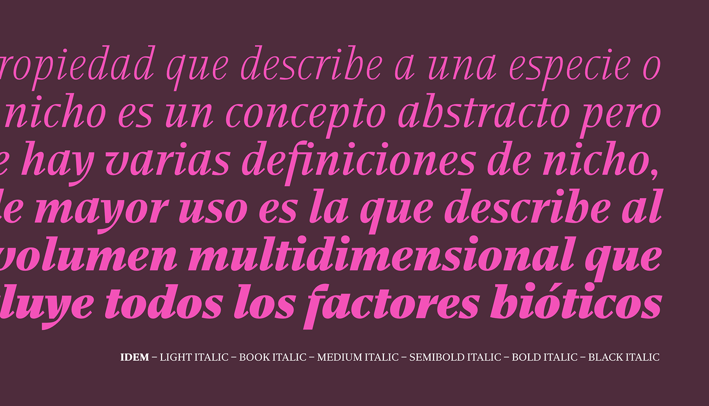
A type family for contemporary editorial design
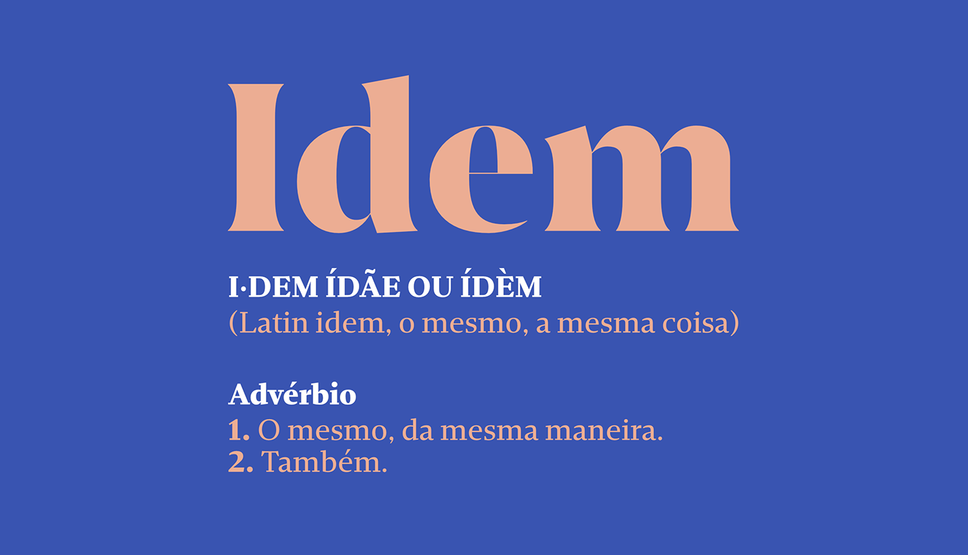
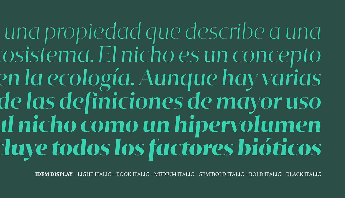
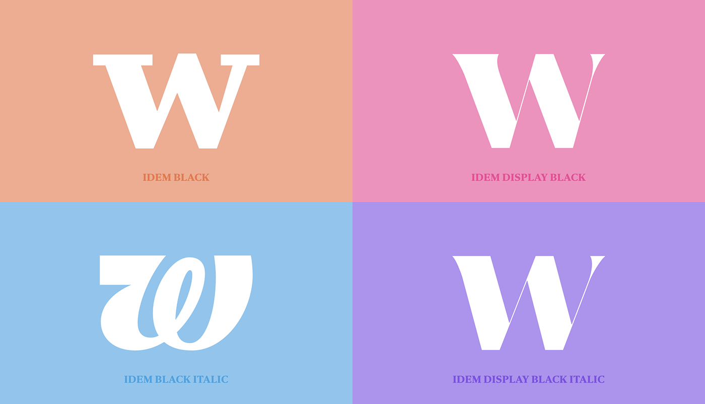
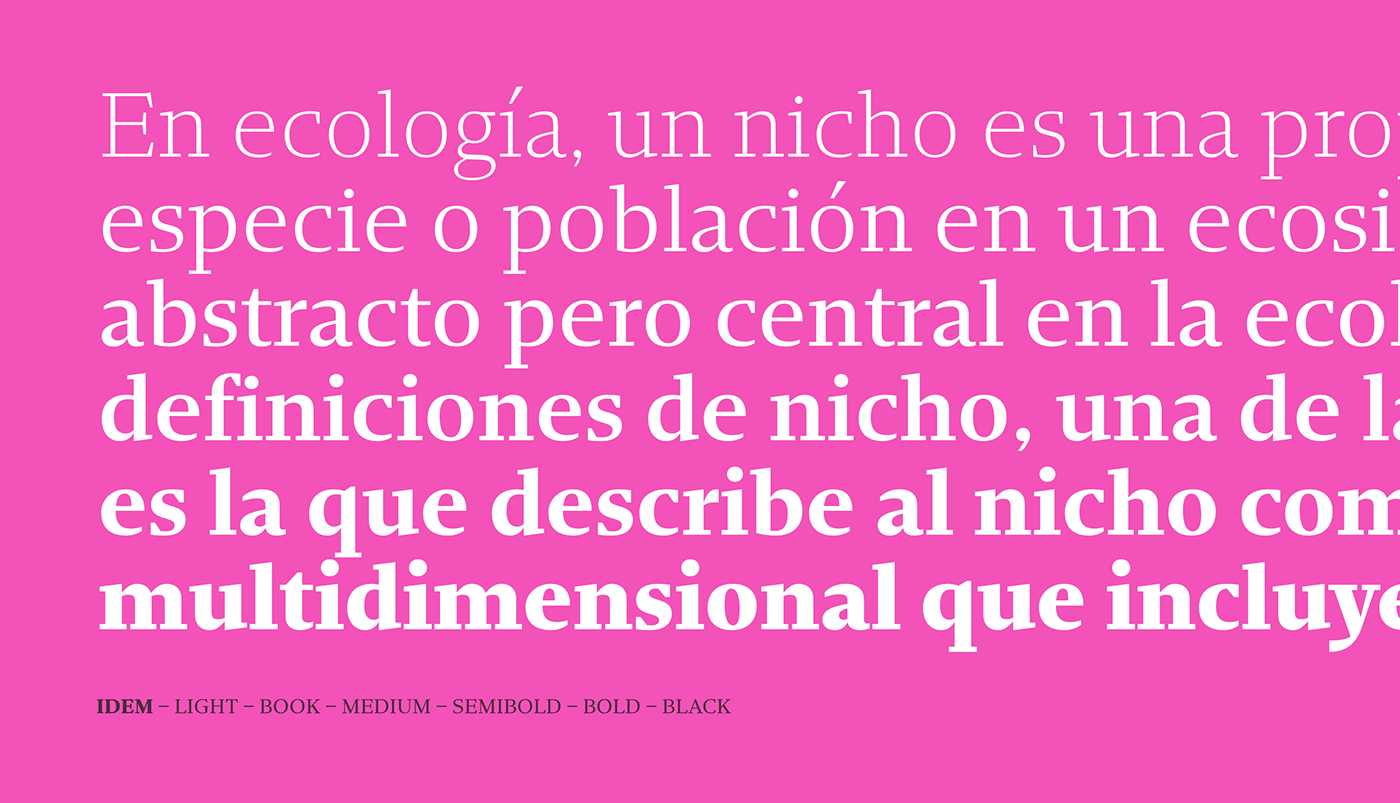
The design of Idem was completely different from all our other typefaces, not by chance but for necessity. With Idem we started with the lowercase italics, specially focusing on the "g" and "&" clearly inspired by the work of W.A. Dwiggins. The "g" was based on "A technique for dealing with artists" and the "&" was based on the Hound & Horn lettering. This staring point lead us to a contemporary, sturdy type family for text setting and a flared display version with tight spacing, contrasted strokes and straightforward italics.
Now available at dstype.com
