S C U D E R I A S O N N E V E N D
Branding for a world-class showjumping training and breeding stable
_______
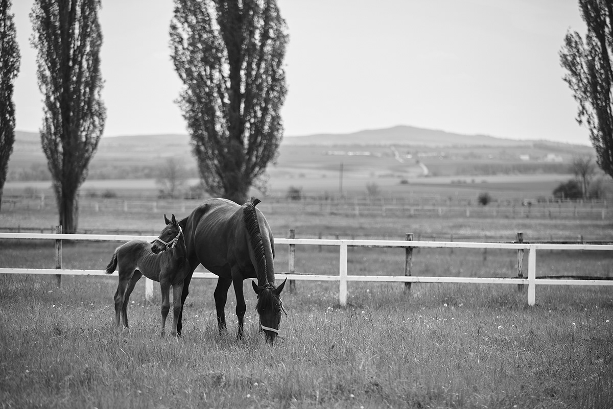
Scuderia Sonnevend is a world-class showjumping training and breeding stable with one of the highest quality genetic stock portfolio in Central-Europe.At their centre, they breed the highest quality horses while focusing on maintaining and strengthening the Hungarian equestrian heritage.
We started with designing the logo and developing the brand. The logo includes an emblem made of two horse heads, one in white and the other in black. They fit together like an optical illusion, as we used the negative space around one of the horse heads to form the shape of another. In the logotype there is also a secret nod to the activities of Scuderia Sonnevend - the line under the “o” represents the obstacles that horses jump over, just as the “o” seems to be jumping over the line.
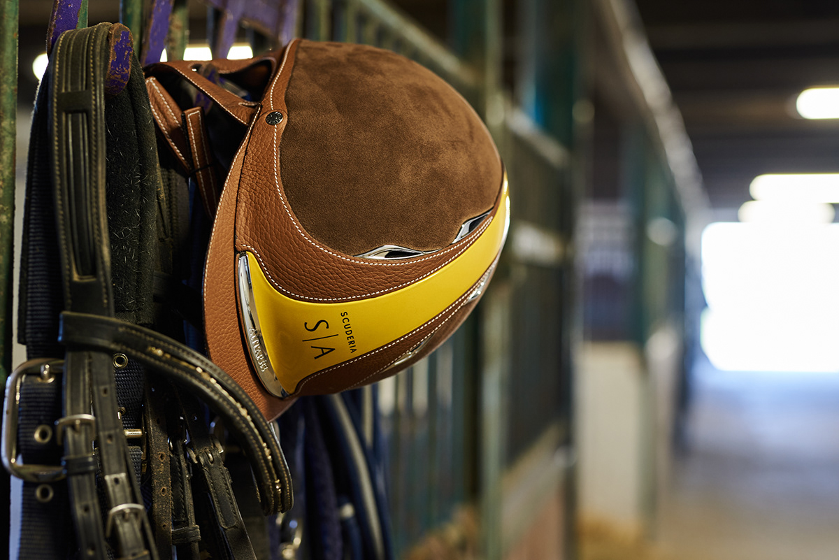
From there we designed embroidered badges which are featured on the shirts and caps. We created them in the traditional ‘scuderia’ style, much like a coat of arms. The other clothing items also include colours, emblems, or logotypes, depending on their design. For example the riding cap includes the yellow and orange colours from the brand and includes the logotype in the centre.
The emblem and logotype are also prominently featured on the huge, modern van that very comfortably transports up to 6 riders and their horses to races. The emblem is enlarged, thus emphasising the illusion of the two mirrored horses. The logotype and brand colours are also included in the design, adding to the tasteful and elegant result.
Ph photography by Andras Zoltai
Ad art direction by Eszter Laki
Gr graphic design by Eszter Laki & Réka Imre
_______