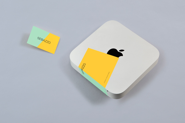
Constructed from Gridnik – the logotype’s uppercase sans-serif letterforms, 45-degree corners, monoline weight, structure and geometry, as well as its compounded nature, all point towards a straightforward and confident technological efficiency and neatly reference the designers that make up Sebazzo. The characters are well spaced, balanced by a central A and executed with a single black ink print treatment that provides a distinctive contrast to the more expressive and tactile sensibilities of the stationery.
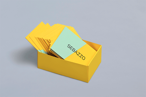
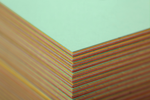
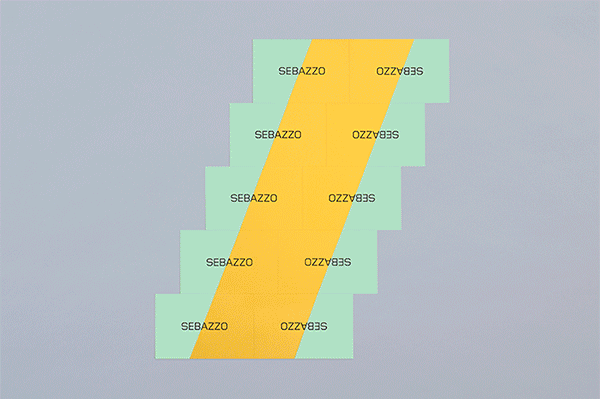
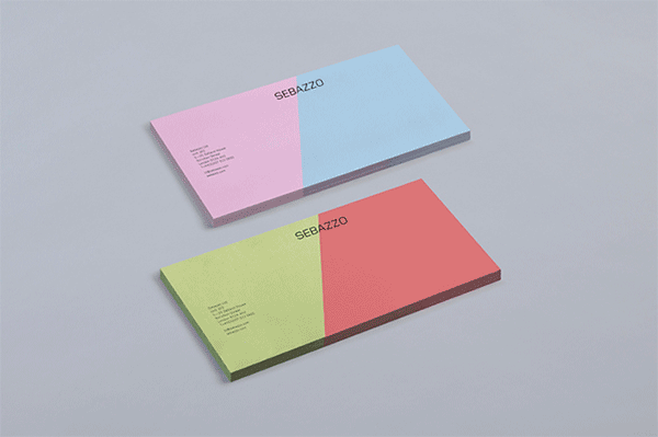
The diagonal cut of the bright and pastel boards that make up the business cards create a striking but restrained dual tone and subtle dynamic aesthetic that feels like a simple but effective distillation of a two-man studio which compliments the ideation of the name and neatly splits the logotype into its two constituent parts. These are neatly unified by the tactile and crafted qualities of their paper marquetry construction.
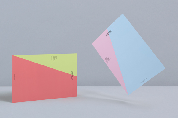
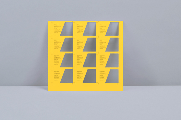
The letterhead and compliment slip are absent the detail of the marquetry process, their full bleed colour palette and angle ties in well with the cards and continues to split the logotype.