


-
NEATH | Brand Strategy & Visual Identity Design
-
NEATH | Brand Strategy & Visual Identity Design
-
We have collaborated with Neath - a start-up cozy and lifestyle brand based in Hong Kong, to develop a full branding-building project, including brand strategy, identity systems, and social media marketing for the brand launch. From brand concept to logo design, and from web design to packaging, we help Neath to discover and establish an all-rounded brand statement from the creative concept of #BeNeath.
-
SCOPE
(i) Branding - Concept Creation, Brand Strategy, Visual Identity, Art Direction
(ii) Web Design - UX/UI Design, Creative Consultation
(iii) Package Design
(iv) Social Media - Creative & Visual Direction, Content Creation
-
SCOPE
(i) Branding - Concept Creation, Brand Strategy, Visual Identity, Art Direction
(ii) Web Design - UX/UI Design, Creative Consultation
(iii) Package Design
(iv) Social Media - Creative & Visual Direction, Content Creation
-
THE CHALLENGE
Starting from scratch, we have to open ourselves up to all directions and possibilities in the beginning, and to narrow down the ideas into funnels at the end. We aimed to craft an integrated concept as the core value, and from that to determine the further handling of the brand statement, logo identity system, visual direction, web design and social media strategy.
-
OUR STRATEGY
OUR STRATEGY
Through producing comfy skincare and lifestyle products, such as after cream, shaver, the brand aimed to share the association of, as well as the brand keywords, “Cozy”, “Modern” and “Comfort Lifestyle”. With the hybrid brand nature in the industries, the creative direction of building a new word from its brand name - Neath has come to mind. Neath is more than a plain brand name, but representing a new kind of slow-paced, comfy and modern lifestyle spirit.
-
OUR SOLUTION
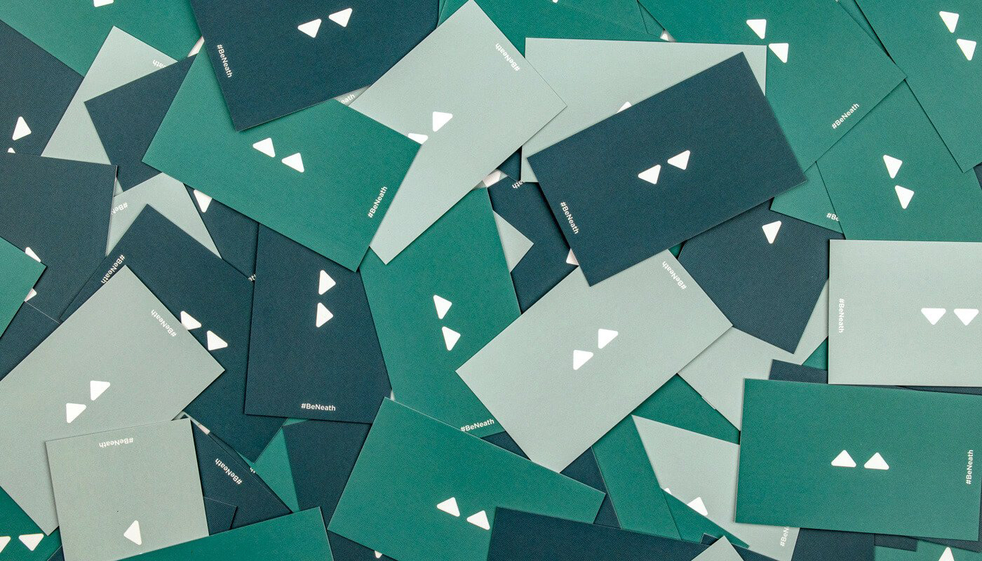
Simply enough, we apply the word “beneath” with a minimal twist to be the brand tagline as “Be Neath”. Obviously, it sets a call to action of joining us as part of the brand; and on the other hand, we aimed to sell the brand as a belief and spirit of having the comfy beneath the skin, which also echoed with their skincare products.
We go further and apply the brand concept as our visual strategy. On the brand logo, we aim to go for as minimal as possible, we have crafted two triangles with round-corners and pointing to the “Neath” wordmark as a way to represent the letter “B” of “Be”. The two triangles not only come to play as the submark, but also carrying the brand core statement.
-
A project by Welvermind
Follow us on Instagram & Facebook
www.welvermind.com
-
A project by Welvermind
Follow us on Instagram & Facebook
www.welvermind.com


