

Overview
This project is completely an hypothetical concept. The concept is based on making another brand which is named as "Pristine" as it is inspired by the brand "Jil Sander". We made a whole layout of this brand by keeping "sustainability" and "minimalism" in mind. Our main goal is to make a brand with inspiration so, we tried to build a concept of Jil Sander opening another brand which includes sustainability in her clothing as well as in the whole process. Minimalism is her forte, which we have carefully used in every aspect.

Design Brief
Background
Pristine, another brand in clothing and accessories is now launching out to sustainable clothing. It is another brand launched by Jil Sander. Sustainability is set to be released in the form of clothing. The 4 collections of Jil Sander’s brand are introducing sustainability in its clothes.
Positioning
Sustainable fashion is about meeting today’s needs while ensuring that the way we go about meeting those needs meet future needs as well. It also has a huge climate change footprint, and the brand is going to tackle the existential threat of climate change.
Key Fact
Fashion brands haven’t focused on sustainability yet including the Jil Sander brand as well. The brand focus on for the consumers to feel more confident about the ethical practices even when making a purchase and having a relief of eco-friendly shopping.
Target Audience
• Age- 20-40 years.
• Gender Neutral.
• Location - Europe.
• Main market is focused on Germany, Austria, Switzerland and Asia.
Objective
There is a huge opportunity for Pristine to connect more with the current and potential consumers which can be achieved through making use of platforms such as Instagram, snapchat and even through blogs. The sustainability in clothes is a major sector for the brand. Jil Sander brand didn’t focus on the ethical issues related to the sustainability practices in its clothing which resulted in another brand introducing sustainability for the consumers.
Tone
• Luxurious, durable, contemporary but sophisticated garments.
• Oversized, simplicity and modernity.
Key Consumer Benefits
Sustainability and long lasting - Sustainability in fashion extends beyond the product itself and consumers will get the best quality products with good ethical practices. • Simplicity and modernity – Consumers don’t prefer fuss of decoration on clothes, they like simplicity in it. • Perfect composition and clean lines – Consumers ask for clean and sophisticated clothes in a form of minimalism.
Mandatories
• Pristine will be using reduced energy requirements, consumption and carbon footprint by harnessing natural sunlight and ventilation.
• Segregation of wet and dry waste for composting will be a priority for the brand.
• 100% of our Electronic Waste (E-Waste) will be recycled & disposed off in an environment-friendly manner.
• The brand will be fur-free and leather-free right from the start and will continue to be so in the future.
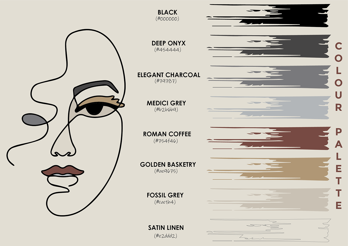
Colour Palette
Mood Board
The brand digs this minimalist mood board because of the simplicity it conveys, in addition to the “cohesive aesthetic”. This board keeps it real and on-point, which revolves around the theme pretty nicely. Here the basics are communicated: minimalist imagery and neutral colours.
It stands out by powerfully conveying the style and personality of the brand, but with surprising restraint and authenticity. We immediately fell in love with is the wonderfully compiled neutral color scheme. It helps to add a calming effect to the design, while also showing off the brand’s potential abstract personality with the element styles and illustrations.

Logo
Description
The design is based on the overall ideology of the brand that is sustainability. Jil Sander firmly believes in gender neutrality when it comes to fashion and so there are illustration of male and female faces. Being the ‘Queen of Clean’, Jil named this label as ‘Pristine’ which means clean. The illustration is very modern yet classic so that people could easily relate to it. Use of leaves depicts the whole spirit of sustainability and slow fashion.
Colour Preferences
The colours used are from the neutral family. They are soothing to the eyes and go well with the minimalist theme.
Look and Feel
Whole idea is kept quite subtle as the theme of the brand is minimalism. It’s a very basic line drawing with the help of flowy and continuous lines. The logo feels very modern, feature a flat, neutral coloured design and designed keeping versatility of the brand in mind.

PRESS RELEASE

PRESS RELEASE DELIVERABLE IDEA
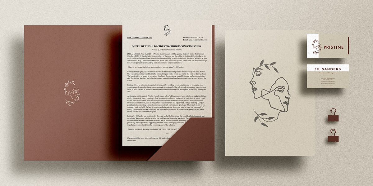
INVITATION CARD IDEA FOR THE EVENT

BRANDING
Brand images as references, how the overall tags, bags, displays, perfumes, hangers, business cards and shoe boxes will be presented. The packaging and display is important for every brand and just to make it look more appealing and presentable, we have shown the images according to the needs.


INNOVATIVE GIFTS
Jil Sander stands for a clear style characterized by elegance and timelessness which is the key ingredient in Pristine Candles. They will provide you the ultimate experience of gentle aroma therapy and thus could be included in your meditation routine. The best part about these candles is that they too have the touch of sustainable practice as these have botanical plants seeds inside them as a residue which you can use after the candle is over. This feature acts as a cherry on cake because no harm to the environment is done which is the main idea of this brand.


