Overview
TieSavvy is an ecommerce startup in the men's clothing retail space. The member's only site delivers a boutique-like personal stylist experience with celebrity curated collections specially selected according to the taste of each individual user. The web application uses an algorithm that makes personalized product recommendations based on the data in user generated profiles gathered through an onboarding "style quiz" questionaire. In other words, it's Shoedazzle for ties.
I was brought on by the founder to act initially as the UI/UX Designer for the product, with the possibility of becoming the product manager post launch. The project is currently under backend development in partnership with a third party programming team based overseas in India, with a planned MVP release in mid 2014.
Note: This portfolio is a work in progress, and will grow as the project grows. I've tried to focus on the thought process behind the work as much, if not more so, than the work itself, although I'm at risk of this becoming more of a design blog than a portfolio at some point. I'll continue to update and add examples as I am able. Enjoy.
The Challenge
To create a modern ecommerce web site that stands out above the rest for personalized
choice of merchandise, enhanced social connectivity, ease and speed of use, and pleasing asthetic appearance.
The Process
I approach user experience design from the perspective of a product owner, and I am heavily influenced by Scrum and Agile methods as well as Lean Startup principles. My process is really a derivative mishmash of what I consider to be the best elements of the three. There are plenty of buzzwords out there like Lean UX or Agile UX, but I'm not really interested in following arbitrary delineations. What I find is that these methodologies are quite complimentary, and combine rather naturally.
I try to incorporate Lean principles of validated learning, scientific experimentation, and iterative product releases to shorten product development cycles, measure progress, and gain valuable customer feedback, along with Agile's collaborative and iterative processes and sprint cycles that reduce waste and increase speed to market. I follow the dual mantras of testing early and testing often and getting out of the building to observe and talk to users. Above all I try to keep real users at the center of this ecosystem, making sure that my designs are human-centered and meet the actual needs of the people I’m designing for. There are some great workflows in practice out there and I'm always looking to learn and improve my process, but at the moment this is what is working for me.
I've adopted Roman Pichler's framework of the Product Canvas as a basic organizational guide for my work. For those of you who aren't familiar I highly recommend checking out his product design ideas at www.romanpichler.com/blog. What follows is my own rudimentary rendition of his well thought out process.
The Product Canvas is an organizational layout divided into three sections. The first section is called "Target Group" and details the intended users or customers of the product. This is where I place my user personas. The second section named "Big Picture" outlines the desired user experience and contains the User Journeys, Visual Designs, and Nonfunctional Properties. The third section is for ready User Stories that are finished and prepared for the next sprint, as well as any finished prototypes.
Getting everything about the design up on the wall and really visible like this helps keep the overall user experience in perspective while zooming in to work on individual aspects of the product. This way I don't lose sight of the big picture while producing deliverables like wireframes and mockups. On a bigger team, maintaining the product canvas would be the product owner's responsibility, but in a startup environment the UX designer's role becomes much broader. Regardless of the team size and the delegation of responsibilities, I always try to take a holistic approach to user experience design, and this system really helps me to do that.
With the framework in place, what is left is to fill in the spaces on the board, which I break down into four basic steps: Discovery, Design, Iteration, and Implementation. I approach each step as a separate design sprint, the duration and intensity of which is determined by the timeline and budget of the project.
1. Discovery
AKA: Research, Observe, Define, Understand
For me, the first step in UX Design is always about asking really great questions. Better questions lead to better answers and to better understanding. It’s very simple in a rather Socratic way. So this means figuring out the who, what, when, where, why, and how of whatever it is I’m building. Basically, who are the users of the product, what problem is it solving for them, when and where are they using it or what is the context of use, why is it better than what they’re already using, and how can we build it? Getting really deep insight on these questions from a user’s perspective is the key to creating something that really addresses their needs, solves their pain points, improves the quality of their lives, and makes them happy.
Since human needs are central to this process, this step really boils down to need finding. This includes the needs of the organization, or the business goals; the needs of stakeholders, particularly management; and of course the needs of users, which lie at the heart of user-centered design.
The first two are usually pretty straightforward and will be addressed in meetings before the project begins, and will set the internal benchmarks for success, like the number of page views, signups, or conversions.
Finding out the user needs requires a little more effort, and usually starts out with a ton of research. Surveys, interviews, observations, prototype testing, and other methods are great ways to engage with potential users of a new product in order to identify their pain points and the possible solutions for them. I tend to rely on more guerrilla methods of user testing. It's amazing what a total stranger will go through for a $5 Starbucks gift card.
After gathering enough data about the target users, I'll use the information to develop three to five user personas. I follow a pretty basic template for these, but it's important to be as specific as possible when personalizing personas because they will serve as a reference for the rest of the team to remind them of who they are building the product for. These are the characters that will star in the scenarios and storyboards, and will be the voices behind user stories later on. A good persona is like an artist’s muse. They should be inspiring and aspirational reminders of the impact great user experience design can make on real people’s lives.
For TieSavvy I engaged 170 potential users from our target group through Facebook, Surveymonkey, and face-to-face interviews. I used the data to create six personas (4 male, 2 female), as well as the user scenarios and storyboards.
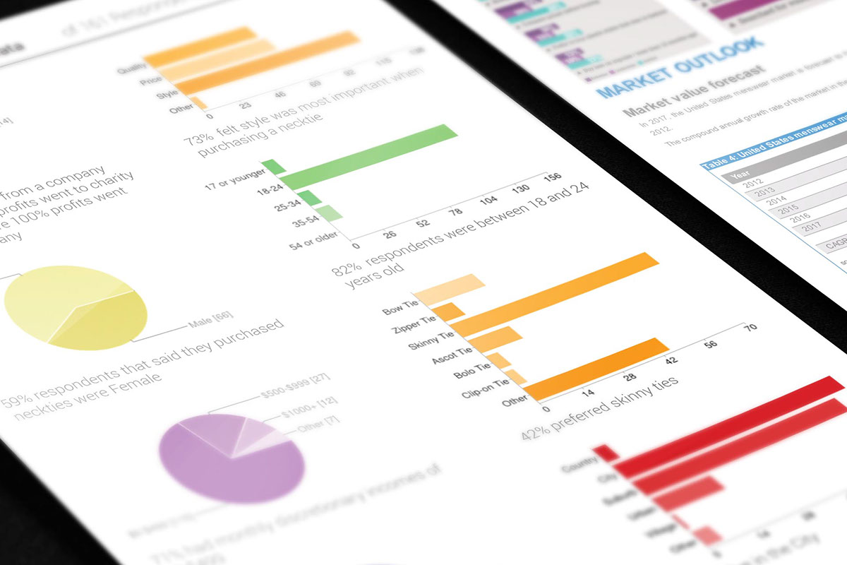
User Survey Findings
2. Design
AKA: Brainstorm, Ideate, Visualize
Effective requirements gathering is a critically important part of my design process. My approach is based on Agile and Scrum development methodologies. I like to use Scenarios, Storyboards, User Flows, and User and Constraint Stories to flesh out the requirements and fill out the product canvas. These artifacts are largely informed by the rich research-based personas developed in the discovery phase, combined with input from other stakeholders and the results of ongoing user testing, and will in turn form the foundation for the visual design work to follow. These deliverables will also be passed on to the development team.
These core techniques essentially cover the four principle product elements that combine to create a product with a great user experience. User stories work well to define Product Functionality. Scenarios, user flows, and storyboards are great for describing User Journeys. Sketches and mockups capture the Visual Design, and constraint stories describe the Nonfunctional Properties and information architecture. I've found that by focusing on these four elements I am better able to describe my ideas so they are easy to understand and to validate.
When it comes time to start getting ideas down on paper, I like to eschew the paper at first and begin on the white board. Something about working big with lots of space and chunky pens just gives the ideas more room to flow, and it helps make the process more collaborative. I’ll open with some mind mapping, and just throw every last little idea up on the board without too much concern for how it looks. This may involve visual sketches as well, anything from user flow diagrams to sloppy wireframes. I try to let the ideas come out in whatever form they need to take without self-editing. Afterwards, I’ll snap some photos and then take a sketchpad and copy down everything in a more organized way. From this raw creative stuff I’ll start to form the beginnings of the different design elements. Working on the board or on a sketchpad I’ll draft out the scenarios, storyboards, and user flows, and even a few wireframes. Everything is in the lowest fidelity necessary, MVP style, and at this point my objective is to get feedback on the direction from the rest of the team.
Using my user personas as a guide, I’ll also come up with as many user stories as I can possibly think of, starting with epics and then breaking them down into smaller bits, until I have a pretty strong sense of the user requirements and the product functionality. Whenever possible I try to make this a collaborative process, because I inevitably will miss something if working on my own. The more voices present representing a wider variety of users, the more well rounded the user stories become.
Once I’m confident everyone is on the same page, I’ll put together a half dozen or so mood boards or Style Tiles to capture the conceptual visual themes. I’ve taken to using the wonderful Style Tile template that Samantha Toy Warren has been gracious enough to share with the community from her site (styletil.es). They are just clean and easy to follow and I don’t see any sense in reinventing the wheel on this one. I can whip these out pretty quickly and they go a long way towards communicating the design without getting too invested in complex mockups.
The artifacts from this stage will be the documents supporting Product Functionality and User Journeys.
.
White Board Sketching and Sticky Notes
3. Iteration
AKA: Create, Build, Prototype
AKA: Create, Build, Prototype
This is when the real fun starts. Using all the foundational materials developed in the Discovery and Design phases (which are posted up on the Product Canvas), the next thing is to begin raising the fidelity towards a finished product.
After getting some buy-in at the conceptual level, I’ll start sketching out paper wireframes. I have a fine art background, so this comes pretty naturally to me. I’ll start with a ton of ideas before narrowing it down, and will usually end up with around three different versions by the time I’ve gone through another feedback loop with team members. By parallel prototyping I can test my ideas in different combinations to see what resonates most with users, and the feedback I get when users are able to compare and contrast more than one version side-by-side is innumerably better than if I test them one at a time. Paper prototyping at this stage is quicker and easier than working on anything digital. I’m still using broad strokes here, establishing the fundamentals of the user experience, and again trying to stay lean and low-fi, while validating as many assumptions as possible with the least amount of “effort”.
I’ll repeat this feedback loop with users at each stage of the prototyping process, from paper, to digital wireframes, to mockups and finally working prototypes. During the process the best and worst aspects of the designs start to emerge, things get added and taken away, and eventually what started as several versions gets narrowed down to one primary prototype, which is the culmination of all the insights gained from testing along the way.
Sketching
I always start a new design by hand sketching with pen on paper. This gives me the freedom to work fast and loose and play with as many ideas as possible early on in the design phase. Using a pen keeps me from being able to edit anything at this stage. It's important that the ideas flow and that everything gets left on the paper. After filling out a page of sketches I'll go back through and annotate with any ideas that are important to remember, especially things like functionality that can't easily be conveyed in a sketch.
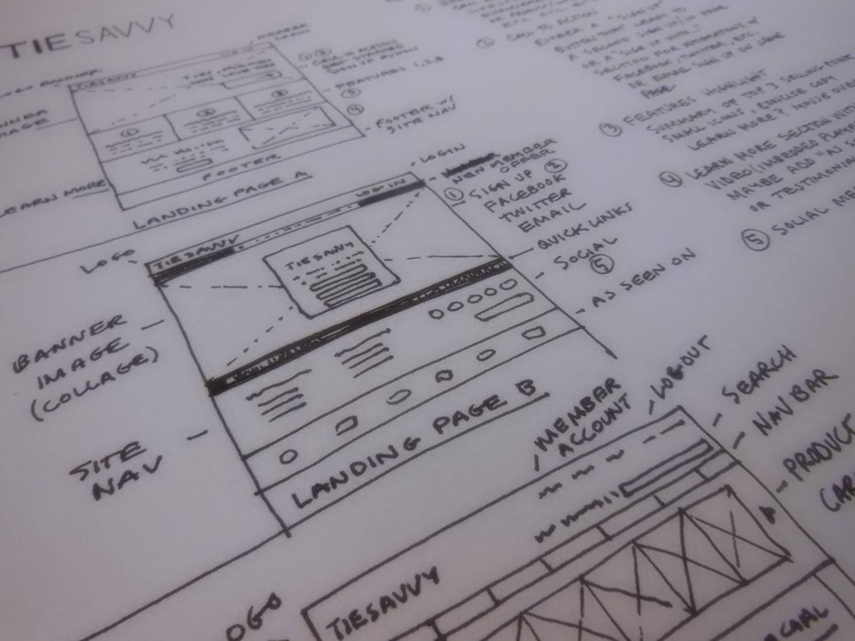
Pen and Ink Sketches
Wireframing
After getting buy-in from the team on my sketches, I'll move on to wireframing. I usually create these in Adobe Illustrator, because it makes it easier to transition quickly into a hi-fidelity mockup using the finished wireframe as an base layer. I believe that parallel prototyping yields the best results and ellicits more useful feedback from stakeholders, so I will typically start with at least 2 or 3 rough wireframes based on my top sketch concepts. After another round of feedback, I'll condense down to 1 or 2 hi-fidelity wireframes containing all the best elements from previous iterations.

Early TieSavvy Wireframe

High Fidelity Wireframe in Illustrator
Mockups
Using the final wireframe as a base layer in Illustrator, I can quickly transition into a full color mockup by copying and pasting elements and adding colors and photos. This is much faster for me than working with software like Balsamiq and Axure for wireframing and prototyping, although I have used those succesfully in the past. I find Axure to be quite useful when interactive prototypes are necessary, but I may also work with InDesign or Fireworks depending on the requirements. The examples here were all done in Illustrator and Photoshop.
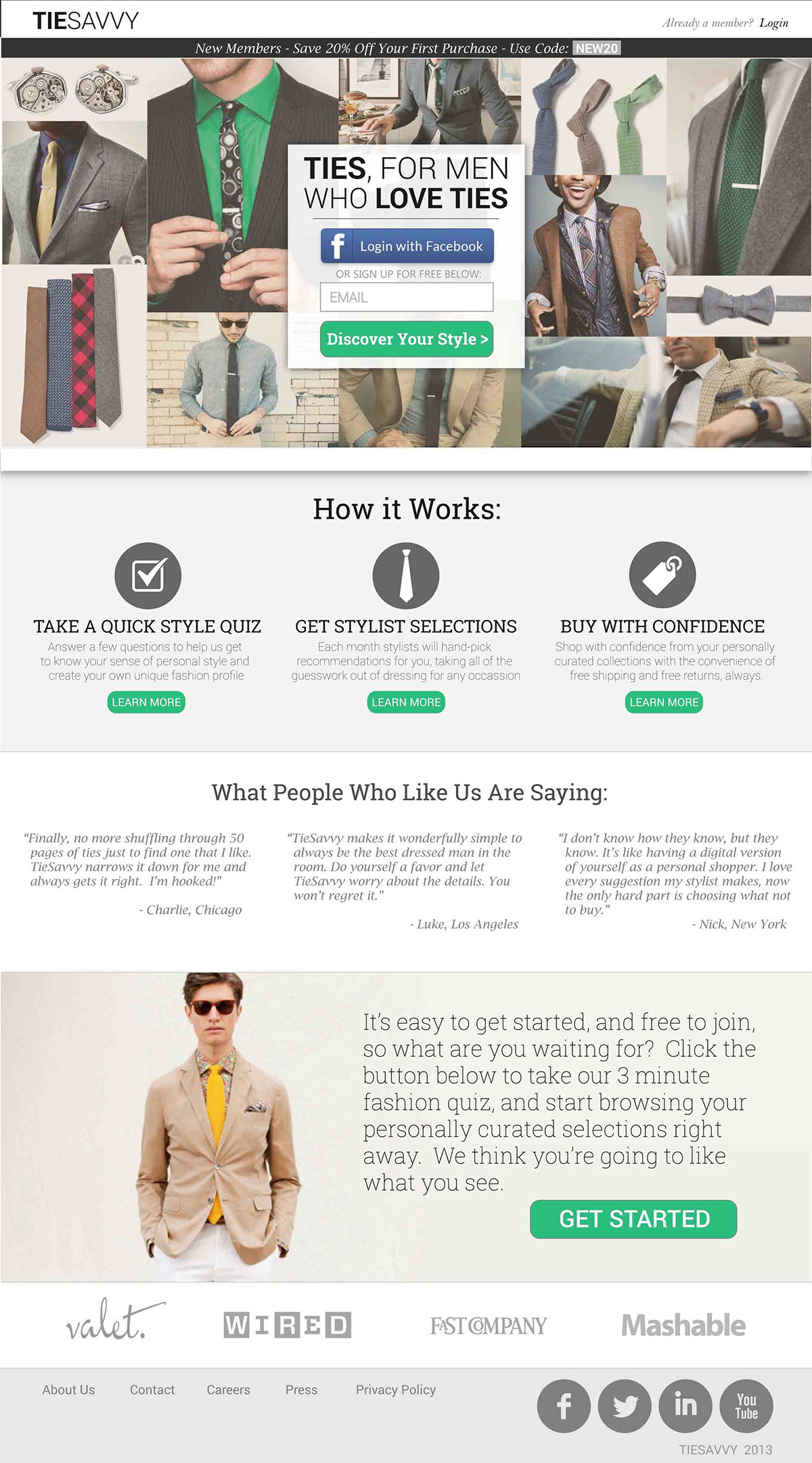
Hi-Fidelity Mockup of Landing Page with Adobe Illustrator
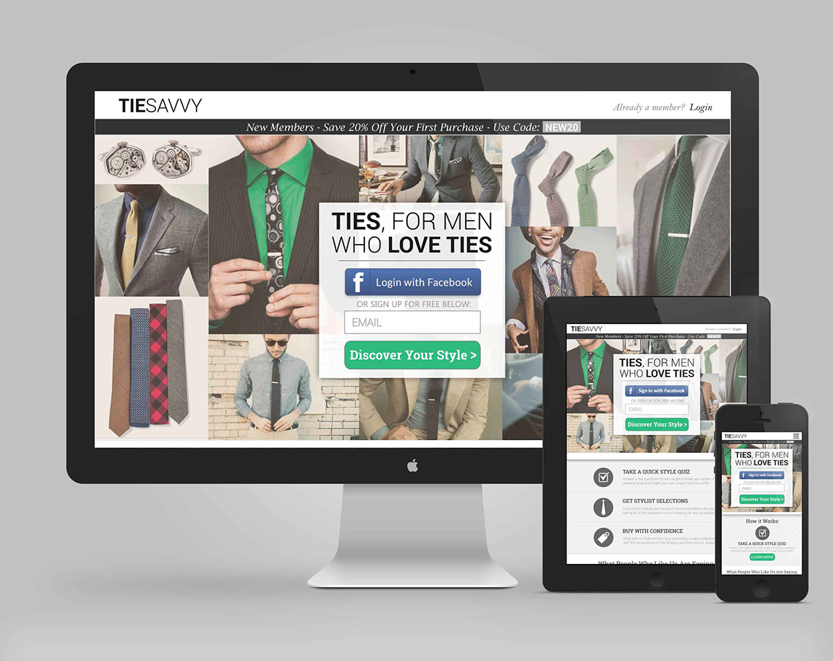
Devices Mockup
Prototyping
I will usually have 2 or 3 prototypes running parallel before narrowing it down to the best version. I start off with quick and dirty hand-drawn paper prototypes, then computer generated ones, and finally digital prototypes using Axure or Justinmind. Once we've narrowed it down to a primary version, it becomes more important for users to interact with the product in a more realistic context, and the paper prototypes are no longer as effective. Letting users try out the product on different devices and in real world situations produces far better use cases, so I try to get to this point sooner than later. Examples coming soon...
4. Implementation
AKA: Test, Produce, Launch
This is often the handoff point where things transition from designing the product to actually building it. Hopefully all the work thus far has paid off and at this point the team is pretty confident that they are building something people actually want. Ideally, the user experience designer stays involved as the advocate for the user as features are prioritized to make sure that the resulting MVP meets the objectives set forth from the outset of the project. Then, post launch, the role shifts towards user testing and optimization, with user feedback guiding the choices of what to change to make the product better and more usable.


