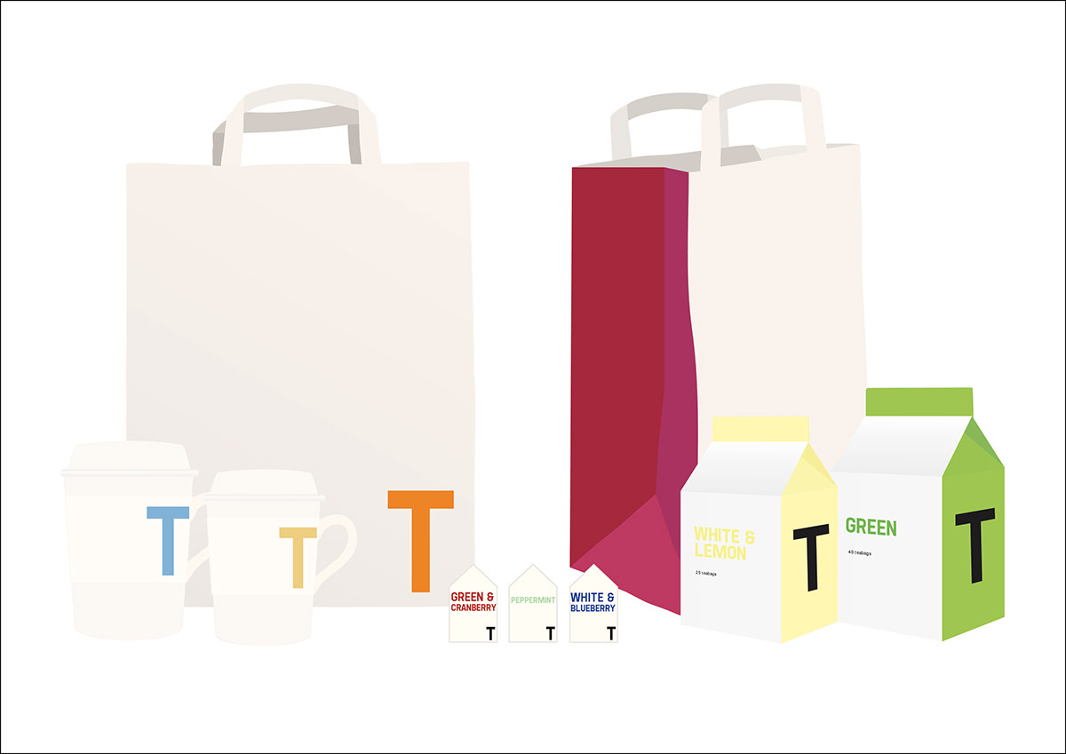
This was a 3rd year University project. I created a brand and produced designs for the packaging. I looked at modern coffee culture, and decided to bring some of the modern, clean minimalism that coffee shops have into the tea industry which is generally focussed towards more traditional, 'old fashioned' design. Using the company name 'T', I aimed to bring tea into the 21st century and target the younger generation. I used bright colours that come from common Indian and Chinese colour themes to keep a relationship with the heritage and history of the industry. I mixed this with a simple, clean design for the logo and packaging, using an off-white as the common colour to tie each design together, and adding accents of the heritage colours to give vibrancy.
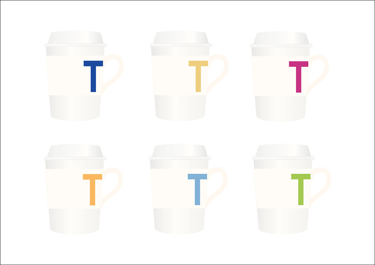
Takeaway cups with sleeve to protect the consumers' hands. The sleeve features a handle, giving the cup the appearance of a traditional teacup.
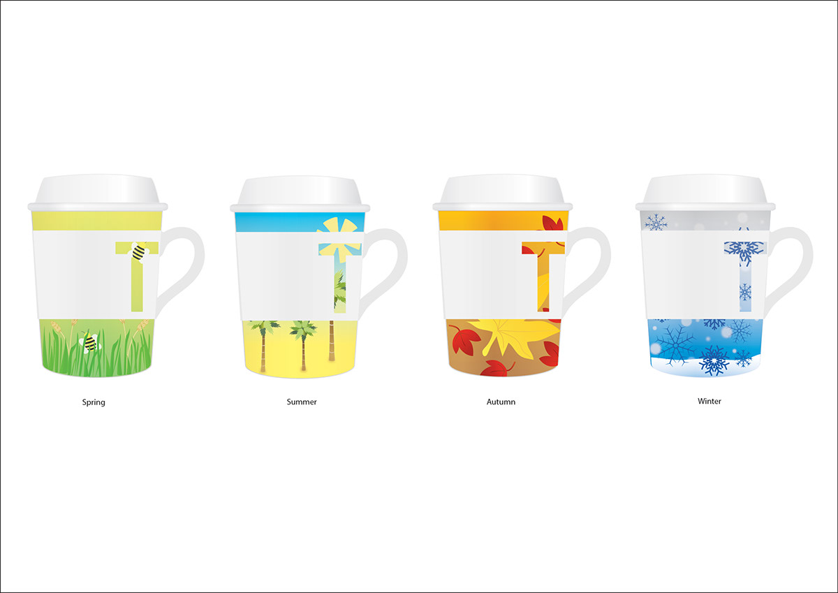
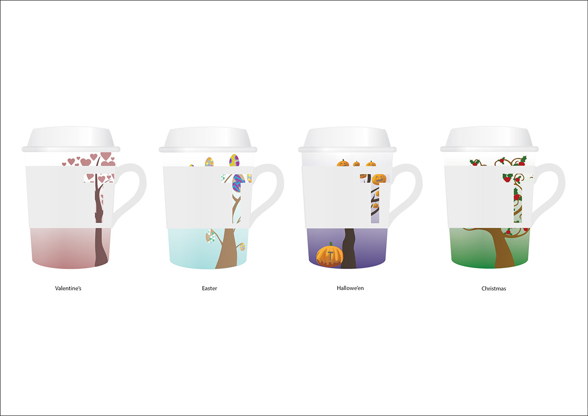
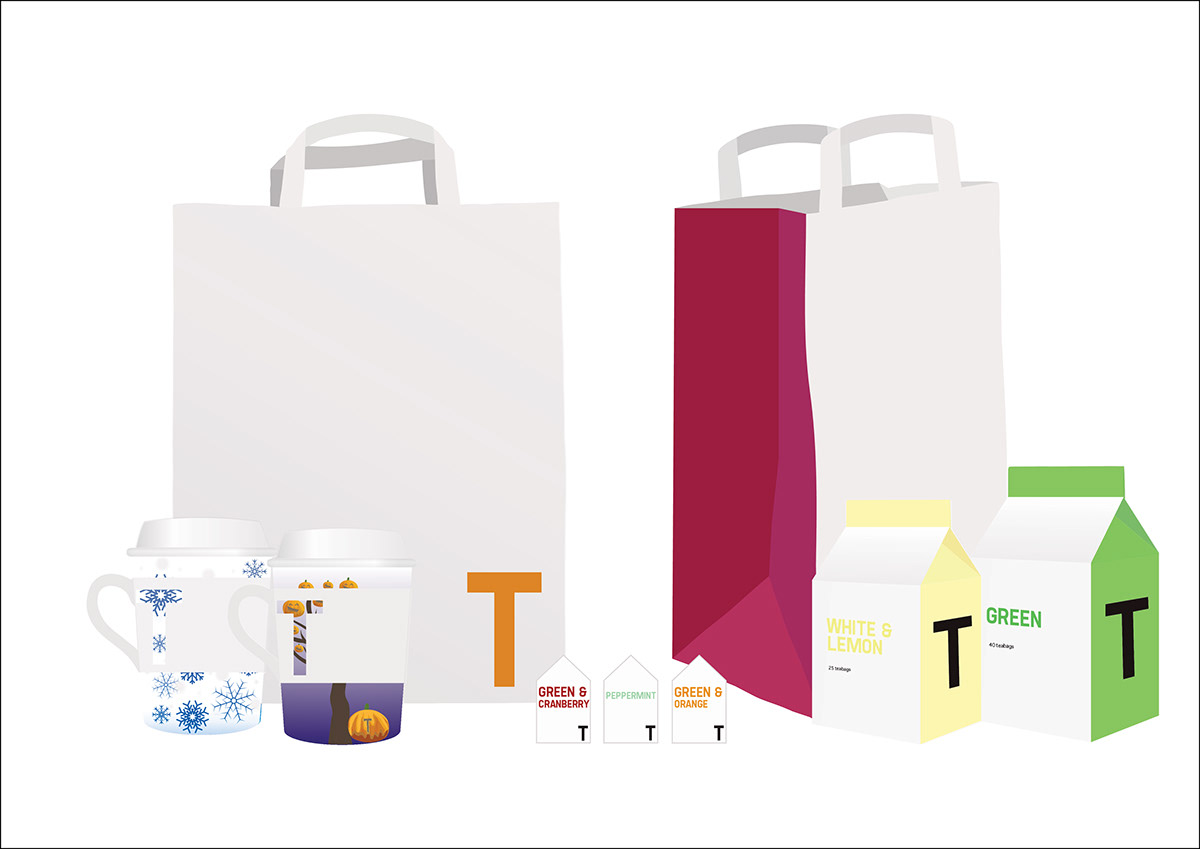
Takeaway cups with seasonal and holiday designs, to be used occasionally as promotional/marketing items.
Also could be sold as ceramic/bamboo reusable cups.
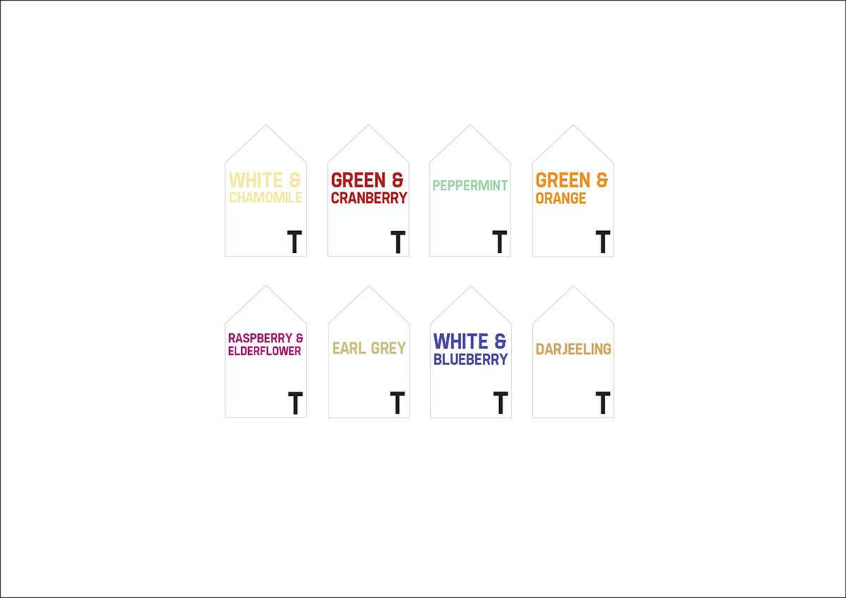
Tags for the teabags

Boxes of tea to be sold at each T shop.

Bags for customers to be given with purchases of T boxes or reusable cups.