*Brand Design
Kim Khánh is a Vietnamese traditional bakery established since 1960s, with the featured products are traditional cakes that still reserve the original flavour from the past. Kim Khánh want to preserve the value of the heritage itself while still having a modern and distinctive look for the logo and the brand identity.
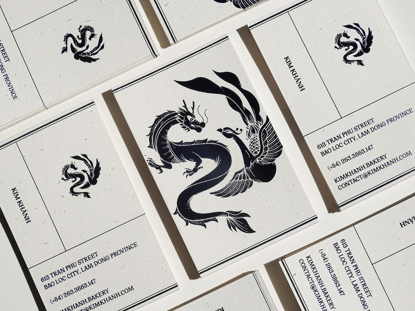
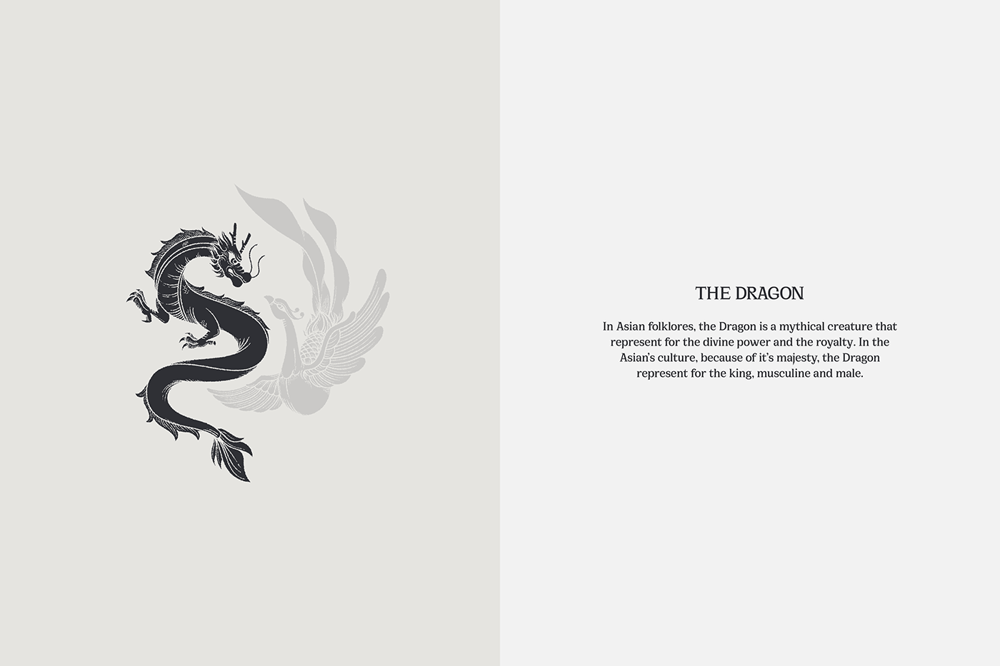
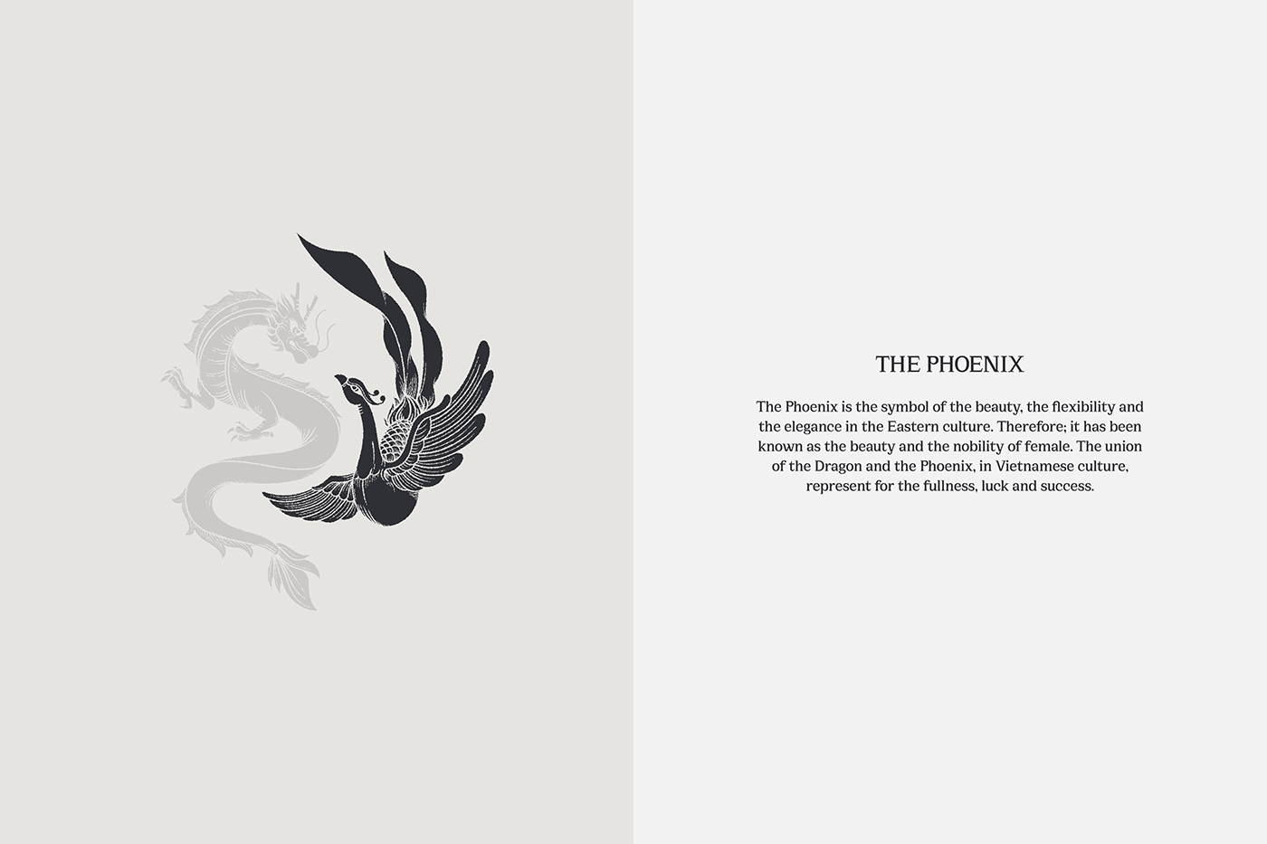
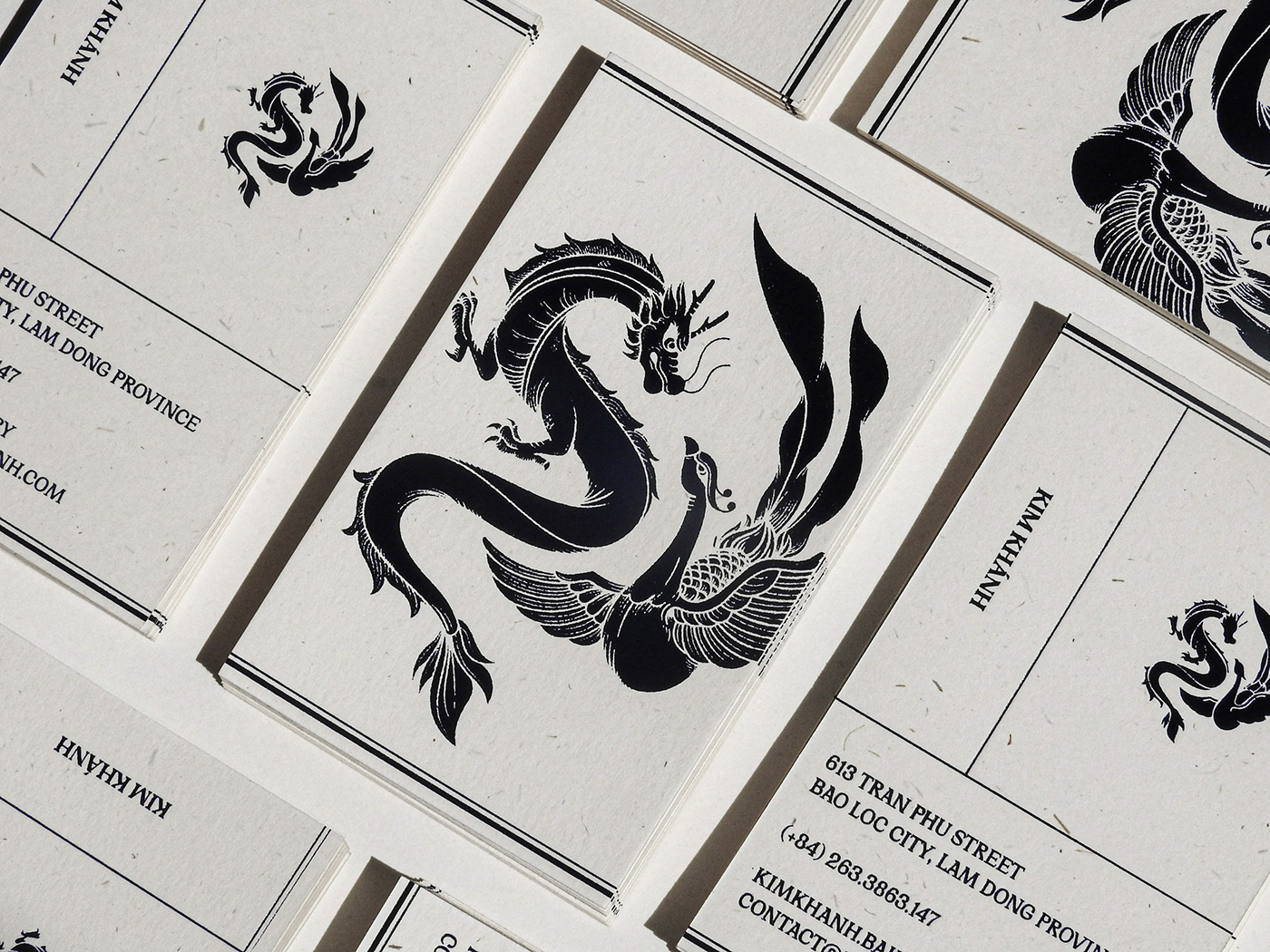
In order to tell the stories of the good old day in the today world context via the visual identity, we designed an illustrative yet distinctive logo, meaning of which originated from the Eastern folklores. With this direction, which is neither too simple nor too complicated, will help the Kim Khánh’s concept not only evoke the traditional essence but also easily approach the modern world; however, still keeping it flexible and greatly identified.
In order to tell the stories of the good old day in the today world context via the visual identity, we designed an illustrative yet distinctive logo, meaning of which originated from the Eastern folklores. With this direction, which is neither too simple nor too complicated, will help the Kim Khánh’s concept not only evoke the traditional essence but also easily approach the modern world; however, still keeping it flexible and greatly identified.



*Packaging concept
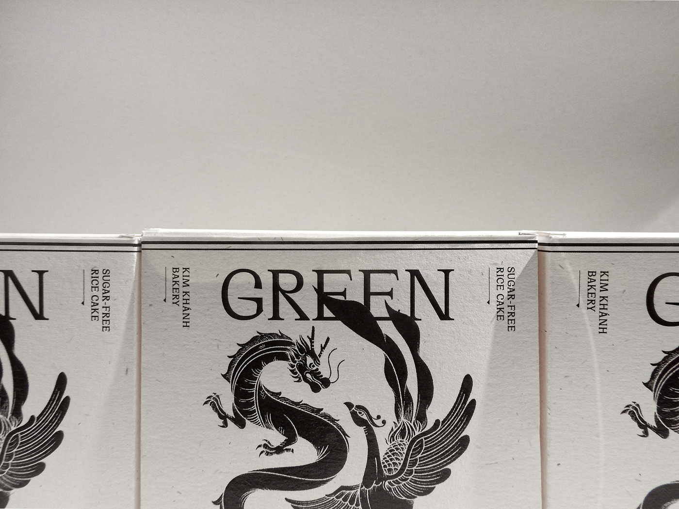
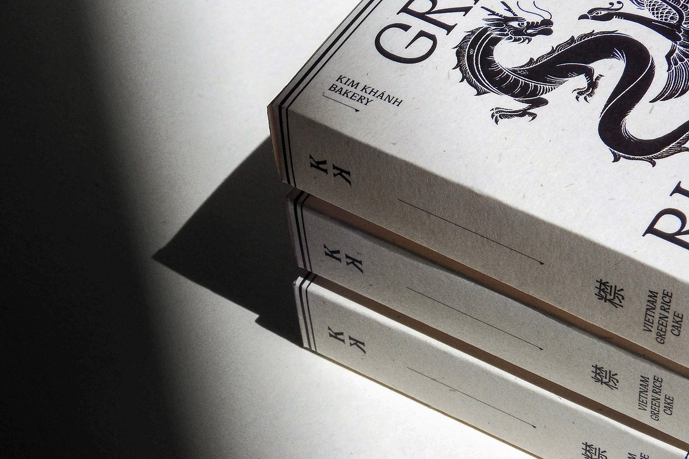
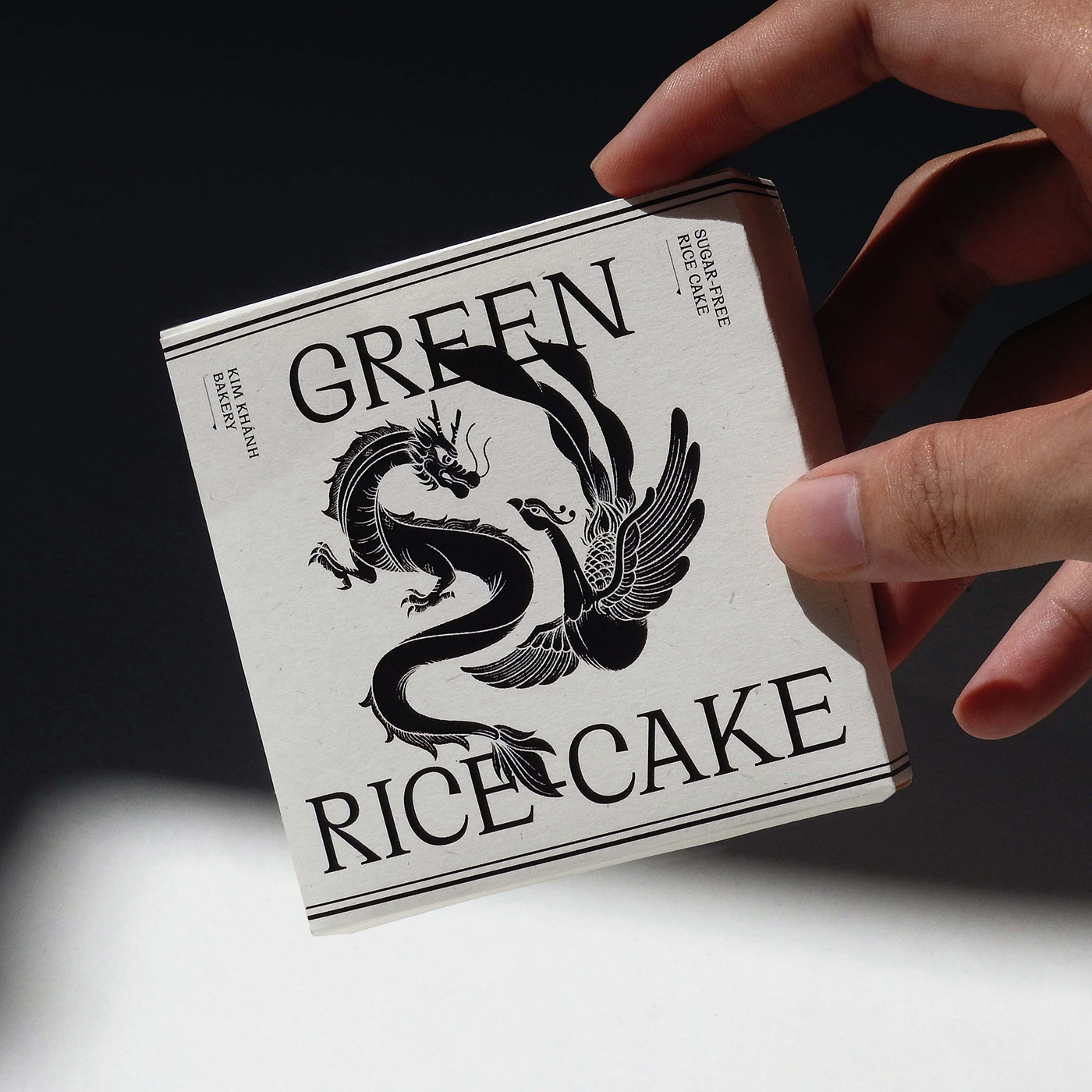
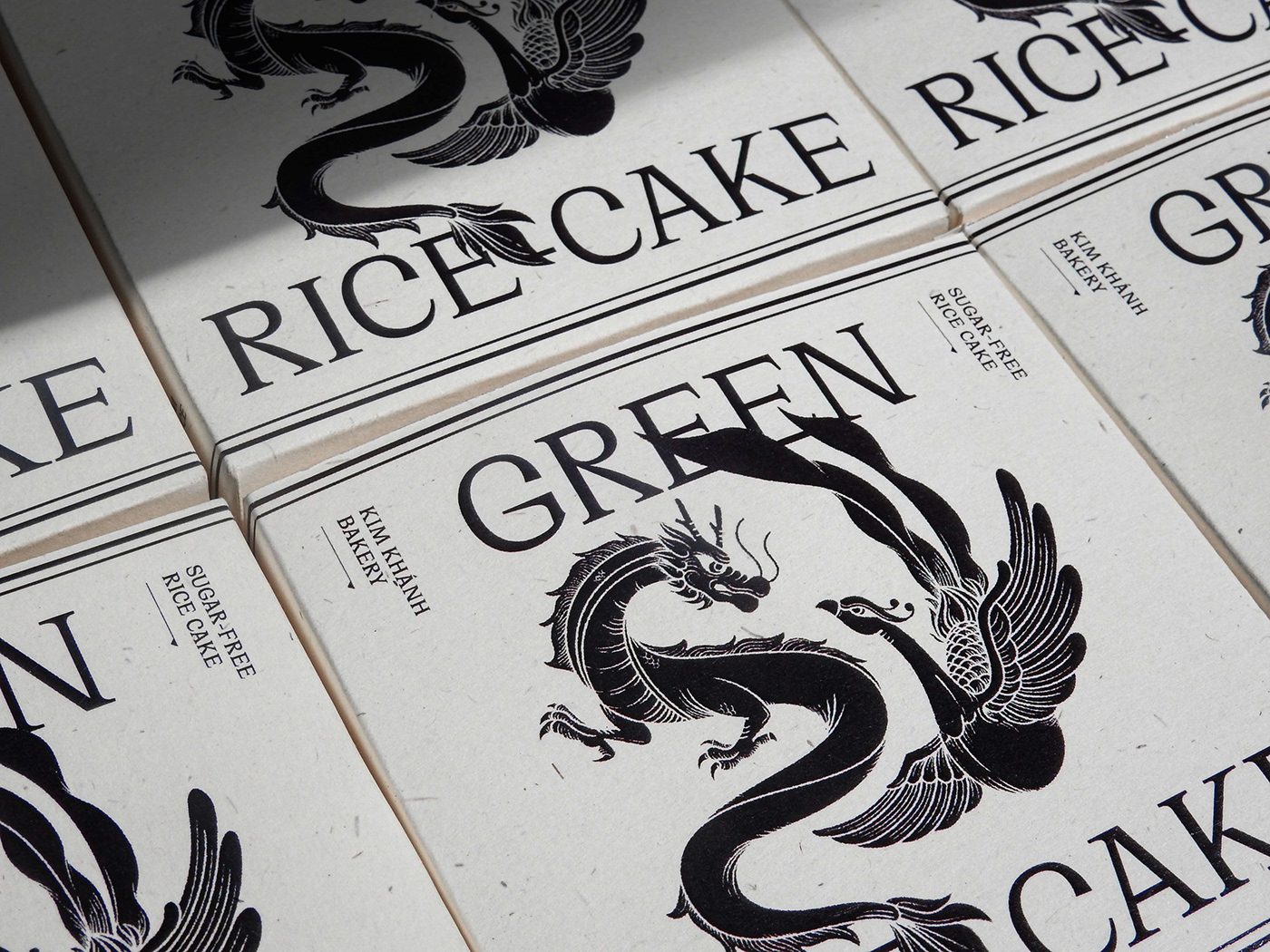
Maintaining the continuity of the brand identity, the logo, which has it own unique concept and also represent for positive meanings, will be suitable to be the key point of the packaging design. Additionally, applying the whole illustrative logo on the packaging as a direct touchpoint will enhance the repetition of the brand's key visual.
*Visualization
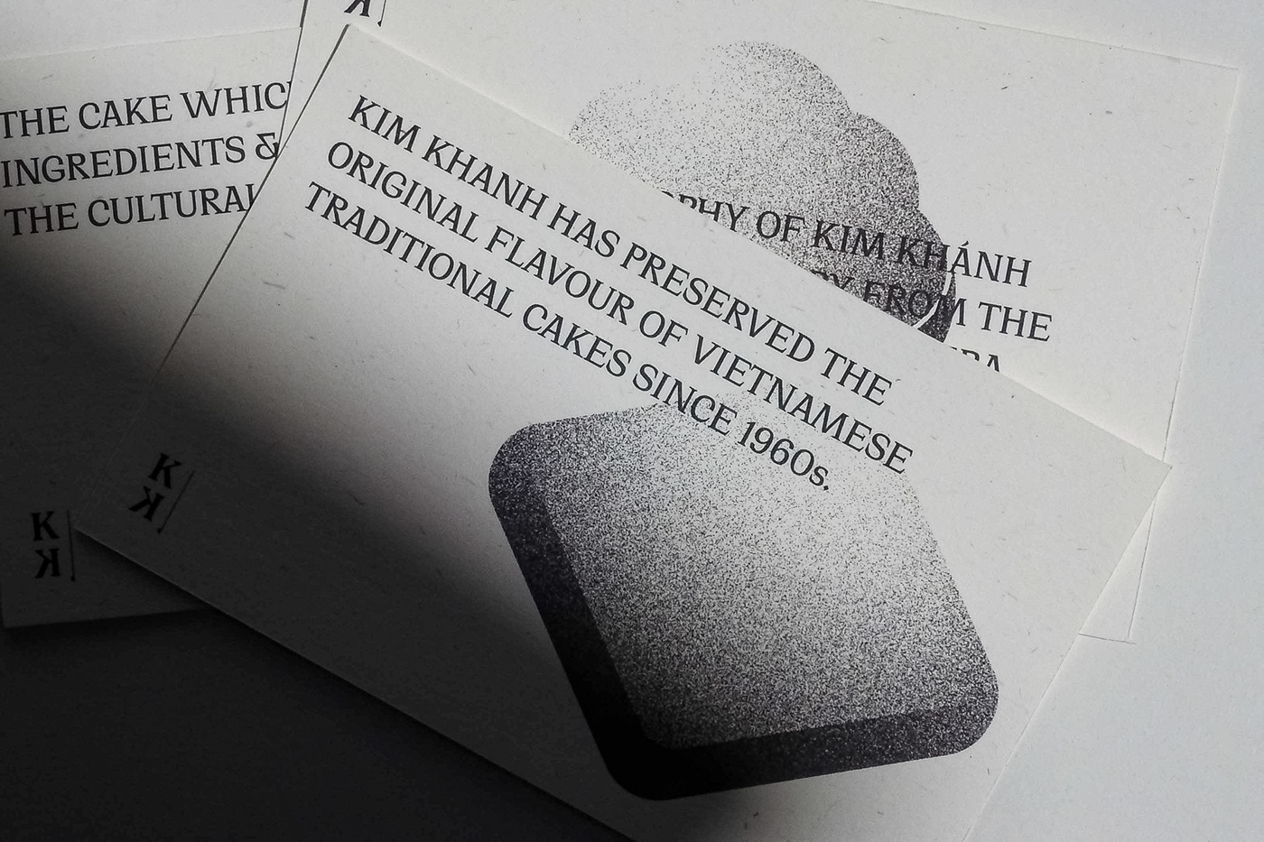
Making of flour, mung beans and sticky rice, all the traditional cakes are memorable images for the visual identity. Inspired by the movement of flour grain, the expansion of the cakes and their iconic shapes, the brand's visualization will provide us with a new image of traditional cakes.
Hence, combining with the messages that the brand is conveying: “Telling the old stories for the new generation”. The postcards of Kim Khánh will draw us back to the affined pictures of tradition via the modern visual execution.
Hence, combining with the messages that the brand is conveying: “Telling the old stories for the new generation”. The postcards of Kim Khánh will draw us back to the affined pictures of tradition via the modern visual execution.
