


Mary Mary – A booze-free goodbye to 2020
Visual identity, verbal identity, packaging, illustration, website design & build, photography
It’s no secret that we love an end-of-year gift here at UF and what a year it was. Of course we wanted to delight our friends with a nod to the WTF-ity of 2020, but we also didn’t want to focus on the negative. And so entered the idea of rounding off a not-so-average year with a not-so-average beverage that would reflect the year’s joys instead of the headaches.
Mary Mary is a deliciously non-alcoholic aperitif designed from product-to-packaging by the team at UF and born from the absurdity of 2020. At the conclusion of a year of doom and gloom, Mary Mary invites you to look on the contrary and celebrate the small joys you came across.
Any insights?
We all could have used a celebratory sip to toast to the end of 2020, but we’d had enough headaches for one year and a(nother) hangover was certainly unnecessary. And so entered the idea of rounding off a not-so-average year with a not-so-average beverage.
And what seems to be the problem?
While we’re well-versed in the design side of things, what about sourcing product, packaging materials and all the other challenges our clients face when building a brand from head-to-toe?
This was definitely an exercise in testing new skills.
So how'd you go about it?
Well, first we needed the product. We wanted something uniquely Australian that would hero native fruits in its flavour profile while also being natural, vegan and gluten-free. The drink needed to be balanced — not too sweet — and also achieve the mouthfeel of an aperitif without the help of alcohol. Armed with our sobering brief, award-winning mixologist Rocky Hair delivered 14 flavour iterations, patiently taking us through taste-tests until we arrived at the selection we were happy with.
How does your branding grow?
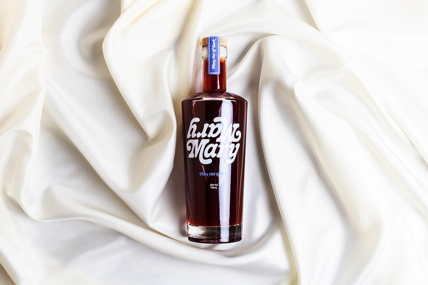
The name came from a play on the famous childhood nursery rhyme, with Mary Mary’s contrariness infused into the concept — a product that tastes and feels like alcohol but isn’t, so you get all of the upside and none of the downs — and a way to bring a little 10/10 to 2020. The upside down, flipped around logo mark further played into this, as well as highlighting our intention to create a product that reflects the year. Cooper Nouveau paired with Dazzed from Displaay gave us two contrasting yet fun and quirky typefaces to play against each other in a lighthearted, joyous way.
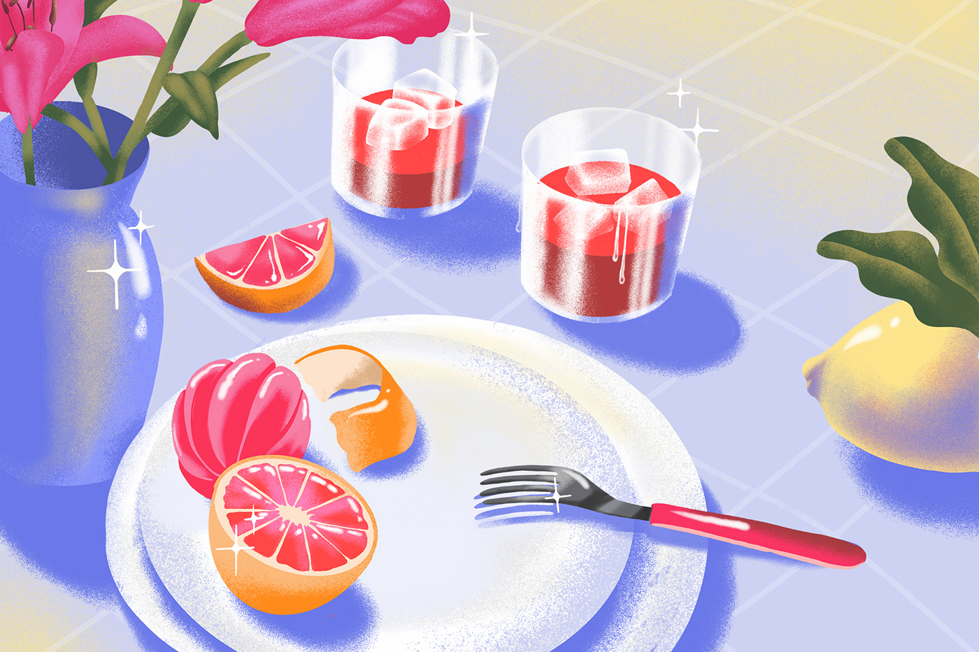
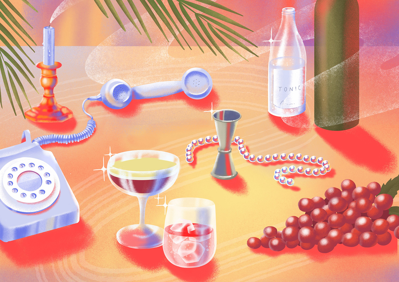
Our illustrations were created in-house as a way to depict two contrasting scenes of ways to serve Mary Mary. One in the daylight with a no alcohol added, and the other in the evening, presumably mixed with a spirit. We developed a style that felt surreal yet euphoric, to reflect the peculiar year. The result is mesmerising and colourful, and adds some sparkle to the overall brand.
The silver bells and cockleshells
Picking a glass and cork combo was an unexpected challenge. High minimum order quantities make the cost of entry into the drinks category very high. We wanted something high quality that could hold the volume we wanted and a bottle that also felt like a spirit, not a wine. Time didn’t permit us to explore custom packaging, though watch this space for the next iteration.
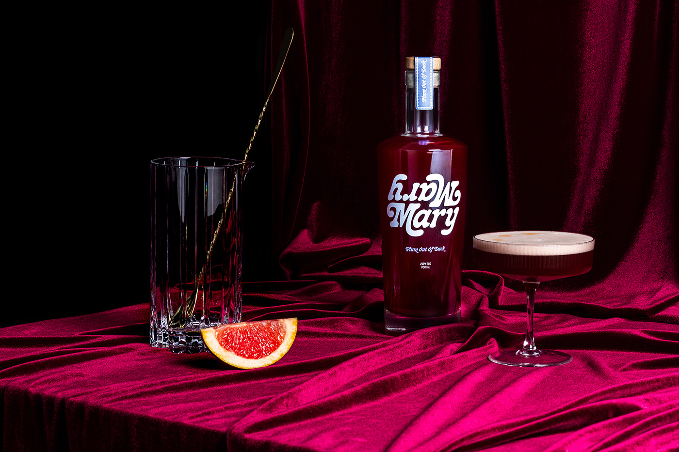
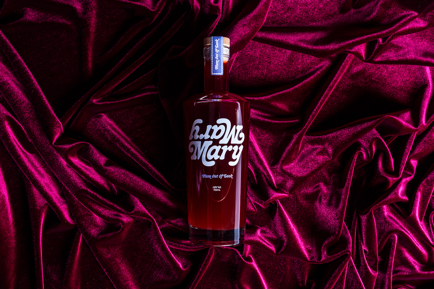
The glass was kept as uncovered as possible to showcase the rich colour of the drink, so each bottle is simply branded with a two-colour screenprint and the essential information, with our copy cleverly working in subtle nods to our concept — “Conceptualised, designed and bottled by Universal Favourite… to reflect on the weirdest, upside down year-to-date”. Once bottled, these beauties were wrapped and boxed for safe-keeping and sealed with a custom-made monogrammed tape.
All pretty, made, out it goes
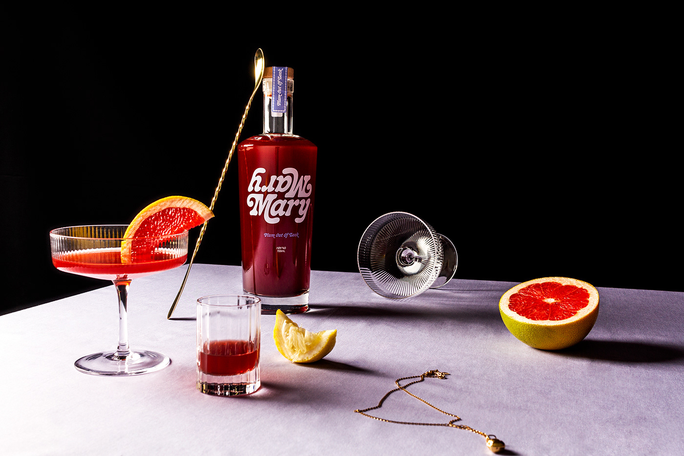
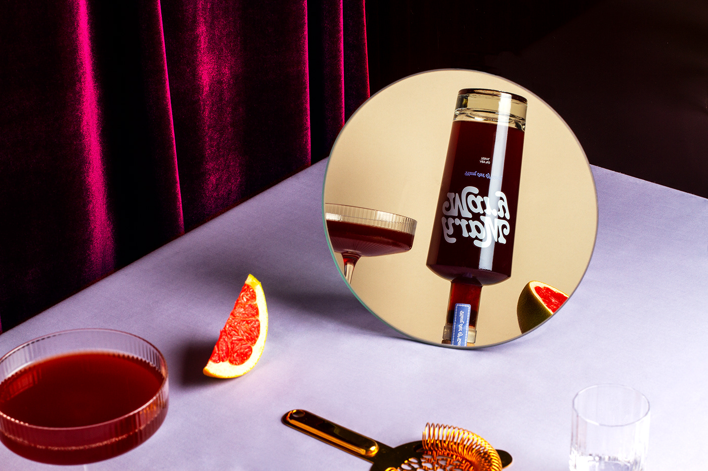
In the interest of tackling the top-to-toe challenge, photography and art direction also took place in our studio too. One light, one team, one dream… multiple spills. We wanted to emphasise contrast and play on the contradictory nature of the concept — light and dark, upside and down, decadent and airy. The outcome was a suite of visual collateral that really highlighted the beautiful colour of the liquid.
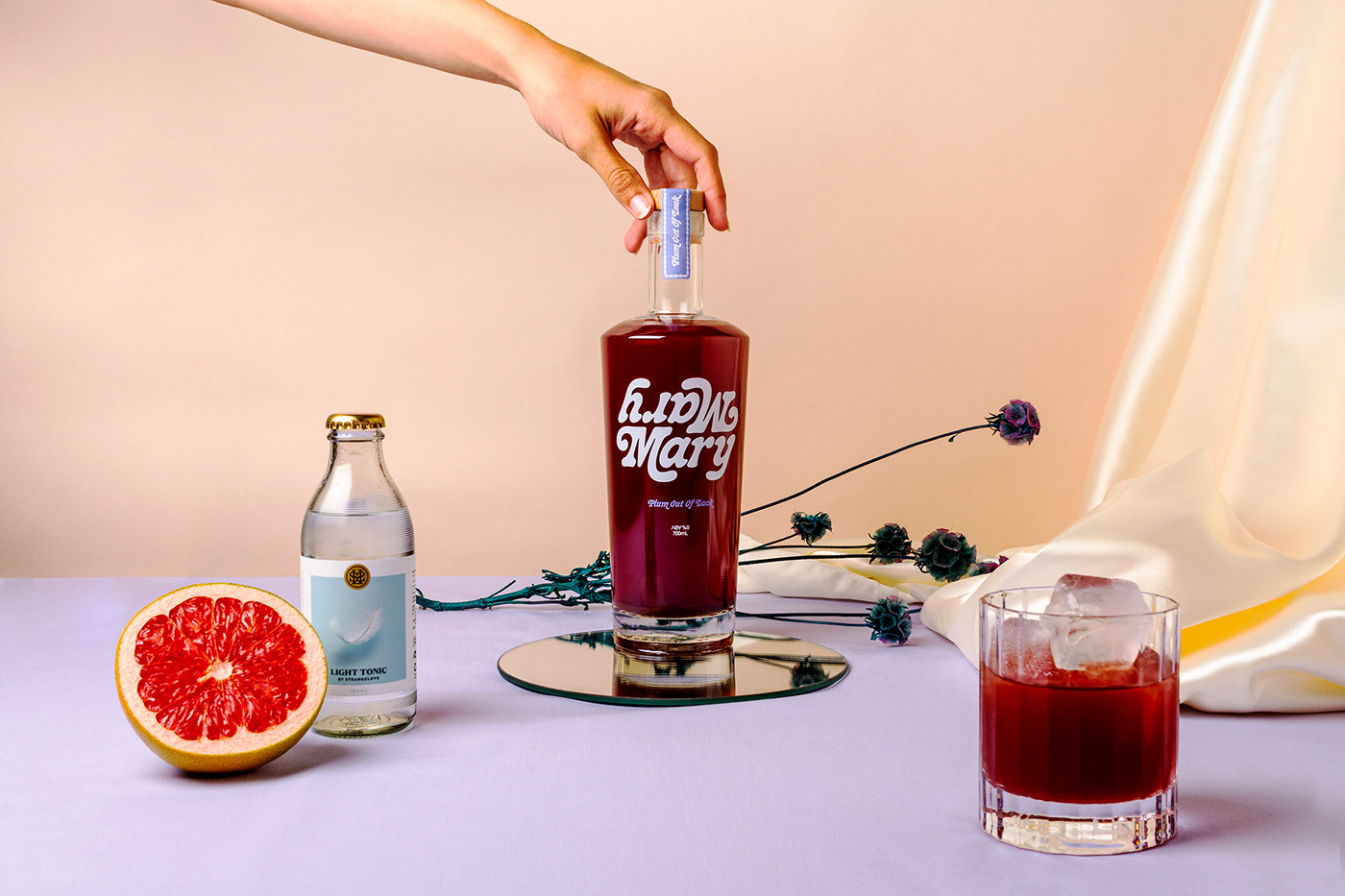
The photos made their way onto our split-screen website that, once again, spoke to the ups and downs of the year that was. As the user scrolls, the split screens come together to pair the ingredients with their matching descriptions.


And the end result?
Our topsy-turvy take on an often-boozy end-of-year gift was both challenging and exciting in unexpected ways — much like the time it was made to reflect. The end result was a seriously delicious way to make light of a heavy year, which brought a bit of joy to all its drinkers.


