Crumbs Brewing
This is a Briefbox brief to create branding and packaging for Crumbs Brewing - a craft brewery based in New Zealand. The designs needed to go across both can and bottle mockups. A huge part of their brand is the fact that they use surplus bread to make the beer, which is something that they wanted to be see throughout the designs. The client wanted move away from an illustrated style but focus more on pattern and typography within the designs. The target audience is young professionals.
After some market research I focused on Pale Ale, Dark Stout and Twisted Tropical as the different flavours of the beers. This is because these were the most popular flavours during my questionnaire.
I started the overall design with some initial logo designs focusing on aspects of New Zealand and bread to be able to keep a consistency within the brand. I also started to work on some packaging designs to showcase some exciting and fun pattern work.

Initial Logo designs
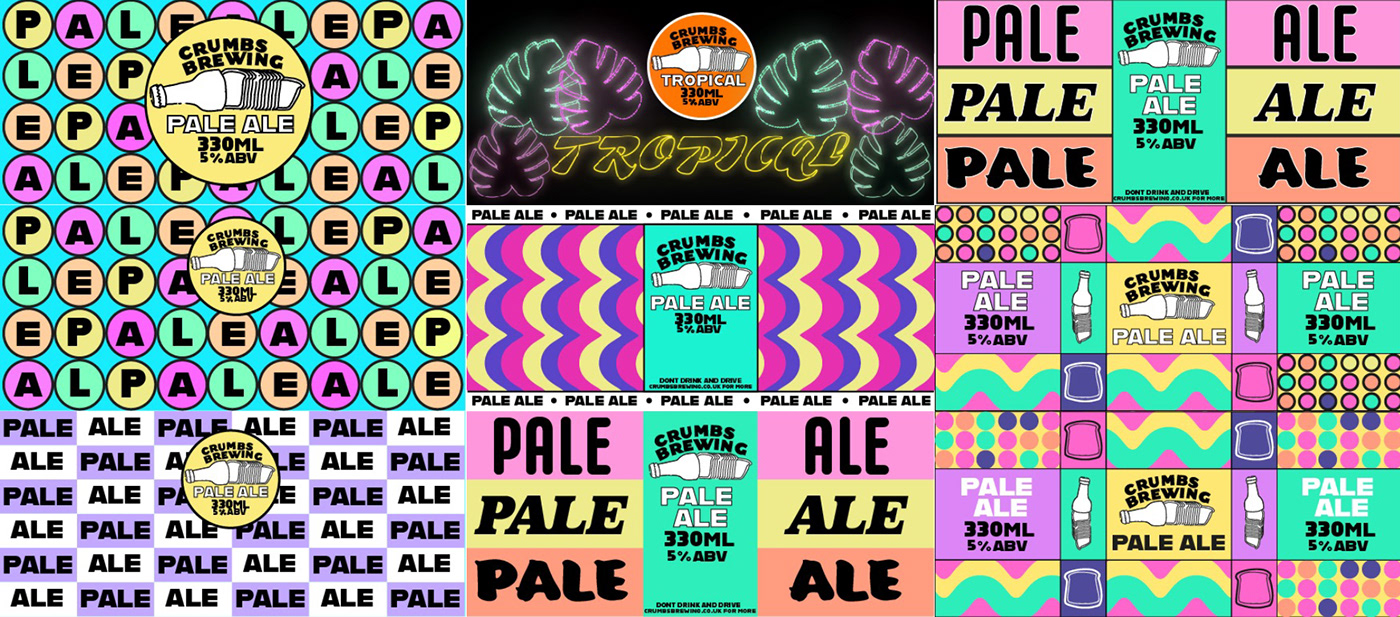
Initial packaging designs
After some feedback, we had spoke about creating some unique patterns that could compliment the brand. Due to this I started to use the traditional medium of water and nail varnish as this is a technique that I had seen before that made some amazing designs.

Pattern creation
Once I had created the unique designs, I took photographs and put the images into Photoshop to be able to experiment with colour and blend modes to be able to get it to match the different flavours of beer. I then applied these patterns to the layout of a beer can/ label to be able to work with how it would fit within the packaging.

Patterns being edited in Photoshop
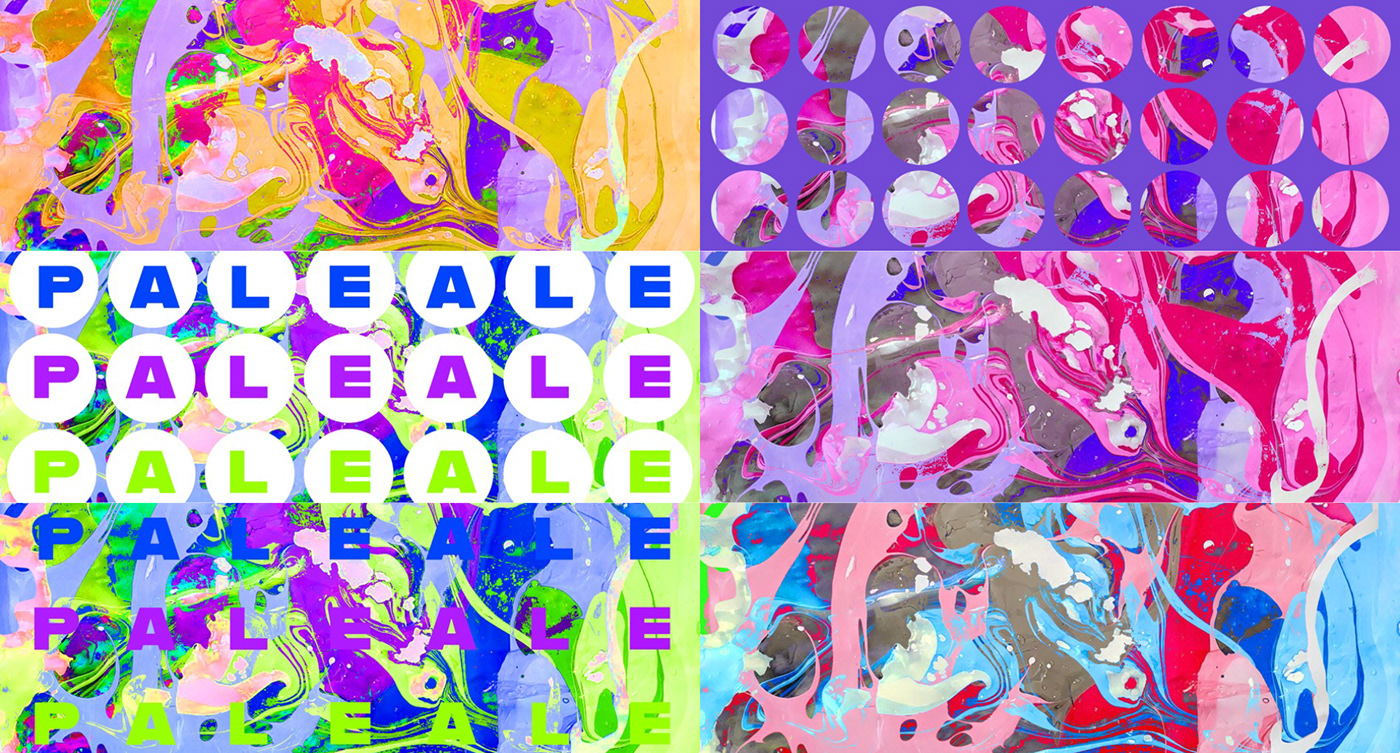
Pattern development

Pattern mocked up onto can
Whilst continuing the development of the packaging design, I continued the logo design to be able to make sure there was consistency between the two. I was working out ways that I could merge the use of bread and beer so I was experimenting with turning a bottle into a loaf of bread. However, it got too complex for the overall packaging and something that I did not end up continuing with.

Logo development
At this point I am getting further into my development of my packaging and logo designs and I am working out the best way to be able to show all the necessary copy and designs across the packaging.

Development of label design
The above design was a development of creating the label design. I really like being able to see so much of the design in the background but unfortunately it is very hard to read majority of the information.


I continued working and refining ways that would make the information much clearer across the label with the use of coloured blocks. I experimented with the position of these boxes and found they were much more successful when put along the bottom as it made the packaging much more cohesive throughout.

Continuing with the logo development, I found that I had been working across the logo and packaging design so separately when I really should have been working across the two areas cohesively. I have started here working out a way that I can still have the exciting background of the packaging showing whilst having a symbolic logo to represent the brand.
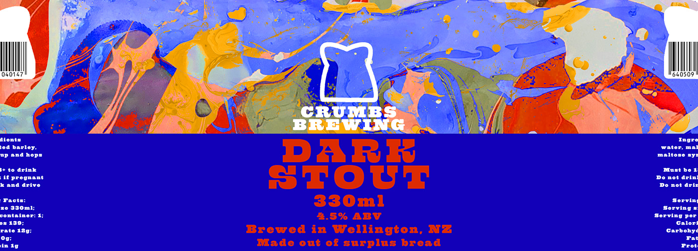
Final Dark Stout label design
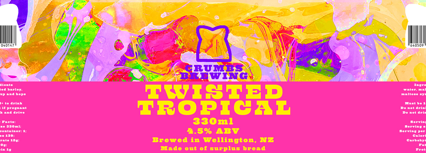
Final Twisted Tropical label design
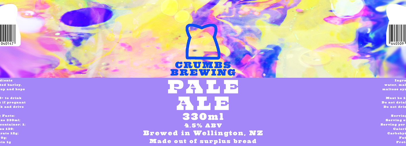
Final Pale Ale label design
After continuing to refine all of the elements of the branding and packaging I have finalised everything. The above images are the finished labels and the images below are the labels mocked up in the correct context
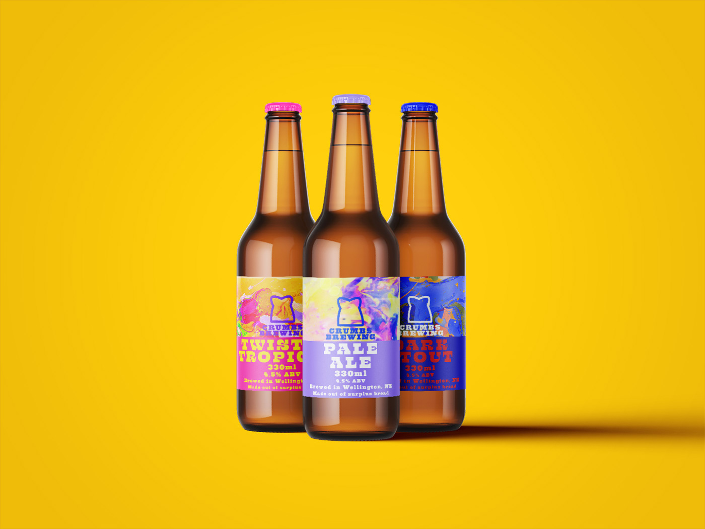
Final Bottle Design
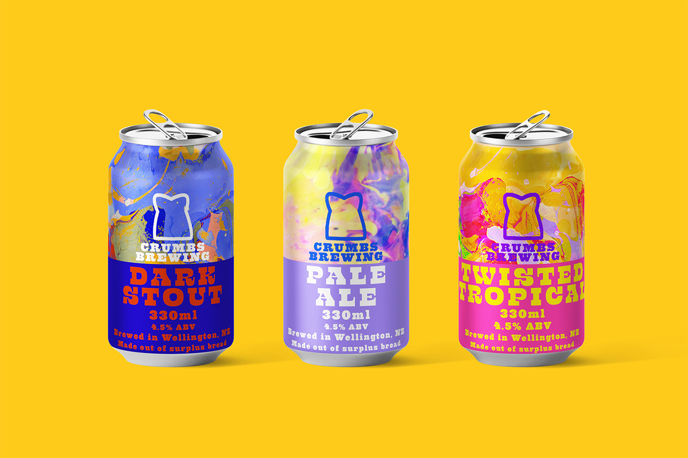
Final can design
Pale Ale 360 view
Dark Stout 360 view
Twisted Tropical 360 view


