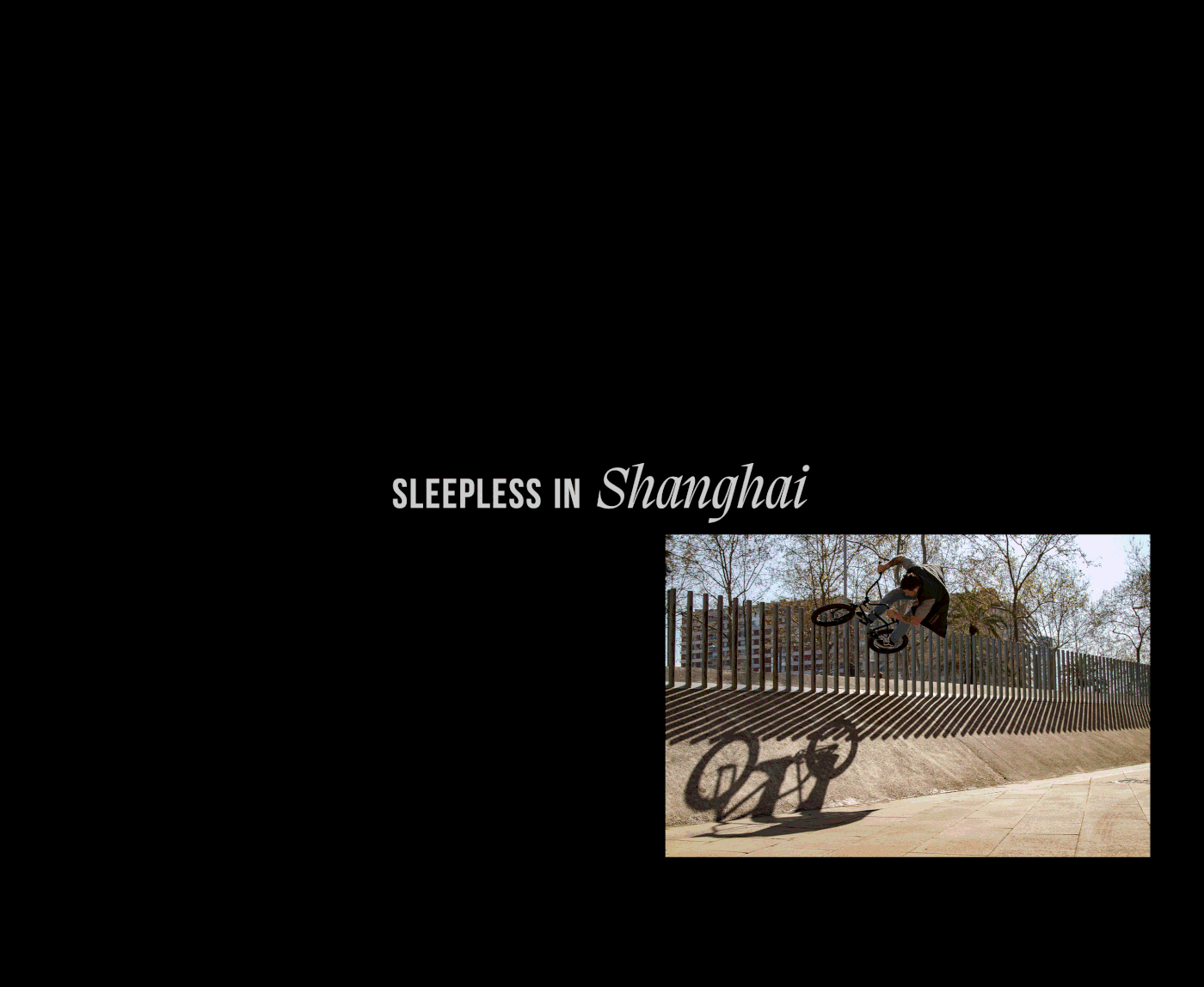
Sleepless is the brand and project of South African born photographer Tyrone Michael Kelly. With his passion for photography, videography, street culture and actions sports such as BMX the goal of the project was to generate a brand identity that captures all of these aspects in a compelling visual language.
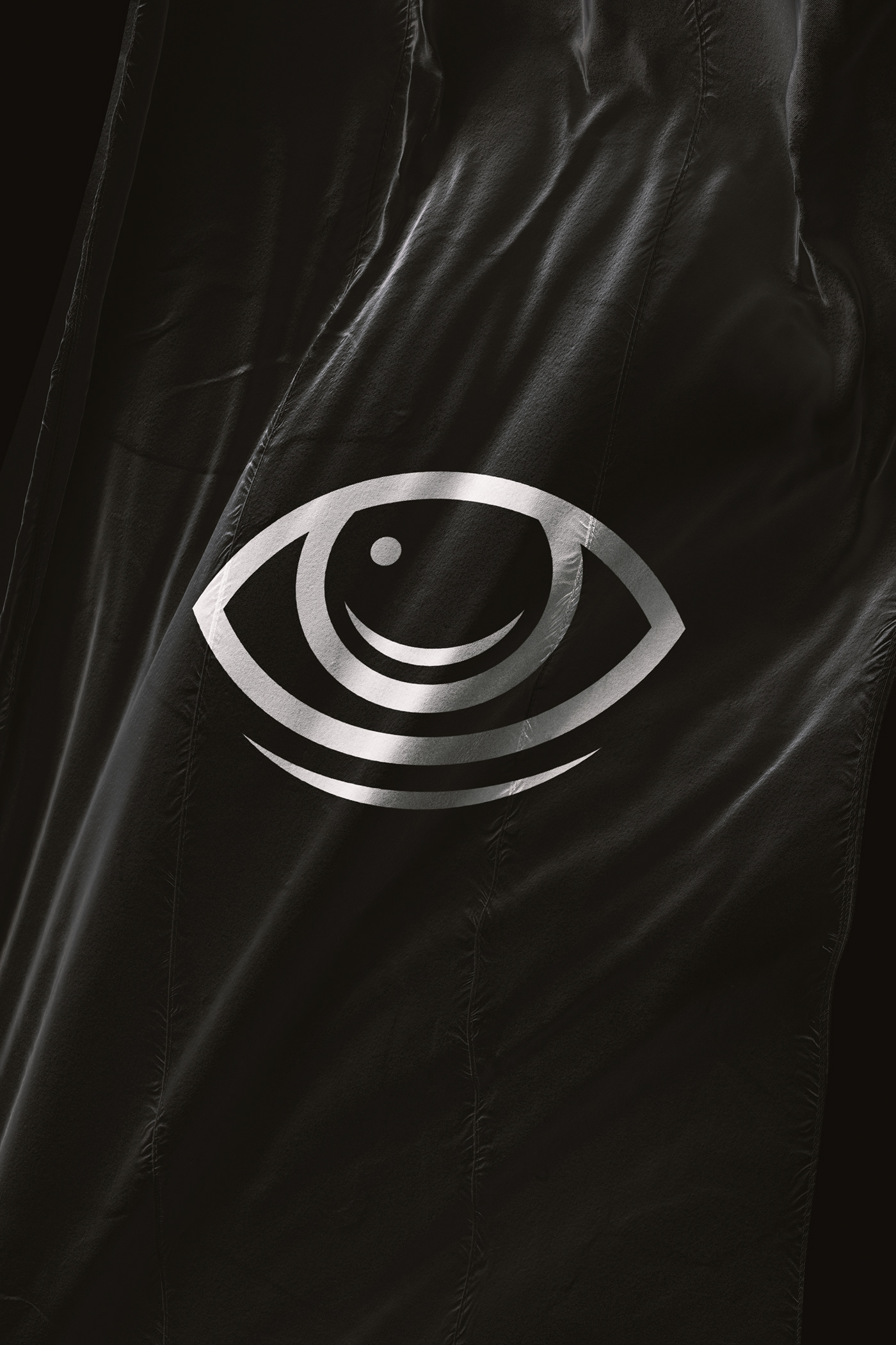
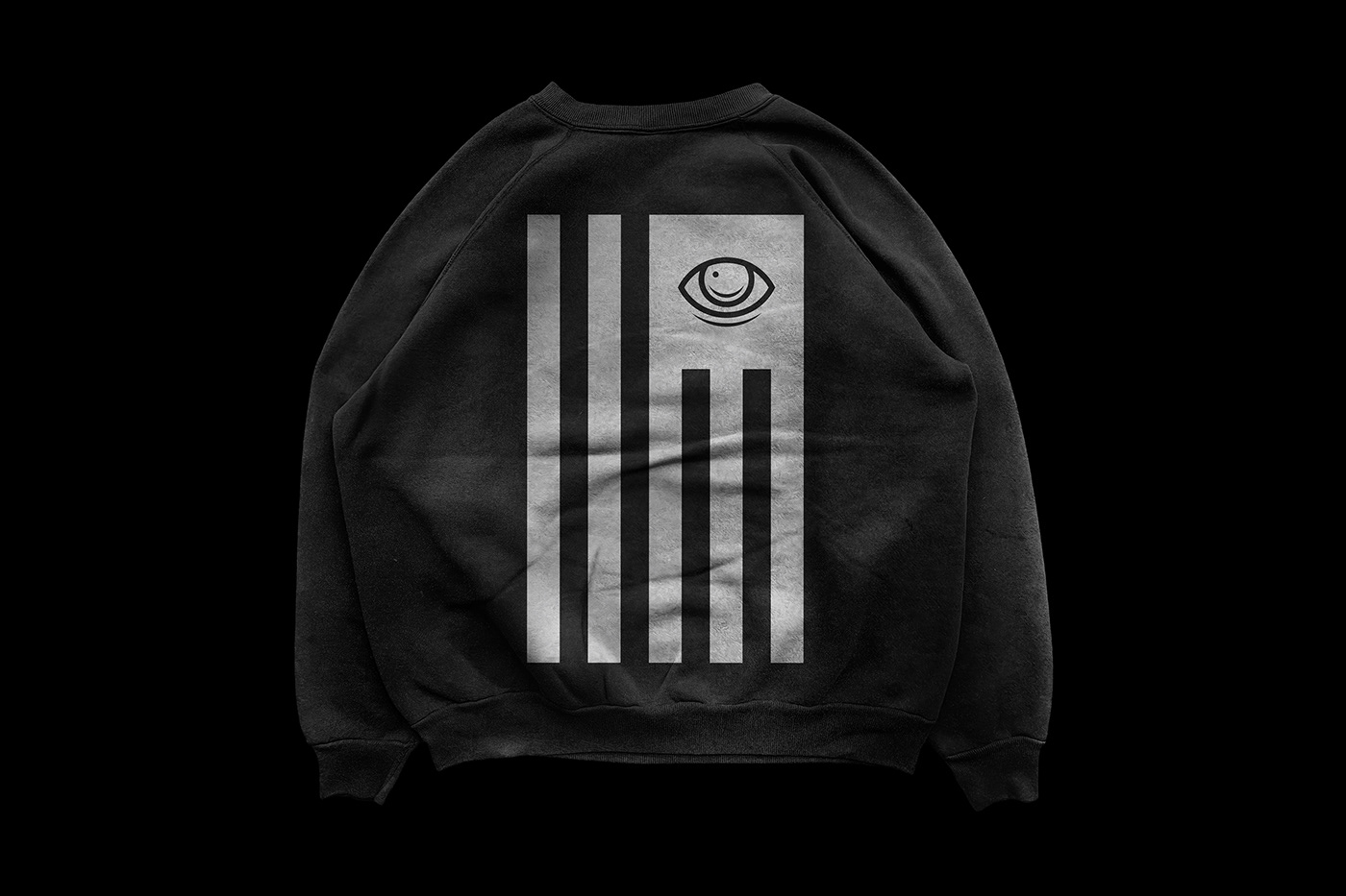
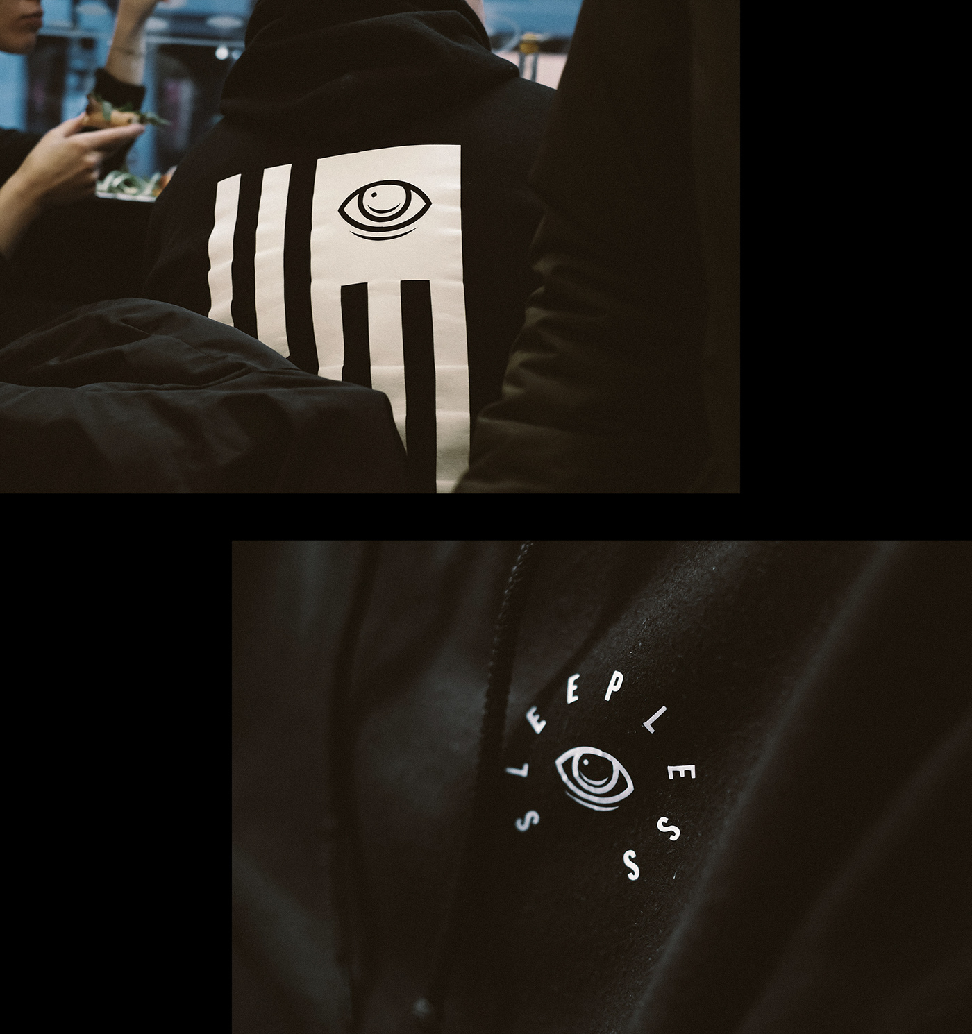
The brand identity is built around the center element, the eye. It has a double meaning in which the eye stands for an all seeing symbol capturing the world around it, and also behind the name Sleepless — getting no rest and always keeping your eyes open. Secondary elements are the flag as well as symbols of death, such as the coffin and the tombstone. The flag captures the idea of travel and the resulting imagery captured on those trips. This also gets represented through the wordplay of combining the brand name with names of cities – Sleepless in Johannesburg for example. Death is represented as a result of a lack of sleep.
Being born in South Africa, Tyrone has since lived in different cities such as London, Shanghai, Hamburg and Vienna and has been embracing his passions along his journey. The result of the project was a brand identity that speaks the language of street culture and BMX, communicating photography and videography only as a secondary. Besides their digital usage, the brand elements find application on clothing, stickers, posters, patches as well as on a limited edition of laser engraved tobacco grinders.
Typefaces in use: Bebas Neue (Dharma Type), Migra Italic (Pangram Pangram)
Photography and Videography: Tyrone Michael Kelly
Case Photography: Thomas Sturm
Produced in 2016 independently.