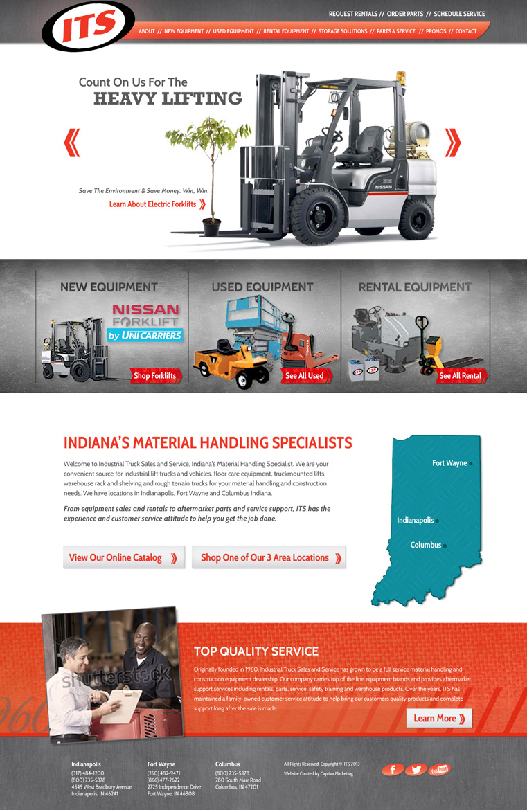
For this design, I wanted to give the site an industrial feel but still keep it very clean. I used steel, orange and 100% white for the main colors. I incorporated some green for the slider to accentuate the sustainability messaging and incorporated a blue into the map. I utilized diagonal lines in the navigation and near the footer because they compliment the tilt of the logo. I felt the “top quality services” section deserved its own section, so I highlighted it near the footer.