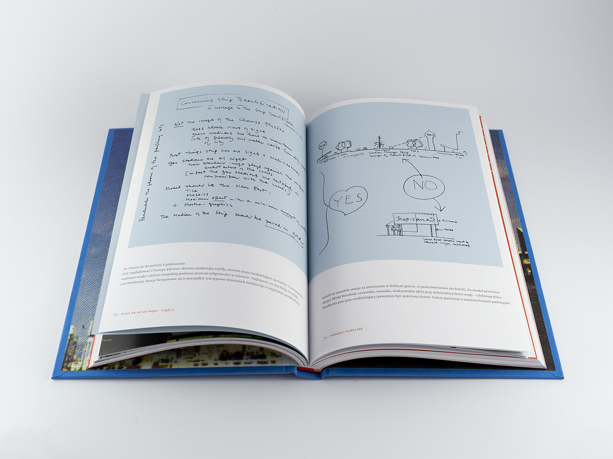
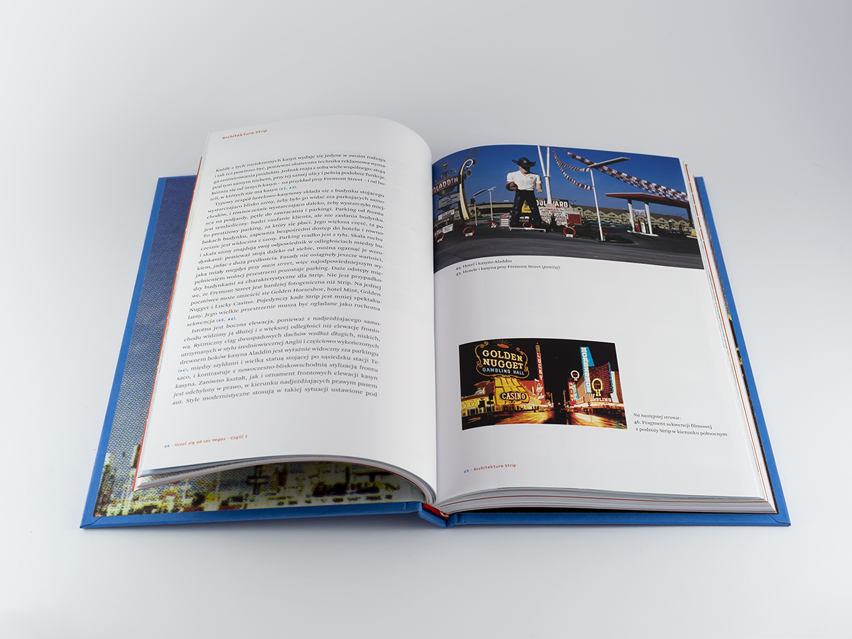
Robert Venturi, Denise Scott Brown, Learning from Las Vegas
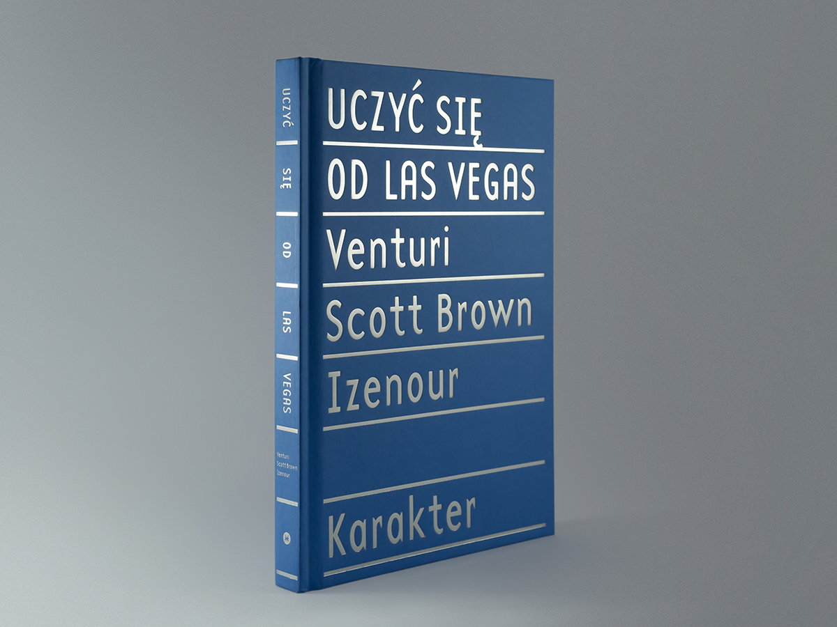
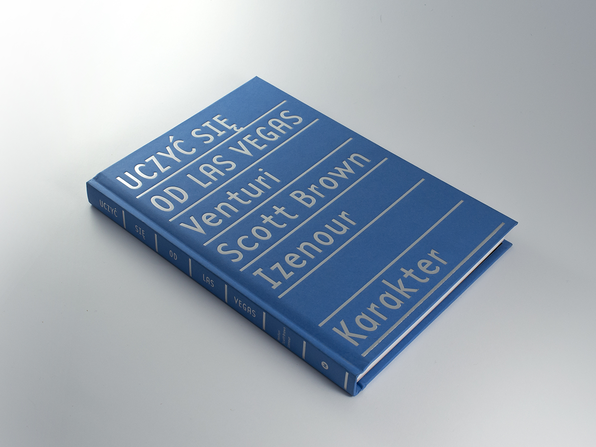
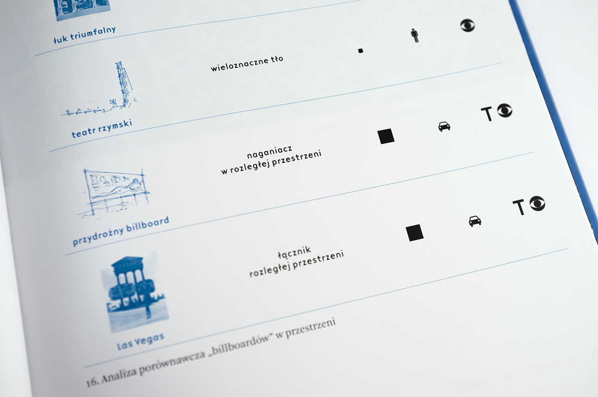
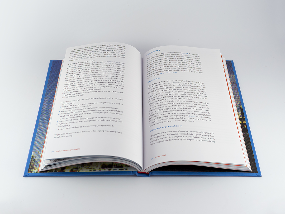
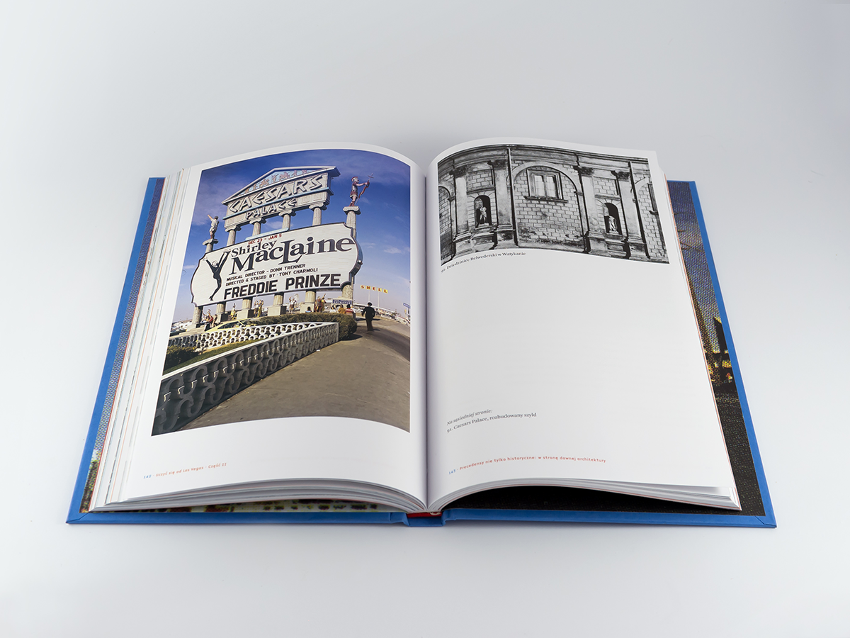
A seminal work on architecture arguing that there is a beauty to be found in what many see as a junk architecture. One of the most important 20th-century titles on architecture. It is not an easy read, full of diagrams, maps, and photos. The original version designed by Muriel Cooper in the late 60s is completely wacko, beautiful, sprawling like a modern city, dynamic, full of juxtapositions, and inventive page-layout. I bought one copy of the original edition on eBay, had it unsewn by a bookbinder so I could quickly scan the original color photos. These gave our version this sweet, warm, rasterized look. I tried to tone down the design a little. Publishing the book in its original format was out of a question – it would never pay back to issue such a large volume. The cover design is a distant echo of American displays on cinemas, where you could see what was played at the moment – with inscriptions in neat rows made up of single interchangeable letters.
Year: 2013
Page size: 164 x 243 mm
Page count: 232
Binding: Hardcover
Paper: G-print 115 g
Cover material: Geltex 1331
Typefaces: Base 12, Arnhem