


AOLO, Branding
2021 Brand eXperience, BI, Package, Visual strategy Photography_Sean Jackson, Ceramic_ Line and Segment AOLO is about ‘Emptiness and fullness’.
Bracket symbol is used to represent for openness brand philosophy,
mindful messages and names of collaborators.
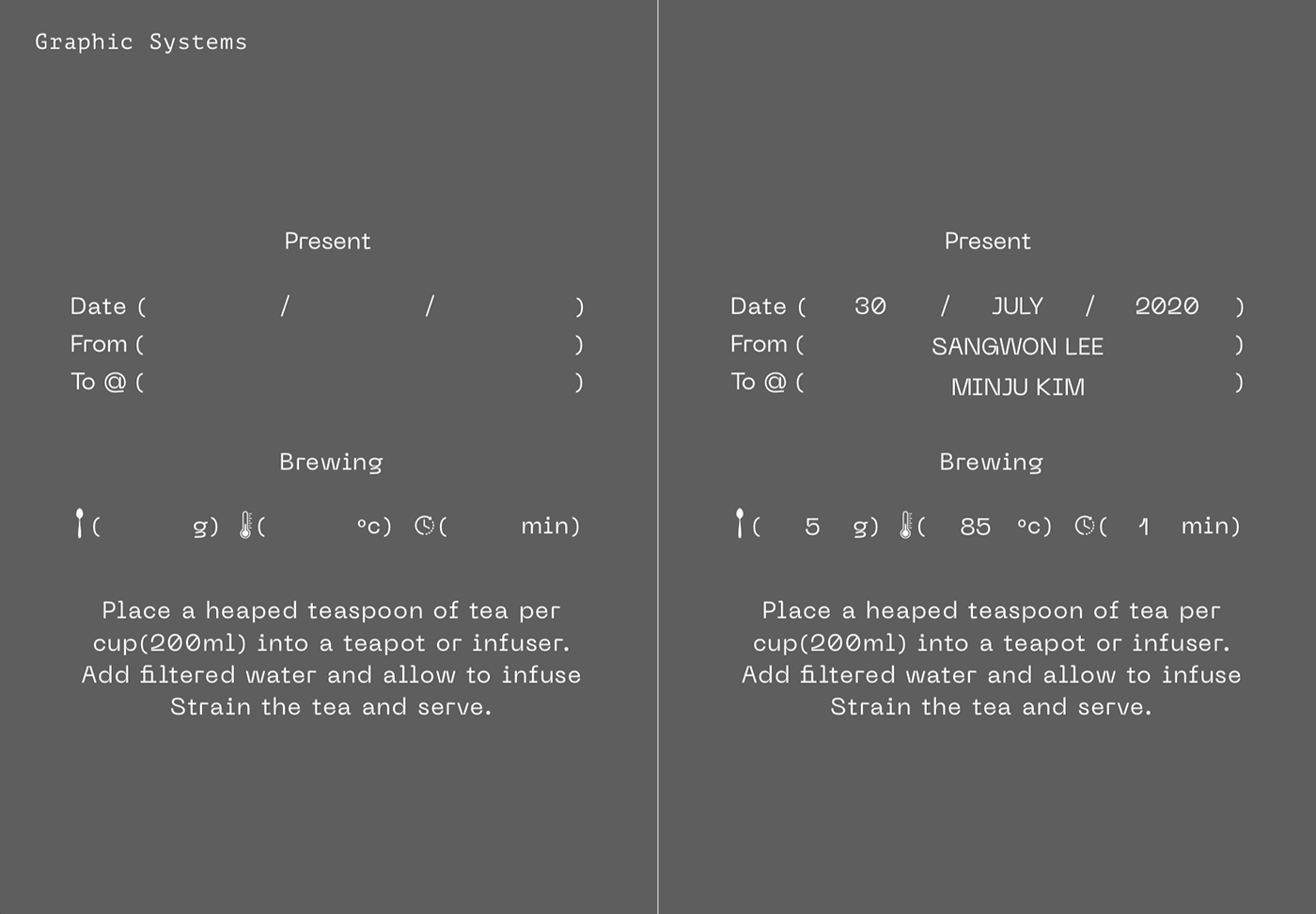
Number system represents how many ingredints are included and blended in a pacakage.
It is checked by hand on full numbers
. Photography describes to brand image abstractly and emotionally.
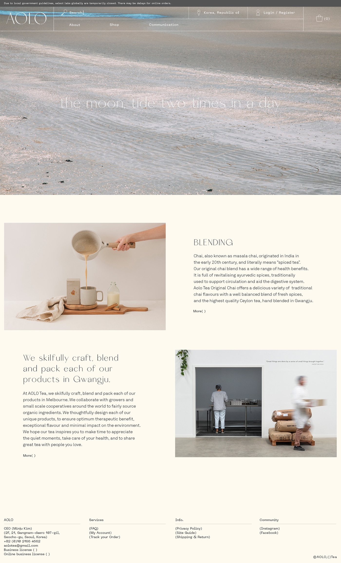
The moon is photo series, high tides and low tides cause the moon, times and leftover.
아올로는 '어우르다'는 순한글말로, 비움과 체움에 대한 아올로만의 문화와 태도로 만들어진 블렌딩 차(tea) 브랜드 입니다. 괄호는 이와 같은 브랜드의 철학과 생각, 혹은 함께 채워나가는 콜라보레이터를 담는 아올로의 아이덴티티가 되었습니다. 패키지에서 보여지는 넘버시스템은 블렌딩되는 재료들을 나타내며, 수기식으로 체크 할 수 있도록 하였습니다. 달에 의해 만들어지는 밀물과 썰물에 의해남겨진 것들에 대한 포토그래피는 이러한 컨셉을 감성적으로 다가 갈 수 있도록 하였습니다.


