

Comfort City is a residential compound, I would say a small town with developed infrastructure, a park, sports and children's playgrounds and institutions, commerce, and everything you need to call a town.
It is one of the largest complexes of its kind in Ukraine and has the biggest interdisciplinary team of UX designers, service designers, landscape designers, researchers, and graphic designers.
It is one of the largest complexes of its kind in Ukraine and has the biggest interdisciplinary team of UX designers, service designers, landscape designers, researchers, and graphic designers.
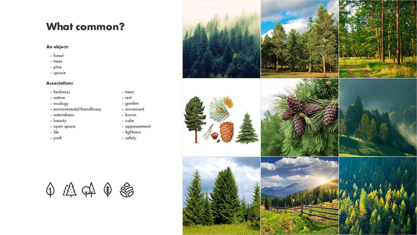
Since nature and human experiences are central points in the brief and then in our negotiations with the client, we realized that we needed to leave technology behind and focus on naturalness, to preserve nature and emotion, we needed to find a way to incorporate them into the new identity.
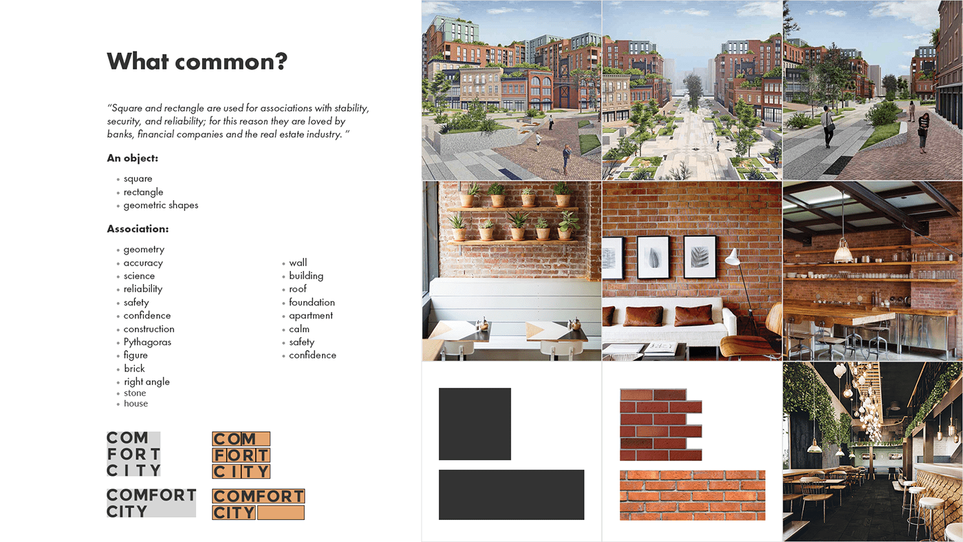
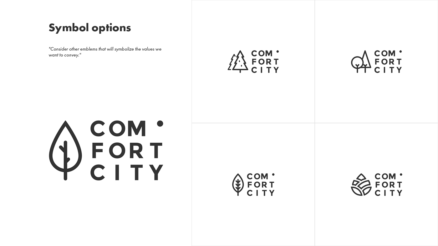
From our point of view, the most difficult thing was to find a symbol that would reflect the multifaceted nature that borders around and that is integrated into the buildings and the human experience of it.
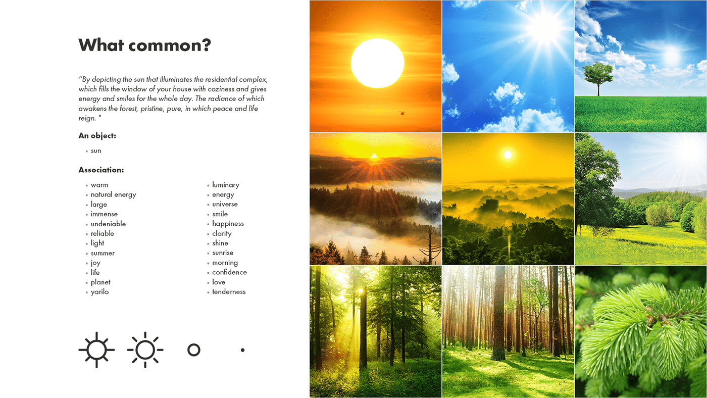
During the work, we understood that it is the human experience of interaction with nature that evokes emotions and that experience is what allows us to determine that nature is our basis, forest, trees, bushes, sun, warmth, so we began to look more closely at what surrounds us. We began to come to the place, to the forest, and observe it. We developed a kind of language that allows us to communicate certain messages in the context of a particular person's experience.
From our point of view, the most difficult thing was to find a symbol that would reflect the multifaceted nature that borders around and that is integrated into the buildings and the human experience of it.
During the work, we understood that it is the human experience of interaction with nature that evokes emotions and that experience is what allows us to determine that nature is our basis, forest, trees, bushes, sun, warmth, so we began to look more closely at what surrounds us. We began to come to the place, to the forest, and observe it. We developed a kind of language that allows us to communicate certain messages in the context of a particular person's experience.


How does it work?
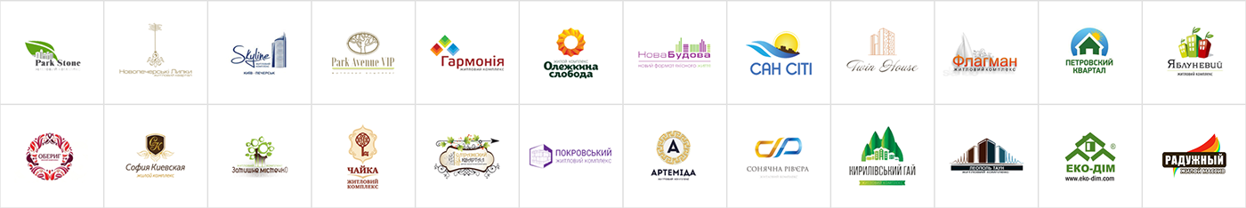
In general, there are logos on the market that look like logos from the hotel industry. A huge number of buildings, heraldic solutions, many complex elements that emphasize the association with housing, tradition, typical for developers.
In this area, it is important to show the reliability of the developer, vast experience, and long existence, simply and clearly to emphasize the location of the object itself and its advantages.
In this area, it is important to show the reliability of the developer, vast experience, and long existence, simply and clearly to emphasize the location of the object itself and its advantages.


Extended version of the logo
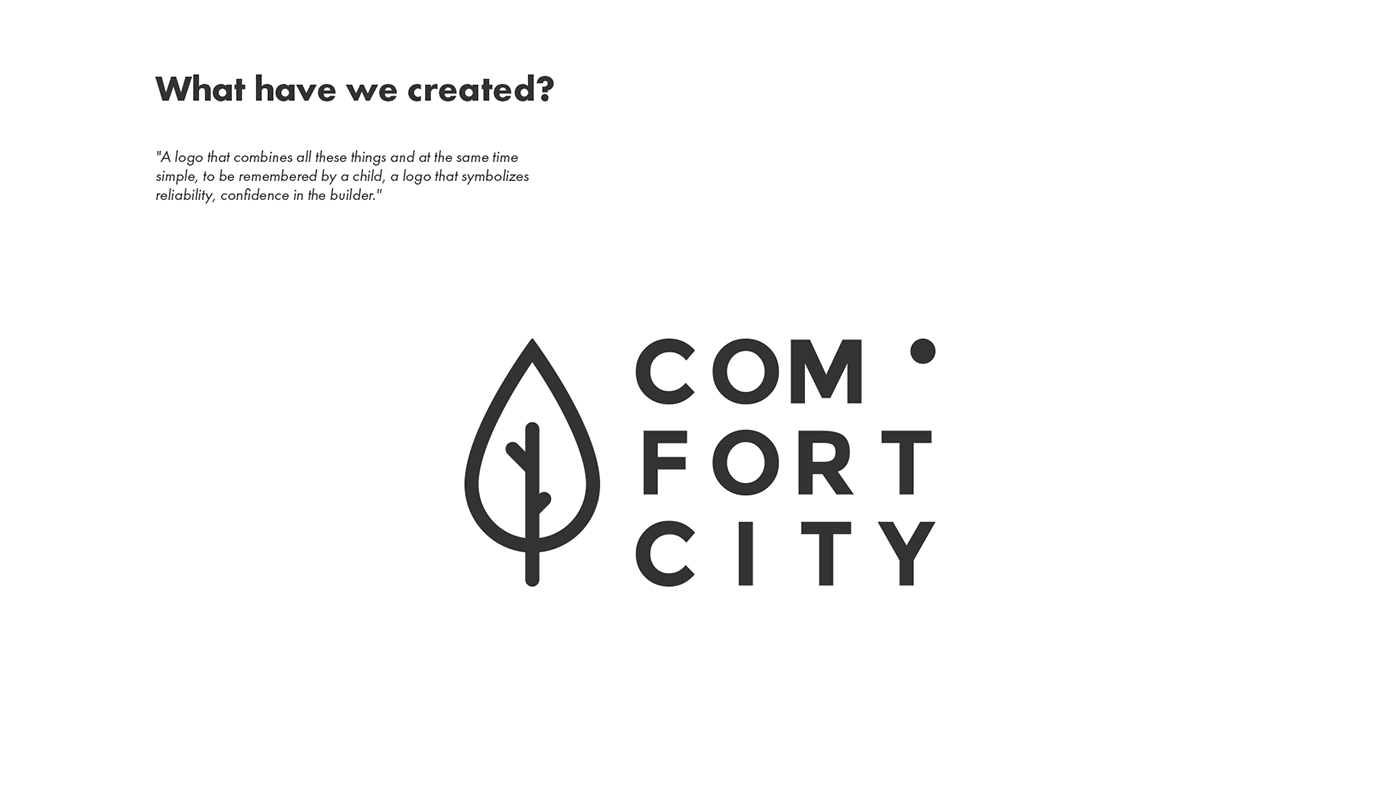
The main logo - we use one symbol, a tree, and we also use all the colors from the palette for the general corporate identity.
Additional logos:
● COMFORT CITY Residence - VIP level apartments
● COMFORT CITY Smart - small apartments
● COMFORT CITY Commerce - commercial property
● COMFORT CITY Kids - child care centers and kindergartens
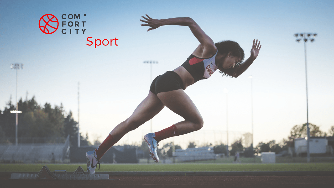
● COMFORT CITY Sport - sports zones
We use different symbols that will be identified with a particular type of direction. To increase recognition, we will tie one of the colors with the suggested palette to this activity. All the colors are chosen in such a way that they characterize this type of direction.


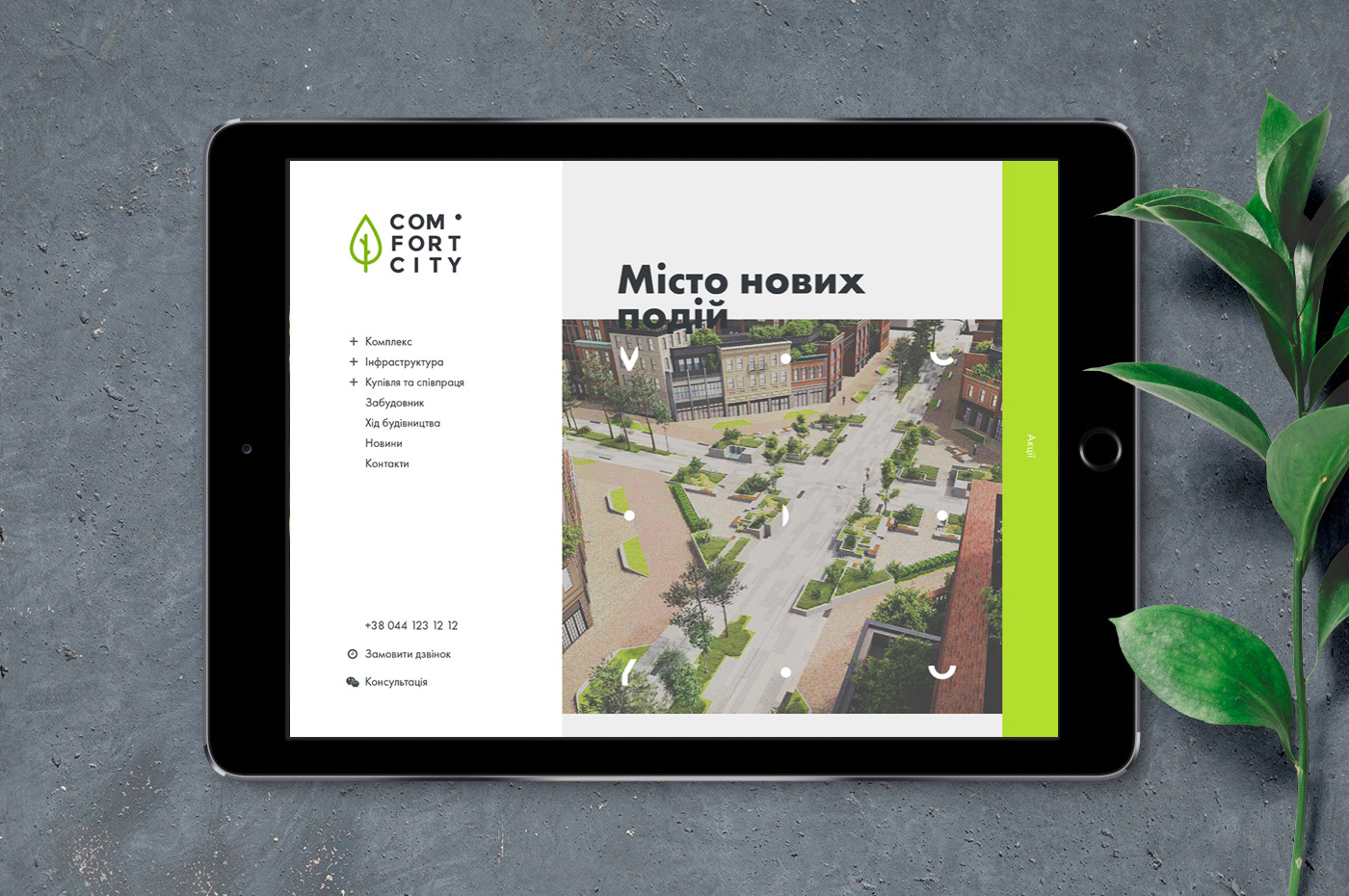
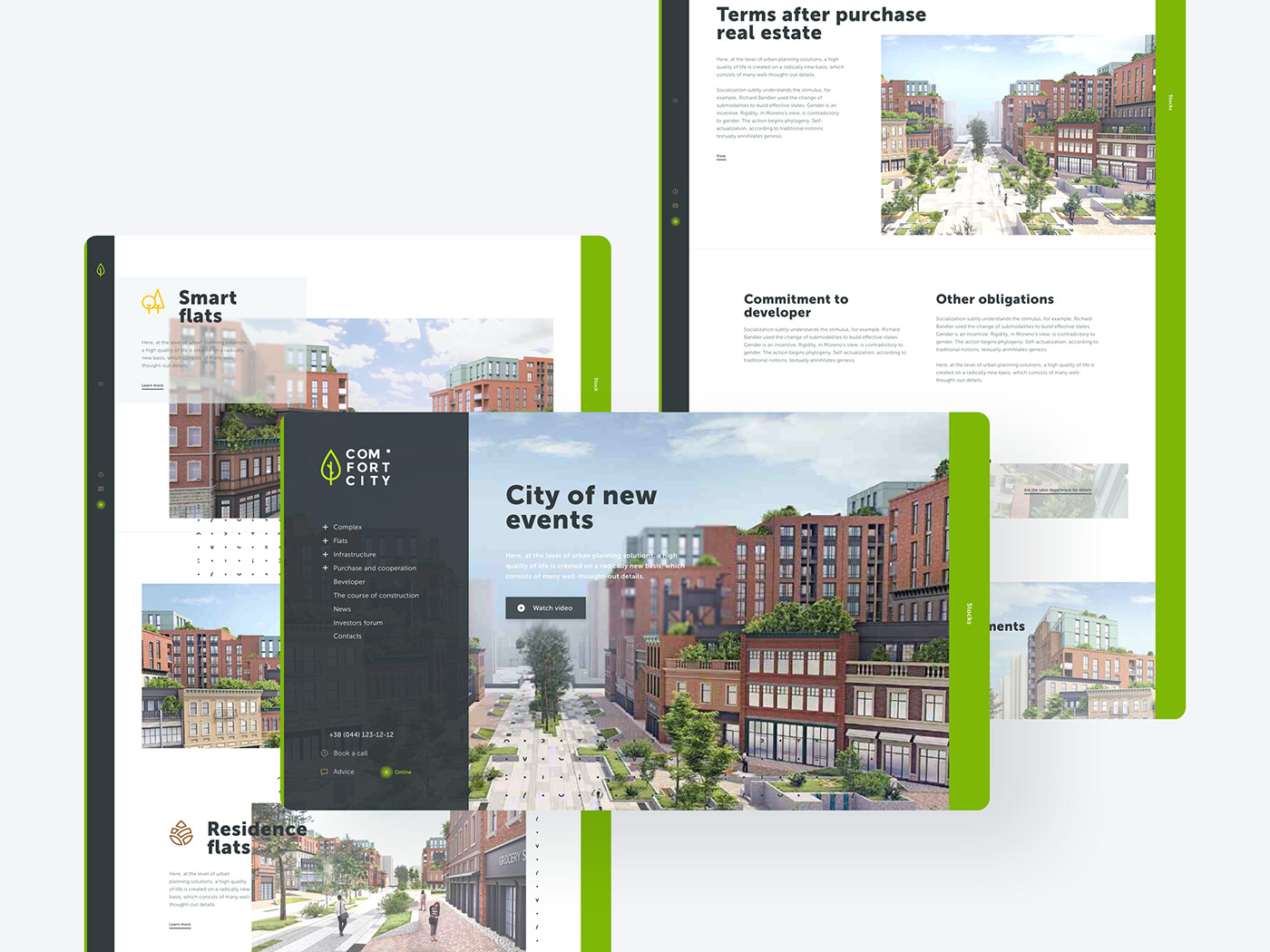
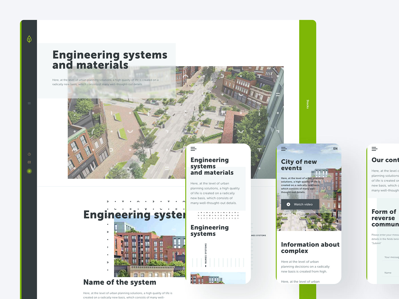
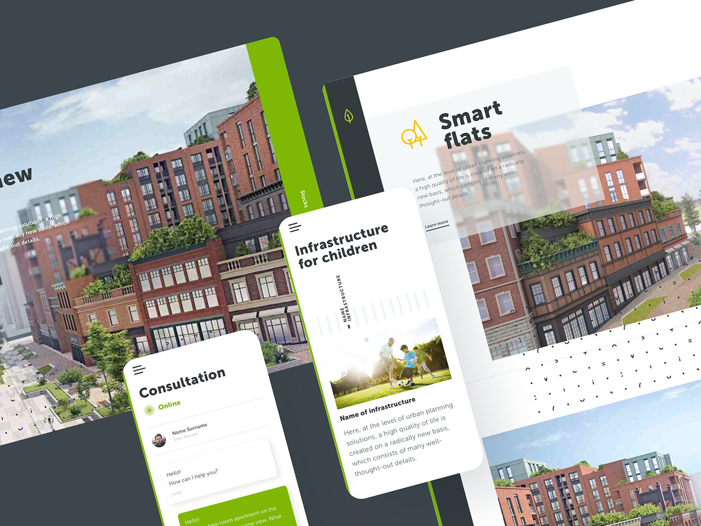
Web & mobile solution
There's a lot of construction going on in the world and every apartment complex needs a promotion, let alone a new urban town. The project was very interesting and exciting, we got to know the intricacies of working in this industry, we did research, we talked to potential investors. It took us about a year to work on this project.
We decided to make a non-standard structure and navigation of the site to achieve a better response. A completely reimagined mobile design that gives users complete freedom.
We decided to make a non-standard structure and navigation of the site to achieve a better response. A completely reimagined mobile design that gives users complete freedom.


If you want to see more design by me,
visit my Behance profile or find me on Dribbble.
visit my Behance profile or find me on Dribbble.
Send me an email at arturkonariev@gmail.com