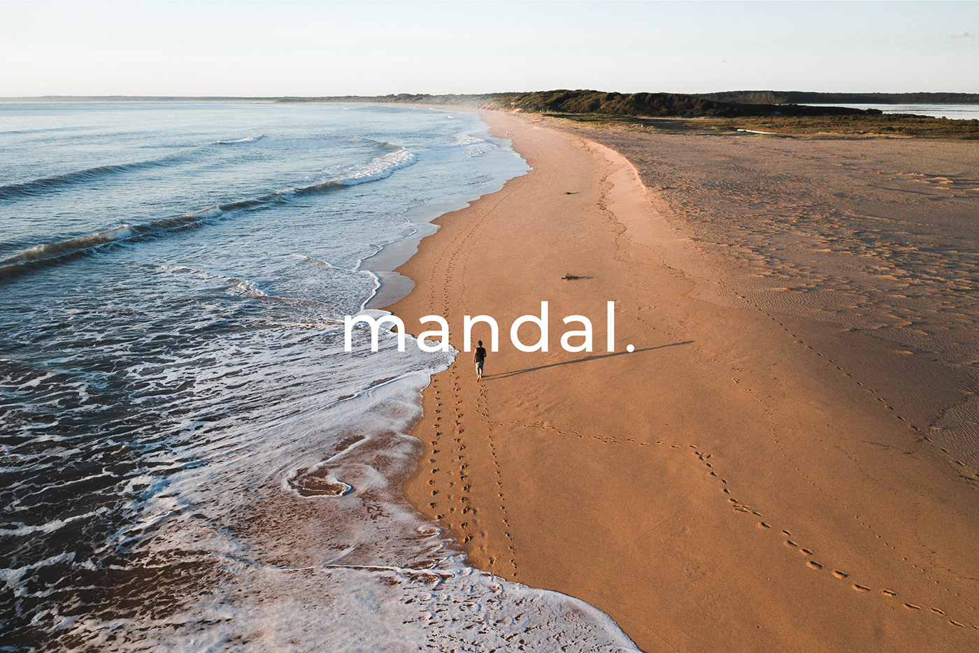


Mandal
Case
The brand name "Mandal" comes from Mandala - Tibetan-Buddhist drawings made of sand. Mandal is an innovative skincare brand founded in Rome, Italy. It is specialised in plastic-free personal care products with plant-based and plant-derived ingredients. Quality, efficiency, and safety are vital for Mandal. The brand's products price is higher than the one of the competitors' due to higher quality of ingredients used in water-soluble drops. Mandal's target group is the younger part of Millenials and the oldest part of Generation Z. People in their 20s, self-educated and responsible, highly inclusive and culturally agile. They highly value sustainable and mindful way of life, relaxed and informal living, as well as they fight for equality and justice. The brand aims to be perceived as "cool" since it possess the features that the target group considers important: open-minded and unconventional; urban and cosmopolitan; authentic, welcoming and trustworthy; authoritative, but friendly; exclusive and relaxed; elegant, but casual.
Solution
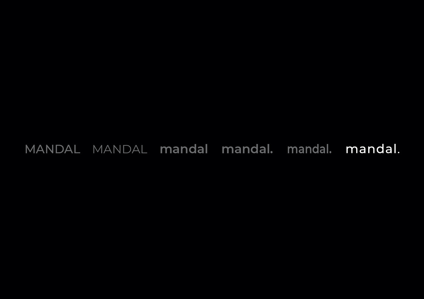
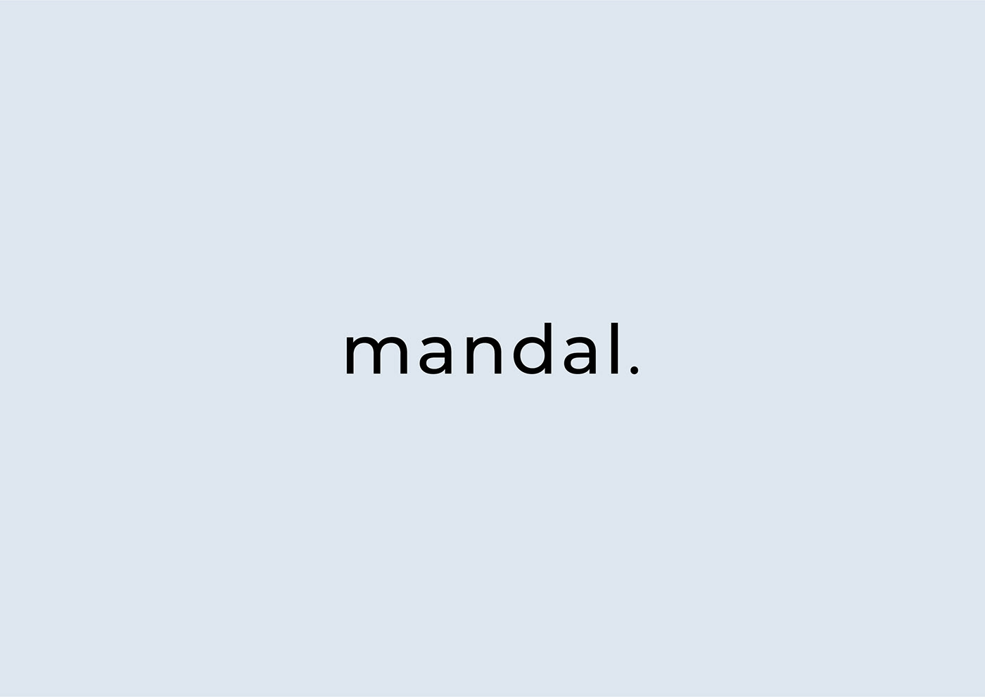
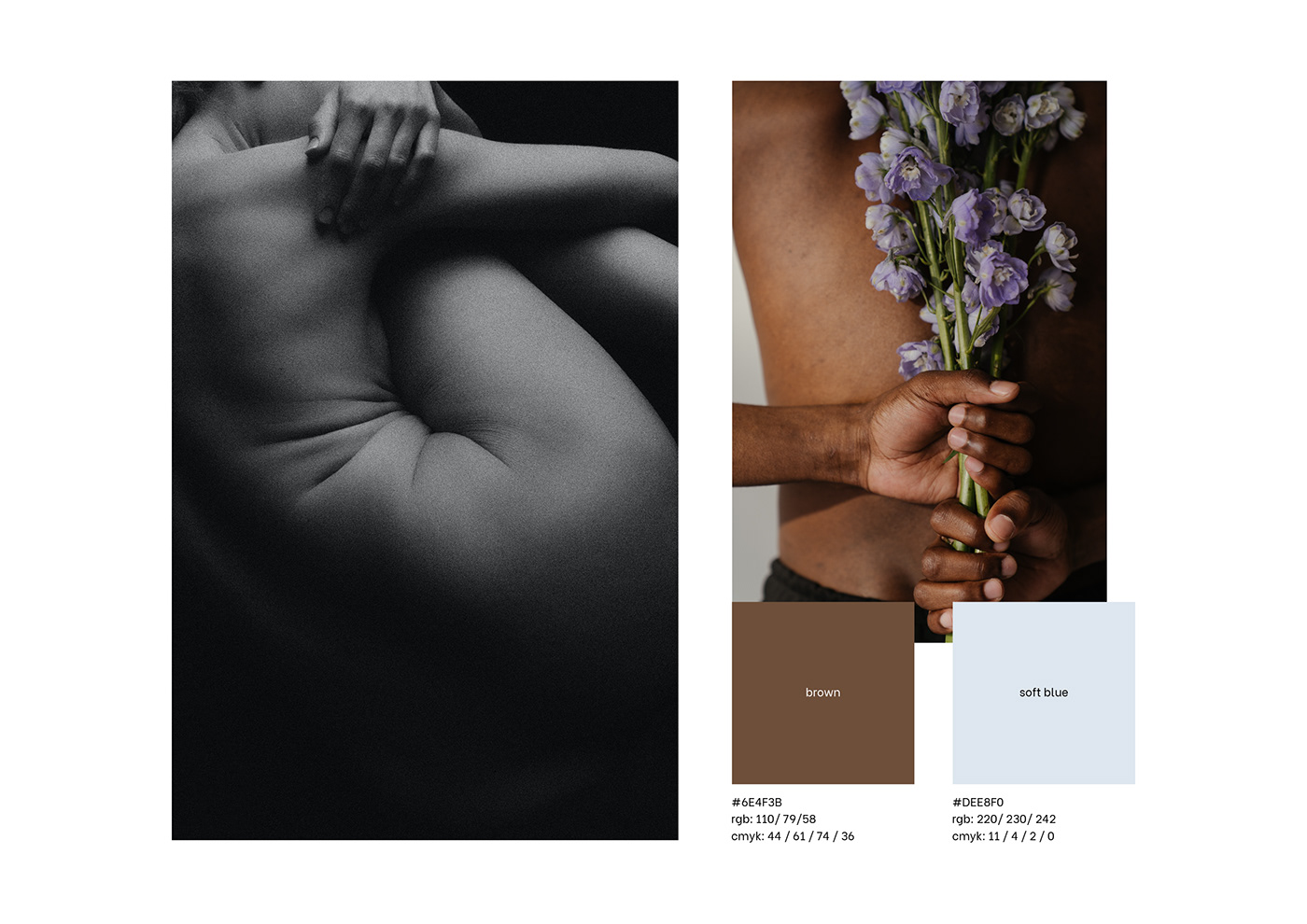
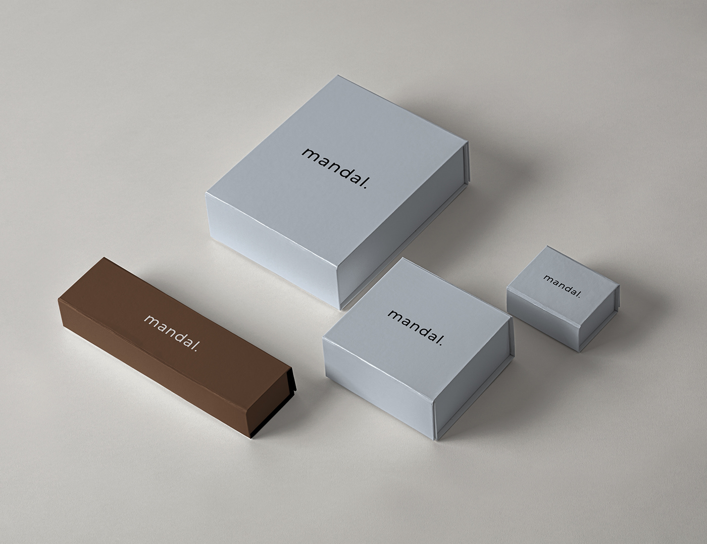
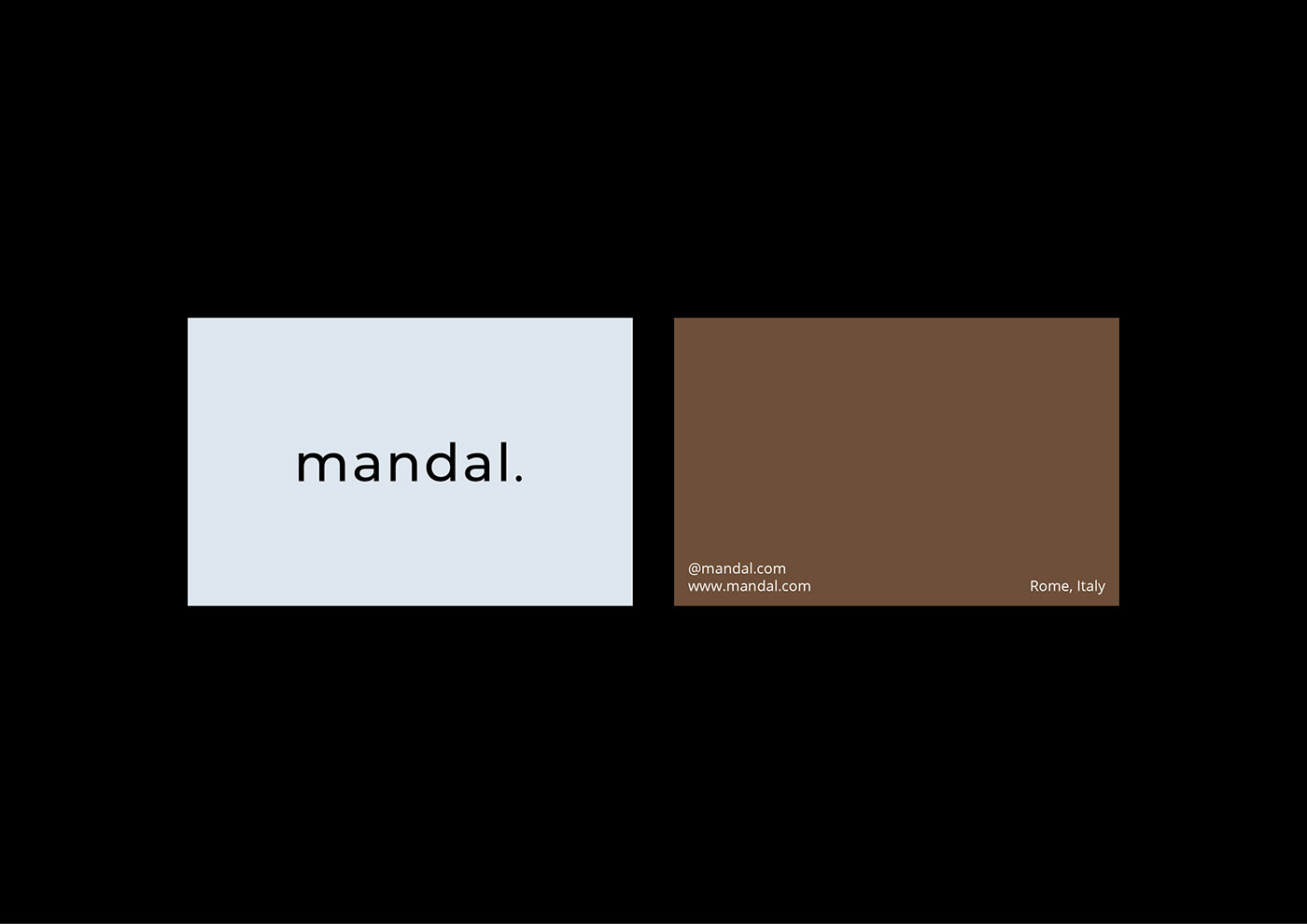
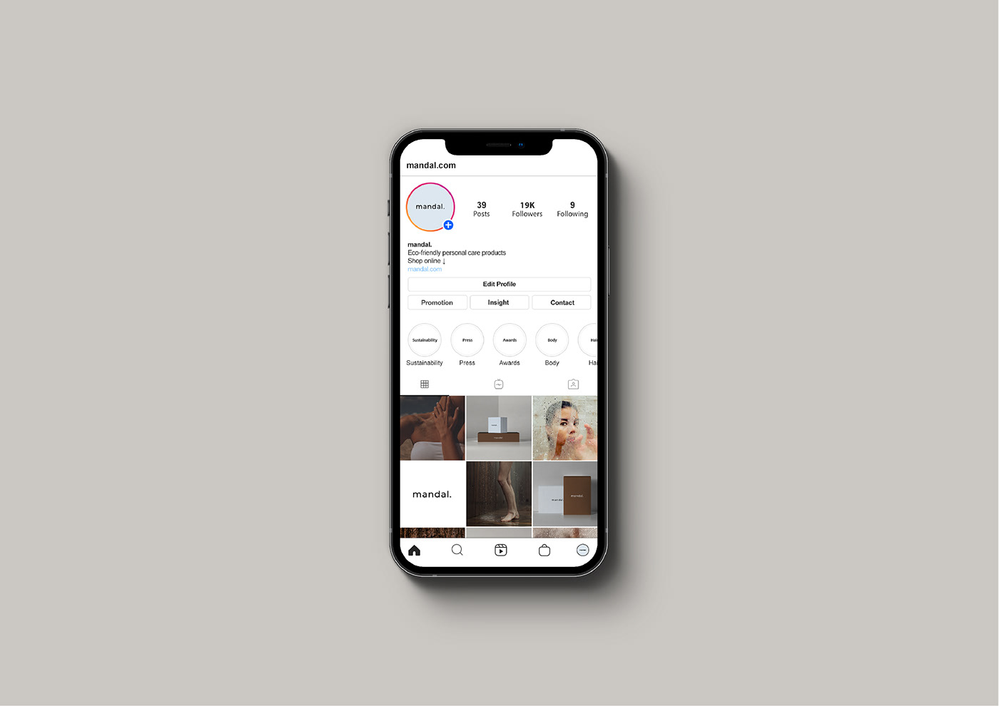
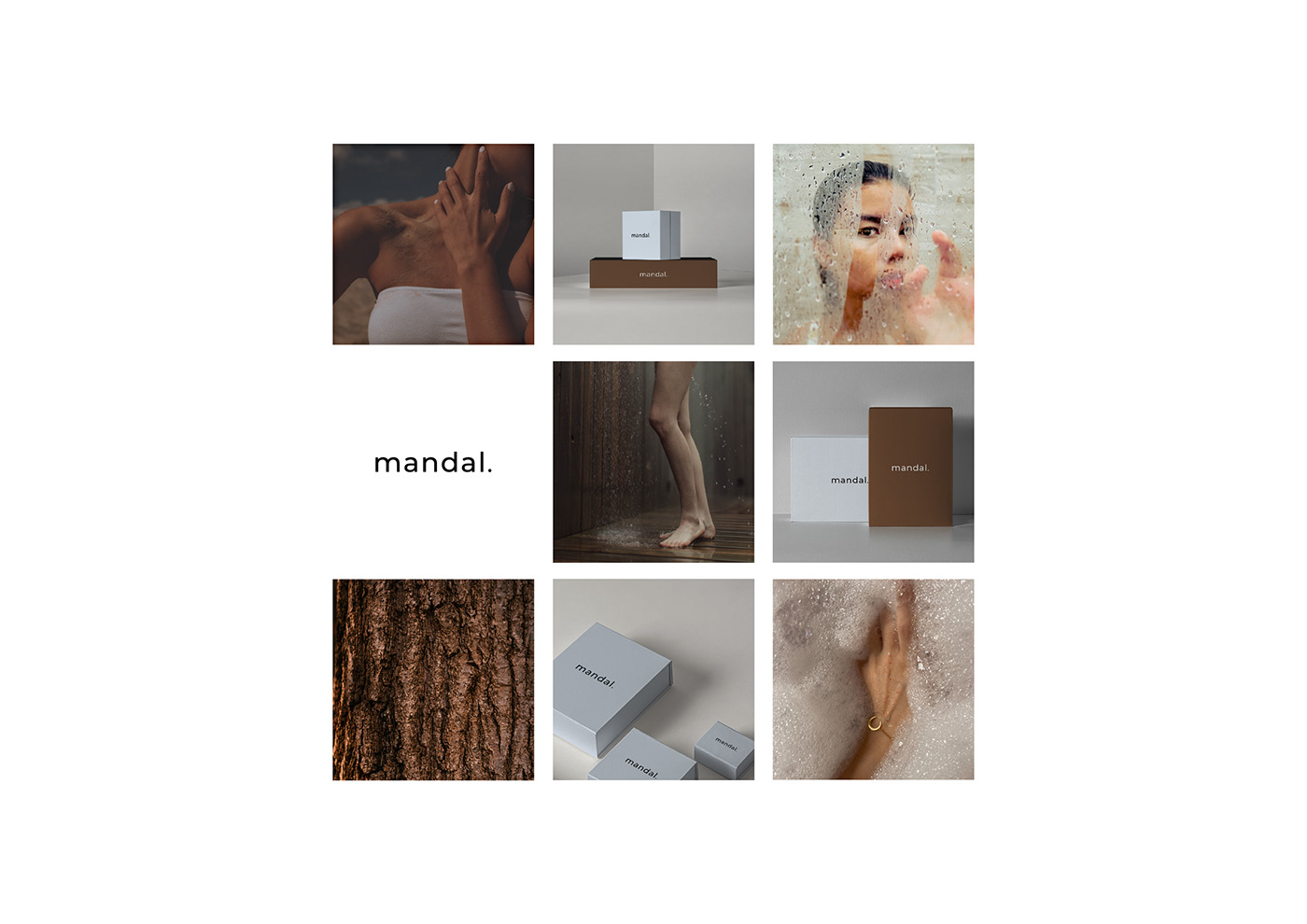
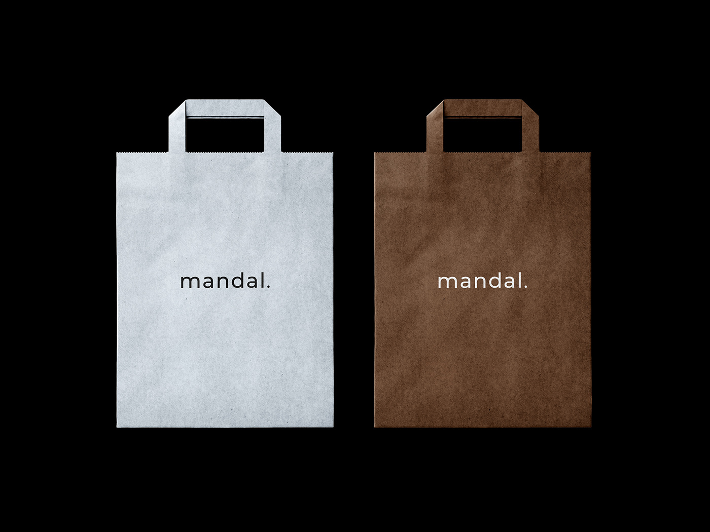
In order to address Mandal to the specific target group and successfully communicate its values, it was decided to avoid vivid contrasts and complex design elements in the brand identity. For the logo, it was chosen a geometric typeface: the letters are straighten and are placed on a measured distance giving the overall composition freedom and modernity. The font weight is medium, what speaks about the balance between the strength and the democratic tone of voice of the brand. The lowercase communicates friendliness, relax, naturalness, and informality, while the dot adds more reliability and confidence to the visual perception of Mandal by its target group. The brand's sustainable approach is communicated through the primary color palette consisting of soft blue and brown shades that are nature derived, and can be associated with watery and earthy elements. Both colors are muted what makes them look contemporary, exclusive, and unconventional. In terms of the psychological matter, blue shades are normally perceived as calm, reliable, and stable, while the light version of that shade adds some elegance to the visual perception. The innovativeness of the concept is supported by the unique text layout, contemporary photography, and the overall minimalist style.