ARITA HEITI Press Kit
아리따 흑채 프레스 키트
/
Brand Typography Book, AMOREPACIFIC
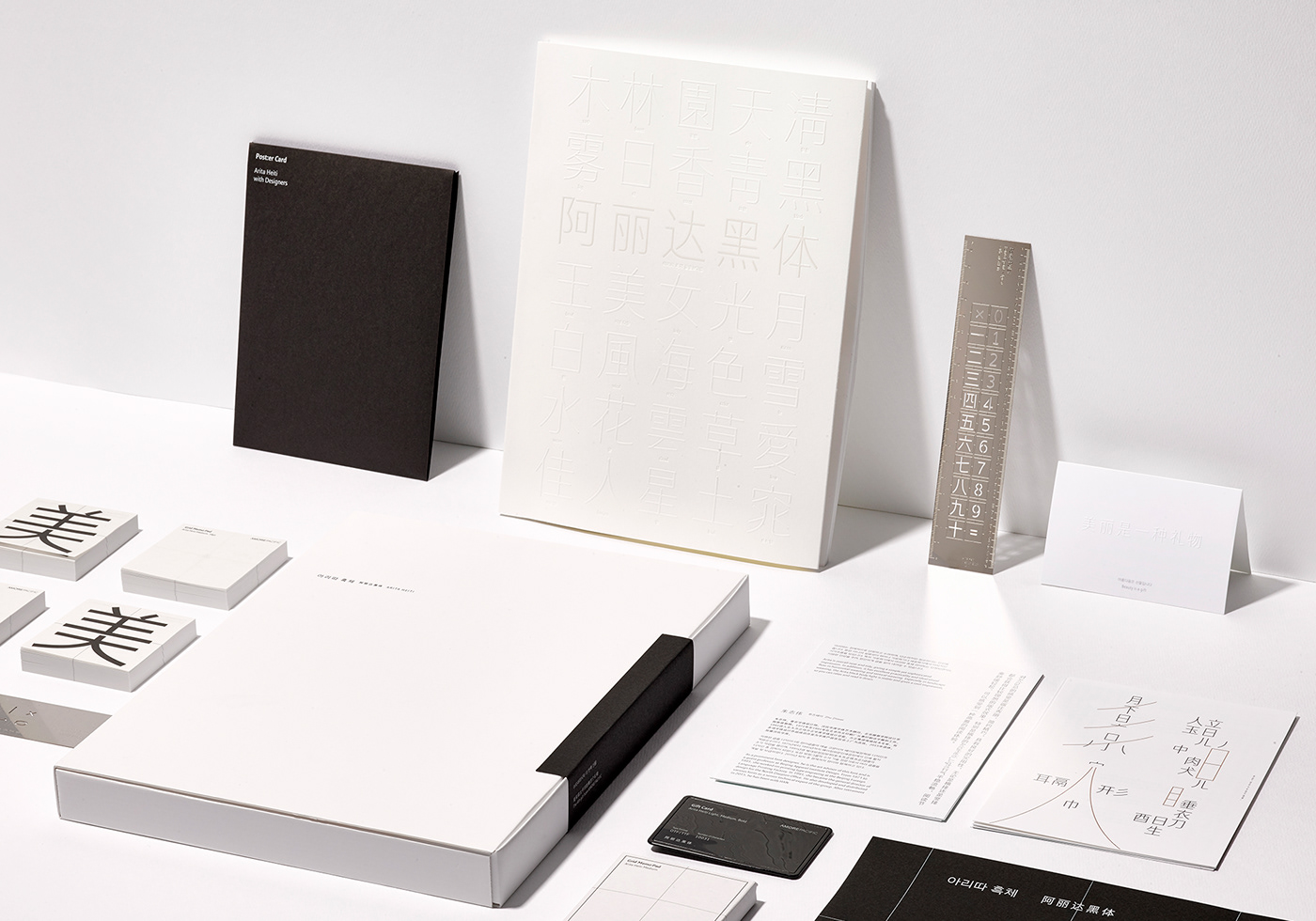
For the last 13 years, designer Ahn Sang-soo and AhnGraphics(AG) Typography Lab have managed the ‘Arita project’, which is to develop a set of typefaces and was commissioned by the Korean cosmetics company Amorepacific, eventually leading to success: Reddot award 2017 winner. Amorepacific and AG Typography Lab embarked on their journey from 2005, and provided each typeface free of charge to the public once development completed. Arita was first heralded with Arita Dotum, then became a complete typeface family with the addition of sibling typefaces—Arita Sans, Arita Buri, and Arita Heiti.
With dreams of providing healthy lives to people all over the world, Amorepacific initiated Arita Heiti project in 2015. Hanyi Fonts and the studio 5 at Beijing Central Academy of Fine Arts participated in designing Arita Heiti as Chinese type design experts. Since Amorepacific considers the legacy of Asian beauty as health solutions, Arita Heiti reflects what define beautiful East Asian women: inner health and elegant figure. Solid structure, beautifully curved strokes, and slender shapes are the embodiments of those qualities. In line with CEO’s belief that “beauty is a gift that changes the world”, Arita Heiti is to be shared from now on.