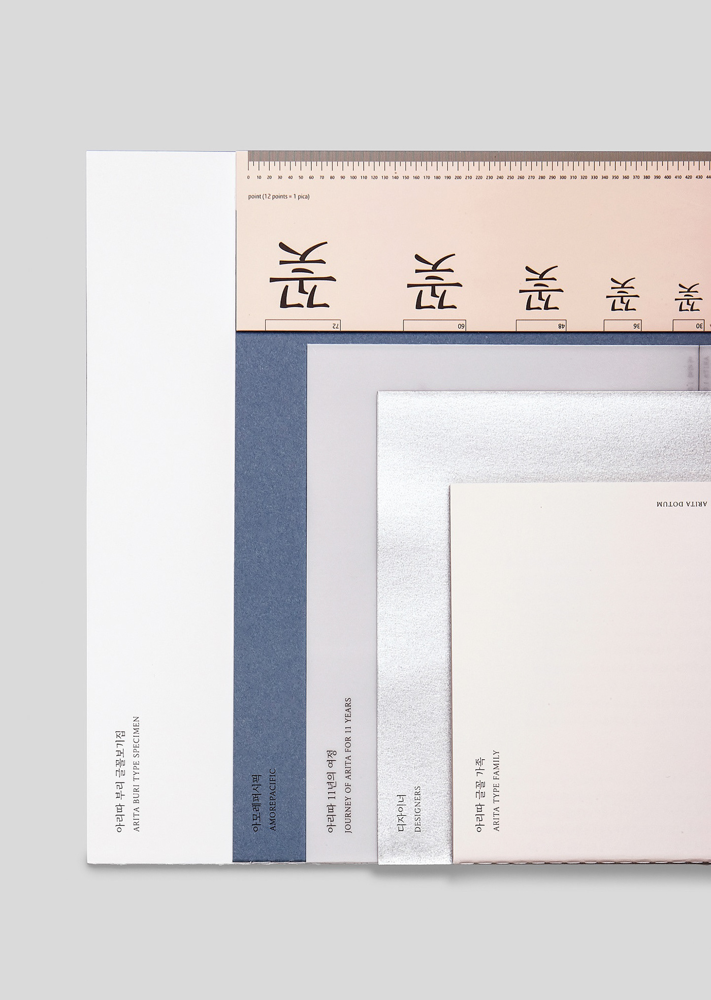
ARITA BURI Press Kit
아리따 부리 글꼴 프레스키트
/
Brand Typography Book, AMOREPACIFIC
Reddot award 2015 best of best.
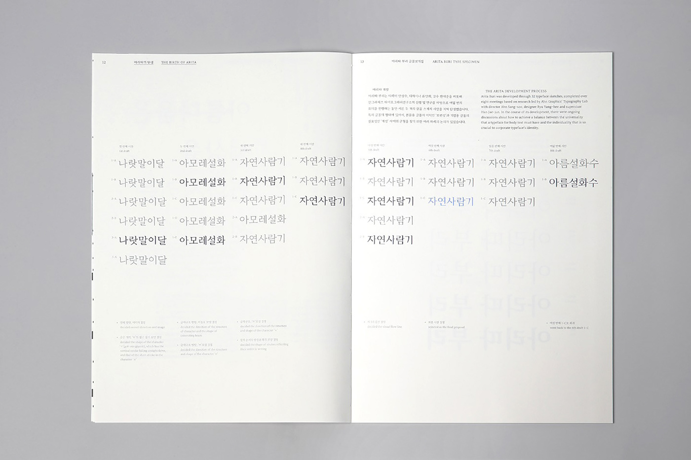
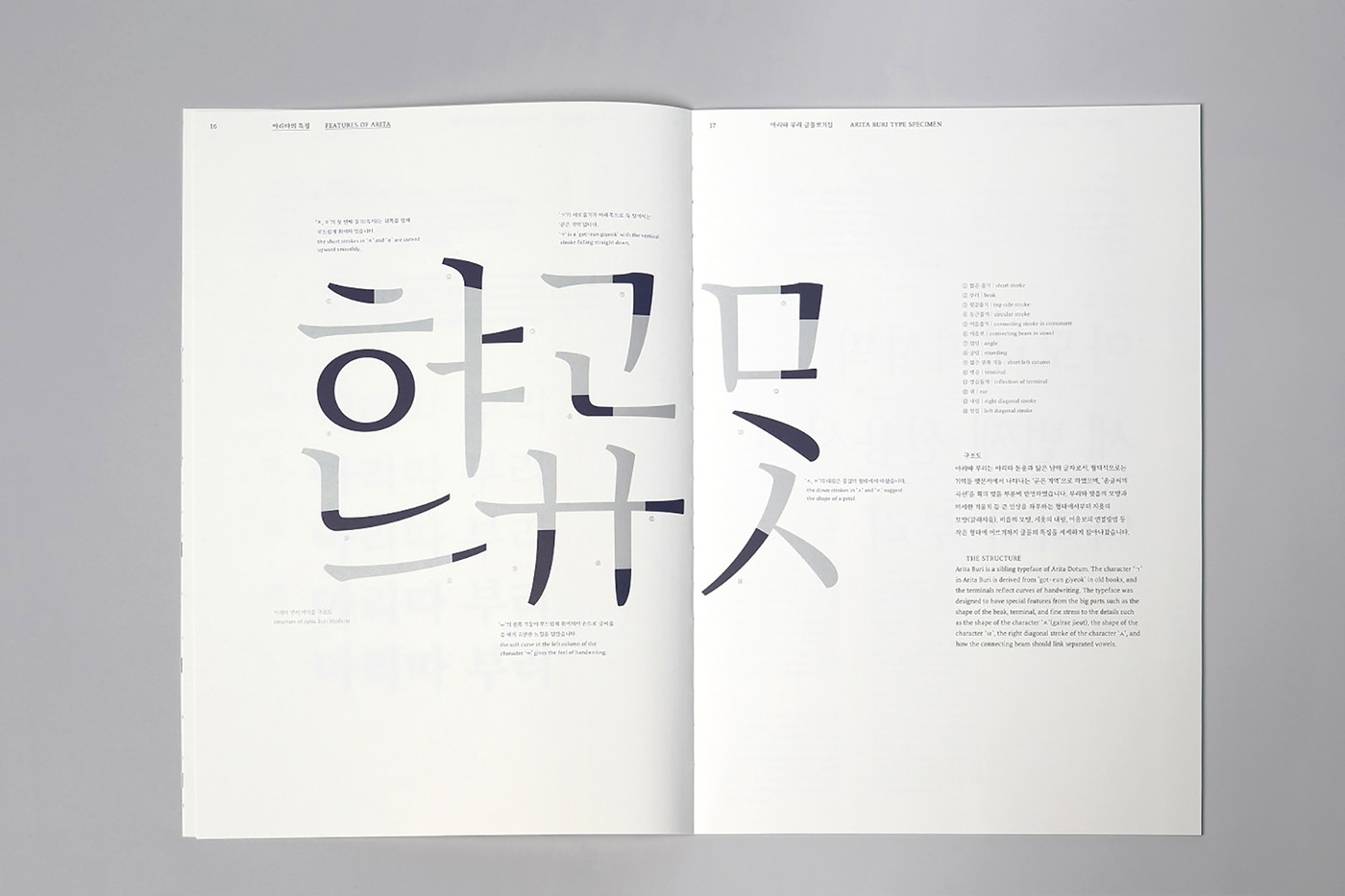
Arita is a set of corporate typefaces for the Korean cosmetics company AMOREPACIFIC. The name Arita is inspired by a verse taken from classic Korean poetry that refers to a beautiful, elegant lady. Arita was heralded already in 2005 with Arita Dotum, a typeface featuring soft curves, and then became a complete typeface family with the addition of the sibling fonts Arita Sans in 2011 and Arita Buri in 2013. While Arita Sans is a Roman font of the humanist sans-serif typeface family with gentle and gracious features, Arita Buri provides various uses and was developed for body text, as it is particular suitable for long sentences. Beautifully curved strokes reflect the movement of handwriting, while elegant yet simple forms aim at conveying the beauty of the different typeface styles. Thus, the font embodies the image of elegant, sophisticated and modern Asian women, merging it with the motif and the interpretation of what the brand pursues, namely “healthy beauty”. Moreover, contributing to the company’s corporate philosophical goals of promoting the values and benefits of culture, the typeface is available to the public free of charge.