
2681QCA TYPOGRAPHY AND PRINT ASSESSMENT 2
2681QCA Typography and Print Assessment 2 was made for students to create a printed publication that is designed to professionally display a selection of fonts. The audience of this publication is targeted to young designers who have an interest in expanding their knowledge in the field of typography. The publication design is aimed to represent a
significant amount of consistent research, experimentation, reflection, and refinement from the knowledge learnt over the duration of the semster. This publications shows the understanding as a student I have acquired on content, determining suitable typefaces, developing page layout designs and typesetting content.
PUBLICATION DESIGN
The design of this publication follows a minimalist approach so it is easily understood by whoever choses to read it. Each page excluding the front and back covers follows a layout that includes 4 columns with a heading is placed in the left corner, this layout serves the purpose that it is visually appealing and differs from the standard 1 or 2 columns. It has the pop of colour of green to break up the simple colours of black and white and showcase to viewers the importance of adding bright colours to make certain text stand out. The fonts that are included in this publication are Georgia as the body copy and Kepler std, Bebas Neuve and Hero New as the display fonts. Even though all this fonts are different they work perfectly together to showcase various typefaces and the impact they have in publications. The fonts size for the heading of each essay is 36 and the body paragraphs are written with a font size of 10. Overall, this publication takes a simplistic approach with a modern twist which appeals to young designers and shows how important typography rules for upcoming designers in the twenty first century.
DRAFT LAYOUT.
When creating the template, the draft established that the one column did not achieve the modern and eye catching look that I was aiming for so that is when the second draft of 4 columns was created and remains evident in the final publication.


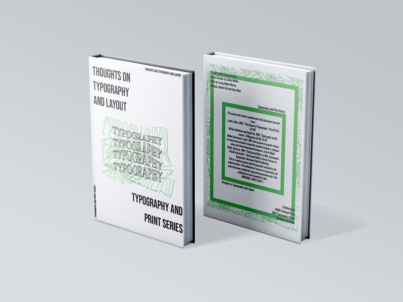
COVER AND BACK COVER
This part of the publication had the aim to be eye catching and gives a taste of what is to come within the publication. To plays with a variation of font sizes ranging from 16 to 60 to achieve a bold effect. It uses the font Bebas Neuve which is the same as the font used in the essay grid systems.


`REFERENCES
Beatrice Warde
As a publicist for the Monotype Corporation, one of the leading typeface manufacturers, Beatrice Warde filled lecture halls from the 1930s to the 1950s, speaking to printers, typesetters, teachers, and students. Quite literally, she brought art to the masses. Through her prolific lectures and essays, she rose to meet the towering issue of the day—functionalism—with an approach based on tradition. In her mind, classical approaches to typography were not shackles to be cast aside but valuable history that should inform new work.
Josef Müller-Brockmann
Josef Müller-Brockmann divided and ordered graphic design into the grid of Swiss typography. He took design elements that were subjective, irrational, and chaotic and brought them under tight, measured control. He delved deep into form and content, spending his life in Zurich paring down his work to the essentials necessary for what he considered an objective—even timeless—method of communication. The grid was key to this pursuit. His intense quest to achieve a universal system of communication calls to contemporary designers seeking ideal global forms for the world of new media.
Ellen Lupton
Ellen Lupton gave graphic design a new vocabulary. Through her seminal books and exhibitions, she took key theoretical ideas encompassing art, literature, and culture and applied them to our profession. When people want to understand design, they turn to Lupton. Beginning in 1992, she served as contemporary design curator for the Cooper-Hewitt, National Design Museum. In 2003 she launched a graphic design MFA program in Baltimore at the Maryland Institute College of Art. Through her work at these institutions and through her prolific writing, she has opened up the discourse of design to the general public.
Katherine McCoy
Katherine McCoy galvanized the design community during the late 1970s and 1980s. Under her leadership, experimental work undertaken at Cranbrook Academy of Art in Michigan transformed graphic design into provocation. Balking against the modern constraints of Swiss typographic systems, her students ushered in a period of complexity, ambiguity, and subjectivity. Moving beyond the more formal radical experimentation of Wolfgang Weingart, McCoy explored “new relationships between text and image.” The resulting multilayered, personal work consciously provoked interpretation from the audience. Modernism’s emphasis on form gave way to a highly individuated study of expression. Typography became discourse to be evaluated and discussed within the dense cultural context of philosophy, linguistics, and cultural theory.
Bibliographies sourced from Armstrong, Helen (ed). 2009. Graphic Design Theory: Readings from the Field. Princeton Architectural Press, New York.
Notes from Science of Typographyby Ellen Lupton
D. G. Paterson and M. A. Tinker, “Studies of Typographical Factors Influencing Speed of Reading: II. Size of Type,” Journal of Applied Psychology, 13, 2 (1929): 120–30.
D. G. Paterson and M. A. Tinker, “Studies of Typographical Factors Influencing Speed of Reading: X. Style of Type Face,” Journal of Applied Psychology, 16, 6 (1932): 605–613.
Daniel Boyarski, Christine Neuwirth, Jodi Forlizzi, and Susan Harkness Regli, “A Study of Fonts Designed for Screen Display,” CHI98, 18–23 (April 1998). Not paginated.
John D. Gould, Lizette Alfaro, Vincent Barnes, Rich Finn, Nancy Gischkowsky, and Angelo Minuto, “Reading is Slower from CRT Displays than from Paper: Attempts to Isolate a Single-Variable Explanation,” Human Factors, 29, 3 (1987): 269–299.
John D. Gould, Lizette Alfaro, Rich Finn, Brian Haupt, and Angelo Minuto, “Reading from CRT Displays Can Be as Fast as Reading from Paper,” Human Factors, 29, 5 (1987): 497–517.
Robert L. Duchnicky and Paul A. Kolers, “Readability of Text Scrolled on Visual Display Terminals as a Function of Window Size,” Human Factors, 25, 6 (1983): 683–692.
Study by Kolers et al, cited in Carol Bergfeld Mills, and Linda J. Weldon. “Reading Text from Computer Screens,” ACM Computing Surveys, 19, 4 (December 1987): 329–358.
