Groupe CHEVAL changes its visual identity.
A new brand image for the first public benefit corporation in the French construction sector
A new brand image for the first public benefit corporation in the French construction sector
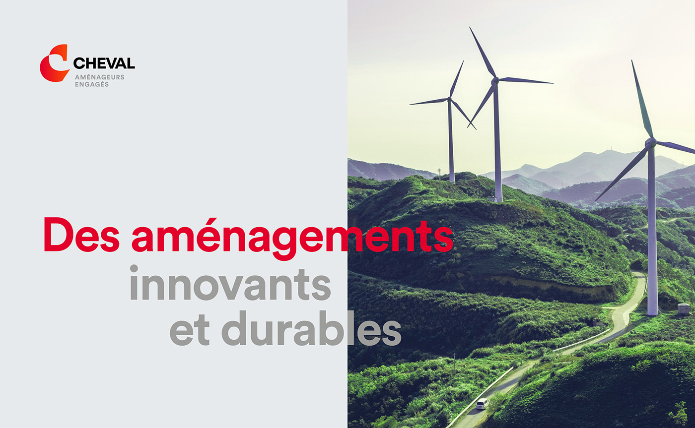
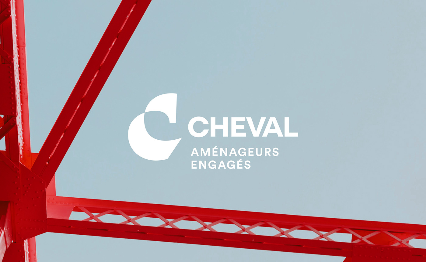
On 16 December 2020, Groupe CHEVAL became the first construction company in France to acquire the status of a public benefit corporation. Their new tagline "committed land developers" embodies the Group's raison d'être. Groupe CHEVAL is a collective of localized companies. The mission of its employees is to work towards a better future. Their ambition is to develop territories sustainably and to contribute to the ecological transition.
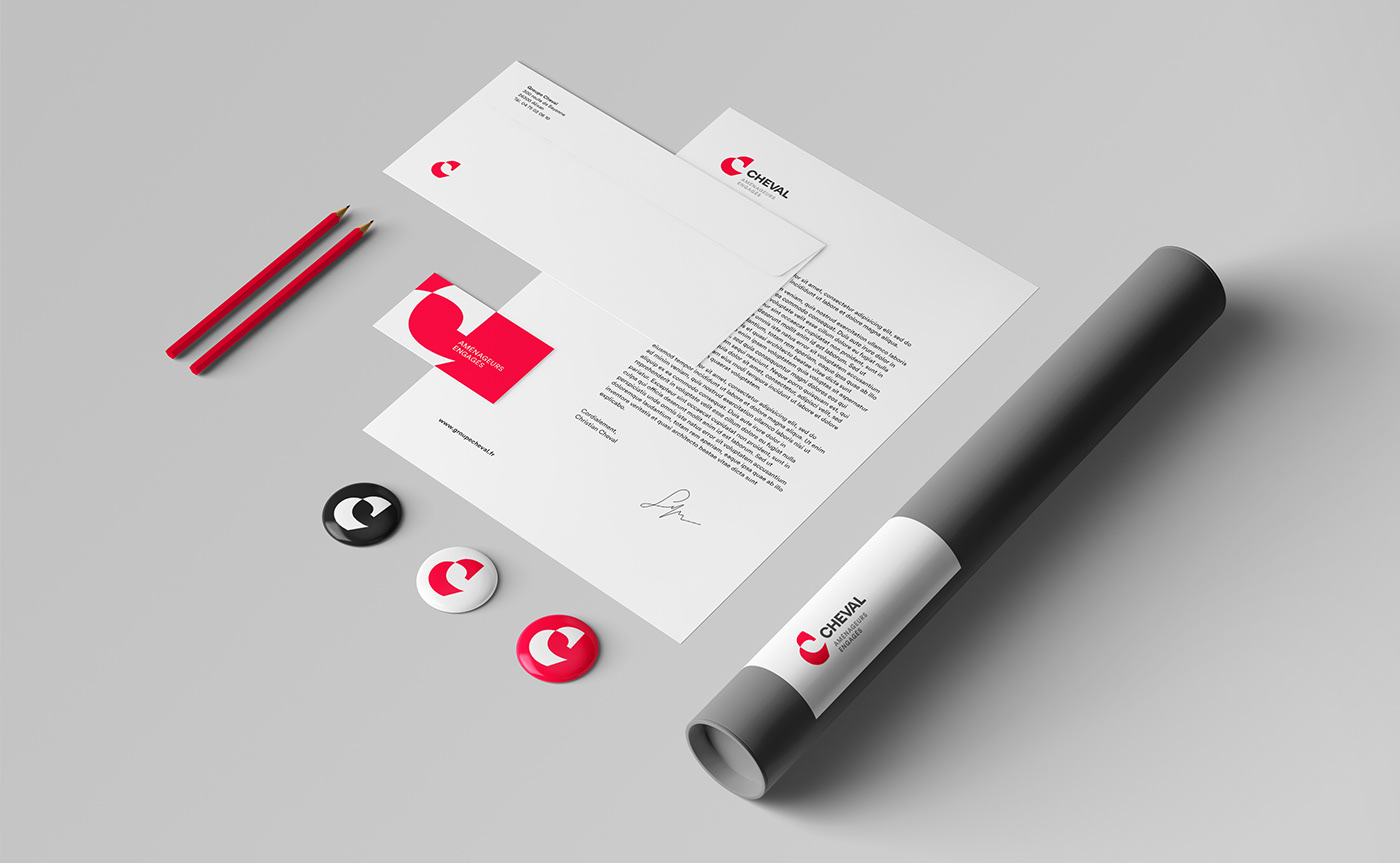
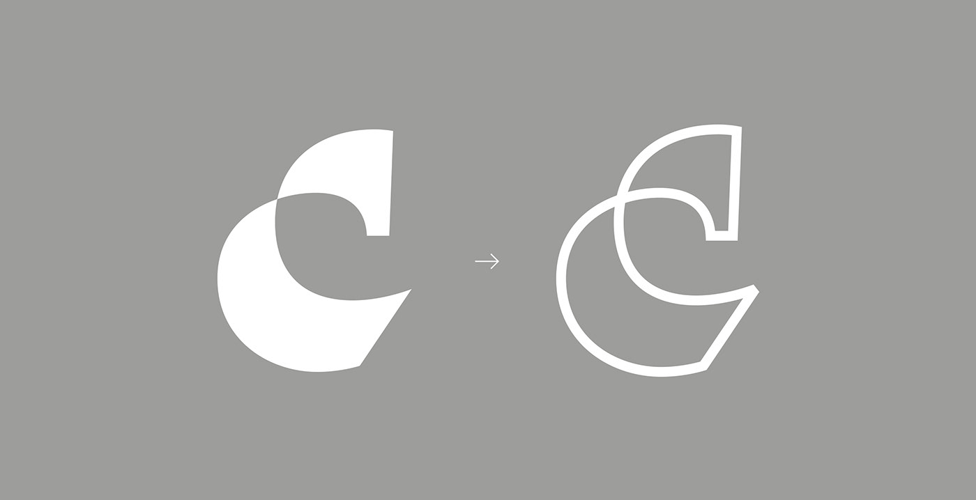
The previous logo represented the road infrastructure, but the ideas of environment, landscape and biodiversity preservation were absent. In order to be in line with the group's vision and purpose, Graphéine helped Groupe CHEVAL to transform its logotype and graphic guidelines.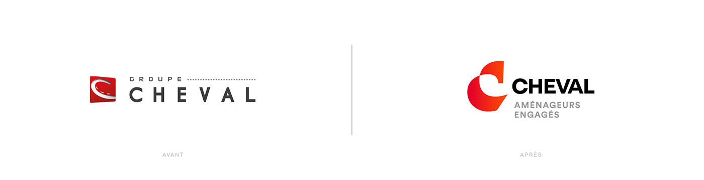


A strong and smart new emblem with meaning
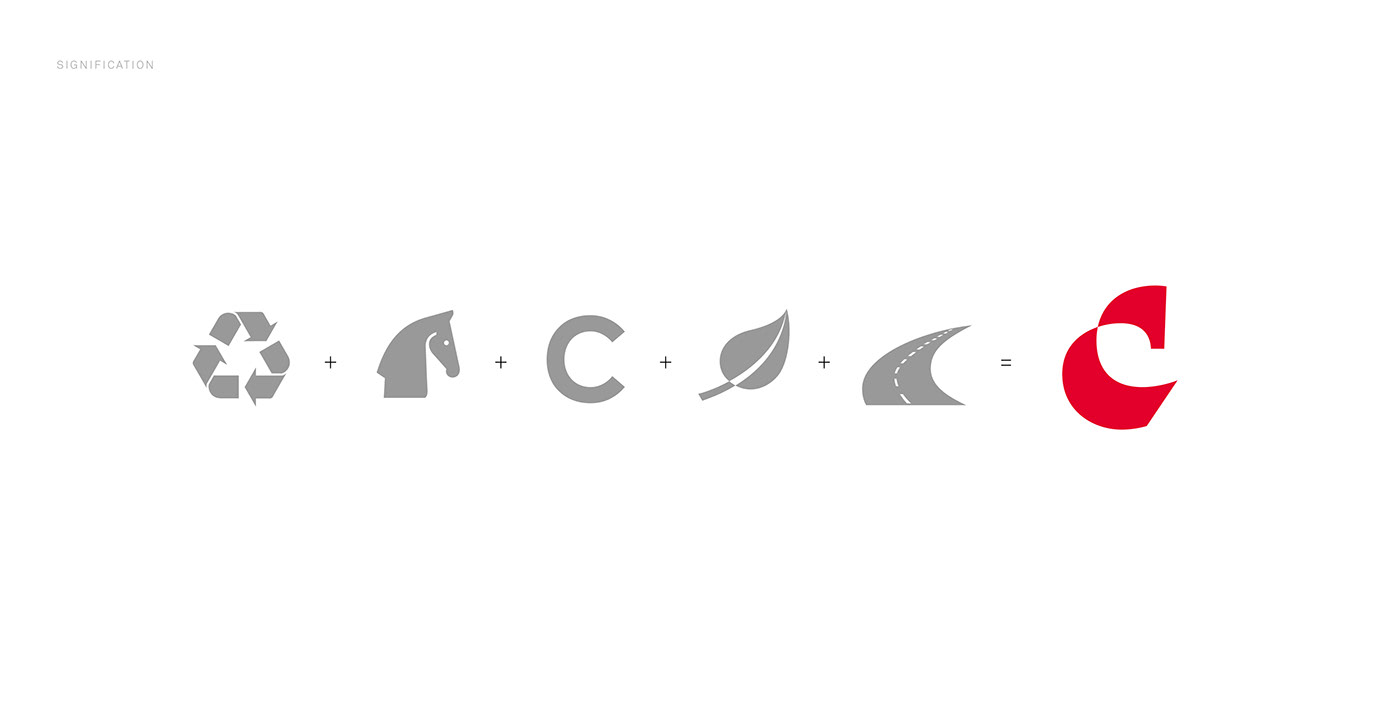
By analysing the logos of competing construction companies, we found that the majority of their emblems use a pure, simple form with a flat colour treatment.
There is no embellishment or layering in these symbols in order to avoid complexity.
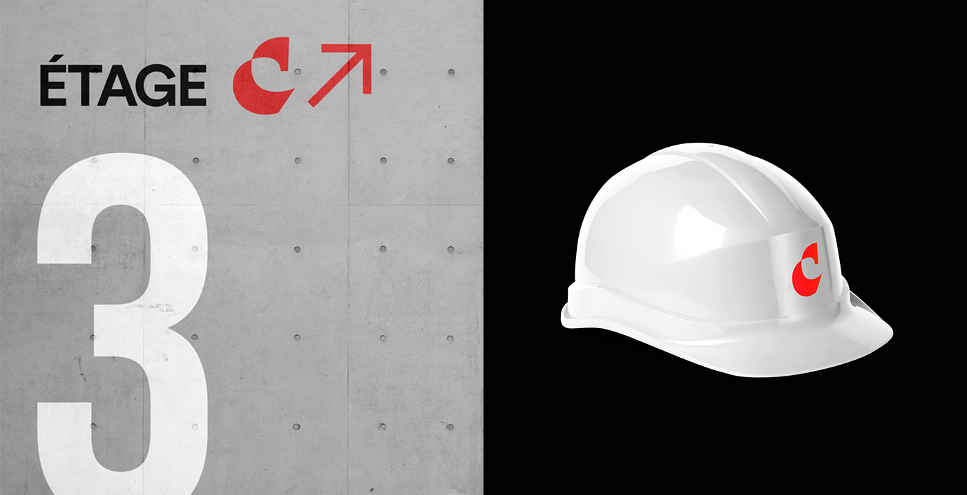
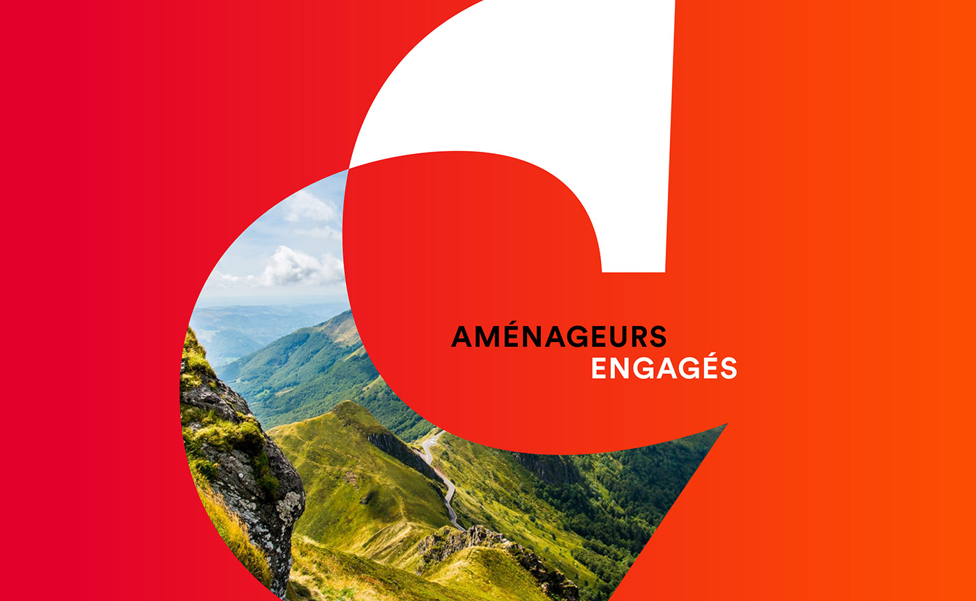
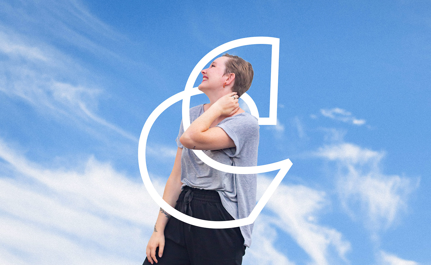
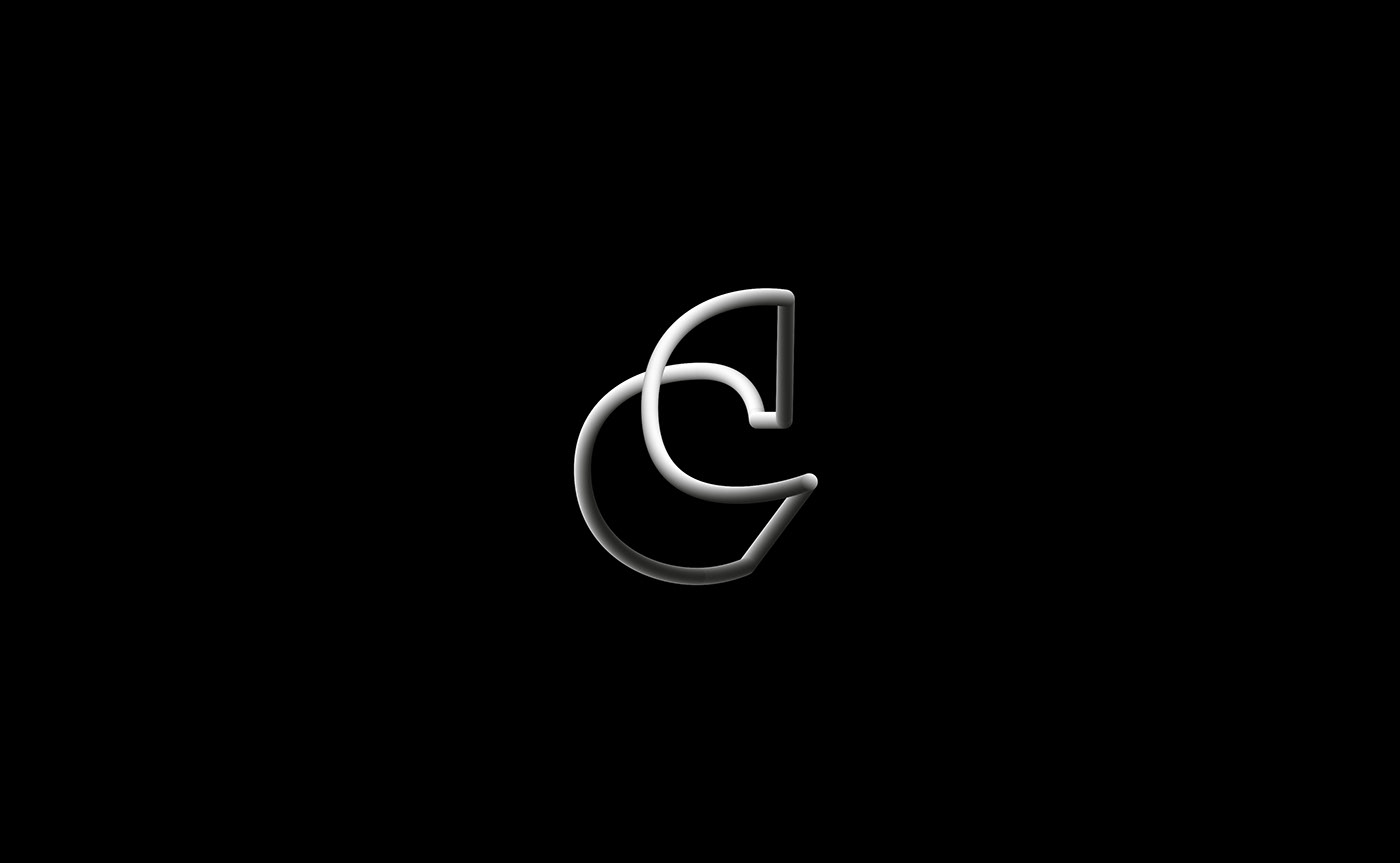
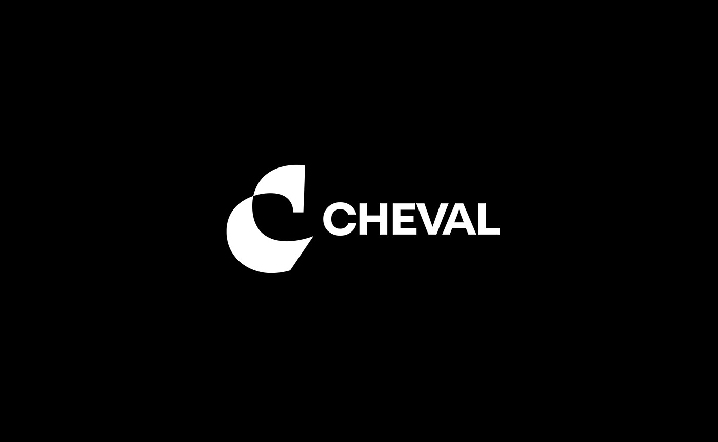
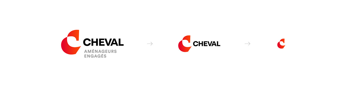
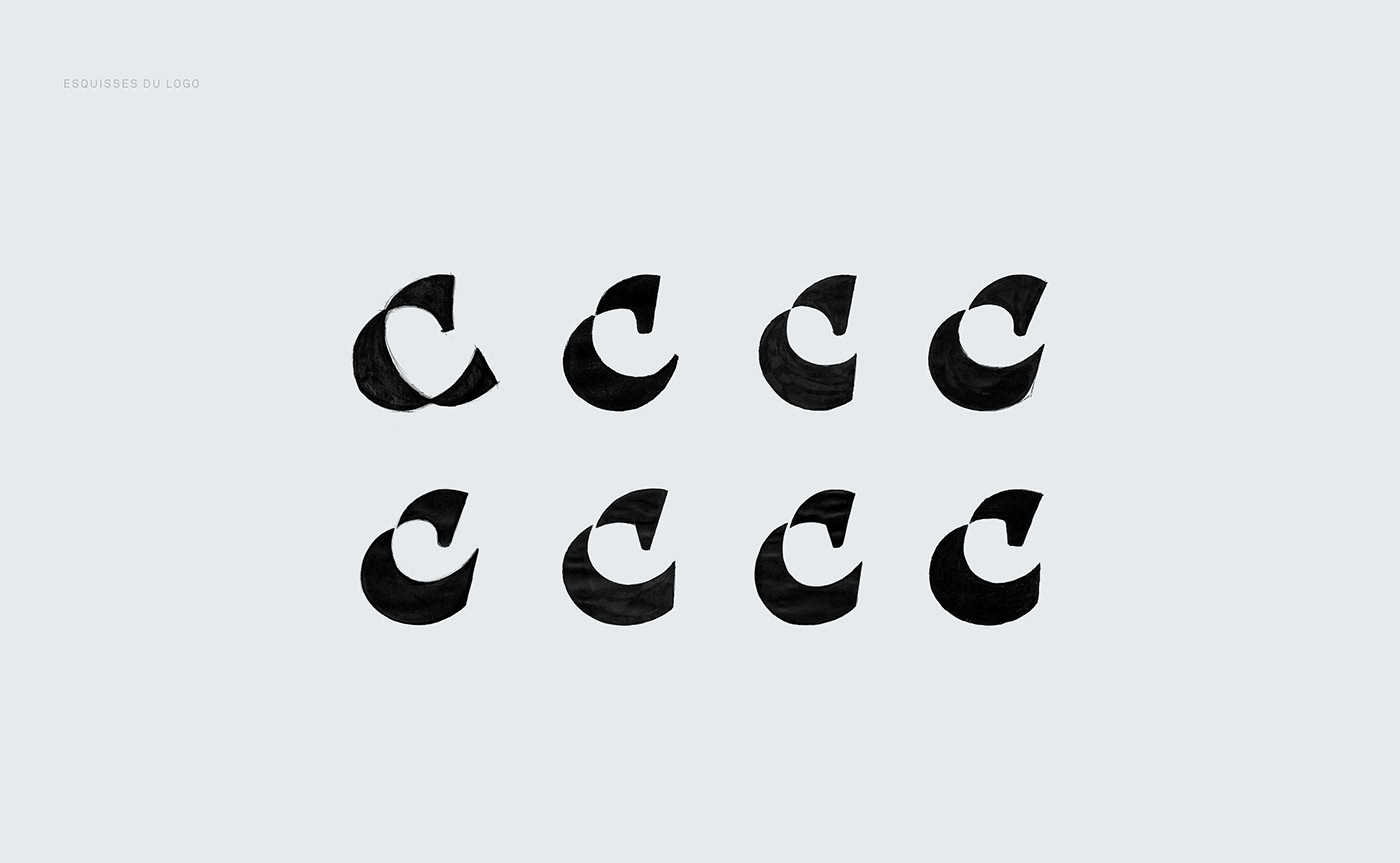
The redesign of the logo retains the idea of a dynamic "C" letterform, while removing the "horseshoe" resemblance and replacing it with a more fluid and aerodynamic design. Its shape evokes the lightness of a waving ribbon. By cleverly stylizing the terminal of the letter "C" we created a minimalist rendering of a horse's head. This horse head is a subtle nod to the company name (Cheval meaning ‘Horse’ in french). It also acts as the spirit animal of the brand, embodying dynamism and agility.
The highly minimalist design of the horse's silhouette is intended to be ambiguous. The horse silhouette might be more or less identifiable depending on who you talk to. This ambiguity adds to the intrigue of the symbol and works to hold the viewer’s attention.


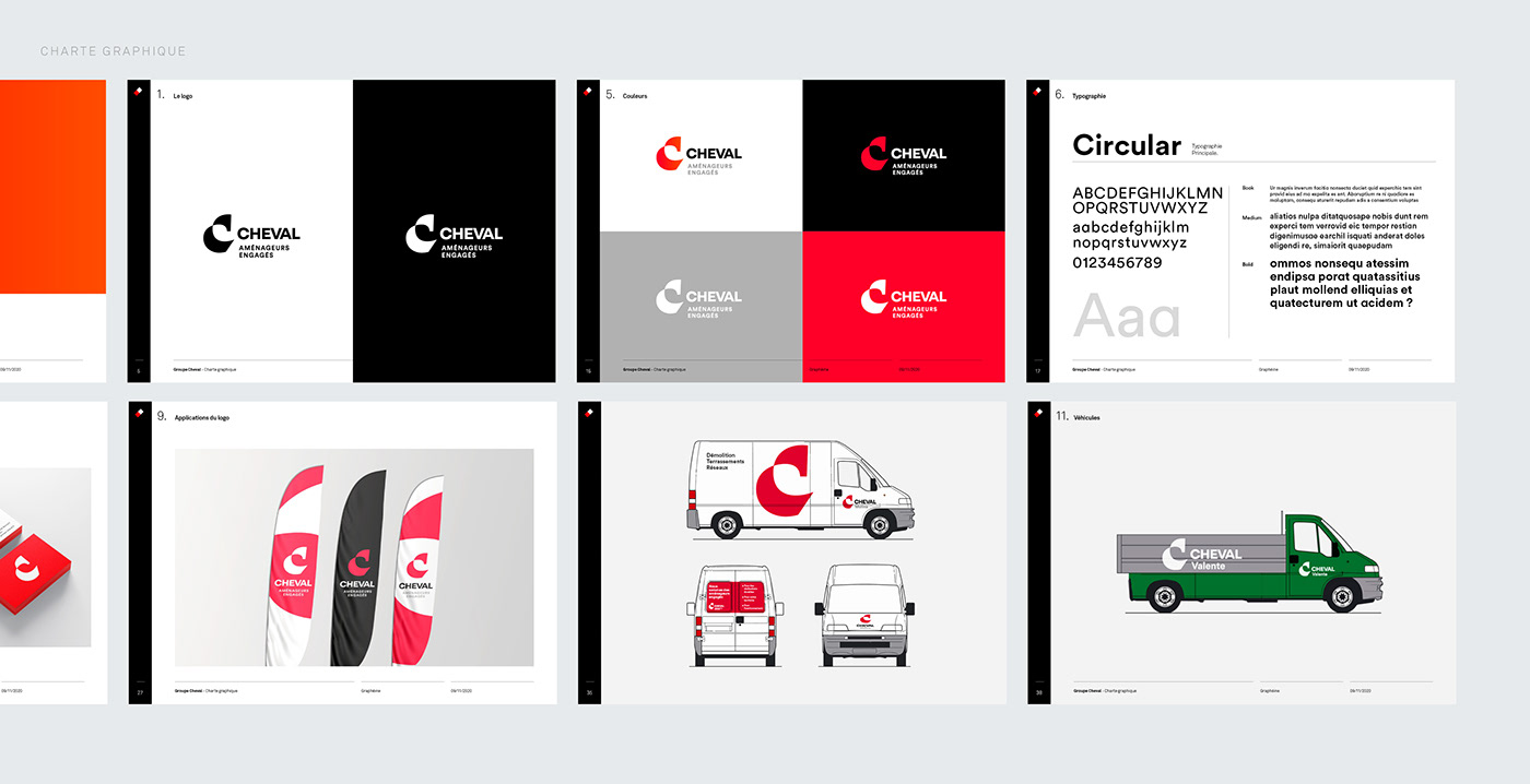
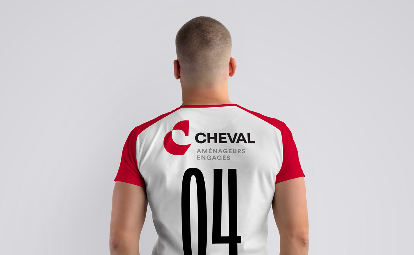
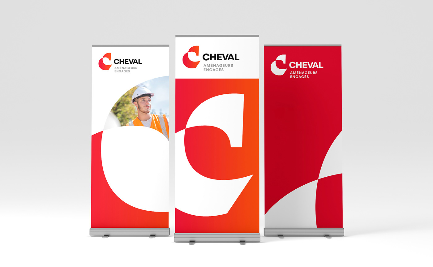
A new, more inclusive brand architecture for the subsidiary firms
The new logo design of the 14 subsidiary firms marks the beginning of a new era for Groupe CHEVAL. Besides the new logo and colours, this redesigned visual identity helps to:
- acknowledge Groupe CHEVAL’s brand DNA
- reinforce the unity of its different brands,
- assert that the Group brings together 630 people committed to sustainable development, for the territory and the environment,
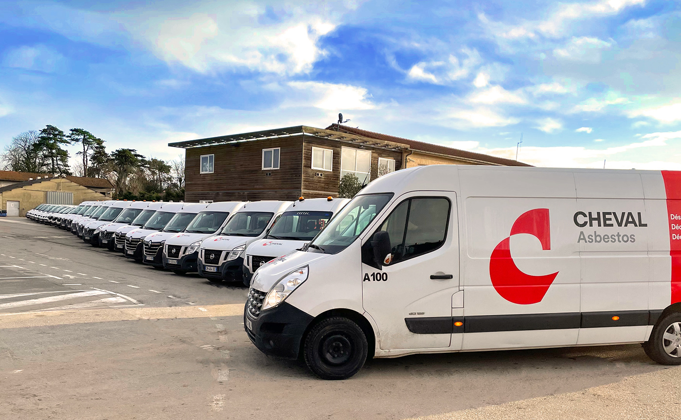
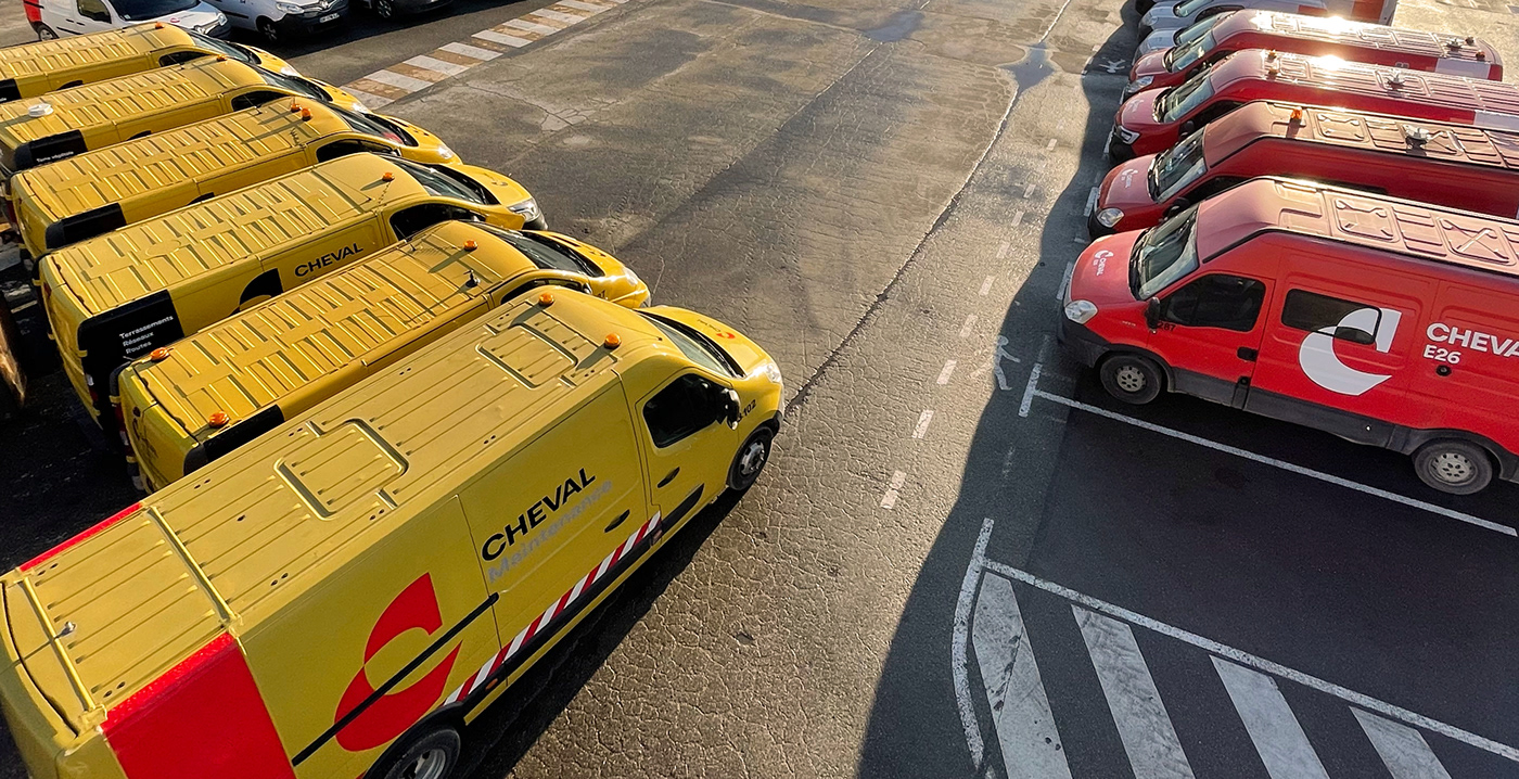
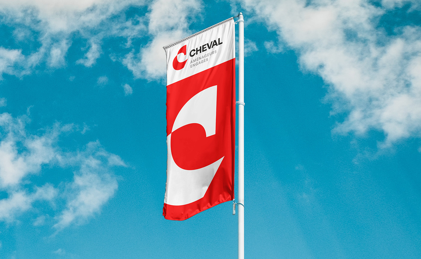
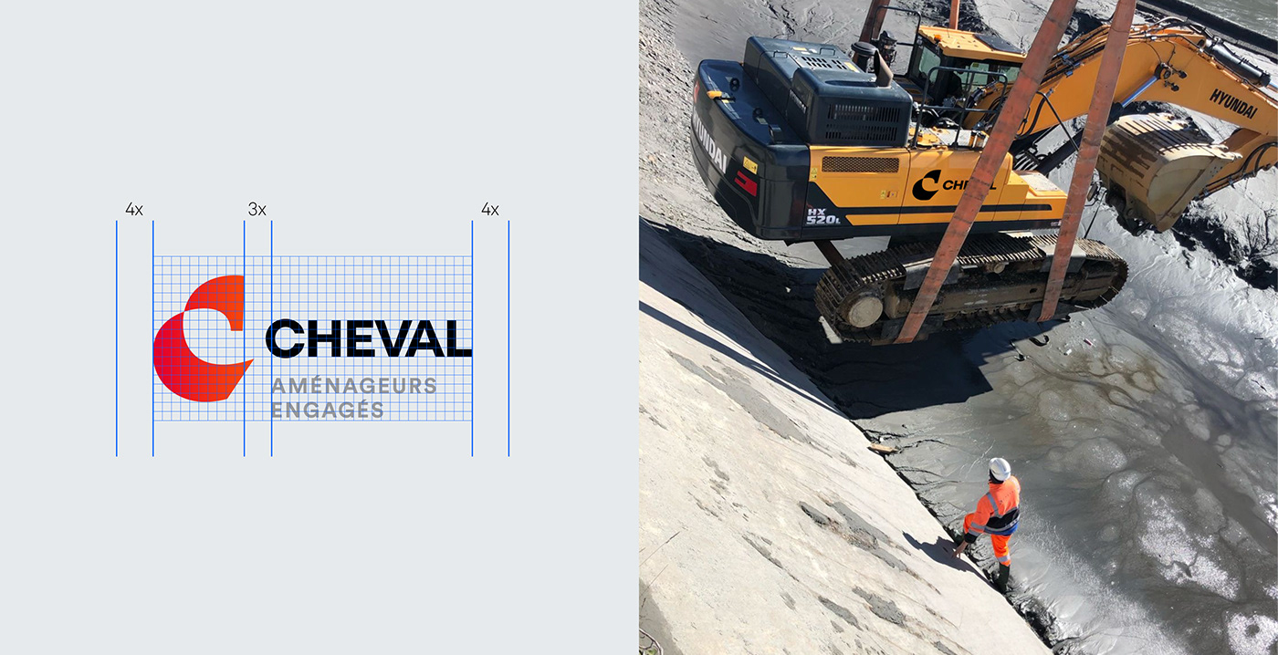
- create a new visual signature with a strong impact, especially as seen on the Group’s vehicles.
(Groupe CHEVAL's fleet of 600 vehicles produced by Smart Cover)
- acknowledge Groupe CHEVAL’s brand DNA
- reinforce the unity of its different brands,
- assert that the Group brings together 630 people committed to sustainable development, for the territory and the environment,
- create a new visual signature with a strong impact, especially as seen on the Group’s vehicles.
(Groupe CHEVAL's fleet of 600 vehicles produced by Smart Cover)