
Hiszpańska Książka is a polish bookstore that is a part of "La Mancha", a polish language school specialized in teaching spanish to polish people, so, the bookstore shares the same goal, to provide literature and text books in spanish, hence their name, it translates to "Spanish book".
The owner contacted me to create a logo for this new business that should connect visually with the language school but should also have its own personality, so to speak. She allowed me to be creative an develop a concept for this icon, beyond the typical book.
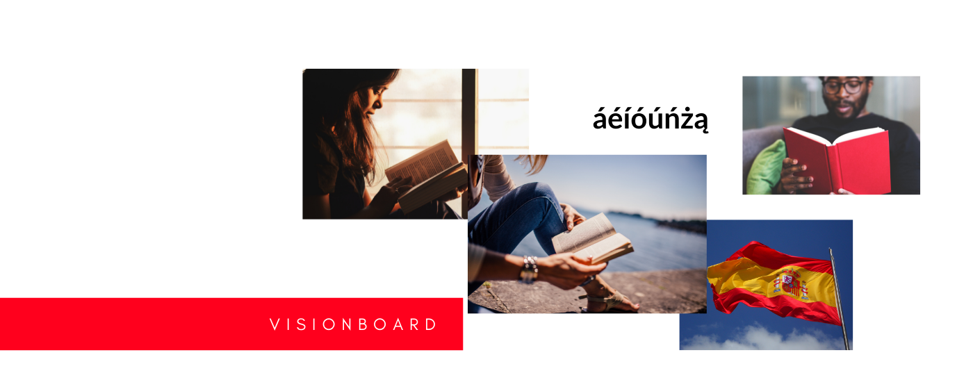
The main idea on the visionboard was to emphasize the action, to read, we decided to maintain the main brand´s colour palette which relates to the Spanish flag and also, I included a "tilde" that little accent on top of a letter that you can find both in spanish and in polish languages.

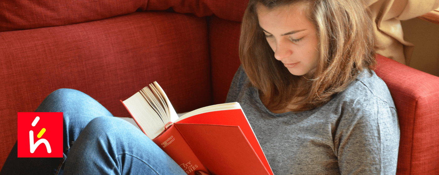
I sketched a few different ideas, I wanted to include the h and k letters on the icon and eventually I was able to find a way to integrate them and the "tilde" so it would all look like a person reading.

I decided to highlight the word książka (book), the main product they offer, and decided to keep the words in caps so they would remain visually separated since both words in lowercase display too many ups and downs.


