
WEEK 10 TASK 1 AND 2
TASK 1

Analysis of Spread:
What typefaces were used? How do they relate to the function / message?
The Header of the page is in a serif typeface, the body text is a sans serif typeface. Another more ornate serif typeface is also used in a banner at the top of the spread.
What is the hierarchical structure and what were the markers used?
The header text and image are prioritised in the spread, taking up around 75% of the two page spread. The hierarchy gets somewhat confusing after that, with the increased font size and difference in colour used on the word 'I'm' giving it significant weight; bold type is used for the quote, and solid black used on the banner. Due to the diversity of typographic styling in these respective elements, they all have a similar level of importance on the spread. This is slightly confusing and difficult to navigate.
What kind of grid was used (single-column, multi-column, modular, baseline, other)?
A three column grid is used on the left page. This page has a large spatial zone dedicated to the header in the top left. There are visible gutter lines in between the columns and along the flow line under the header. This composition is mostly effective but quite crowded.
What elements determined the grid structure?
The key elements of the spread are the image (taking up 50% of the spread) and the large header. Overall the grid structure is effective in creating a clear hierarchy of information. But lacks clarity due to the use of different typefaces, font sizes, and colours.
How do you think the design works overall? What could be improved?
Overall I think the design is somewhat crowded. It utilizes too many different typefaces making the content difficult to appreciate. The grid structure works, having text on one page and one large image on the other is a clear and effective layout. With a large portion of the left-hand page being dedicated to the header. This structure makes it easy for the viewer to understand exactly what the article is about. I think the detail of the text page (banners, and quotes etc.) could have been organised more effectively.
TASK 2
The second task for this week involved creating a brochure for healthy lifestyles at uni.
"For your second task, you will design an information sheet on how to maintain a healthy lifestyle as a student on a budget. The text for the information sheet is attached. This should use only one A4 page, you can use one side only, both sides or fold it in half (and make four pages). The choice is yours. Read the information, think about context, audience, message, what hierarchy you need, how can you break it down, and how you can best organise the information layout. Feel free to use stock royalty free / preview images to illustrate your mockup."
I chose to wake four small pages, using the ideas explored in task 1 as seen below. I used a 3 column structure, and Garamond as the typeface.


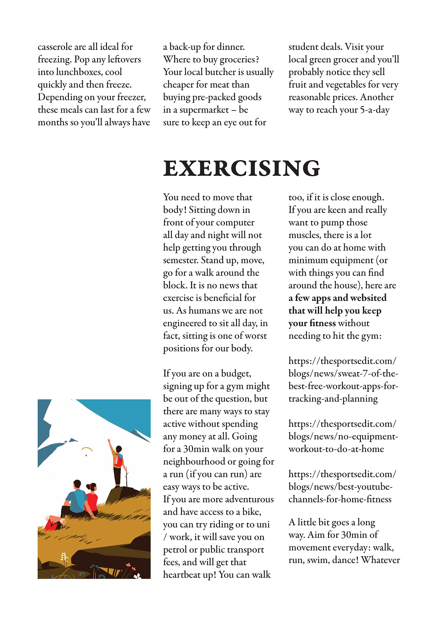


Images sourced from: https://www.instagram.com/tomhaugomat/


