
Esports One
Brand Identity (2018)
Esports One is a stats and analytics company, working to enhance the esports fandom experience. As VP of Creative, I developed the brand identity for Esports One. The goal was to create a refined, modern look that would convey a sense of technical savvy and California spirit. Tying these elements together, we leveraged these guidelines to create a multitude of products, services and collateral.

The Esports One logo is meant to convey the forward momentum of the esports community, which is in the midst of a massive explosion in popularity. The negative space of the E1 and lockup form a subtle joystick, hinting at the videogame-based nature of our business. The substantial heft of the E1 lends an air of confidence and provides good visibility at scale.
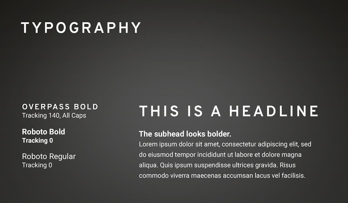
Esports One's typographic look and feel is meant to reflect the look of science as well as harken to the highway typography seen on the West Coast. By paring the headline font choice with simple sans serif font like Roboto, it gave the clean, technological feel we were aimed for.
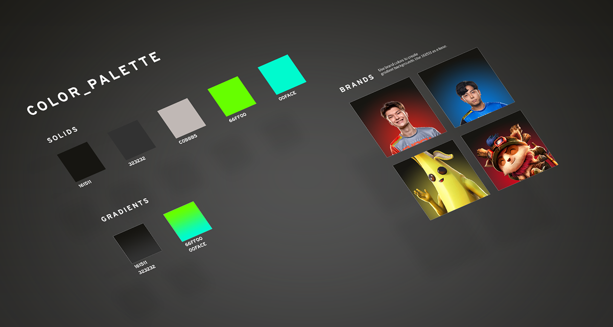
The color palette was designed to reflect the origins of Esports One roots in gaming culture. Saturated neon teals and green mixing with dark grey and black created a dramatic, game-centric feel. Keeping the base colors simple, we were able to leverage existing partner brand colors without sacrificing E1's identity on shared assets.
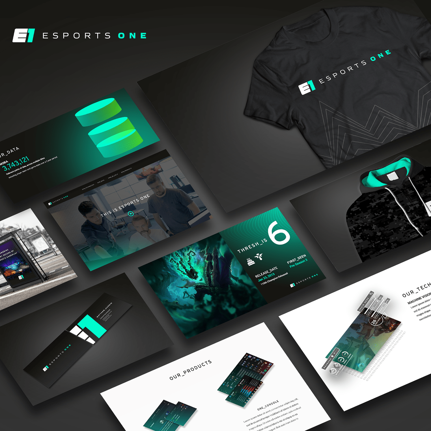
During my time at Esports One, I developed a multitude of different products, websites, social and marketing collateral. Keeping a consistent look and feel, voice and tone is paramount to a young brand and vital for consumer recognition, especially in a developing space like esports.


