DESPENSA ROSETTA
(Branding – CDMX)
Despensa Rosetta is an embrace to our origins through products which have a clear past and present; they look back in order to obtain ethical principles and look forward to obtain a certain dynamism and the modernity sourced from the contemporary.


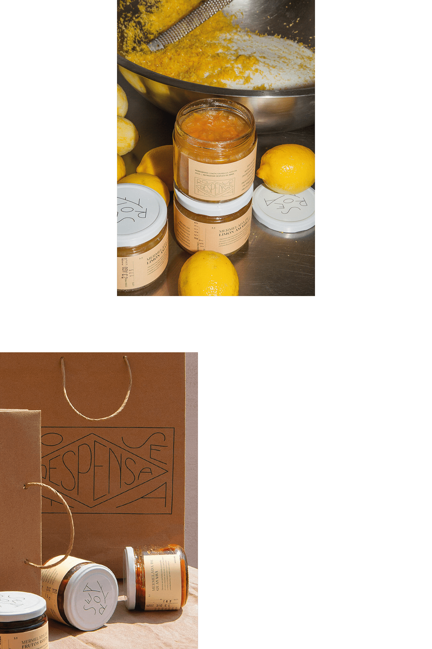
With this range of products Chef Elena Reygadas developed recipes that respect the environment, the producers and consumers, achieving strong human values.

For the identity we rescued these timeless and high quality values: a rooted nostalgia and handcrafting.

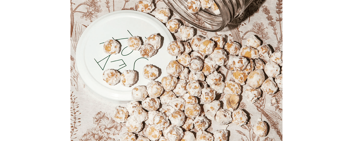
The logo is a contemporary reinterpretation of the past. Inspired in the complex, decorative and modular typographical layouts of traditional confectioneries, it is made up of independent elements which can work as a whole or separated and give the brand great versatility in its application, maintaining a fresh and honest vision.

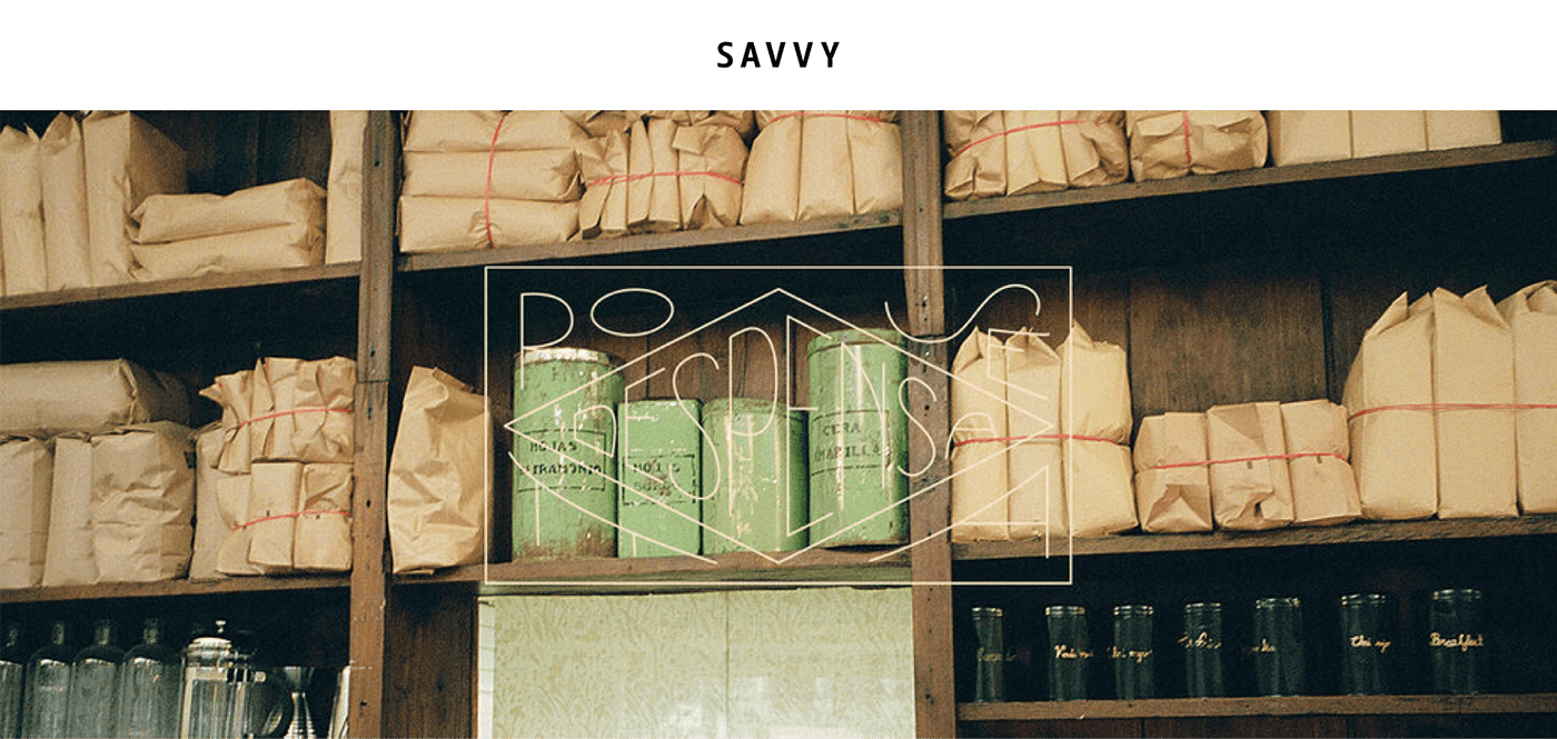
The graphic system is designed so that all of the product can live together as a family in their surroundings, accompanied by a good coffee, a chat, friends, universal and sensible moments: warmth and nostalgia which are represented by pastel tones in the color palette.
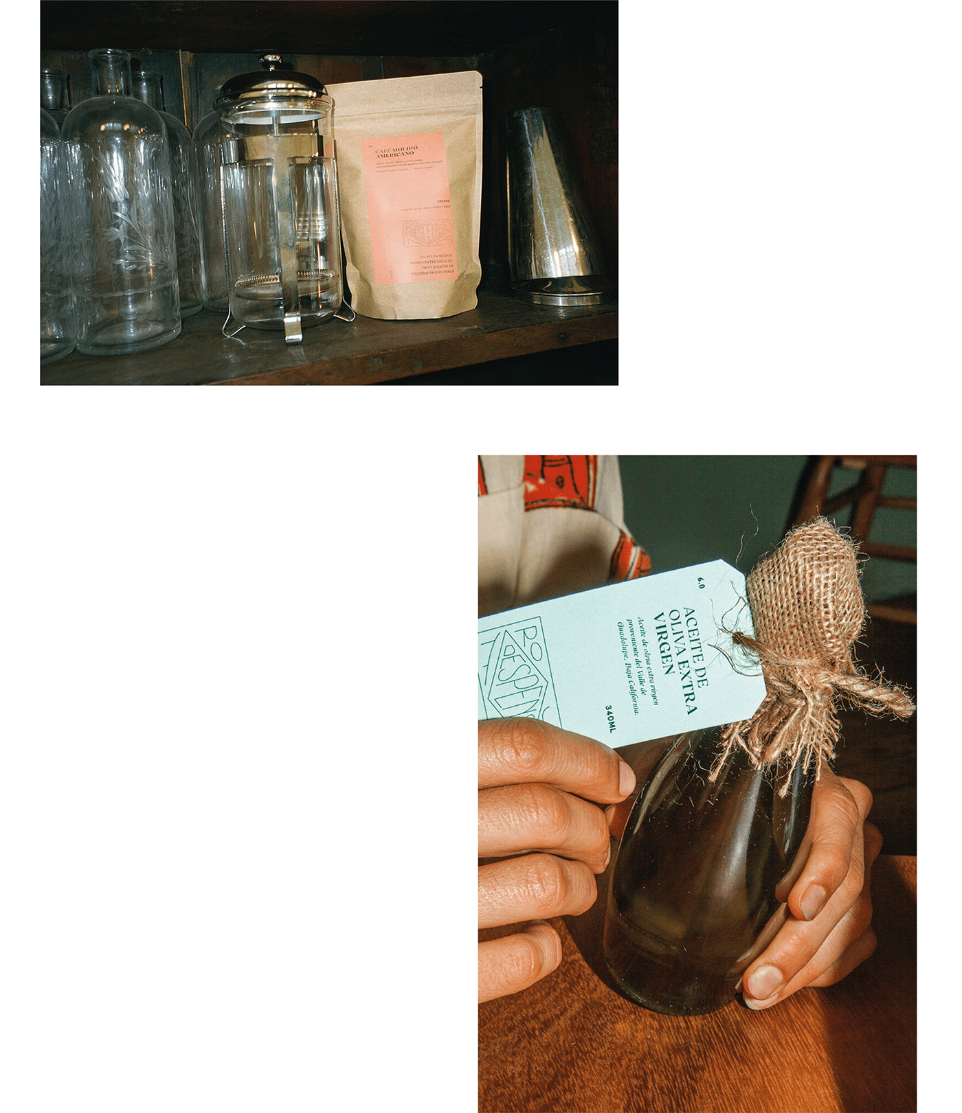
Closing the cycle of a strong respect towards the environment and sustainability, some of the packaging – like the olive oil, for example – reuse bottles which were originally consumed at the restaurant, hence, going them a new life and a new purpose.