项目丨PROJECT
LAN蘭 2020.02
简介丨BRIEF
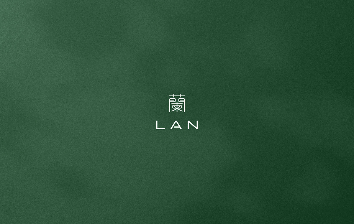
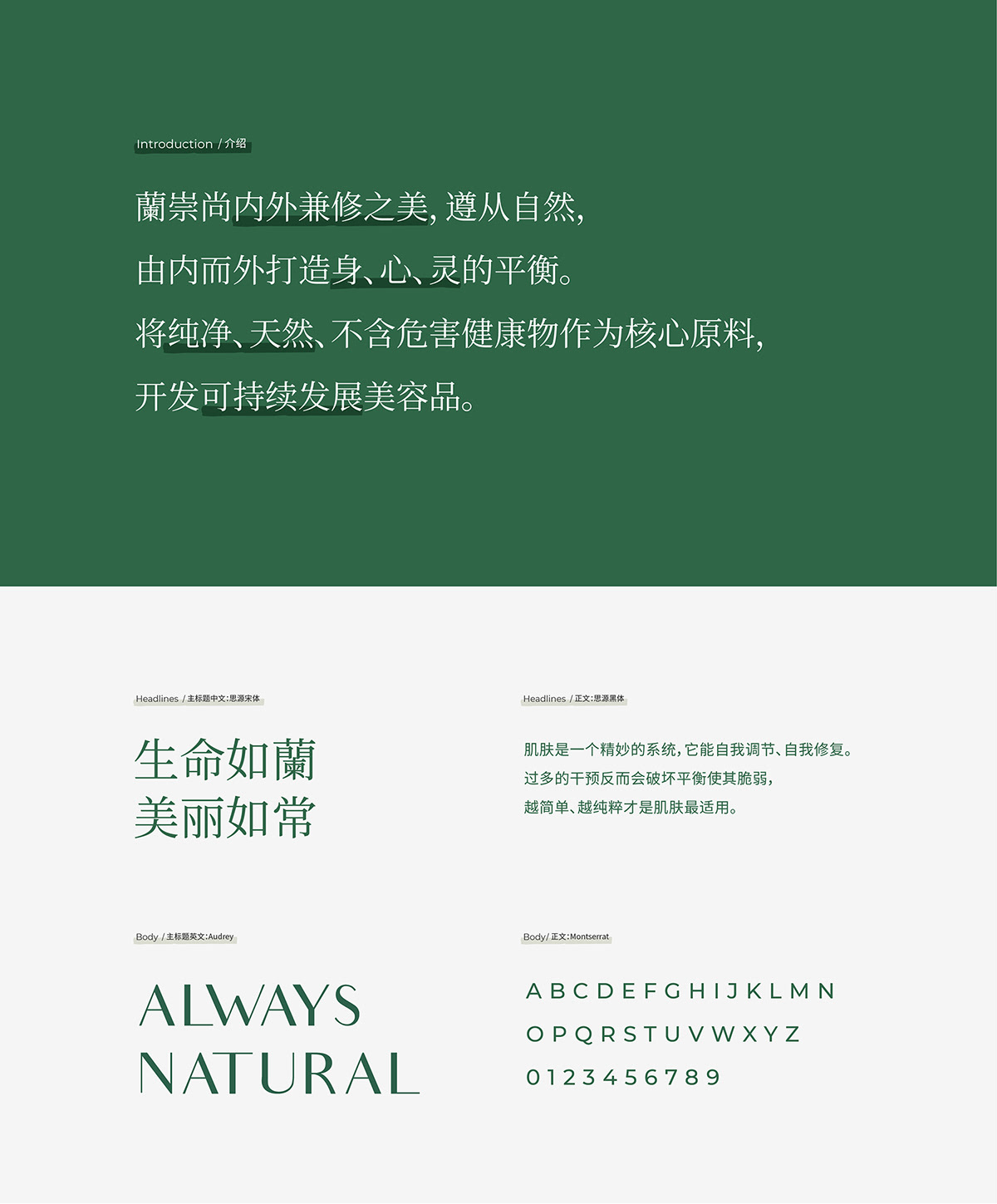
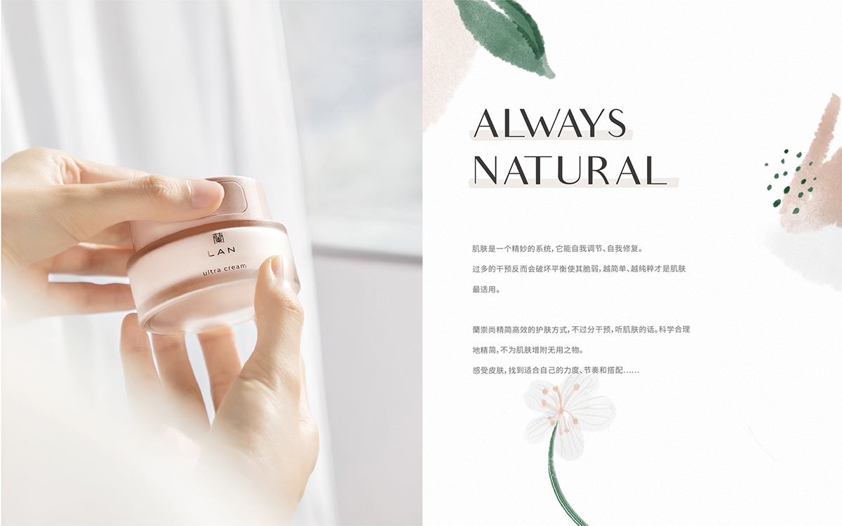
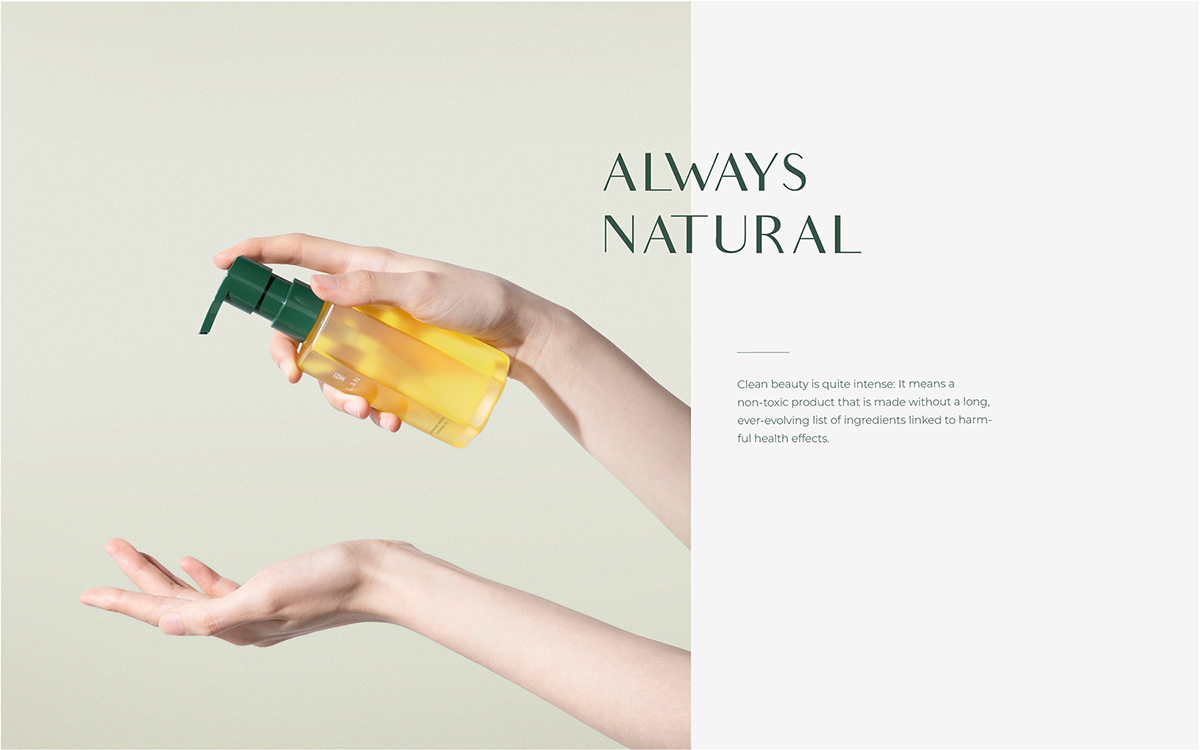
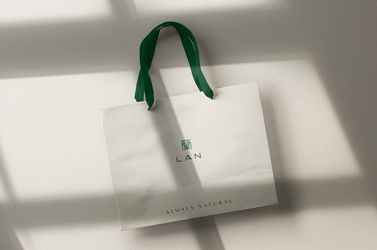
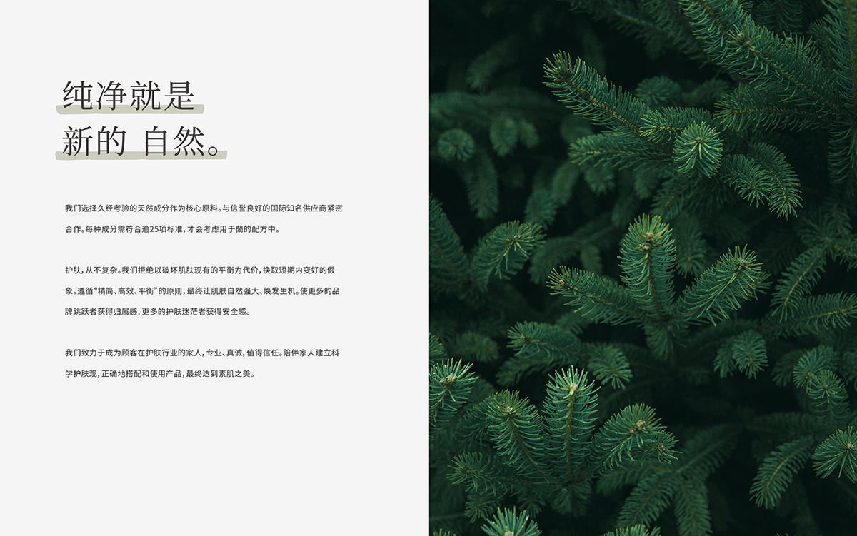
蘭产品研发遵从遵循精简、高效、温和的原则,最终让肌肤自然强大,由内而外焕发生机。回归本真,以油养肤;因此针对其特性提出了全新的品牌slogan——“Always Natural”。针对品牌标志本体以正体字蘭与LAN构成,蘭字在标志中已经起到了图形符号的作用,如果再添加另外图形符号,视觉要素过多会影响到识别。蘭字作为图形符号同时兼顾字形识别,因此在字形细节处打磨,保证其良好辨识度与可读性。
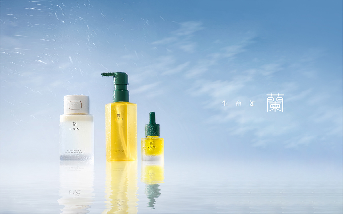
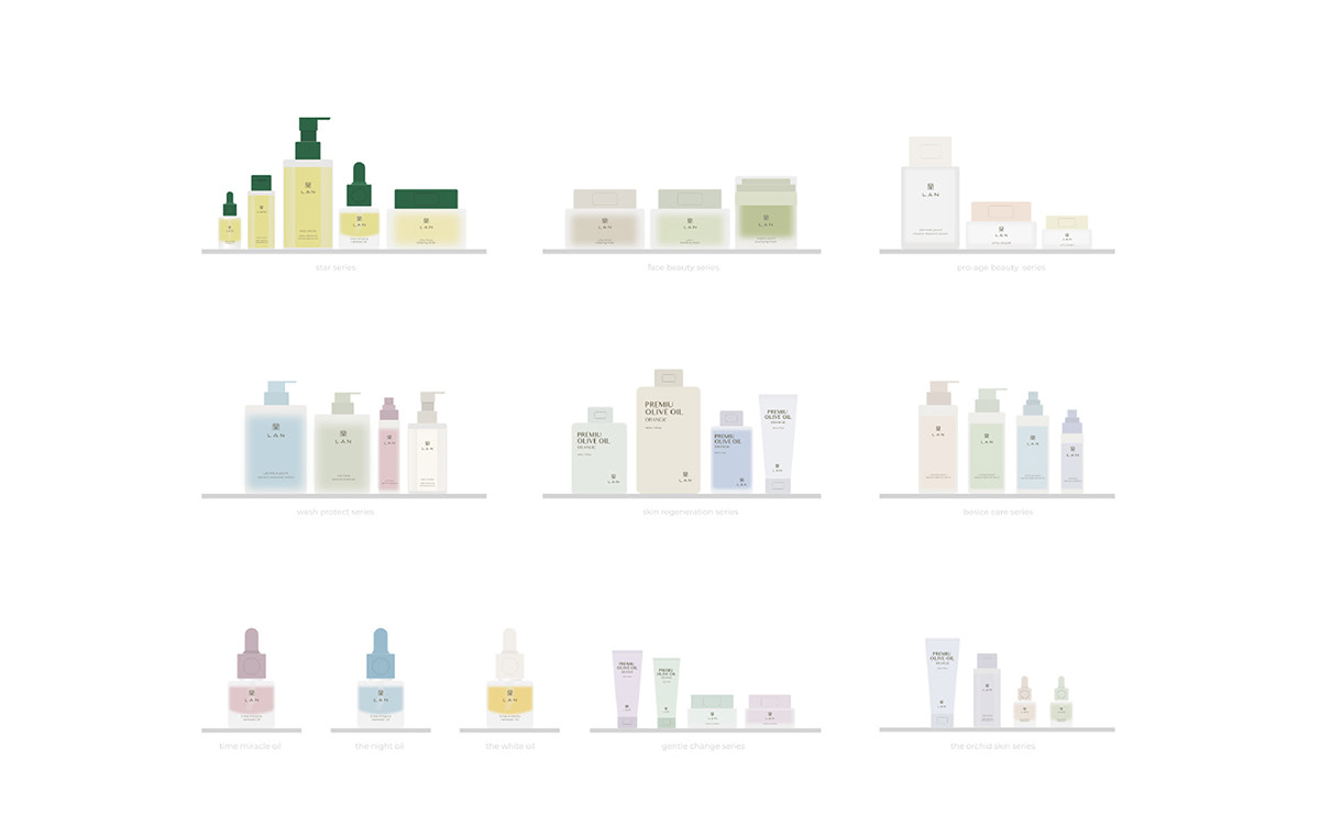
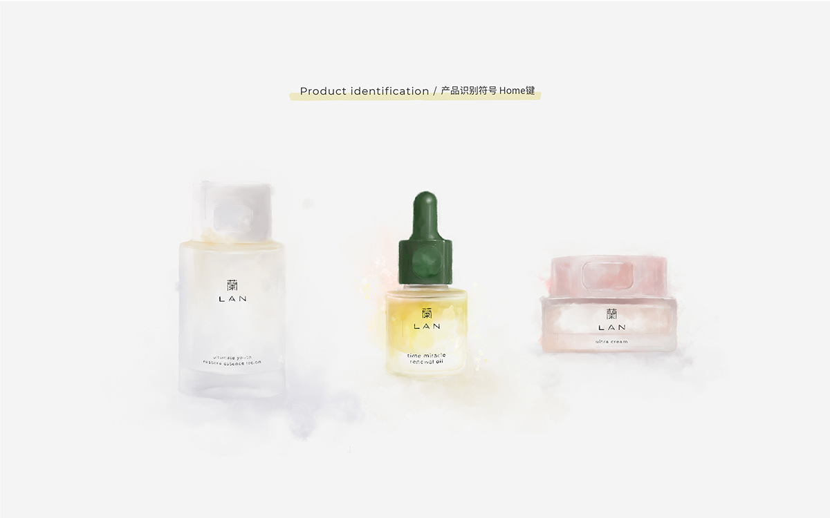
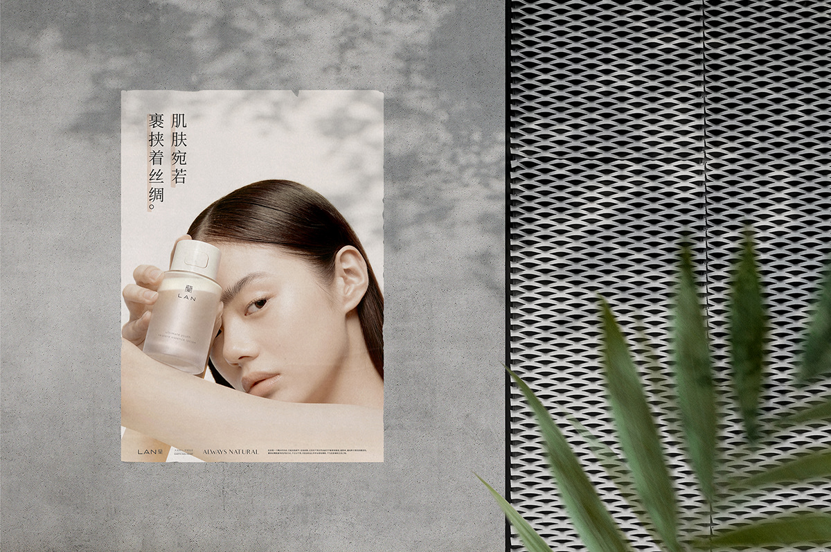
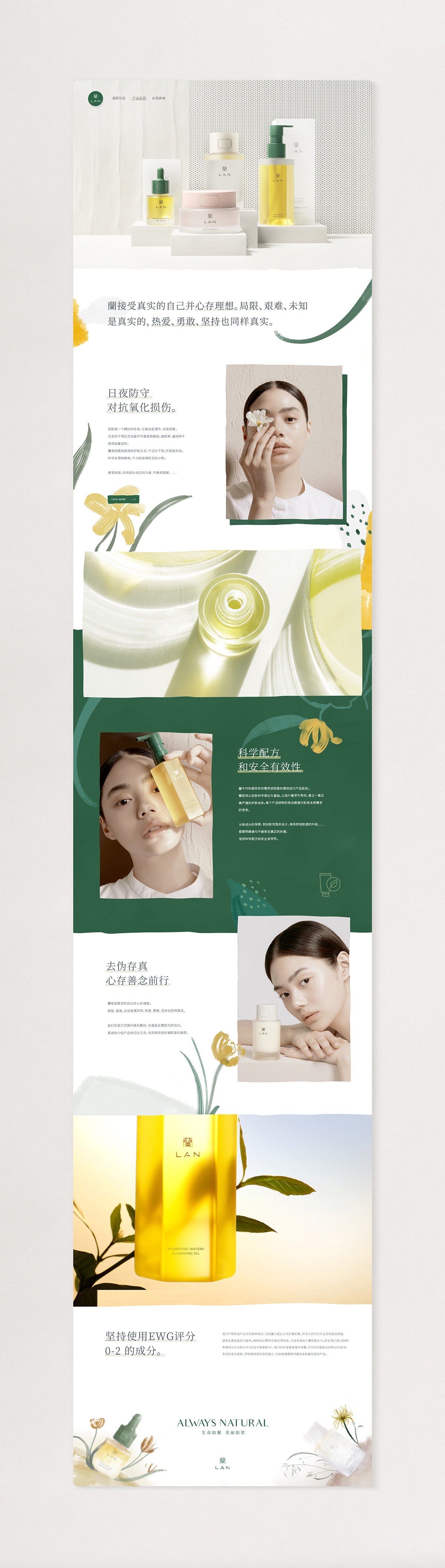
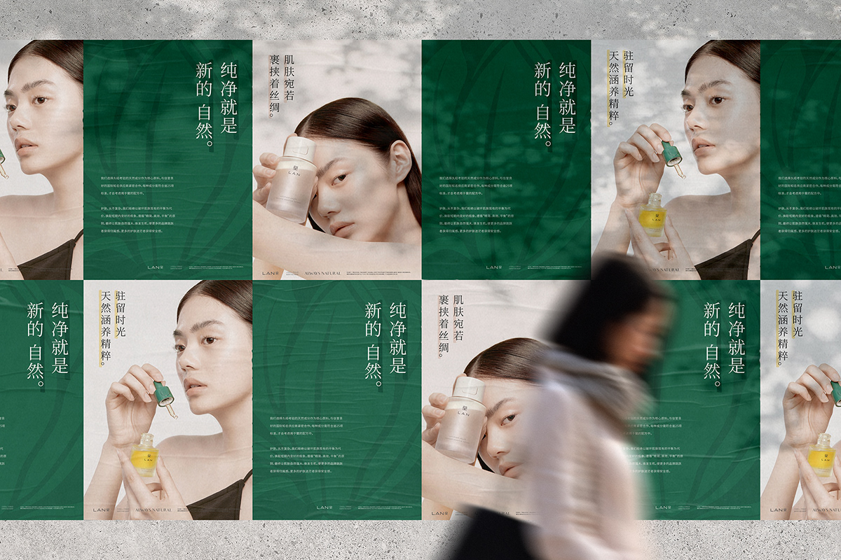
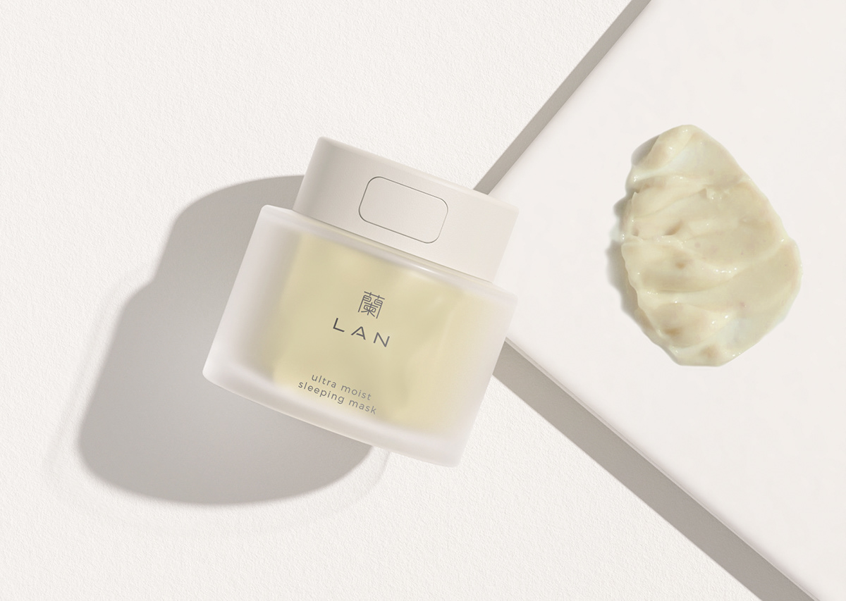
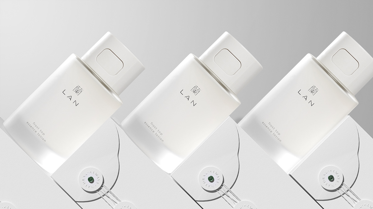
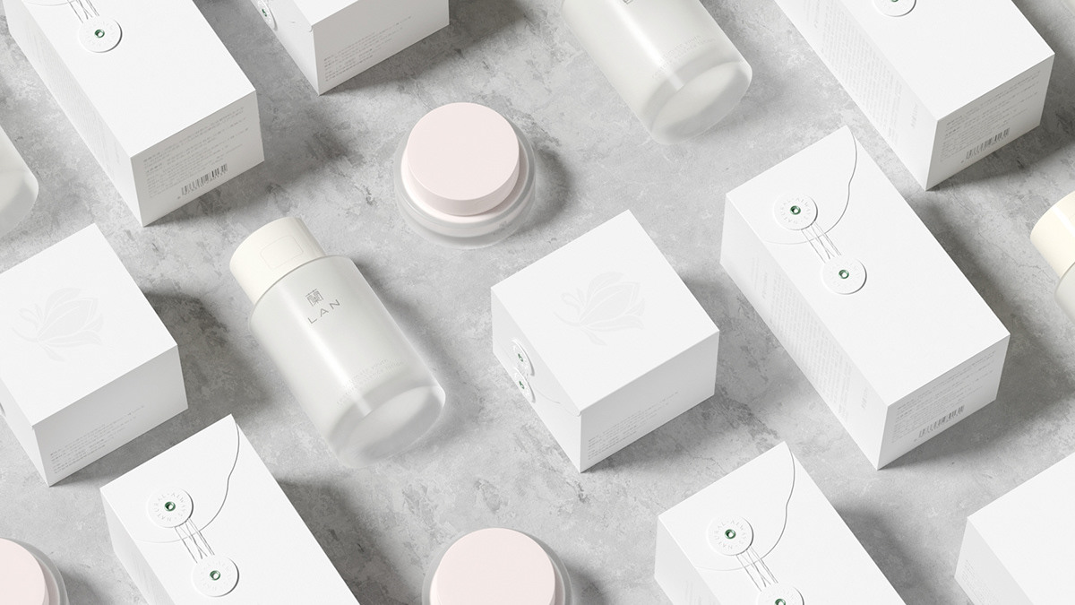
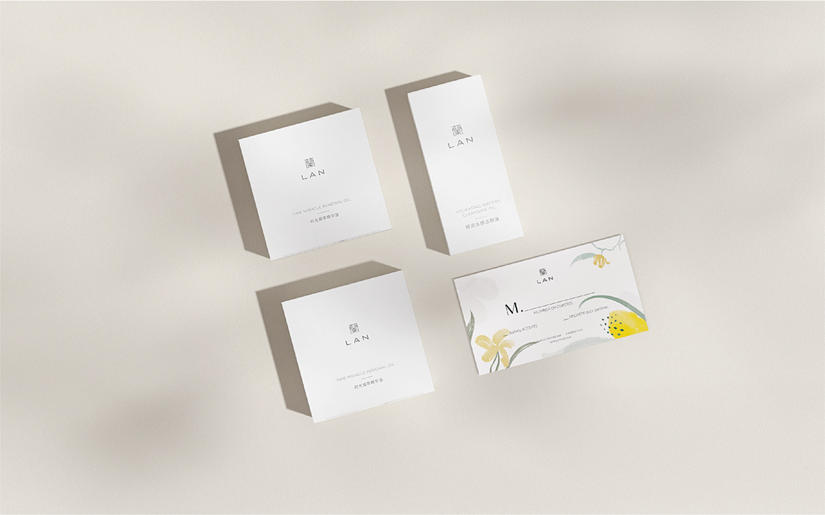
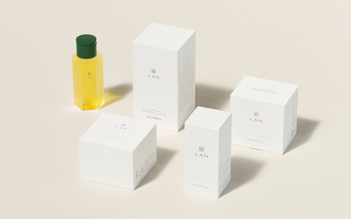
产品:设计上融入了home键识别,一键轻松开启,配上采用主打产品使用品牌色为强调,其他品使用统一梯度的莫兰迪色统一。
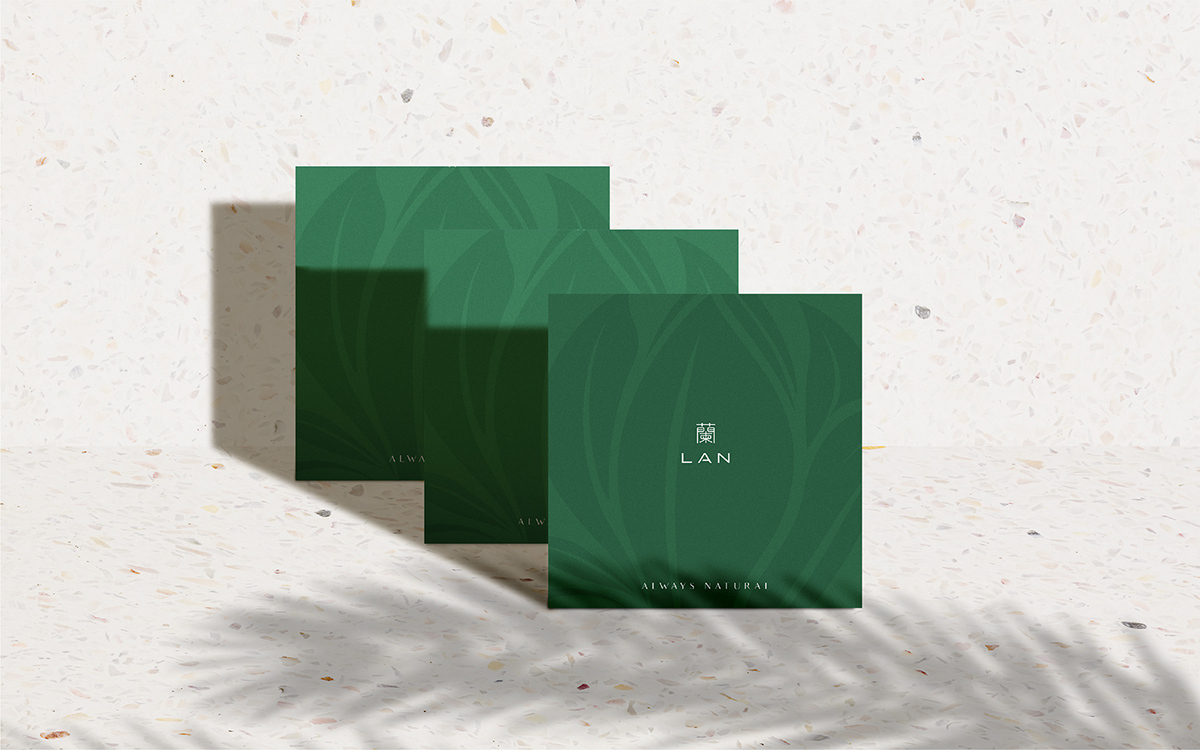
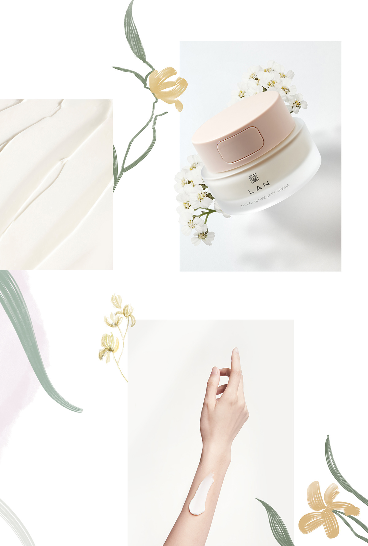
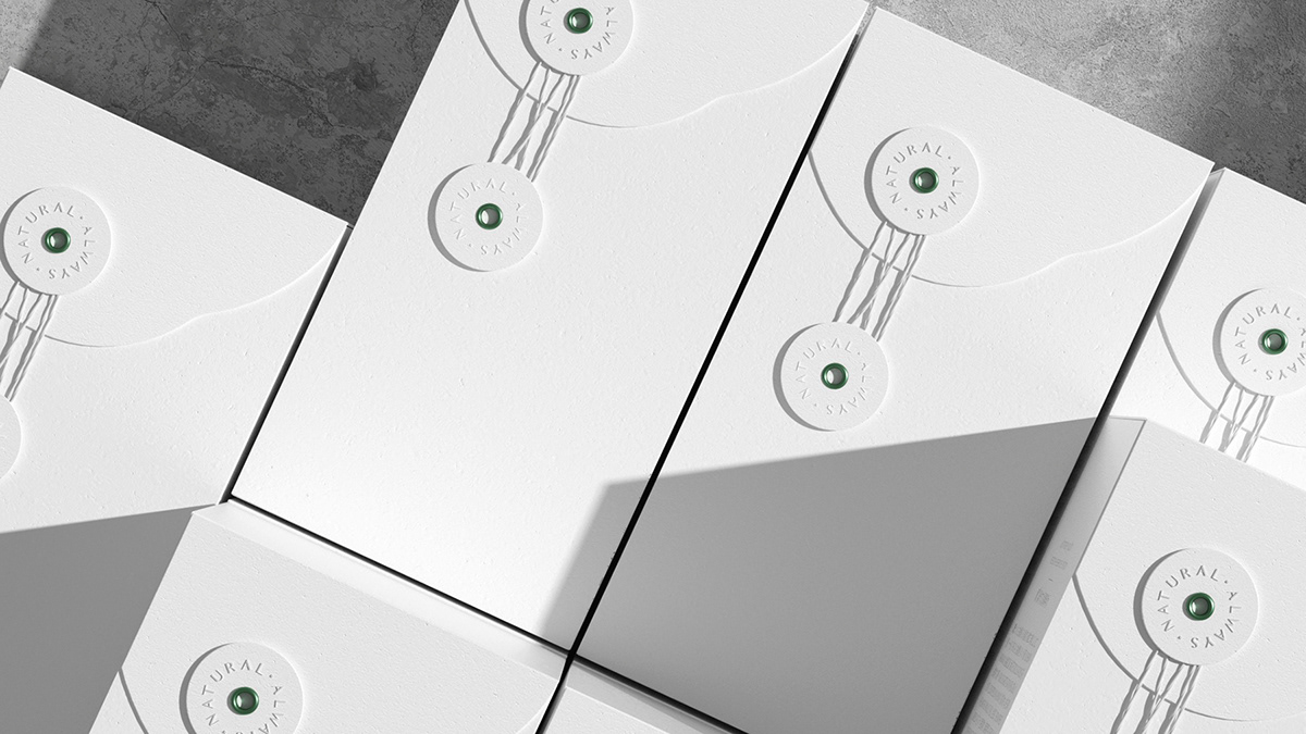
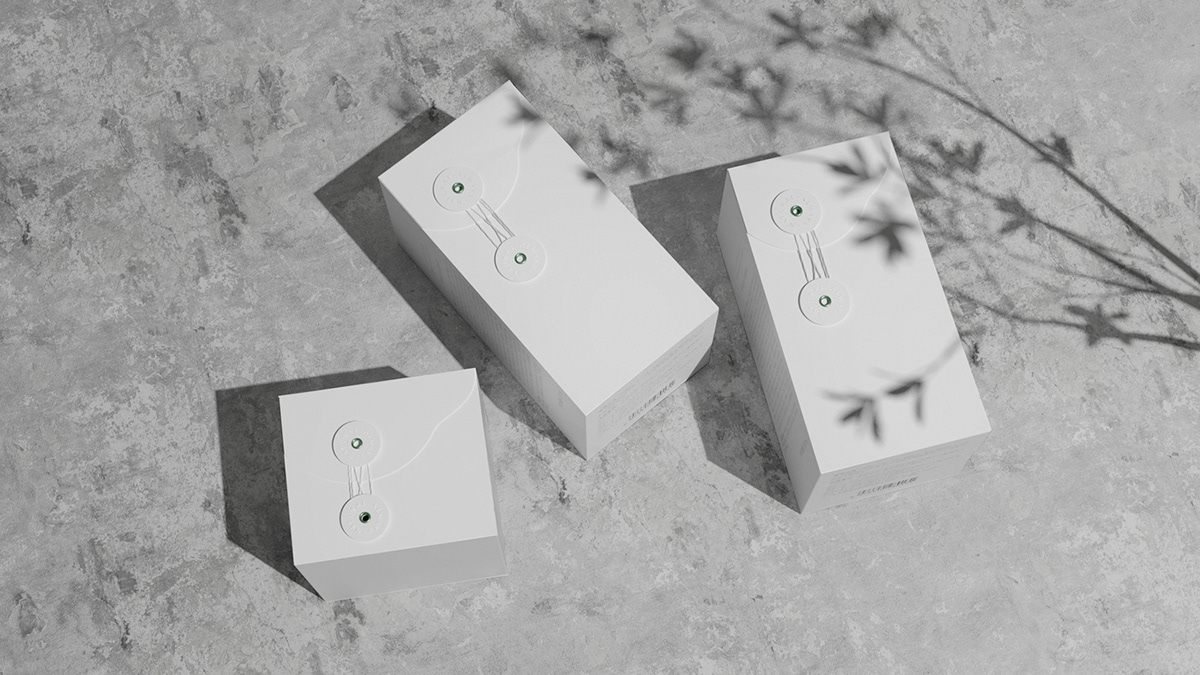
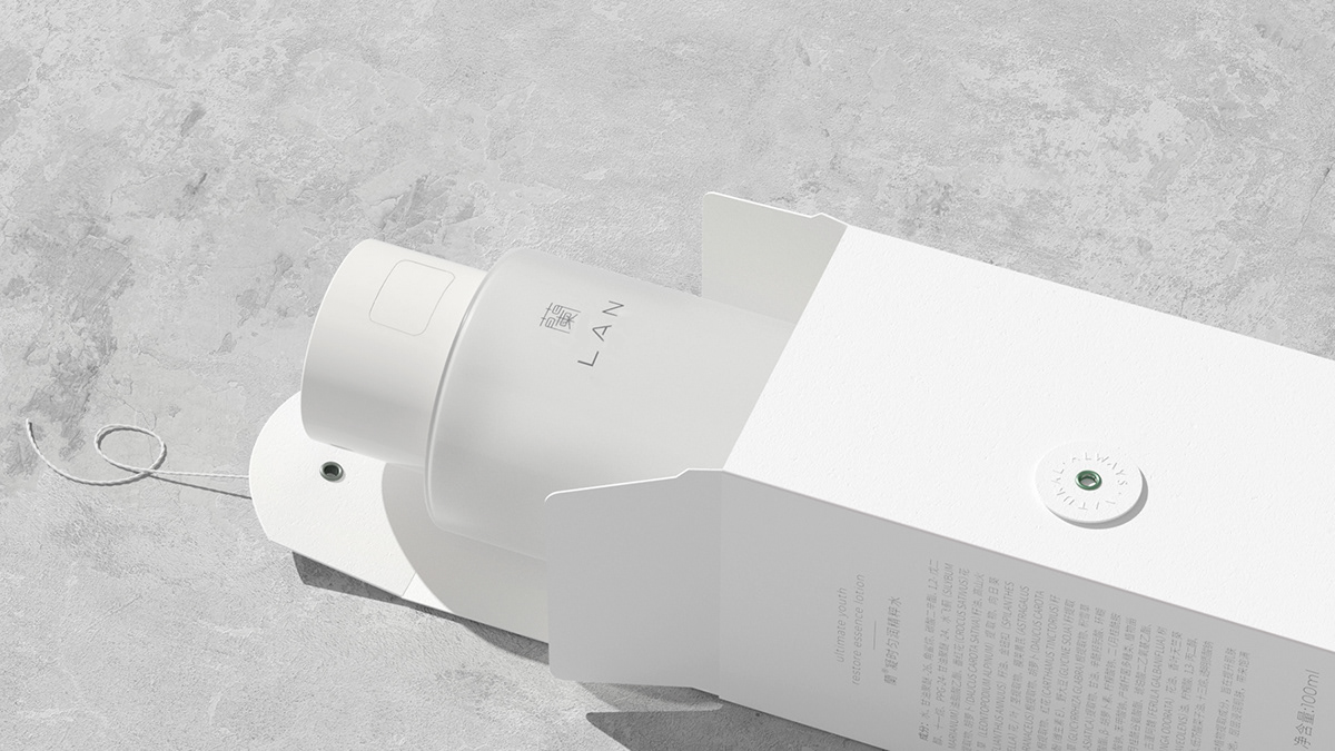
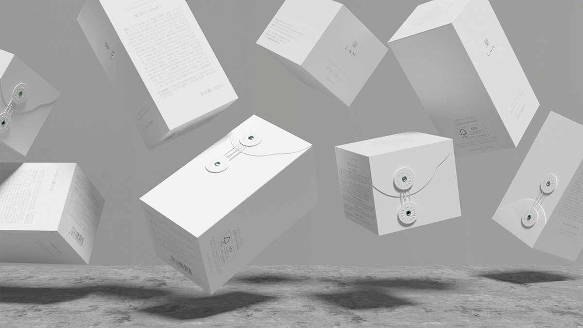
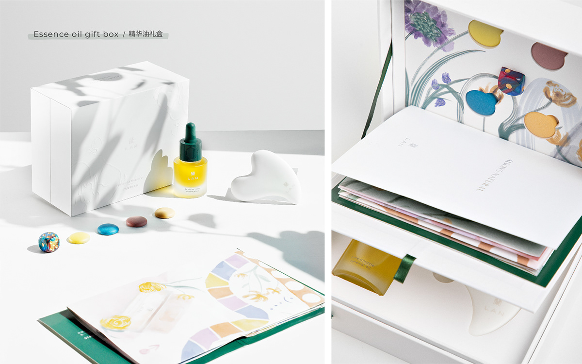
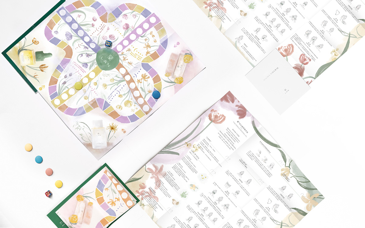
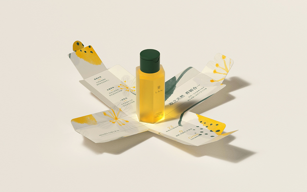
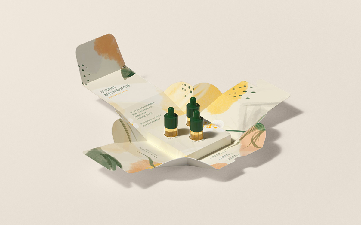
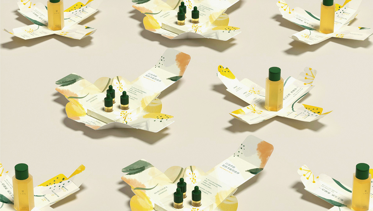
包装及辅助图形:外包装克制素简,以背后盘扣为包装识别,开盒形式使用结构开花设计,展开后通过品牌独特插画制造视觉反差的惊喜感。并且建立了一套独特的插画系统,在有东方传统感的水墨植物绘制的同时,在局部绘制上杂糅许多拙稚的写意笔法、点线面的元素增强现代感。
LAN蘭 2020.02
简介丨BRIEF
蘭产品研发遵从遵循精简、高效、温和的原则,最终让肌肤自然强大,由内而外焕发生机。回归本真,以油养肤;因此针对其特性提出了全新的品牌slogan——“Always Natural”。针对品牌标志本体以正体字蘭与LAN构成,蘭字在标志中已经起到了图形符号的作用,如果再添加另外图形符号,视觉要素过多会影响到识别。蘭字作为图形符号同时兼顾字形识别,因此在字形细节处打磨,保证其良好辨识度与可读性。
产品:设计上融入了home键识别,一键轻松开启,配上采用主打产品使用品牌色为强调,其他品使用统一梯度的莫兰迪色统一。
包装及辅助图形:外包装克制素简,以背后盘扣为包装识别,开盒形式使用结构开花设计,展开后通过品牌独特插画制造视觉反差的惊喜感。并且建立了一套独特的插画系统,在有东方传统感的水墨植物绘制的同时,在局部绘制上杂糅许多拙稚的写意笔法、点线面的元素增强现代感。
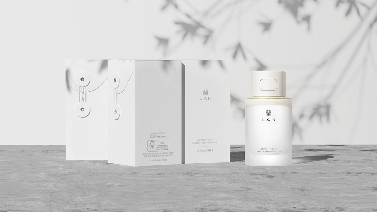
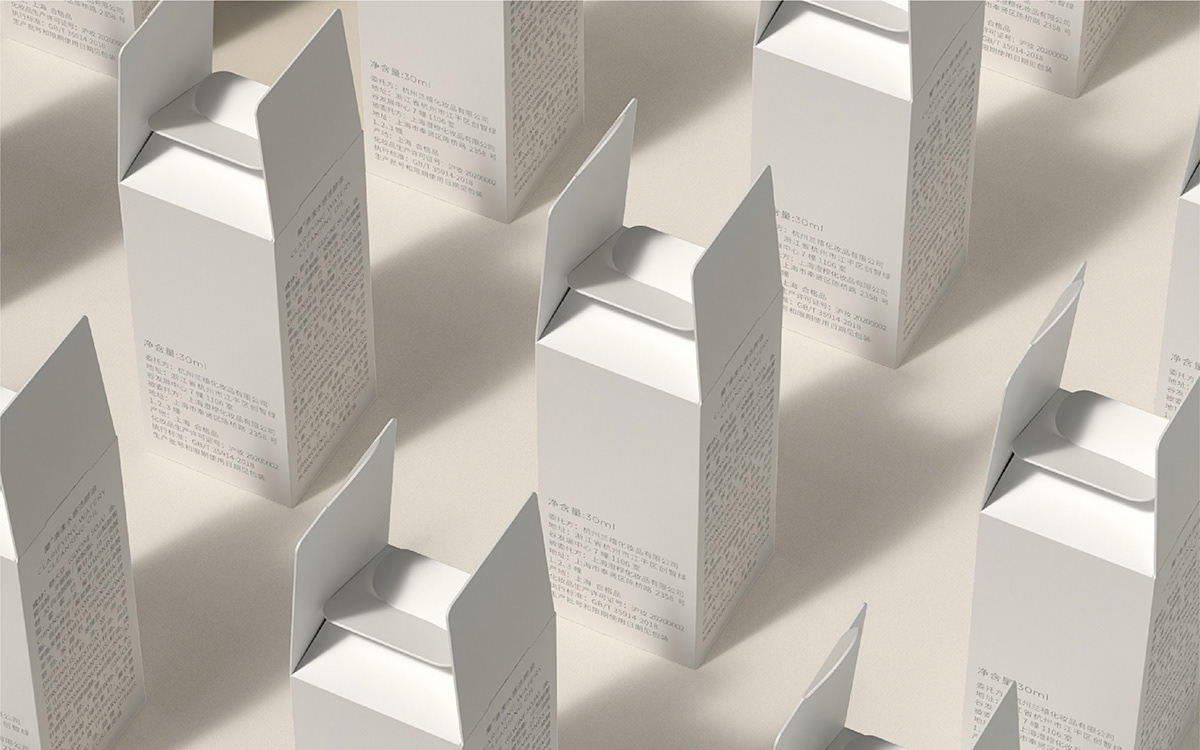
外包装盒采用甘蔗渣制成的FSC再生纸,符合全球森林认证体系使用,减少了木材的使用量及CO₂的排出量,印刷油墨使用大豆油墨进行印刷,避免传统印刷油墨中VOCs挥发性物质对环境的污染。在视觉中表达内在的东方美学。用视觉语言诠释素简洗练的治愈生活、去除矫饰的内心真我、与环保共生的自然理念…
The research and development of LAN products follows the principles of simplicity, efficiency, and gentleness, which will ultimately make the skin naturally strong and revitalized from the inside out. Back to the truth, the essential oil nourishes the skin; therefore, a new brand slogan-"Always Natural" is proposed for its characteristics.The brand logo body is composed of traditional Chinese characters "蘭" and LAN. Lan has already played a role as a graphic symbol in the logo. If another graphic symbol is added, too many visual elements will affect the recognition. As a graphic symbol, the blue character also takes into account the recognition of the glyph, so the details of the glyph are polished to ensure its good recognition and readability.
Product: The design incorporates the "home button" recognition, which can be opened easily with one button, and the main product uses the brand color for emphasis, and the other products use the uniform gradient of Morandi color.
Packaging and auxiliary graphics: The outer packaging is restrained and simple, with the disc buckle on the back as the packaging identification, and the structure and blossom design are used in the form of opening the box. After unfolding, the unique illustration of the brand creates a sense of surprise in visual contrast. In addition, a unique illustration system has been established. While drawing the traditional oriental ink plants, the local drawing is mixed with a lot of naive freehand brushwork and elements of dots, lines and planes to enhance the sense of modernity.
The outer packaging box is made of FSC recycled paper made of bagasse, which complies with the use of the global forest certification system, reducing the use of wood and the emission of CO₂. The printing ink uses soybean ink for printing to avoid VOCs in traditional printing inks. Environmental pollution.Express the inner oriental aesthetics in the visual. Use visual language to interpret the natural concept of simple and clean healing life, removing the pretense of the inner true self, and symbiosis with environmental protection...