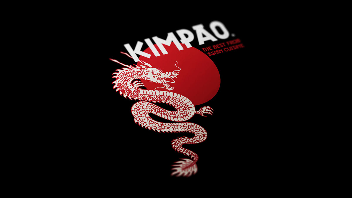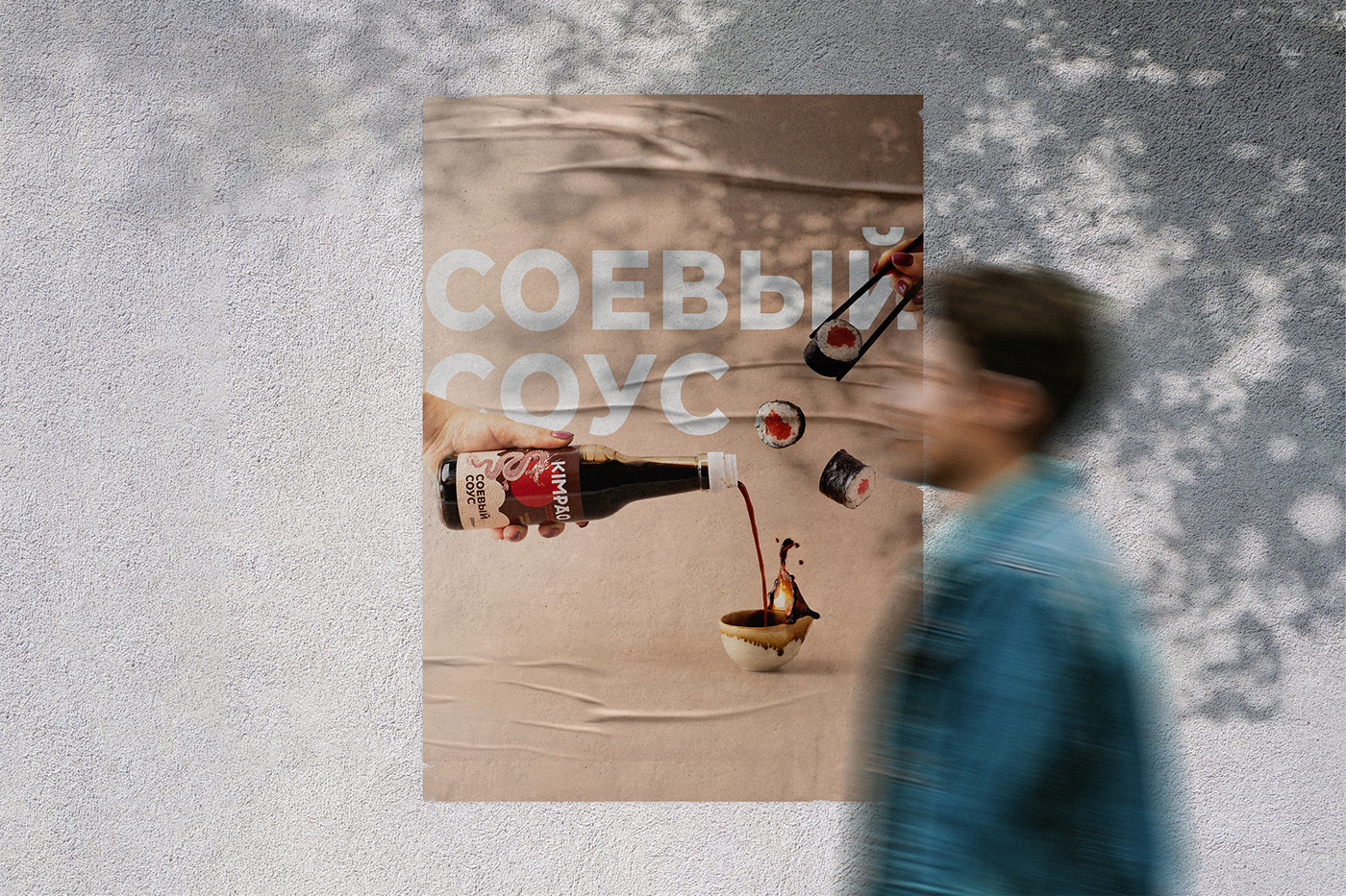
KIMPAO is a russian trademark specializing in products for cooking asian cuisine at home.
In this project I had to design the general brand concept and its visual identity.
Logotype had to have a clear association with Asian cuisine while maintaining
the universality and adaptability for any labels.
Logotype had to have a clear association with Asian cuisine while maintaining
the universality and adaptability for any labels.


Making the logo I decided not to use much of a Chinese calligraphy style, so sans-serif font was the best option. For the color palette I was inspired by red rising sun, brass plates and the Chinese dragon. The logotype is versatile: it can be used in its entirety or in sections depending on the specific needs. Moreover, the need for trademark registration was highlighted so the logotype had to be unique and suitable for this task.


It wasn’t very difficult to dissociate from the competitors.
Almost all brands with similar range of products adhere to one vector: real product’s photos, similar color palettes
and Cyrillic fonts in Chinese calligraphy style in product’s name.
and Cyrillic fonts in Chinese calligraphy style in product’s name.
I wanted KIMPAO to be modern, suitably minimalistic and attractive at the same time.


I faced the task of designing the labels on completely different products in completely different packaging:
tin cans, glass jars and transparent packages. Also, there were a severe restrictions on materials –
there could be only glossy self - adhesive labels.
tin cans, glass jars and transparent packages. Also, there were a severe restrictions on materials –
there could be only glossy self - adhesive labels.


Here are some of the instagram content photos and recipes

Saint-Petersburg, Russia
Design: Ekaterina Knol (@katyaknol)
Photo: Yulia Podkopaeva (@julypod), Elizaveta Yakovleva (@yakovleva_pro_photo)
2020
KIMPAO® registered trademark
Shreder Retail
iska.ru


