I created a portfolio website to get hired. Here's how it looks and what I did.


On the left is my finalized logo, which represents my initials C.S. with a full circle (which can be interpreted as the sun, moon, a circle, or C, whatever you want) to represent the 'C' in a simple, modern aesthetic and a twist on the 'S' in Spivey as a calligraphy dragon. I think this also describes my personality, and I like the color palette, although the symbol can stand in black, as logos should. On the right is a quote I find very relatable to game design, development, and art in general.
I am a big fan of material design, but I love brutalism even more (in terms of graphic design). I find the breaking of standard layouts to be incredibly satisfying because even though it might look ‘broken’ if not carefully done, if it is planned intentionally, feels very future forward.
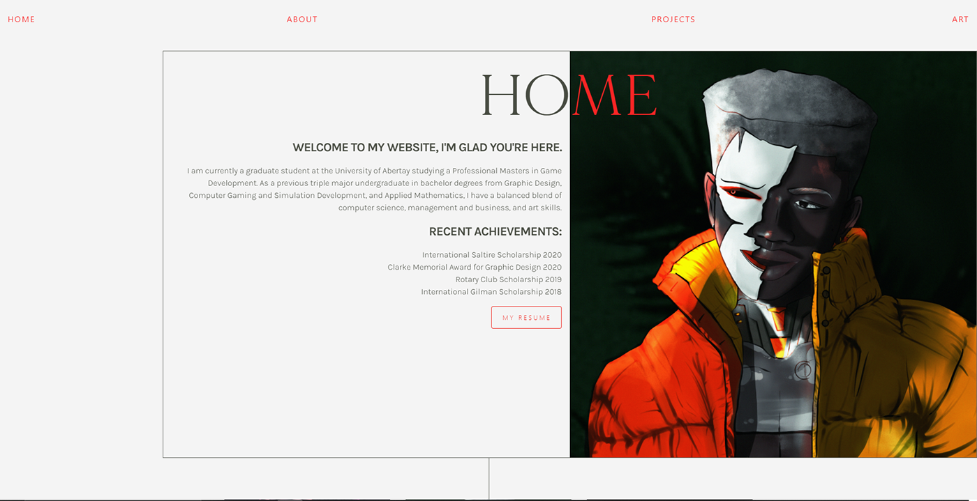
The color combinations on my site are very standard. My primary color is red, secondary is black gray, followed by an utilitarian cement color for the background. I picked those colors because no matter what art I put up, the website will compliment my works and not distract from them. I strayed from the tan color of my resume and itch.io page because I wanted something a bit more impactful, and while the tan color already stands out because it’s not often used, I wanted a starker contrast on my website.
To emphasize the refined style of my website and to compliment my logo, I went with an elegant serif typeface. I wanted structure to be very present and uniform throughout my website but not necessarily in a boring way, because although I did want to dial the graphic design to 100, I knew that people can be put off if I over-designed the website. I did not want too many unexpected things to happen when you changed the website’s aspect ratio.
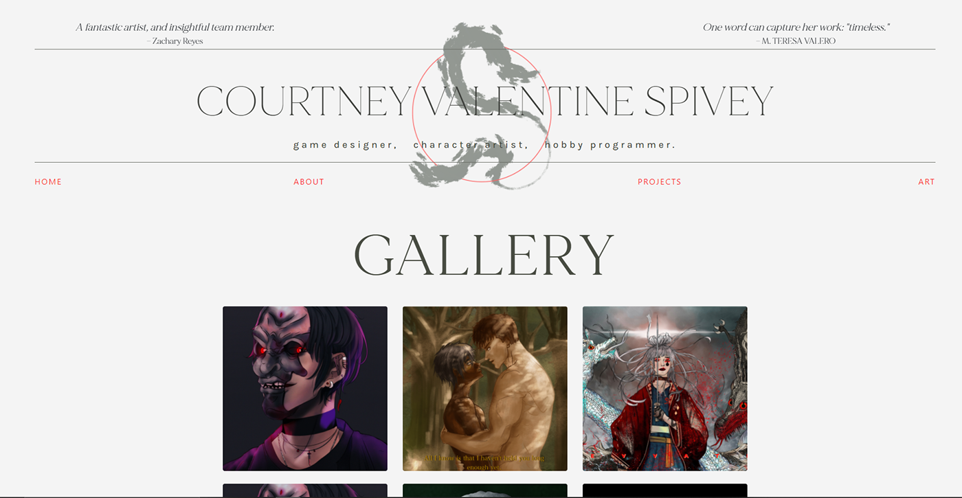
I designed the navigation bar with the idea of capturing someone attention as soon as they land on my website. My links are all styled to strike-through words when hovered over them, which helps with keeping the layout of the website modern because my typeface, design and and general art style is more ‘Times Magazine’ than the average website and that could read as old fashioned if I’m not careful.
I also utilized fine, thin borders to build extra form around elements of my page. This helped me plan templates out easily and kept different components similar in style.


My main page features my character art and my frontpage, placing me immediately as a character artist and graphic UI designer. As you browse through my pages, from my about me section dedicated to talking about my views and work ethic to projects I’ve done, you learn different things about me, all of them relevant to game design in some way.
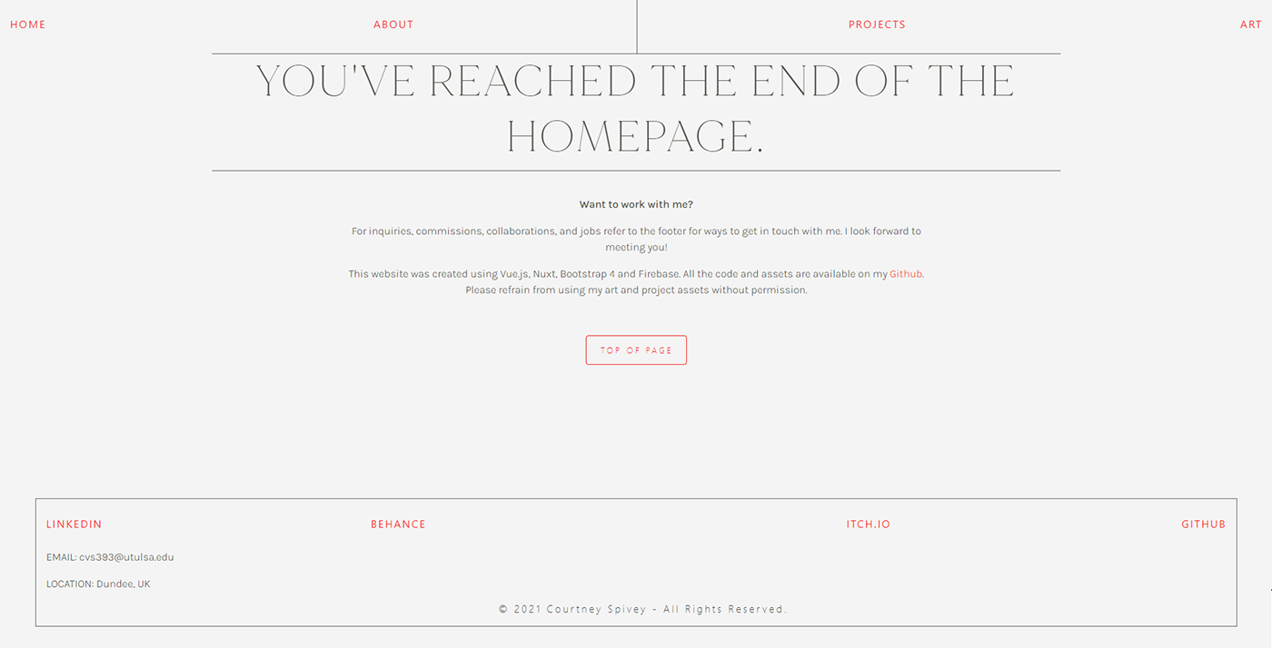
As the viewer browses through my entire website, probably not reading too much, they are intrigued by how I stylistically approach different pages, and after clicking through most links, hopefully feels satisfied with the overall product and probably will click on the links in my footer.
I believe overall, my website has a very cohesive effect.
Visit my portfolio at https://cvs393.github.io! If you want the code, go check out the Github repo at https://github.com/cvs393/portfolio :)


