Bibyke
Bibyke was a brief set by Third Floor Design as part of the University of Worcester's "Live Brief" module:
"I have recently been made redundant and decided to start up my own business. I will be offering a same-day courier service within London, aimed at corporate companies that need to send items within my radius. The parcels will be delivered by electric cargo bikes, within 2 hours of collection and the service will be available 7 days a week. My service will be secure and trackable. This is something I would like to promote, it will reassure clients that their items are safe and will be delivered on time.
Along with the branding, I am going to need an affordable marketing campaign to promote my new business. I would like this to be suitable for print and social platforms. I will also need a website that can receive/manage bookings, payments and allow clients to track their deliveries.
I am open to how the brand should look and happy to be creatively lead as this is new to me. However, my one request is that it shows efficiency and vibrancy. I need to ensure I am noticed by other commuters when travelling whilst being spotted by potential clients."
Why this brief?
Full branding briefs are exciting since they allow you to dig into the brand and industry as a whole. Also, we discussed the perception that couriers may have and it was an opportunity to subvert expectations and create something which breaks the mould.
I began by researching other courier services and similar brands. One which I looked into a lot, was Deliveroo. Even though they aren't the same service as Bibyke, I love the branding that Design Studio developed for the company. One aspect I really loved from Design Studio's approach was their investment into understanding Deliveroo - using the service, talking to riders and customers and getting deep into the world of delivery services. Although I wasn't able to do this for my project, I did still spend a lot of time thinking about what the role of courier service is, who the user would be and why they would choose one service over another.
Even though the target audience might be considered corporate clients, I think that a large number of courier services are still too boring, and just because the client is a big corporation:
1. It doesn't mean that the person arranging the service is out of touch or overly corporate - it may be that the person organising the courier delivery is a younger intern or receptionist who finds good branding appealing.
2. Corporate doesn't need to be boring and good branding will always come through as a positive when making business decisions.

Based on my research, I came up with 3 creative directions.
1. City Flyer focussed on the metropolitan aspect of the brief, with colours and blocky type work which push the feeling of flying through the high rises of London. I quite liked the colour palette here although looking back they didn't really fit the project since they are more pastel and playful. I think the theme of the top logo has some real potential in another project and removing the counters from the text is a really nice way to make the logo bolder and more unique. This was intended as a middle ground between corporate and expressive.
2. On the Move was all about efficiency and movement. The main inspiration being the long-exposure light photography. I think it's such a great way to communicate movement and the slight italicising on the typography further pushes this. The colour palette was a little fiery and lightning-y and it was all about adding dynamism without it becoming too expressive or arty. This was my most corporate territory, although I hesitate to call it corporate since it's still interesting and bold.
3. Print and Send was my "out-there" option and I knew that it was unlikely that it would fit the brief. However, I included it since I wanted to provide a range of creative routes for the client and I really loved some of the imagery on this board. The idea was focussing on physical media since couriers are only needed for things which can't be sent digitally. I played off the idea of screen printing, with these transparent colours and serif fonts. Again, I knew that these ideas were really outlandish given the brief, but I think some of the logos have some real uniqueness to them and wanted the client to at least see the wackier options.
The client chose to go with "On the Move" as he felt it had the most potential for development and was the right direction for the brief.


Development
Below are some of my initial developments of the "On the Move" route.
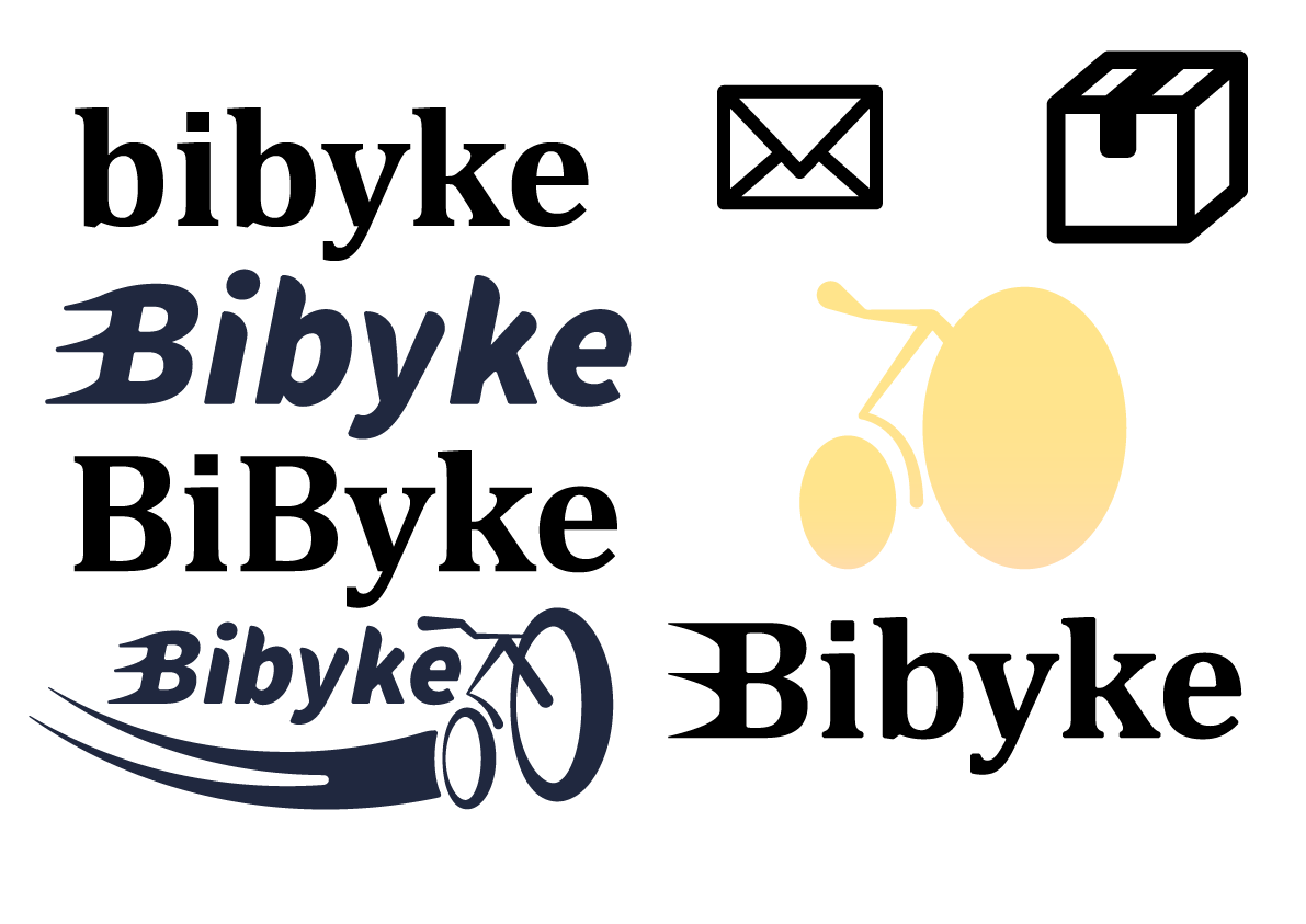
Regarding the logo, I decided against capitalising the second B (despite preferring it previously), and even considered not capitalising any of the word. This was left open in the brief and I enjoyed making the decision based on how we wanted the brand to come across. I felt that the double capitalising made the logo look too static and I was pushing for a feeling of streamlined and dynamic.
The swoosh of the bike was something I really wanted to include, but it just felt overcomplicated and a little cheesy. The icon of the bike was just too on the nose I found and I couldn't find a good way to incorporate it into the logo in the end.
Some basic concepts about how a website might look.
Again, trying to put across motion and dynamism - I like the diagonal angles and the sense of "journey" which is apparent, but the overuse of the bike icon still feels too forced and obvious.
The colours here are really appealing to me, but didn't end up fitting my perception of the brand or the direction which was established in the mood board.


Some more concepts which steered closer to the original concept of long-exposure light photography.
I really like the shirts - it felt like a shame to not use them in the final branding, they remind me of E-sports jerseys which are often very bold with contrasting team colours (see G2 Jerseys for example)
I had finalised a logo which I think was slick and dynamic, with the B being strong on it's own for use as an icon elsewhere. I had also pushed the orange and red tones more and shifted the backgrounds to be darker to contrast with the colours.


These designs had more motion to them, the lines more fluid and intertwining to mimic the mood board images. I like that this pushed the established themes whist allowing the site to still appear professional and reliable.
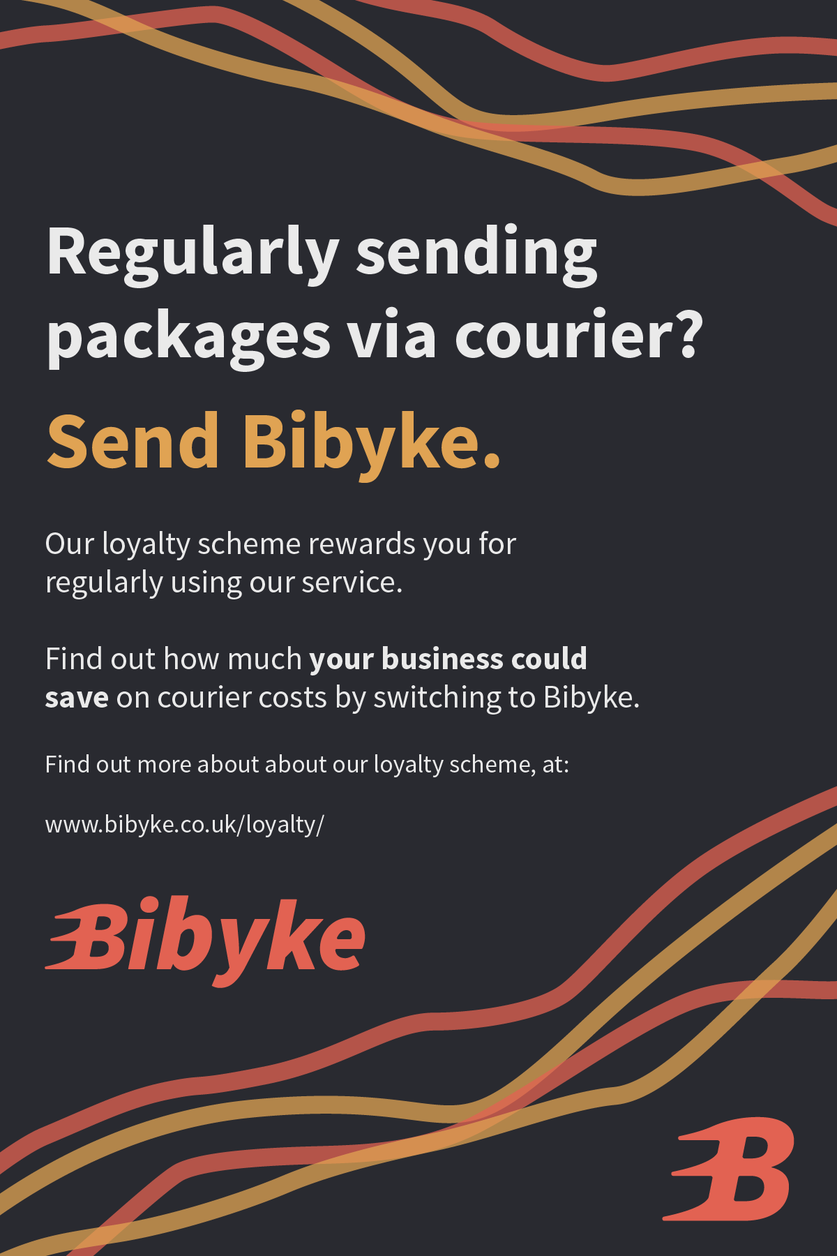
I had also been thinking about a USP for the brand, since there was currently little reason to use the service over another one. One idea I had was a loyalty scheme, rewarding repeated use of the service and incentivising companies to stick with it.
I began pushing the use of the "y" to replace "i". This led to riders being called "ryders" and the sub brand Bibyke Nyght being created. I was thinking about how I like to work late at night and sometimes I will email finished projects to someone at 11:00pm or later. This is something you can't do with physical courier documents. Bibyke Nyght would allow customers to have their documents or deliveries picked up by a ryder late at night (possibly as late as 9:30, but it depends on safety concerns - could be seasonal based on sunlight hours?). The Nyght ryders would then take the documents to a secure storage space and they would be delivered first thing the next morning, meaning businesses would get your files at the beginning of the work day. As opposed to you getting to work the next day, arranging a pick-up and your files getting there a couple hours later and you wasting your morning on setting up courier services.
I felt that the sub brand was a cool idea and something that although niche, would be a reason for some companies/people to use your service over another. It also allowed me to use a different colour palette (I liked the blue/white tones!) and demonstrated the expansive capabilities of the brand.


Final Outputs
The website landing page is clean and gives a user quick access to the most important sections of the website. The image is a placeholder and would be replaced with a Bibyke ryder.

Sending is simple and quick, with considerations for delivery size and whether or not the customer needs a container for their delivery.

Tracking is equally simple and transparent so you can feel safe about your incoming/outgoing delivery.
The map is useful and fits nicely with the rest of the brand colours (made with Snazzy Maps)

Example of an advert, showcasing the loyalty schemes.
Uniforms for both regular and Nyght ryders. Black and white versions mean that you can choose based on the weather, you don't want to be riding around London on a hot summers day in a black jersey.
The Nyght ryder uniforms would also feature reflective material on the stripes to increase visibility on the road.


Ryder merch/kit in the form of a drawstring bag. Something practical and stylish which reflects the brand without looking like direct advertising. I always feel that merchandise like this should be something you want to wear because it looks cool and therefore shouldn't be obvious marketing - hence why there is no website or information on these, who wants to go out wearing something which looks like a billboard? This application still promotes the brand image while still being tasteful.


Some of the example packaging which would be used if a customer needed/wanted a container provided. You can see how the branding is still succinct without any colours.


Overall I found this brief to be a success. Presenting the final designs to the client was a great experience and I think they were happy with the outcomes, feeling that the brand and sub-brand worked well with a coherent and unique visual language.

