


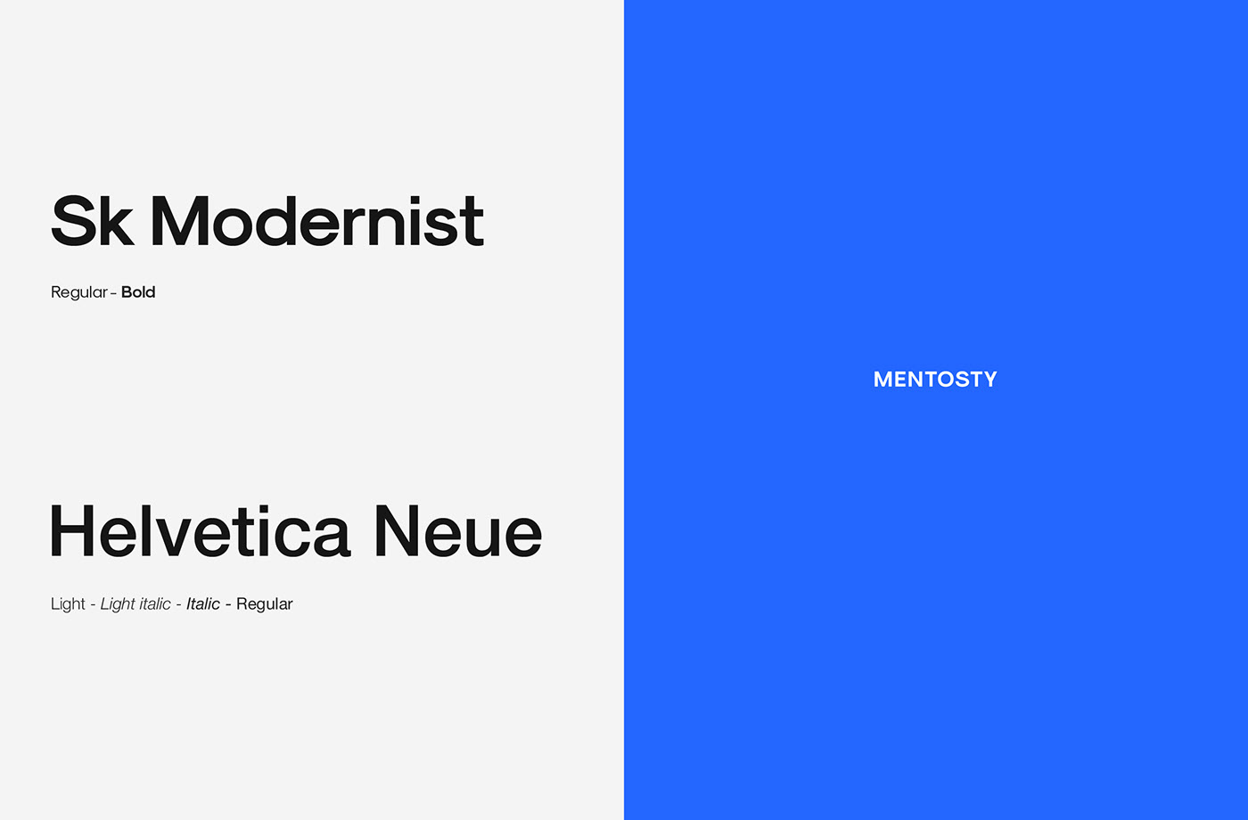
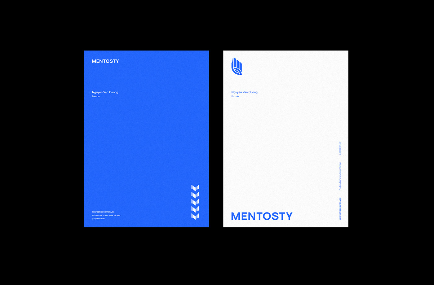
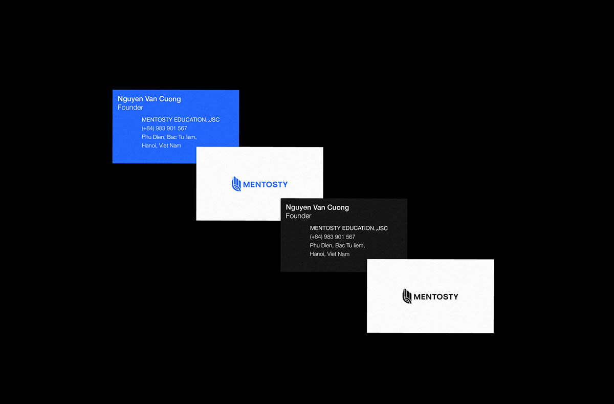
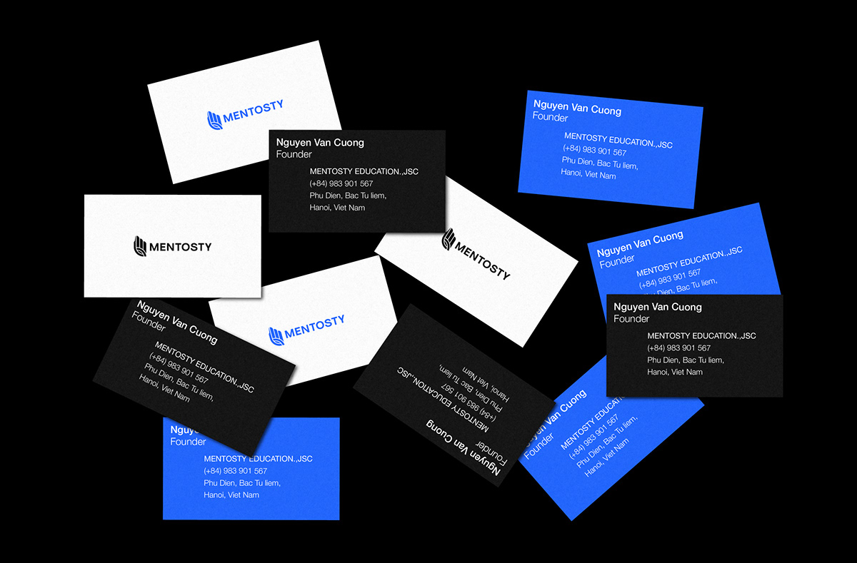
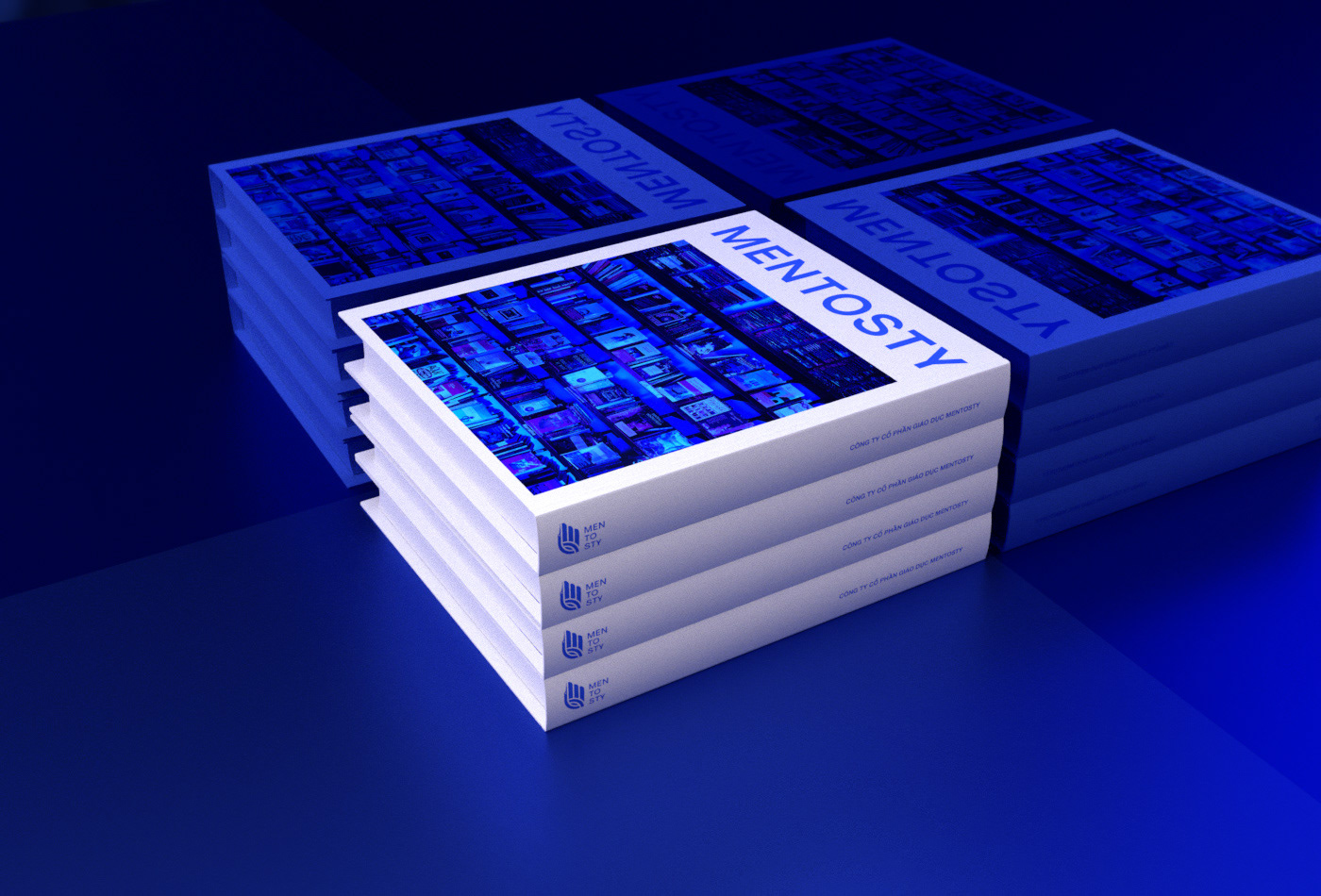
Target: MENTOSTY EDUCATION.,JSC | MENTOSTY Brand identity design challenge
Strategy and Design by Storm Slash Studio
MENTOSTY technology education company was established with the goal of bringing a comprehensive online education platform to the young generation in the future.
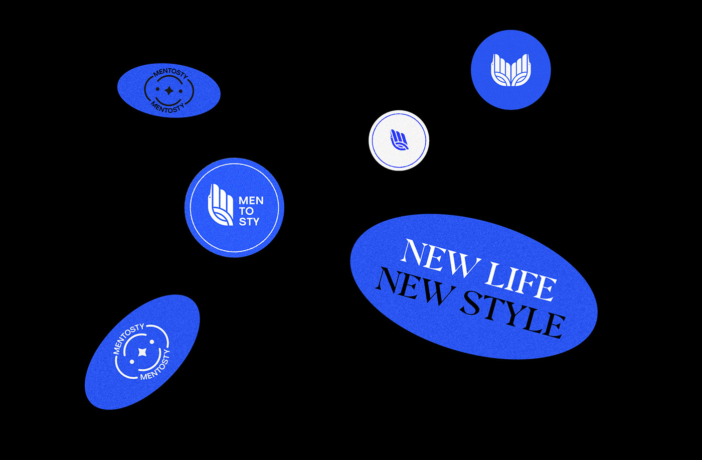
Mentosty logo is inspired by 3 main images:
The crane fairy - the hand - the eye
Fairy crane represents lightness, elegance but still elegance and sophistication. inherit and promoting the minimalism, symbol of longevity, has a little influence from the vignette of the ancient Vietnamese. 'Crane fairy with wings pointing to the sky is the rise, overcoming difficulties, bringing Mentosty to become an educational brand with the best, the most quintessential things that the brand brings to the community.
----------------------------------------------------------------------------------------------------------------------------------------------------------------------------------------
Công ty giáo dục công nghệ Mentosty được thành lập với mục tiêu mang đến nền tảng giáo dục trực tuyến toàn diện cho các thế hệ trẻ trong tương lai
Logo mentosty được chúng tôi lấy cảm hứng từ 3 hình ảnh chính:
Tiên hạc - bàn tay - con mắt
Tiên hạc - bàn tay - con mắt
Tiên hạc đại diện cho sự nhẹ nhàng, trang nhã mà vẫn thanh cao, tinh tế. kế thừa và phát huy
nét tối giản, biểu trưng của sự trường thọ, có một chút ảnh hưởng từ họa tiết của người việt cổ.'
Tiên hạc có cánh hướng lên trời là sự vươn cao, vượt qua khó khăn, mang mentosty trở thành thương hiệu giáo dục với
những gì tốt nhất, tinh túy nhất mà thương hiệu mang tới cộng đồng.
nét tối giản, biểu trưng của sự trường thọ, có một chút ảnh hưởng từ họa tiết của người việt cổ.'
Tiên hạc có cánh hướng lên trời là sự vươn cao, vượt qua khó khăn, mang mentosty trở thành thương hiệu giáo dục với
những gì tốt nhất, tinh túy nhất mà thương hiệu mang tới cộng đồng.


THE END


