Original July 2013 Version: The visual concept was the image of a person behind bars with reflection of light on the hands to symbolize hope with the cross and heart on it above the head. The dove was to reflect the peace and guidance of God. The main color of a light blue for the background was chosen to reflect calmness.
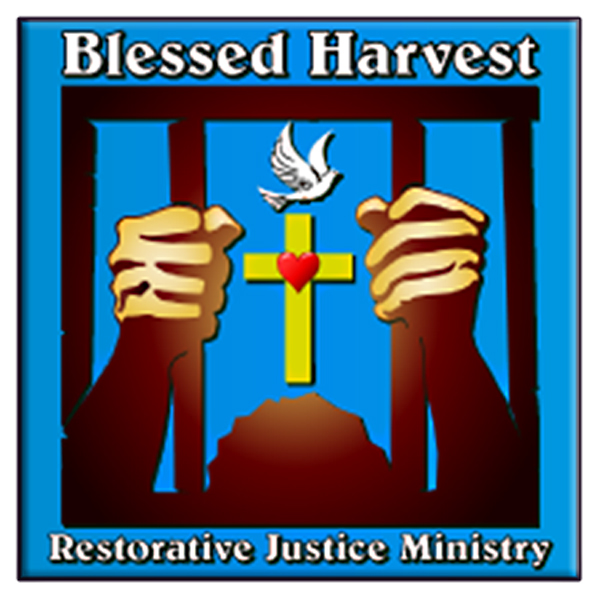
Revised Version (2016): The visual concept was maintained; however, the shape of the logo itself was changed to a rounded square to contrast the shape of the bars. The bars were given a stoned-gray appearance. The depth of the image of the prisoner was deepened, so that the hands would appear to be clenching the bars more. The dove image and the cross image were also changed, as well as darkening the hue of the blue for a softer "calmness." Rather then a dove flying by, this dove lights down upon the cross.


