
MOSHILO
BRANDING
DESIGN
BRANDING
DESIGN
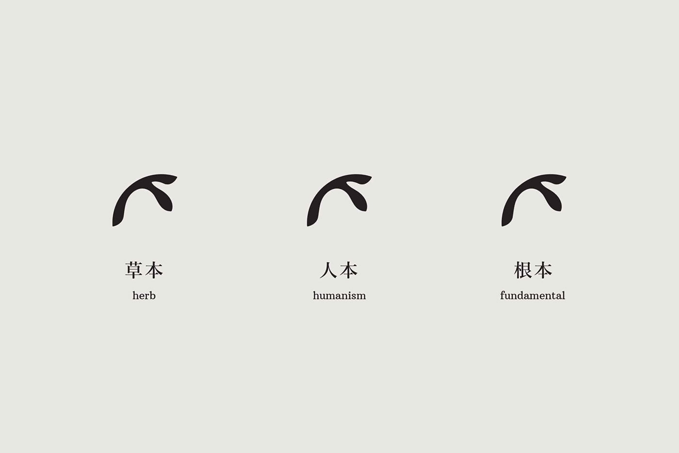
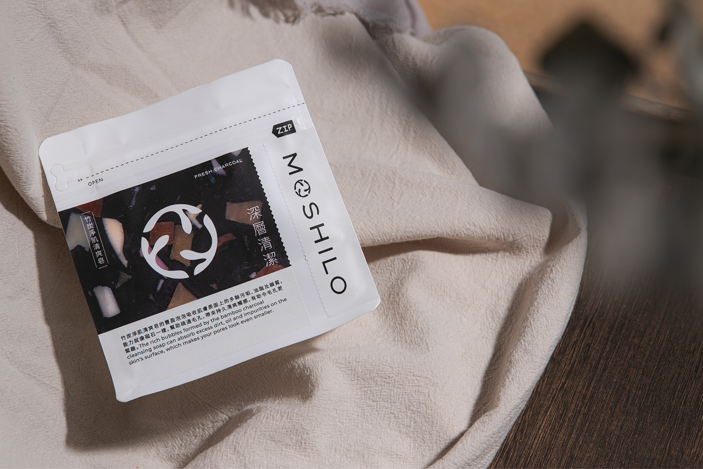
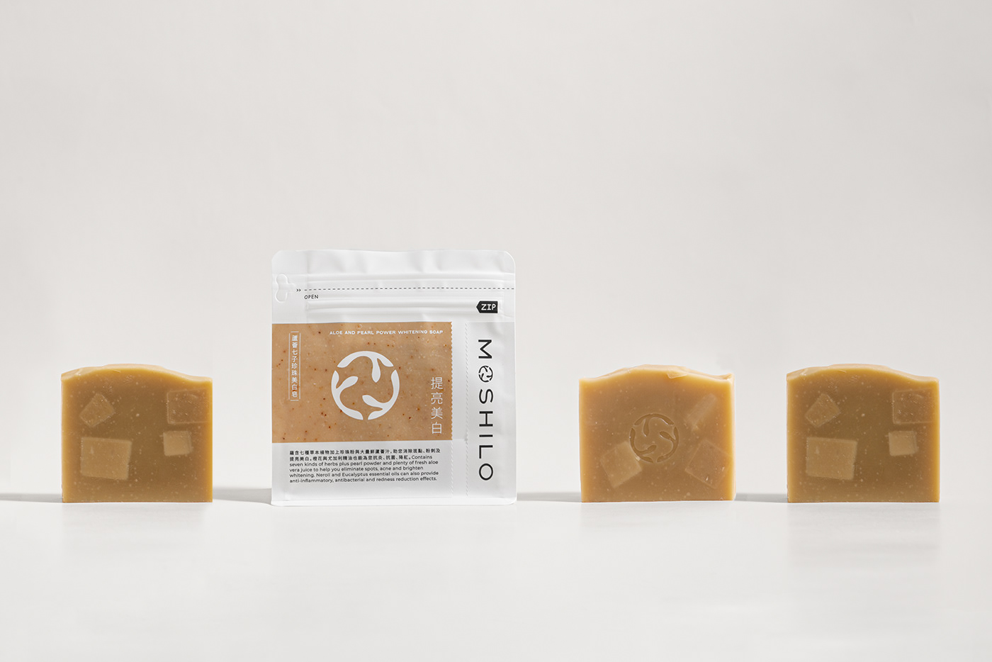
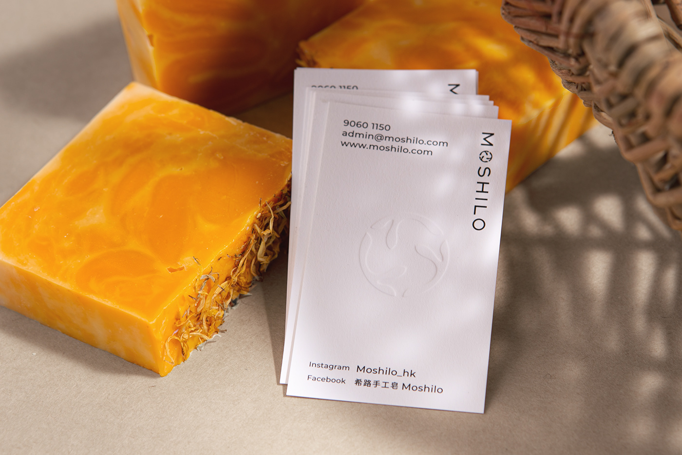
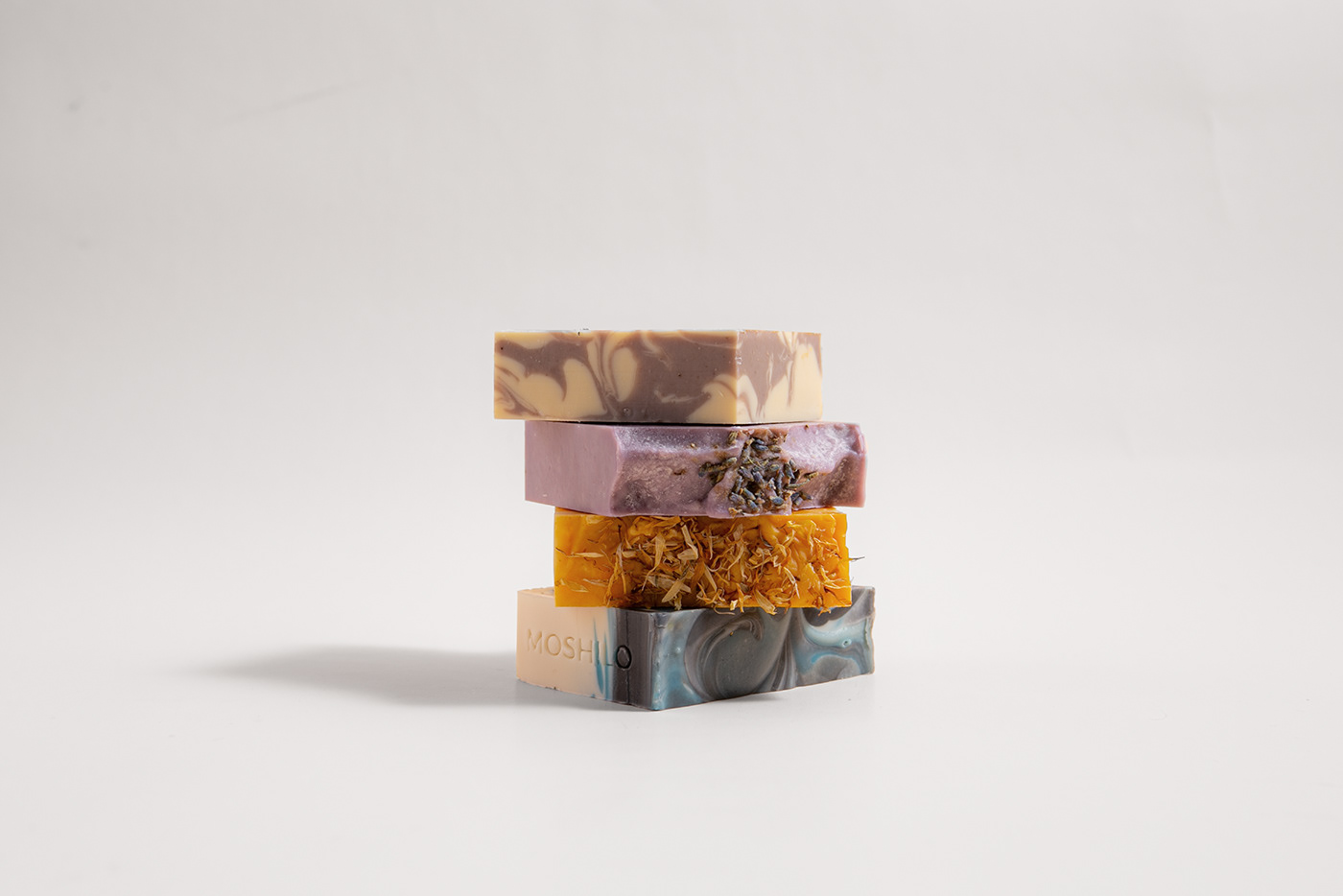
Moshilo is a Hong Kong handmade soap brand which mixes natural ingredients with Chinese herbal efficacy. The brand follows the concept “Humanism 人本”, “Herb 草本” and “Fundamental 根本”, and is dedicated to producing eco-friendly products with ingredients purchased or recycled from local farms.
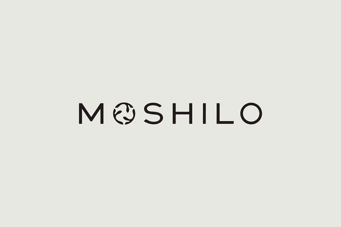
Moshilo had its rebranding project in 2020. The new logo design is composed by 3 duplicated Chinese character “人” (i.e. human), representing “Humanism 人本”. Vincdesign used olive green as brand colour, which is similar to the colour of herbs, presenting “Herb 草本”.
When the three “人” formed a circle, it brings out Moshilo’s visions of protecting the earth, supporting sustainable development and connecting with people.


Branding design for Moshilo 希路手工皂
Client/Project: Moshilo 希路手工皂
Creative Director: Vince Cheung
Design and illustration: Kaman Kan
Photography & Animation: Yin Ip @tinysotiny.co
Client Website: www.moshilo.com
Client/Project: Moshilo 希路手工皂
Creative Director: Vince Cheung
Design and illustration: Kaman Kan
Photography & Animation: Yin Ip @tinysotiny.co
Client Website: www.moshilo.com
商標 | 品牌設計 | 香港 | 香港設計 | 視覺形象 | 包裝 | 包裝設計
logo | branding | design | hong kong | hong kong designer | VI | visual identity | vincdesign | package | package design
logo | branding | design | hong kong | hong kong designer | VI | visual identity | vincdesign | package | package design


