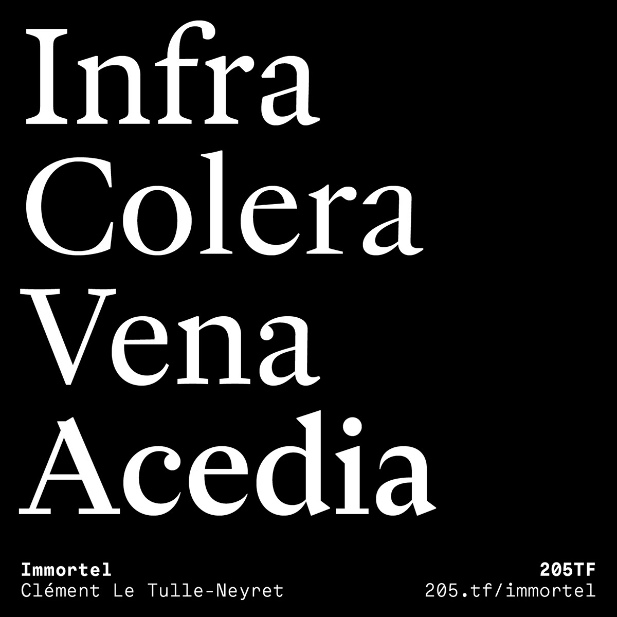
Immortel, designed by Clément Le Tulle-Neyret, is a type family with four variants developed according to the Hippocratic theory of humors that explains these latter through the presence of one of the four principal fluids. Each one is the cause behind the development of a character trait: phlegm represents a lymphatic, sluggish, slow character (Immortel Infra); yellow bile, an angry and prideful character (Immortel Colera); blood, a jovial and warm character (Immortel Vena); and black bile provokes hopelessness and melancholy (Immortel Acedia).
This type family is envisaged like a human being, able to reveal different temperaments through the forms that it adopts. Each variant can be substituted for another without causing any change in the bulkiness of the text, as the metric system, which provides a structural link between the variants—set width, x-heights, the length of ascenders and descenders, height of capitals—is constant.
Typographically, each variant is inspired by the work of type designers, following the course of history:
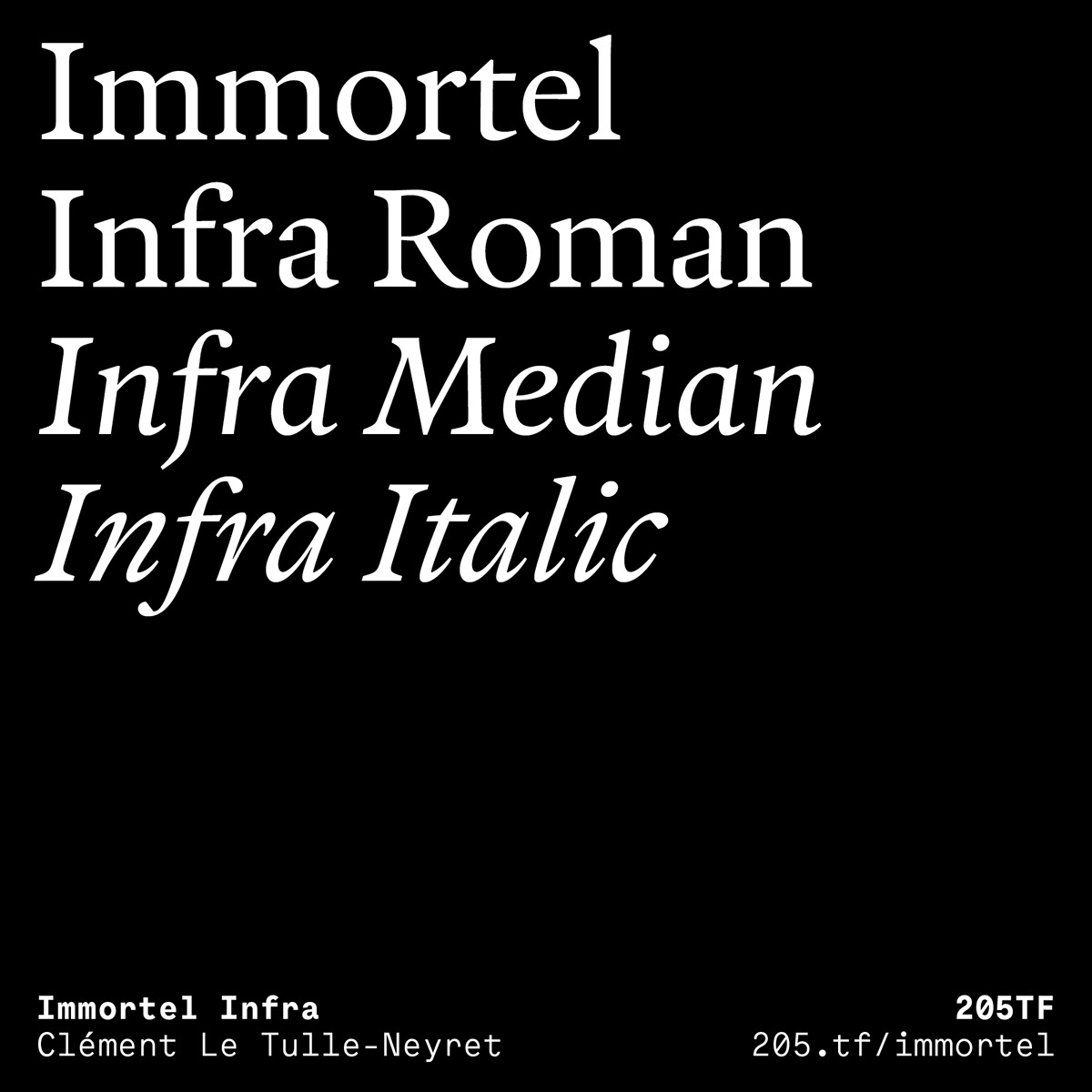
— Immortel Infra finds its source in the work of Robert Granjon, a typeface engraver from the 16th century;
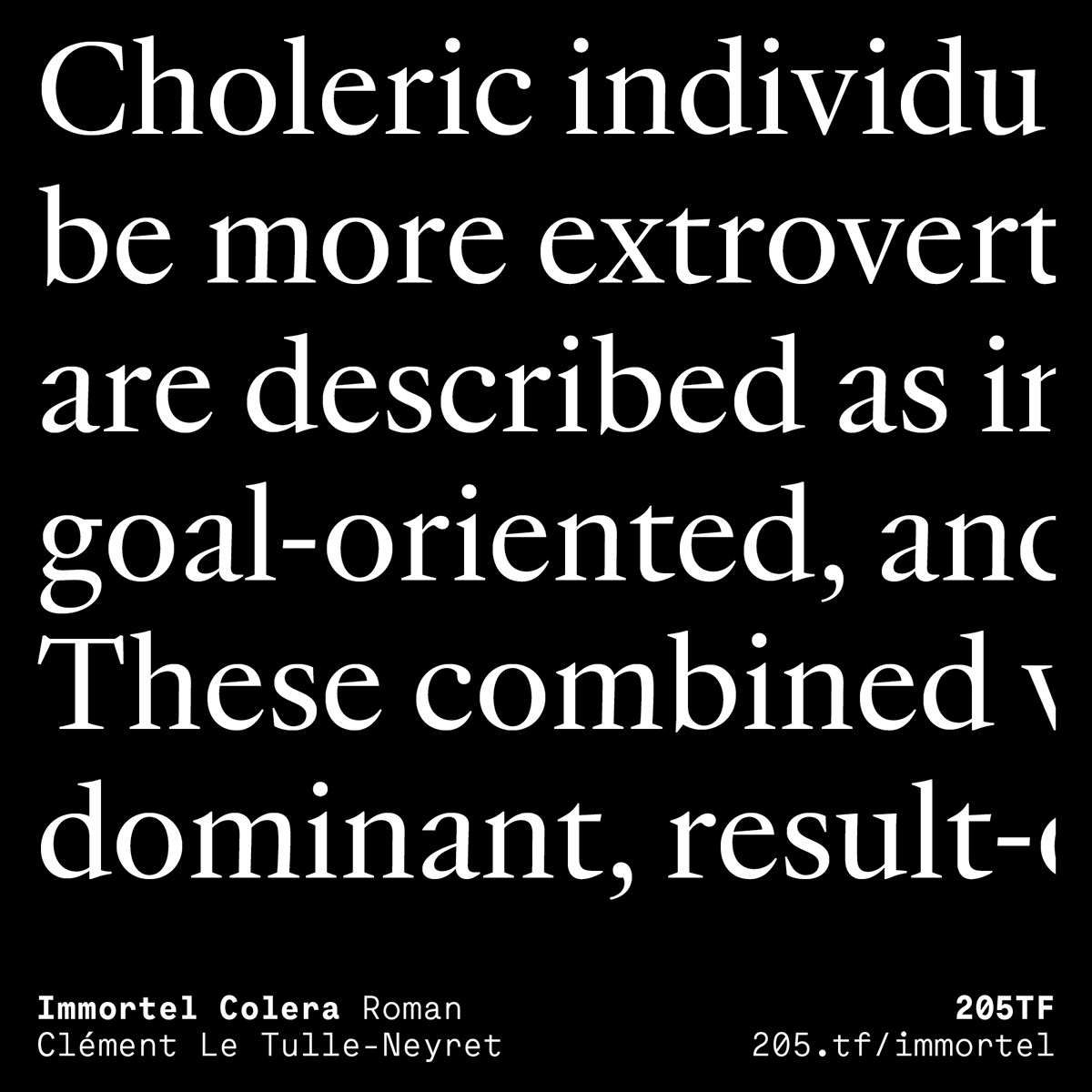
— Immortel Colera in the work of Jean Jannon, an engraver from the 17th century;
— Immortel Vena is influenced by the work of Jacques-François Rosart, an engraver from the 18th century;
— Immortel Acedia takes its inspiration from the engraving Melencolia I by Albrecht Dürer (1514) and attempts a synthesis between two traces of a priori opposing tools, one made by the flat tip and the other by the narrow point. In this sense it is closer to a 21st century typeface.
Immortel Infra and Vena, variants intended to be used with running text, possess two italics: the first, called “Median”, slightly slanted, is ideal for composing long text; the second, called “Italic”, with its very sharp angle and ornate instrokes and terminals, is ideal for emphasis.
To best serve running text, the Infra and Vena variants possess two grades: this signifies that these two variants have two slightly different weights that conserve the same set width so as to have a more or less dark text color according to the page layout and/or the sensitivity of the user. Grade 2 can also be used to compose knocked out text on a dark background.
This type family began life in October 2016 in the Atelier national de recherche typographique (ANRT, Nancy – France). It development was pursued thanks to the support of the Centre national des arts plastiques (CNAP) in 2018.