
My decision to hand draw the typographic logo was an attempt to remove any intimidation that may be felt surrounding the nature of the charity. The colour palette I wanted to keep calm and serene with a vibrant orange to highlight positivity within the marketing.
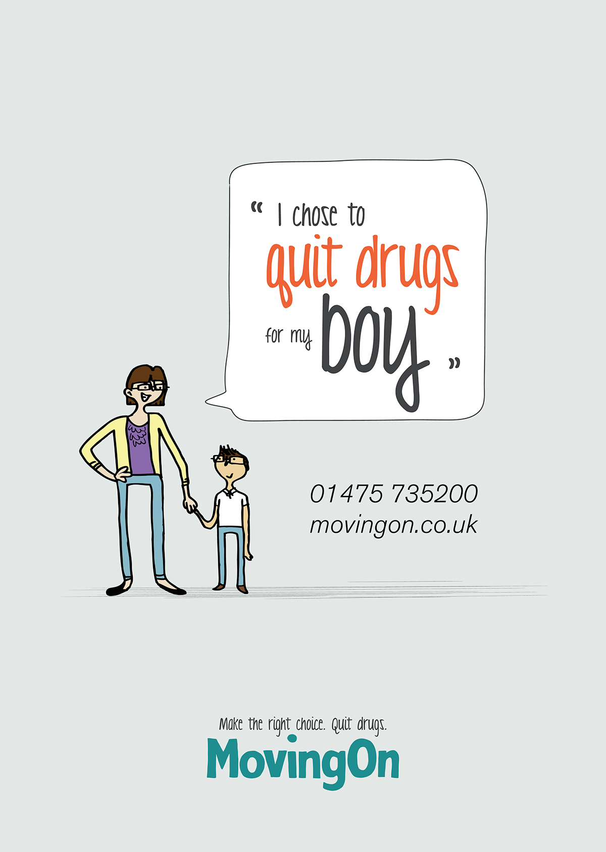

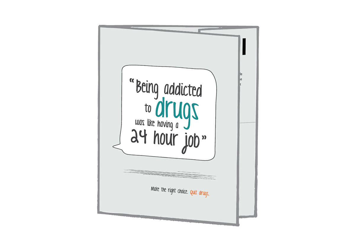
The most valuable research gained completing this project was talking to existing members of the charity. Learning about their motivation and drive to change their lives was what influenced the quotations used within my marketing materials.

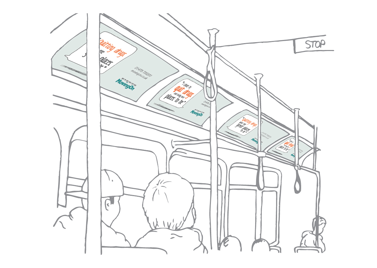


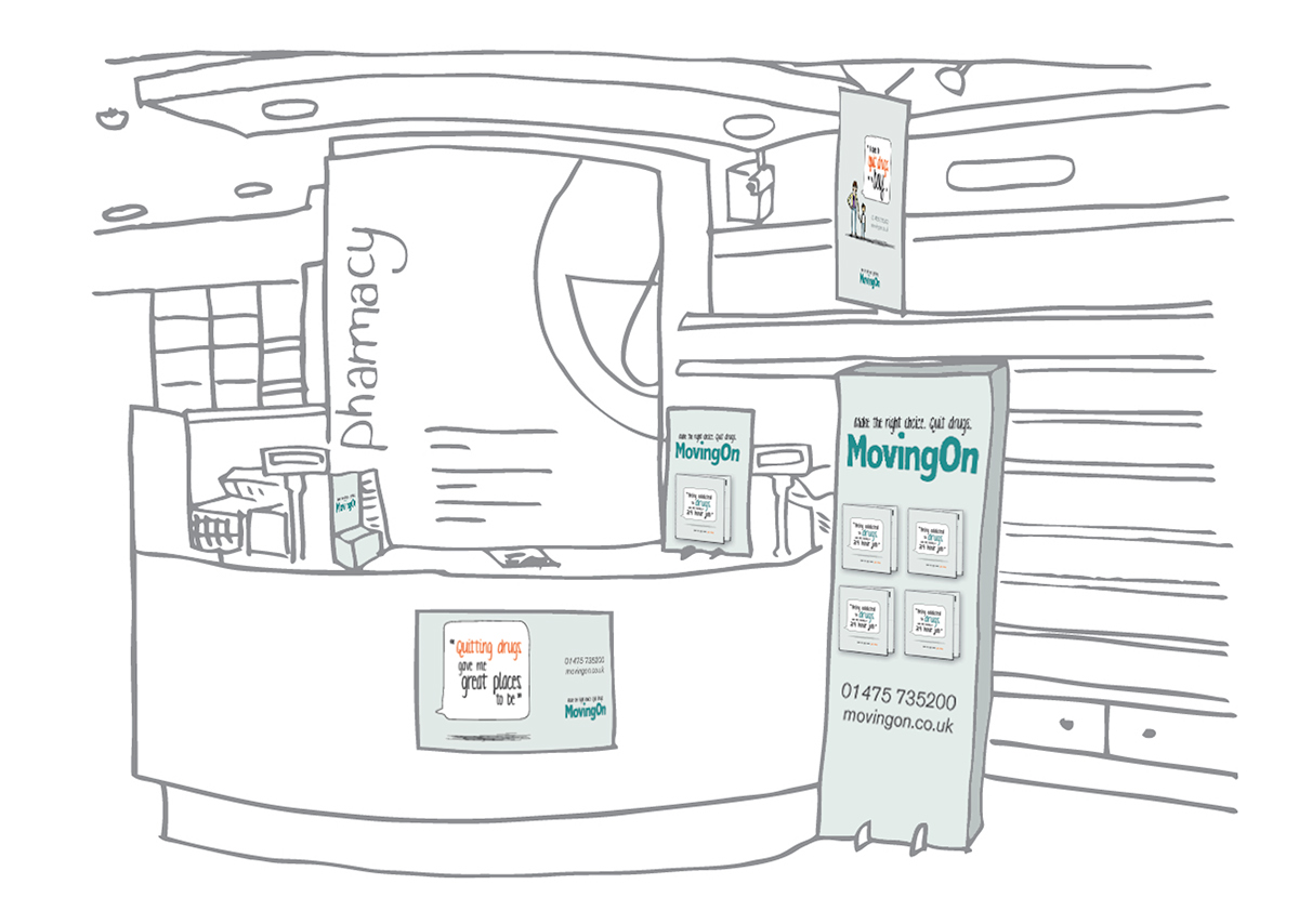
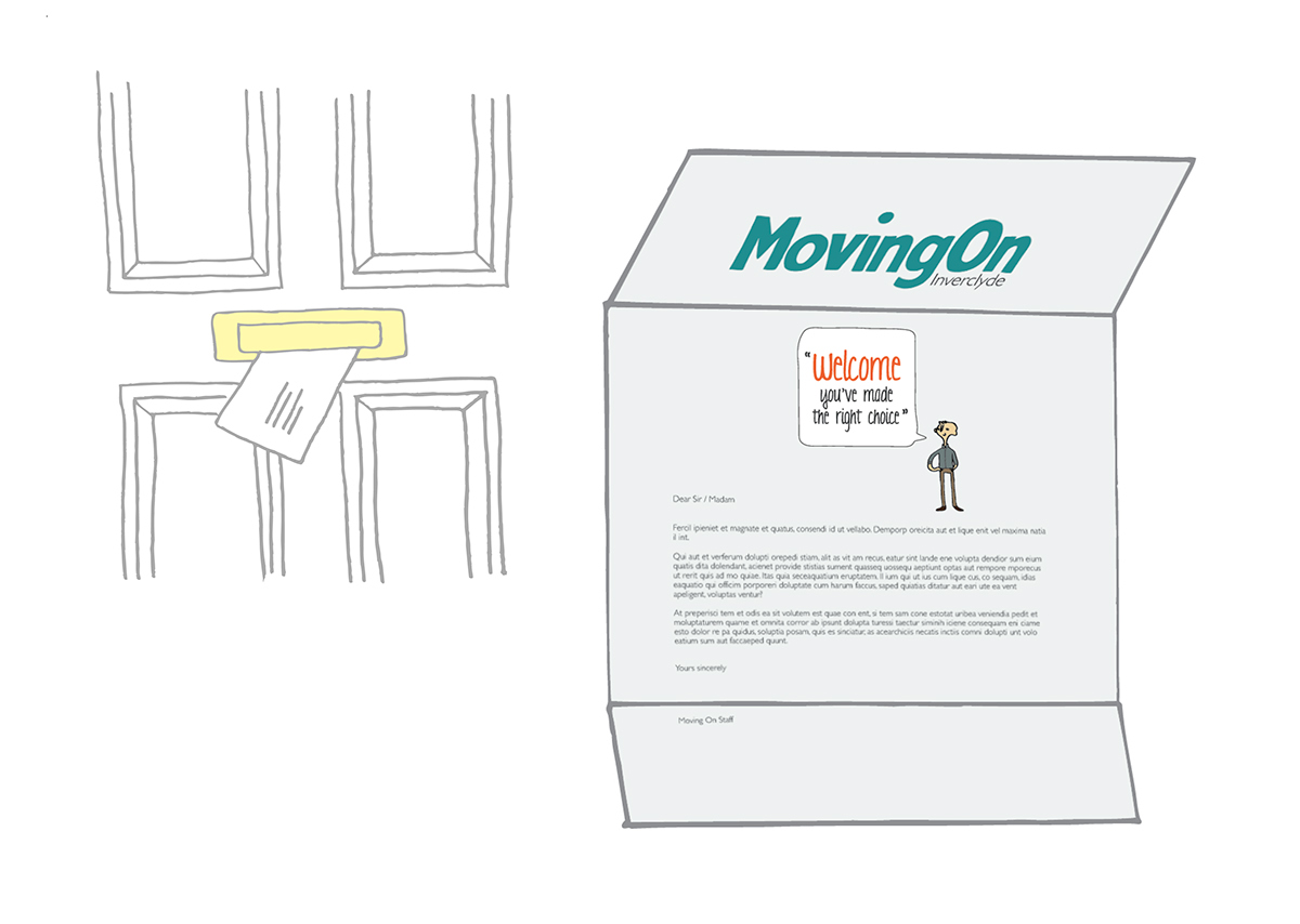
The marketing materials I designed all revolved around the areas that might best target someone who may be struggling to give up drugs. Public transport, taxis and their local chemist continually came up as regular visit sites. Direct mail was an addition I suggested as a more personal outreach to people in their homes where their is maximum possibility of relapse.


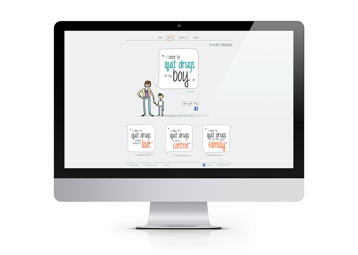
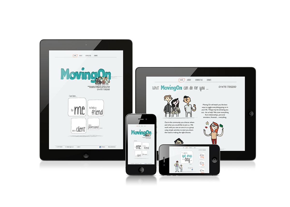
My presentation for the website was highly focussed on being much more user friendly. The idea was to taylor different areas of the website in different written styles depending on who was reading and the information that would be most important to them.


