BRAND DESIGN /// Visual Identity 2020
H I M U G U I - Construtora & Incorporadora
-------
PT
Atuando no mercado da construção civil de Capão da Canoa-RS há 13 anos, a Himugui Construtora & Incorporadora busca se estabelecer como referência em empreendimentos de alto padrão no litoral norte gaúcho.
A empresa pretende através da ampliação de seus negócios, proporcionar momentos únicos entre família, em ambientes confortáveis e sofisticados, levando
experiências marcantes para pessoas que buscam imóveis diferenciados para veranear na praia.
O nome Himugui é soma das iniciais dos três filhos da família e traz um grande significado para o pai.
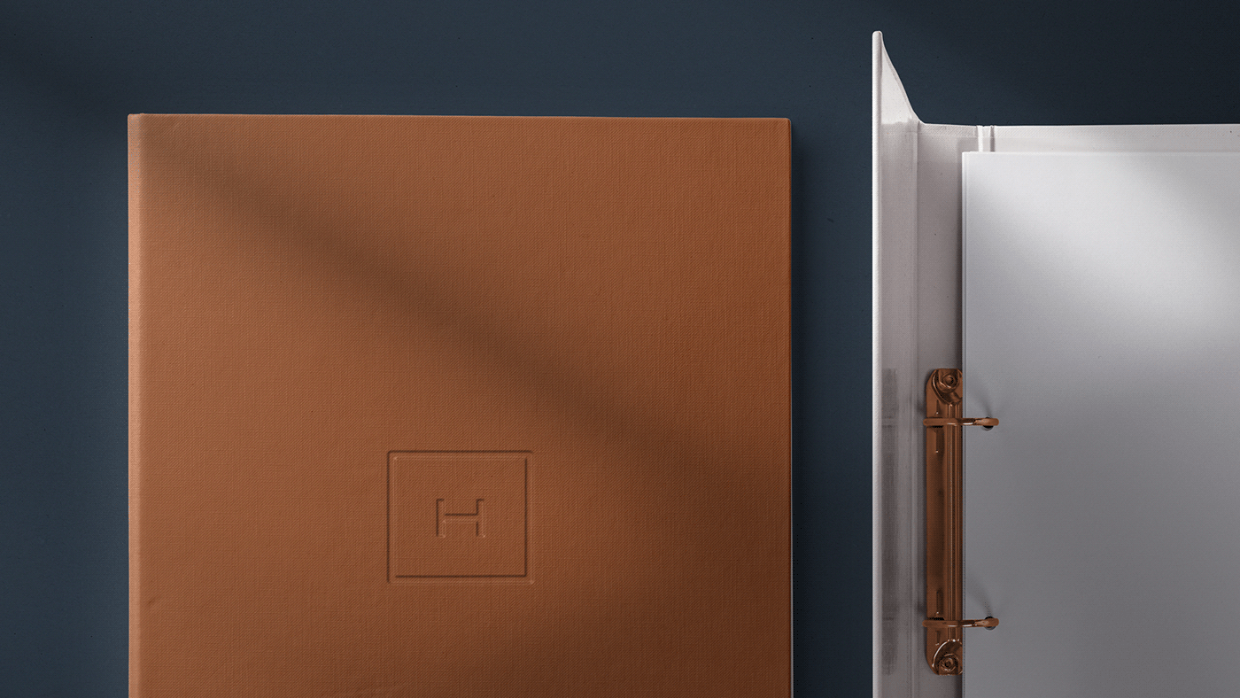
Pensando que quatro pessoas deram origem a empresa, desenvolvi um símbolo que soma quatro lados.
A inicial H encaixa de forma simétrica ao retângulo, que juntos traduzem o minimalismo forte e sólido que a marca precisava.
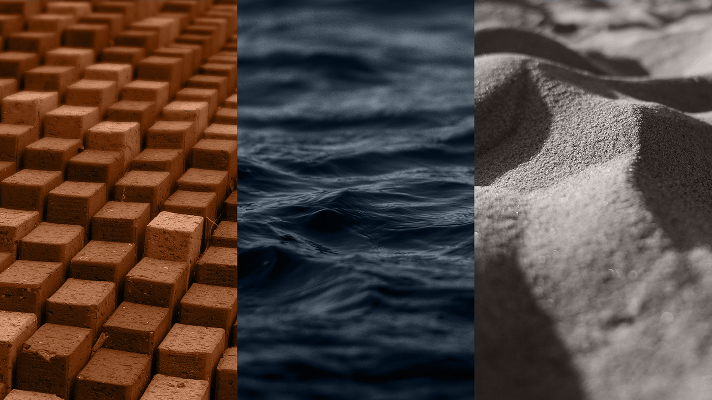
Mar, areia e tijolo serviram de base para as cores do projeto, formando uma paleta que nos remete elegância e respeito.
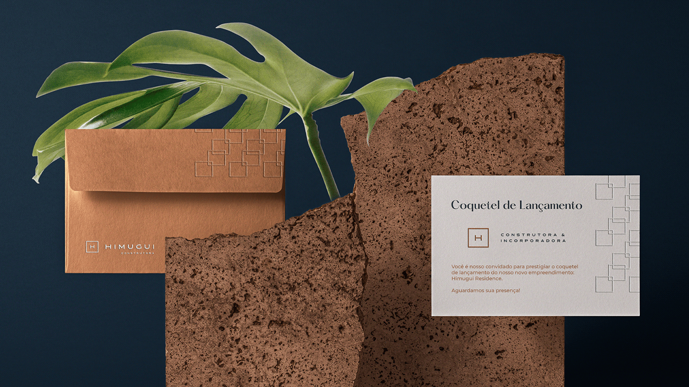
Além das cores originais, o símbolo pode ser aplicado em "bronze foil" em materiais que pedem aquele toque sofisticado.
A empresa pretende através da ampliação de seus negócios, proporcionar momentos únicos entre família, em ambientes confortáveis e sofisticados, levando
experiências marcantes para pessoas que buscam imóveis diferenciados para veranear na praia.
O nome Himugui é soma das iniciais dos três filhos da família e traz um grande significado para o pai.
Pensando que quatro pessoas deram origem a empresa, desenvolvi um símbolo que soma quatro lados.
A inicial H encaixa de forma simétrica ao retângulo, que juntos traduzem o minimalismo forte e sólido que a marca precisava.
Mar, areia e tijolo serviram de base para as cores do projeto, formando uma paleta que nos remete elegância e respeito.
Além das cores originais, o símbolo pode ser aplicado em "bronze foil" em materiais que pedem aquele toque sofisticado.
EN
Operating in the civil construction market in Capão da Canoa-RS for 13 years, Himugui Construtora & Incorporadora seeks to establish itself as a reference in high-end developments on the north coast of Rio Grande do Sul, Brazil.
Operating in the civil construction market in Capão da Canoa-RS for 13 years, Himugui Construtora & Incorporadora seeks to establish itself as a reference in high-end developments on the north coast of Rio Grande do Sul, Brazil.
The company through the expansion of its business, providing unique moments among the family, in comfortable and sophisticated environments, taking into accountremarkable experiences for those looking for different properties to spend the summer on the beach.
The name Himugui is the sum of the initial syllables of the three children of the family and brings great meaning to the father.Thinking that four people gave rise to the company, I developed a symbol that adds up to four sides.The initial H fits symmetrically to the rectangle, which together translate the strong and solid minimalism that the brand needs.
Sea, sand and brick served as the basis for the project's colors, forming a palette that reminds us of elegance and respect.In addition to the original cores, the symbol can be applied in “bronze leaf” on materials that require that sophisticated touch.
-------