Purekey Skin care Brand design
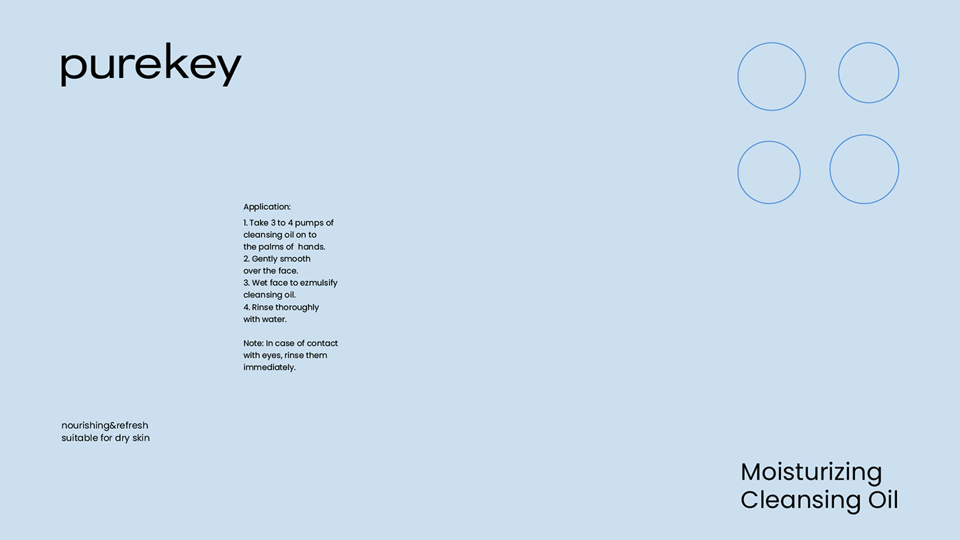
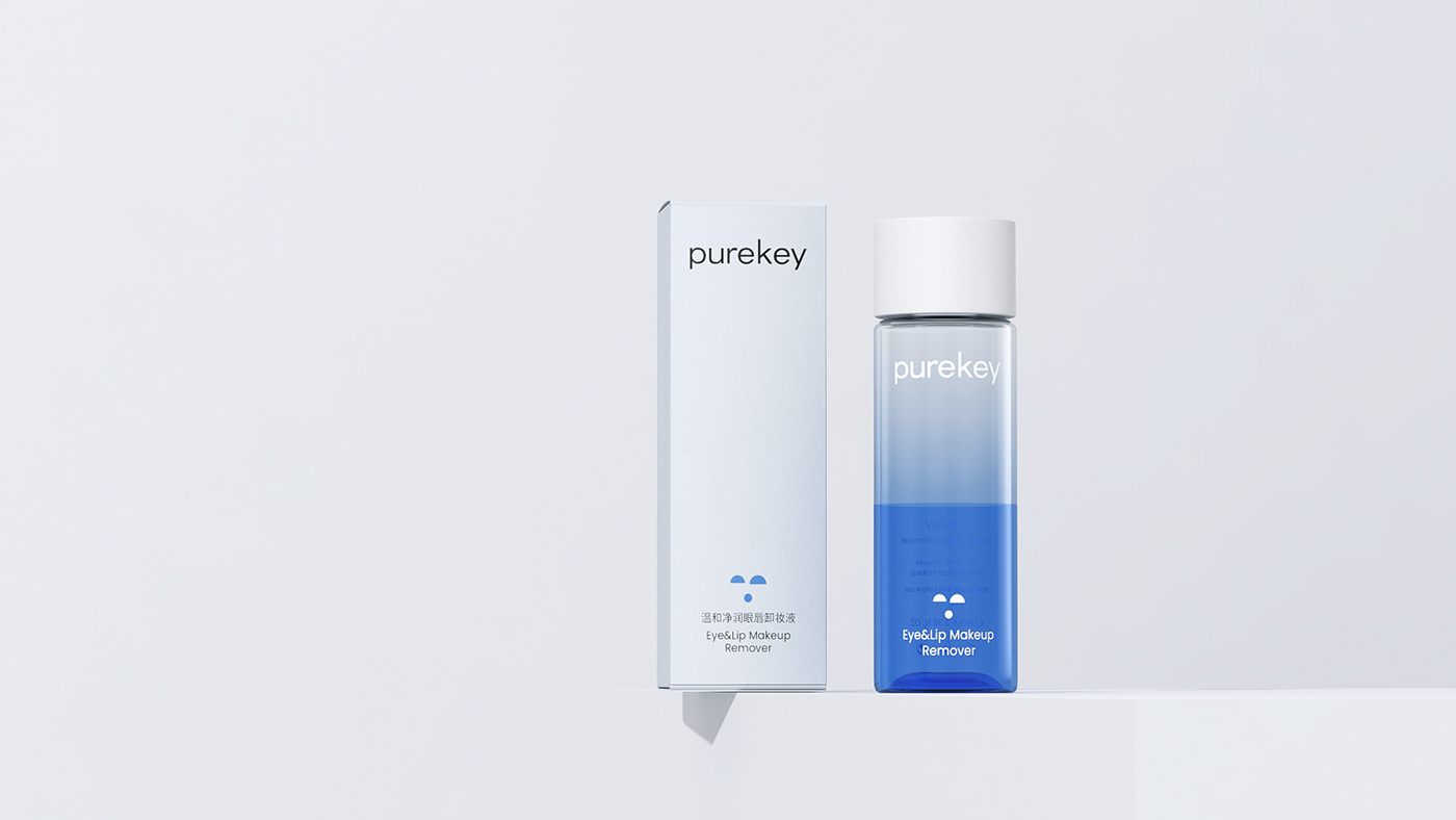
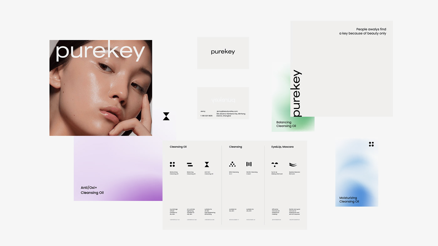
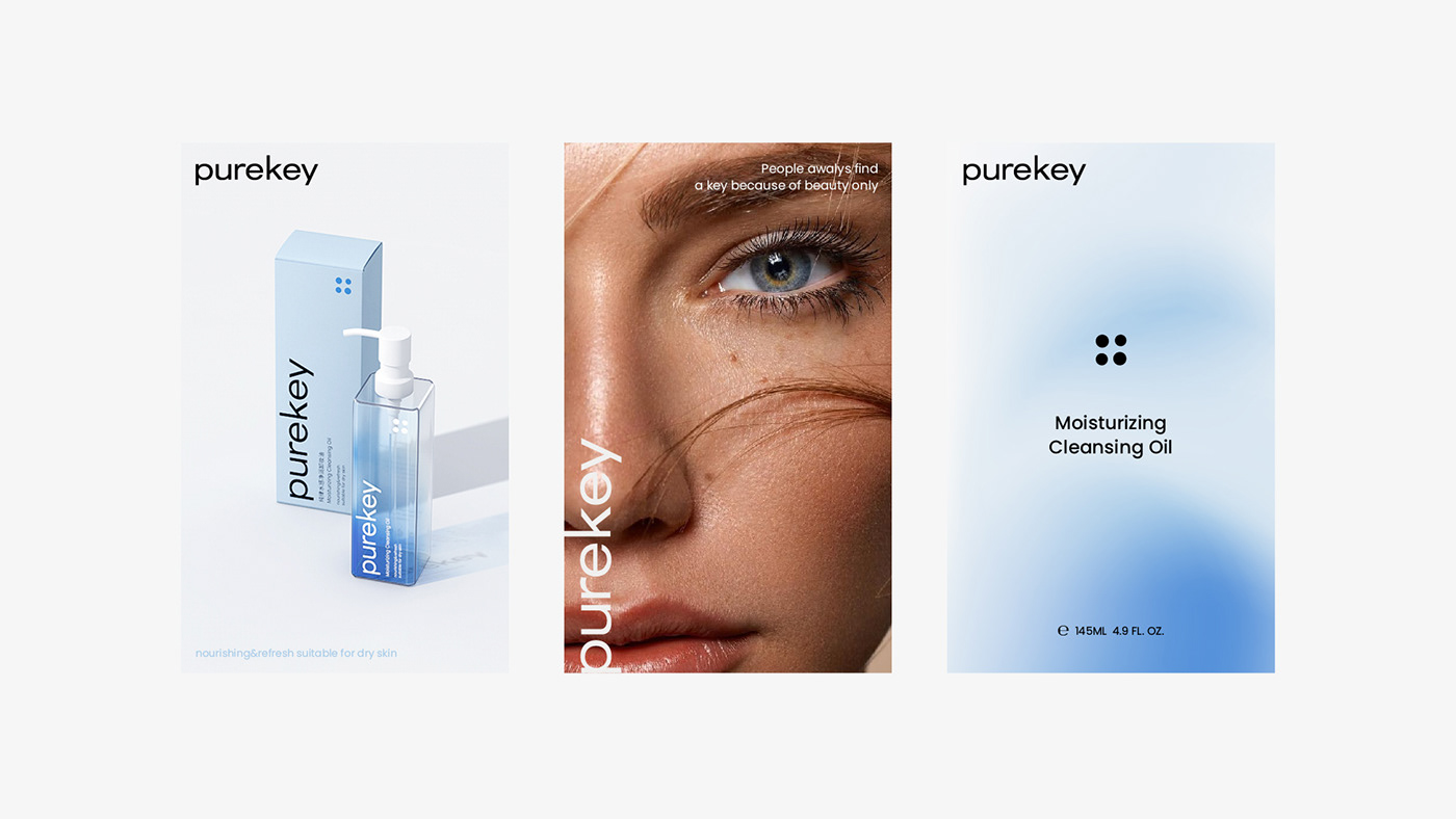
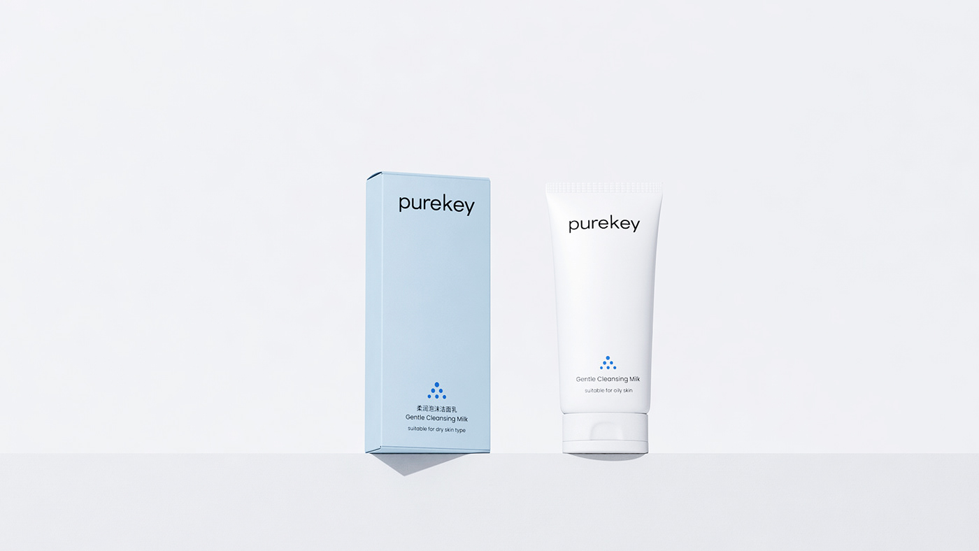
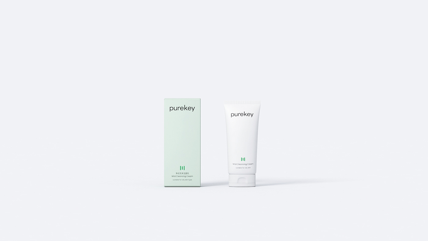
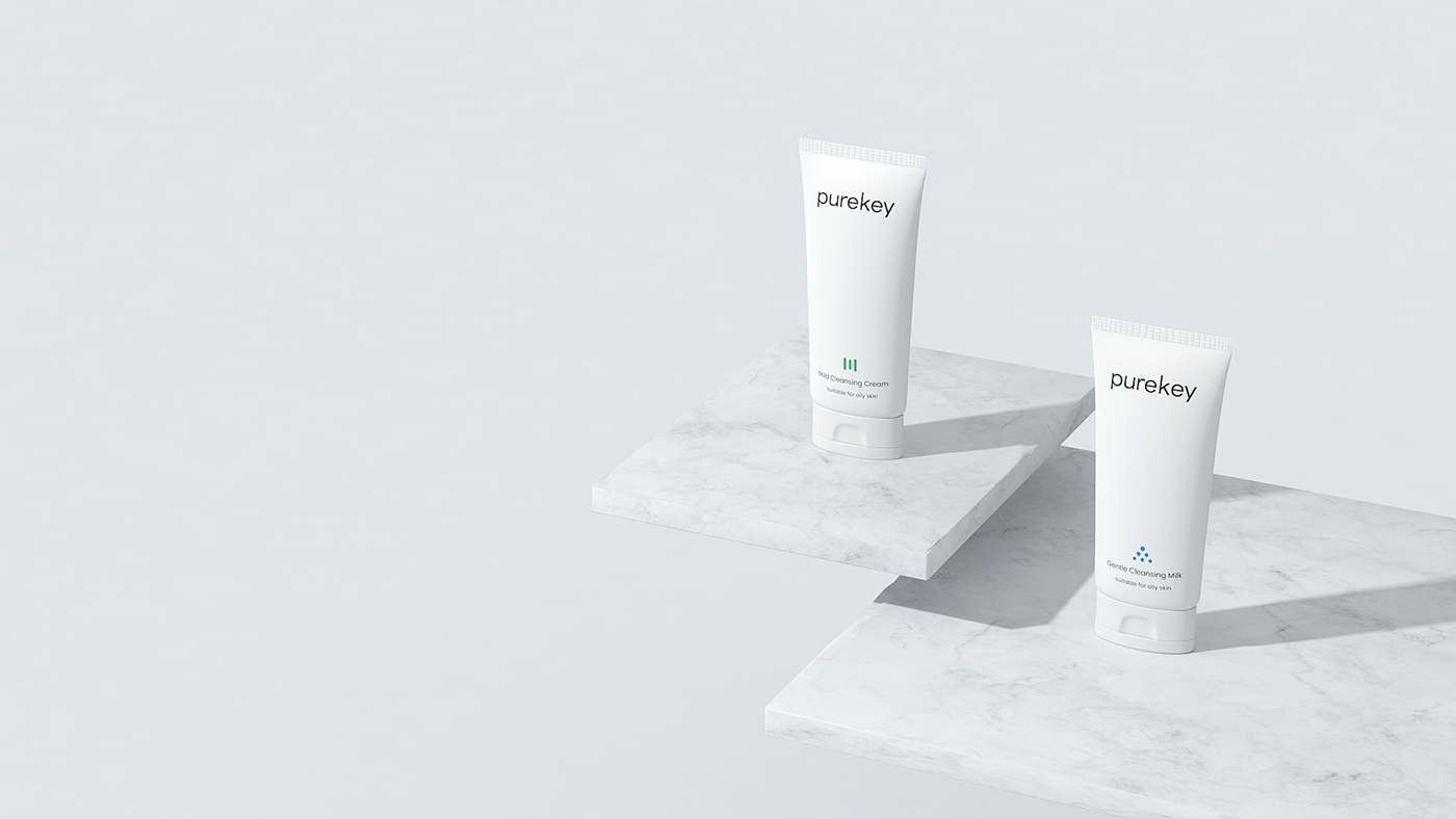
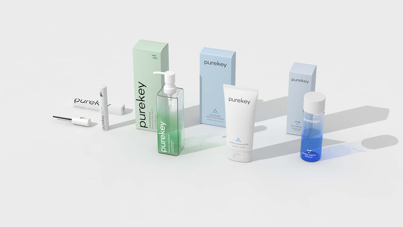
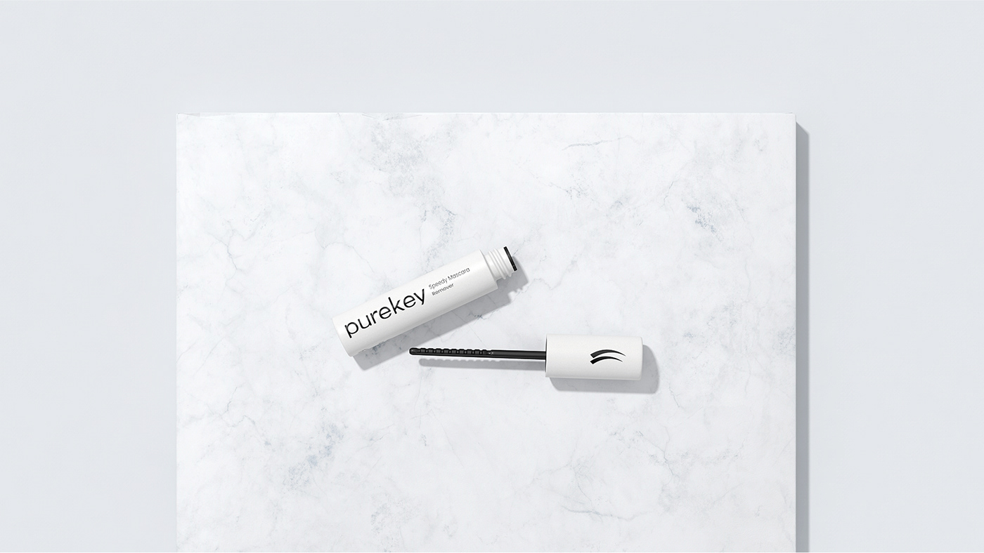
The font logo expresses the simple and modern temperament of the brand, while maintaining a very friendly identification and extensibility.
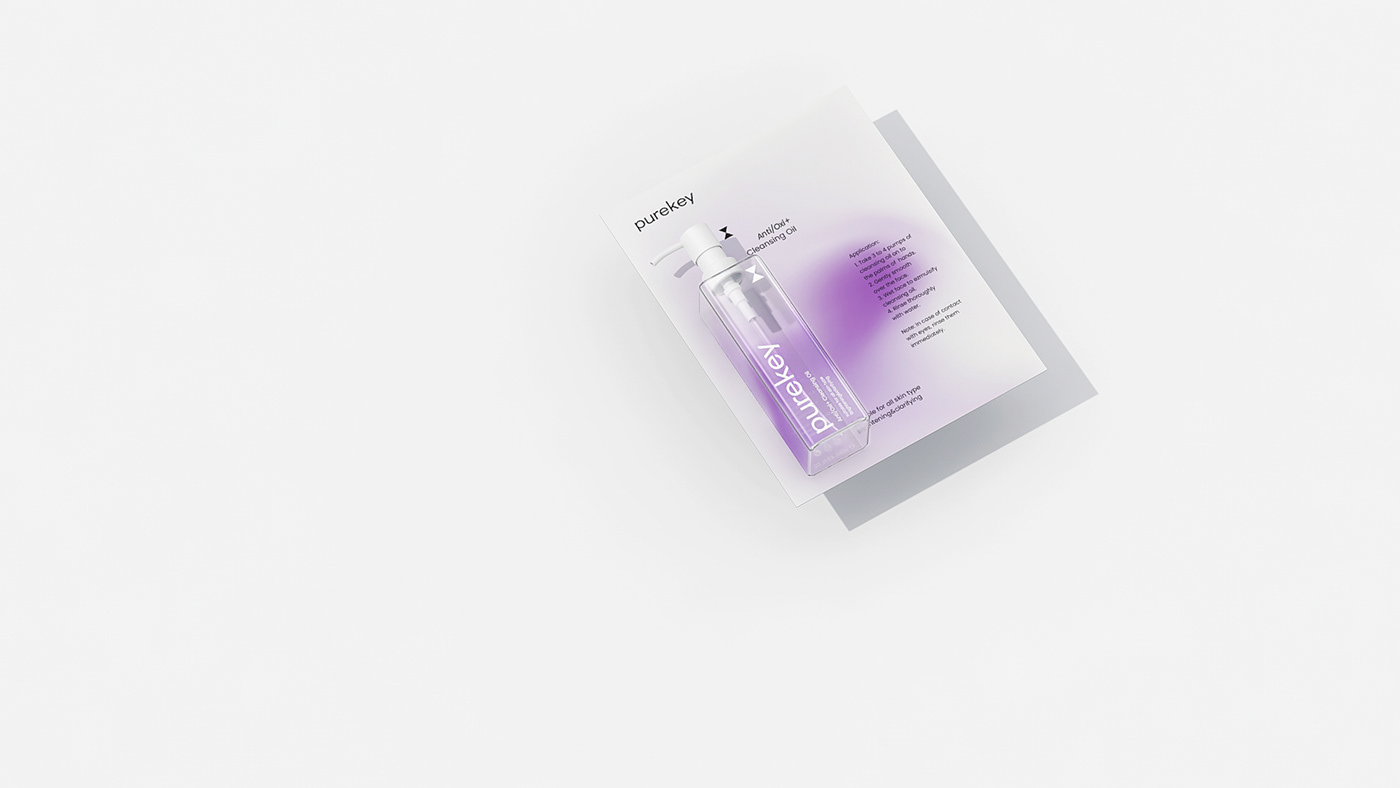
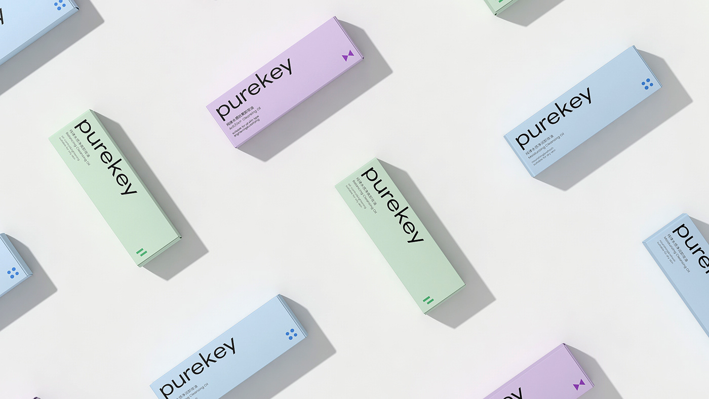
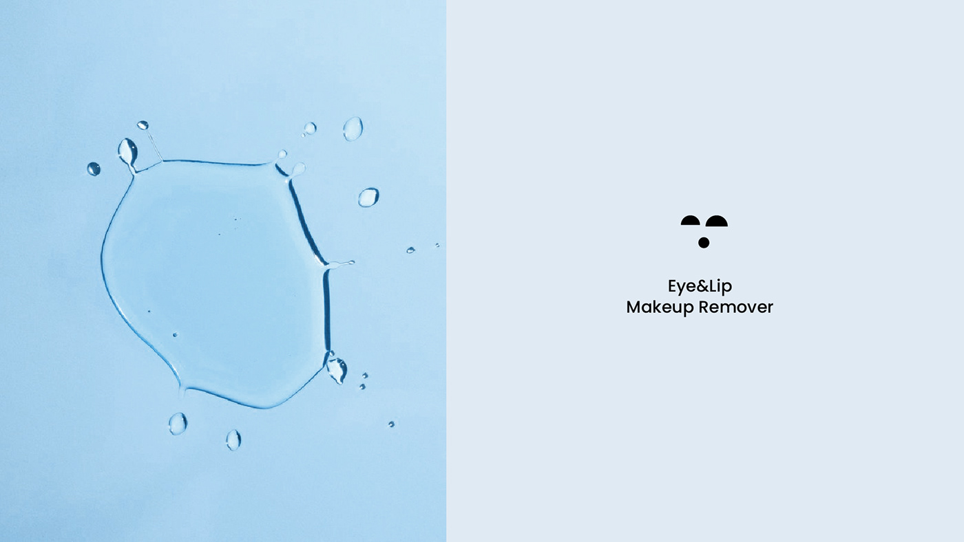
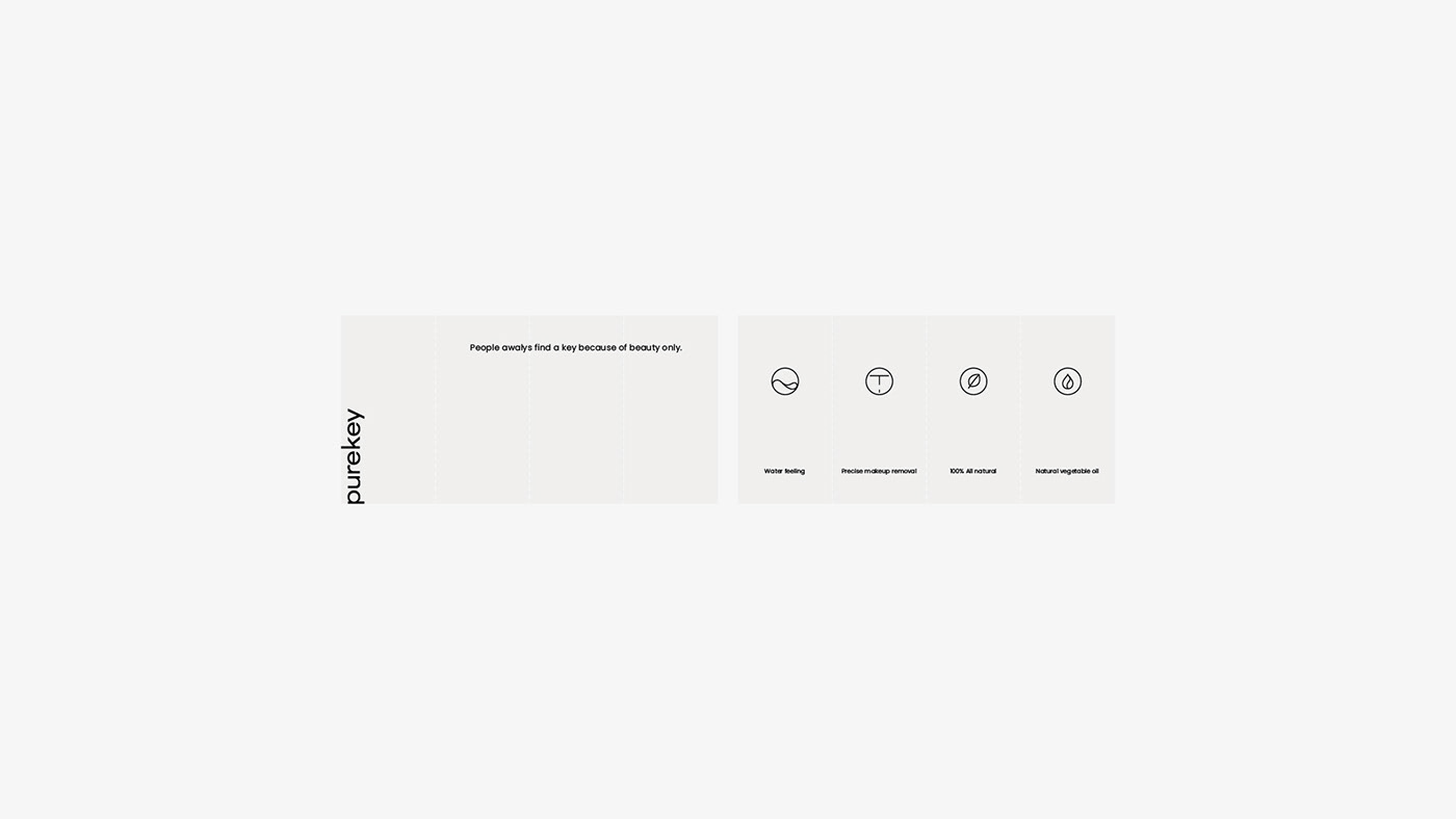
The color of packaging refers to the nature, sea and plants, which makes people feel relaxed and happy. The gradual change form makes the color have a light and slow dynamic. It combines oil feeling and water feeling, a kind of random special gradual change dynamic, which conforms to the natural, light, soft and pure rhythm advocated by pure law brand. Including the representation of different categories and effects of graphics, the use of minimalist design language, visual elements are the most basic and the most simple form. Typesetting is more intuitive, efficient and simple.
字体标志表达品牌简洁,现代的气质,同时保持了非常友好的识别性和延伸性。
包装的色彩参考于大自然,大海,植物,令人心旷神怡,渐变的形式让色彩有一种轻缓的动态,结合了油感,水感,一种随机的特别的渐变动态,契合纯律的品牌所倡导的自然,轻透,柔和,纯净律动。包括其中代表不同类别及功效的图形使用了极简的设计语言,视觉元素都是最基本及最单纯形式。排版上更多考虑直观,高效,简单。