Brand identity and Packaging.
ESP.
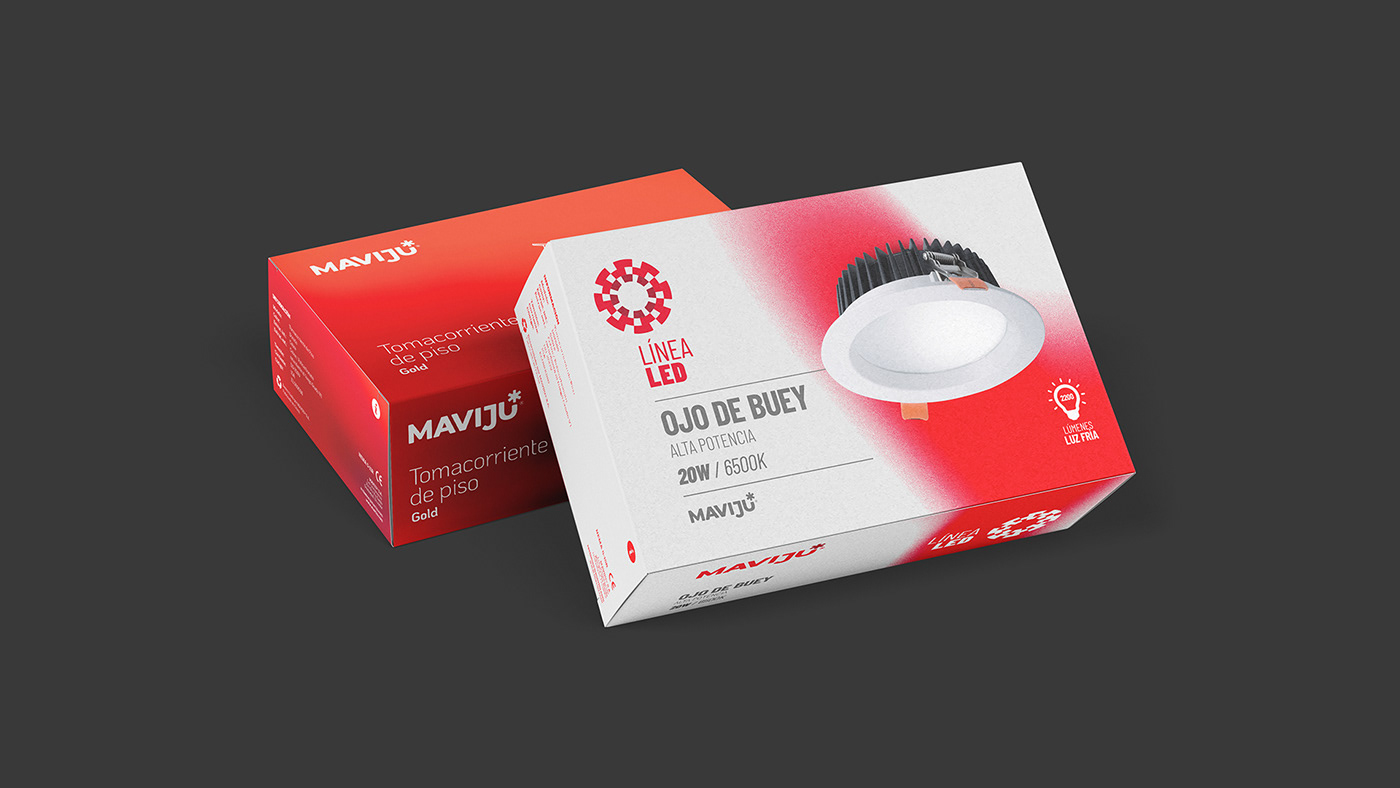
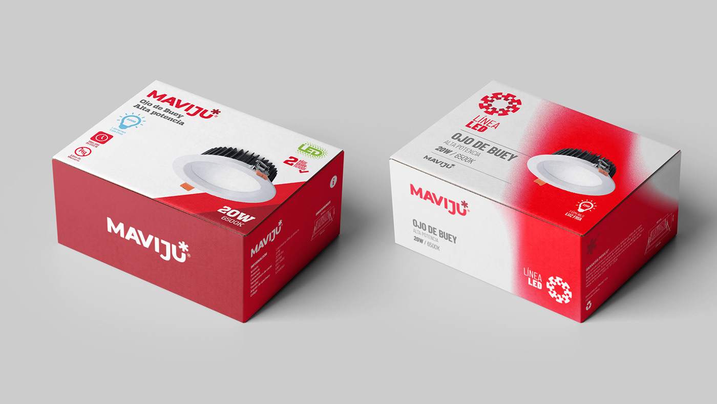
Tal como Aqua, la renovación de la Línea LED nace de la necesidad de independizar las líneas de productos de Maviju. El propósito fue de darle relevancia dentro de la categoría Iluminación, protagonismo al tema LED (tecnología que lleva muchos años por delante de la iluminación tradicional), lo ecoamigable/ecoeficiente, la duración del producto, calidad de luz, entre muchos otros beneficios. En Iluminación LED es importante detallar la calidad de los productos, su garantía, su variedad de portafolio, ser un aliado estratégico en los proyectos lumínicos, asesoría en iluminación, stock permanente, innovación constante.
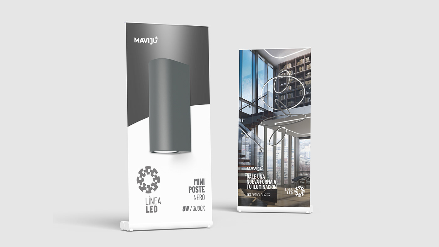
Para el proyecto se consideró primero trabajar en la arquitectura de la marca maestra Maviju, y definir la mejor estrategia para separar e independizar la mencionada línea. La marca debe transmitir innovación, funcionalidad y tecnología, entre otros valores asociados.
Para el desarrollo del ícono se tomó en cuenta un elemento primordial en la medición de la luz y de qué manera esta interactúa con el espacio, lo que se conoce como "Curva Fotométrica", que es la representación gráfica del comportamiento de la luz, estas muestran diferentes características relacionadas con la naturaleza de la fuente, el tipo de reflector, la óptica o el diseño de las luminarias.
Este proyecto es parte de una reestructuración completa del portafolio marcario de Maviju y considera una arista en la comunicación. Finalmente, se trabajó en un nombre específico para la línea, definiéndolo como "ControLED", sin embargo este proyecto muestra el desarrollo inicial de la reestructuración de la línea.
-
ENG.
Like Aqua, the renewal of the LED Line was born from the need to make Maviju's product lines independent. The purpose was to give relevance within the Lighting category, prominence to the LED technology (that has been ahead of traditional lighting for many years), the eco-friendly / eco-efficient, the quality of light, among many other benefits. In LED lighting it is important to detail the quality of the products, their guarantee, their variety of portfolio, to be a strategic ally in lighting projects, lighting advice, permanent stock, constant innovation.
For the project, it was first considered to work on the architecture of the Maviju master brand, and to define the best strategy to separate and make the aforementioned line independent. The brand must transmit innovation, functionality and technology, among other associated values.
For the development of the icon, a fundamental element was taken into account in the measurement of light and in what way it interacts with space, which is known as "Photometric Curve", which is the graphic representation of the behavior of light, these show different characteristics related to the nature of the source, the type of reflector, the optics or the design of the luminaires.
This project is part of a complete restructuring of Maviju's brand portfolio and considers an edge in communication. Finally, a naming for the the line was created, defining it as "ControLED", however this project shows the initial development of the restructuring of the line.