


—TYPOGRAPHY DESIGN
Boom
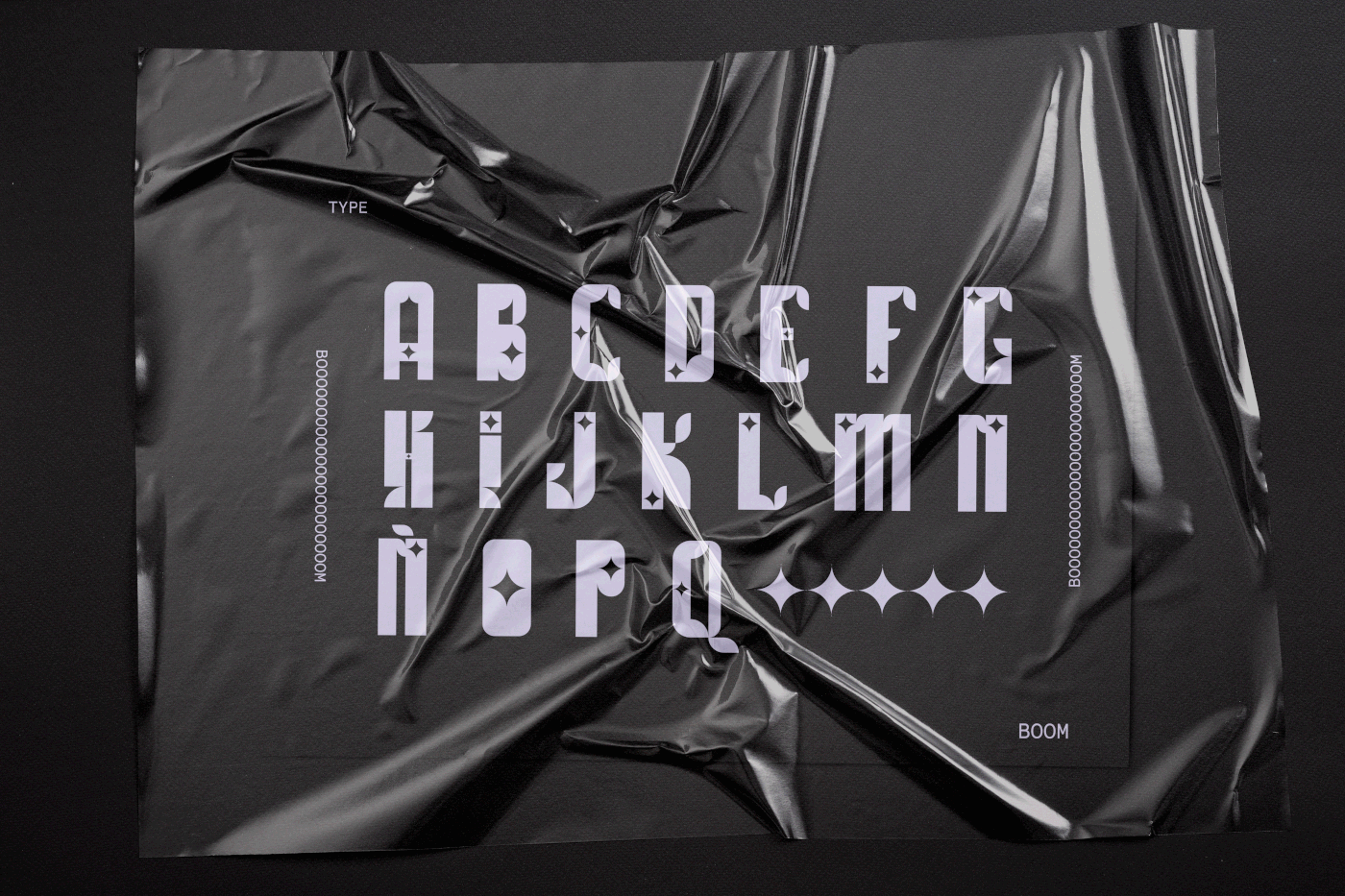
✦ BOOM es la tipografía que he diseñado para el primer número de Neon Tetra, una revista en la que estoy trabajando. Me he centrado en lo que me transmite el concepto raíz de este primera entrega: el garabato: es decir, la urgencia por comunicar; el miedo a olvidar; las ideas que vienen sin avisar…
Para transmitir gráficamente todas estas sensaciones de urgencia y lucidez he recurrido al elemento de la chispa (o como también se puede interpretar, la estrella).
✦ He decidido trabajar esta fuente únicamente en caja alta para remarcar la fuerza de esos impulsos; que son como gritos que necesitan salir de la mente . El grosor de los caracteres es ancho, dejando una gran mancha tipográfica para llamar la atención, sobresalir sobre las otras ideas.
Esta es una tipografía modular —compuesta por módulos—, compuesta por esa chispa, que es la contraforma que se genera al juntar cuatro cuartos de círculo; y el cuadrado.
✦ Lo que hace especial a BOOM es que mezcla trazos que parecen humanistas con trazos digitales. Transmite mucha fuerza, pero también ninguna seriedad. Es jovial, divertida y apela directamente a las emociones.
Los cuartos de círculo se pueden mezclar de muchas formas y generar trazos visualmente muy humanos. A pesar de ser formas geométricas, es curioso cómo algunos caracteres recuerdan a letras clásicas escritas a mano.
Estos trazos humanistas se combinan con otros grotescos muy digitales, con el propósito de honrar todos los tipos de garabatos que estamos abarcando en el primer número de la revista. Creemos que todas las mesas de trabajo que se usan en un proyecto, desde la primera a la última, también son garabatos. Garabatos digitales, hechos con ceros y unos invisibles, pero que cumplen la misma función que una libreta y un lápiz: dar la oportunidad de equivocarse, proyectar, esbozar… Sin concecuencias.
—
✦ BOOM is the typeface I have designed for the first issue of Neon Tetra, a magazine I'm working on. I have focused on what the root concept of this first issue transmits to me: the scribble. That is, the urgency to communicate; the fear of forgetting; the ideas that come without warning...To graphically convey all these sensations of urgency and lucidity I have resorted to the element of the spark (or as it can also be interpreted, the star).
✦ I have decided to work this source only in the upper box to highlight the strength of those impulses; which are like screams that need to get out of the mind. The thickness of the characters is wide, leaving a large typographic stain to attract attention, stand out from the other ideas. This is a modular typeface, made up of that spark, which is the counter-shape that is generated by joining four quarters of a circle; and the square.
✦ What makes BOOM special is that it mixes humanistic-looking strokes with digital strokes. It conveys a lot of strength, but also no seriousness. It is jovial, funny and appeals directly to the emotions. The quarter circles can be mixed in many ways and generate visually very human strokes. Despite being geometric shapes, it is curious how some characters are reminiscent of classic handwritten letters. These humanistic strokes are combined with other very digital grotesques, with the purpose of honoring all the types of scribbles that we are covering in the first issue of the magazine. We believe that all artboards used in a project, from the first to the last, are also scribbles. Digital scribbles, made with zeros and invisible ones, but which fulfill the same function as a notebook and a pencil: to give the opportunity to make mistakes, to project, to sketch... Without consequences.
—
¡Gracias!
Thanks for watching!


