


PROJECT OVERVIEW
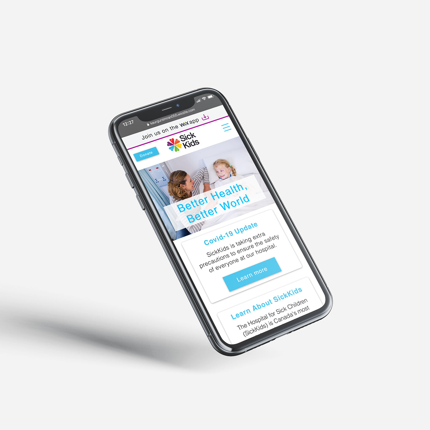
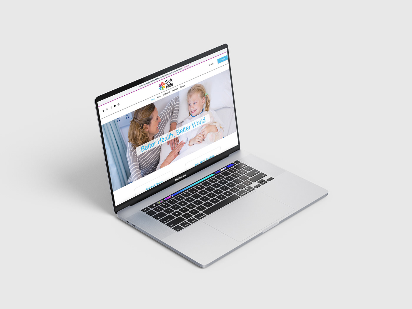
SickKids is an organization found in 1875, fighting for the good health, safety, and well being of children. SickKids launches its new campaign SickKids VS: This is why this shows the inside look at actuality face by the patients and health care staff.
Audience: Families of sick kids, healthy families and charitable organizations across Canada.
Challenge: To overcome donor fatigue by making potential donors aware of the positive impact that SickKids hospital has on children across Canada and around the world.
LOGO DESIGN
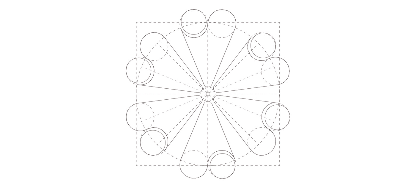
The wordmark represents V and S for the SickKids VS campaign as well, looks like the people of different communities coming together to help sick children by raising or donating money.
The wordmark represents V and S for the SickKids VS campaign as well, looks like the people of different communities coming together to help sick children by raising or donating money.
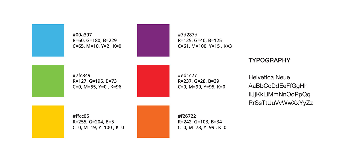
TYPOGRAPHY
SickKids logo is a logotype with san-serif type to give the logo clean and nicer look.
COLORS
The six different colors are selected to represent that people of different communities are together to help sick children (RED, CYAN BLUE, YELLOW, PURPLE, GREEN,ORANGE).


Thank You


