


ENG
Introduction. Marlen wanted to update the design of her website «Lensfinder» and she turned to me. Her site had a Material design (a style of graphical interface design). She wanted more right angles and no shadows at all.
RU
RU
Введение. Марлен захотела обновить дизайн своего сайта «Lensfinder» и она обратилась ко мне. У ее сайта был Материальный дизайн (стиль графического дизайна интерфейсов). Ей хотелось больше прямых углов и полностью избавиться от теней.
ENG
We decided on the overall design style and I started the stage of selecting fonts and colors.
RU
Мы определились с общим стилем дизайна и я приступил к этапу подбора шрифтов и цветов.


ENG
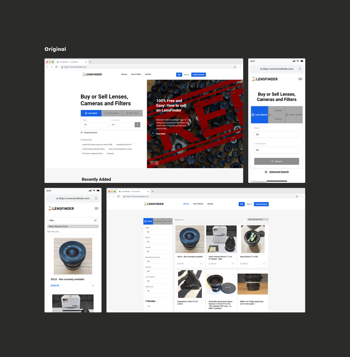
After completing the preparatory work, I started developing the design of the home page. A very important stage. Because all subsequent pages will be developed according to the design of the home page.
RU
После завершения подготовительной работы я начал разработку дизайна домашней страницы. Очень важный этап. Ведь все последующие страницы будут подстраиваться под дизайн этой главной страницы.


ENG
I made a few adjustments to the design, created a clear plan, and started designing the following pages.
RU
Внеся некоторые корректировки в дизайн, я создал четкий план и приступил к дизайну следующих страниц.


ENG
( on some screens I will show the result BEFORE and AFTER )
RU
( на некоторых экранах я буду показывать результат ДО и ПОСЛЕ )


ENG
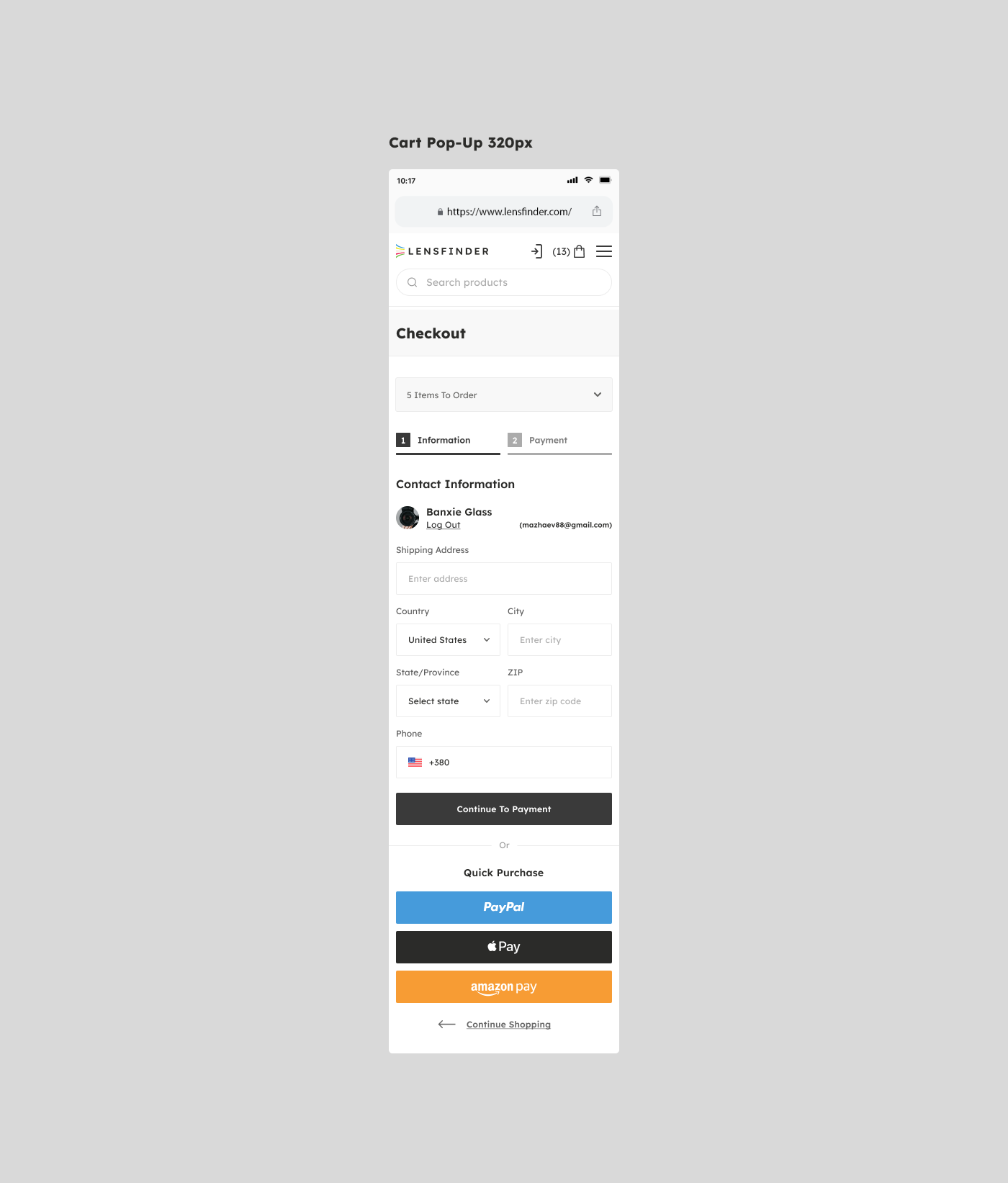
The next step was to develop the shopping cart interface and checkout pages. In the video, you can see the process of ordering the product.
RU
Следующим шагом была разработка интерфейса корзины и страниц оформления заказа. На видео вы можете увидеть процесс заказа товара.


ENG
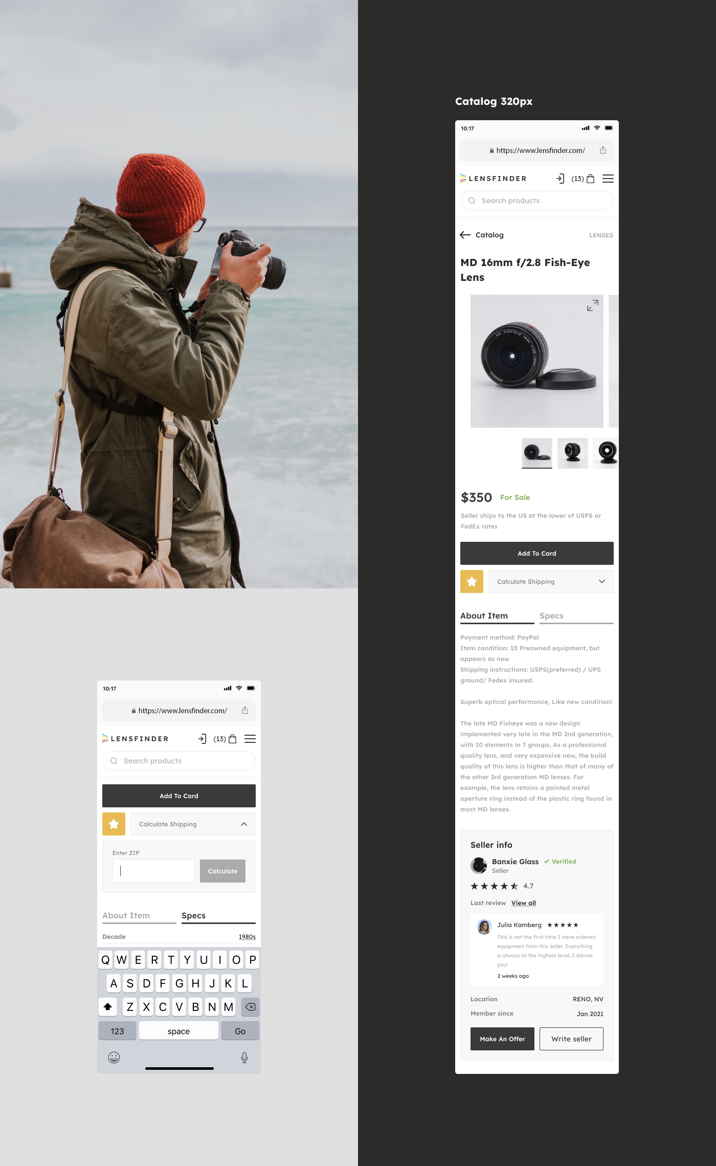
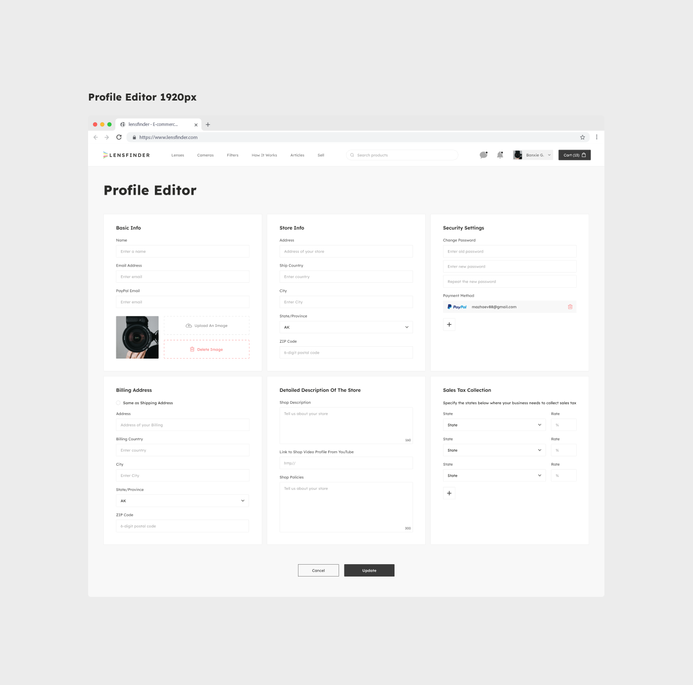
Next, according to the plan, there is a redesign of the personal account. The main task was to ensure the clarity of the interface and take into account all the explanatory characteristics in the design. After all, it is important to me that the user can easily navigate on their own.
RU
Далее по плану идет редизайн личного кабинете. Главной задачей было обеспечить понятность интерфейса и учесть все поясняющие характеристики в дизайне. Ведь мне важно, чтобы пользователь смог самостоятельно легко ориентироваться.


ENG
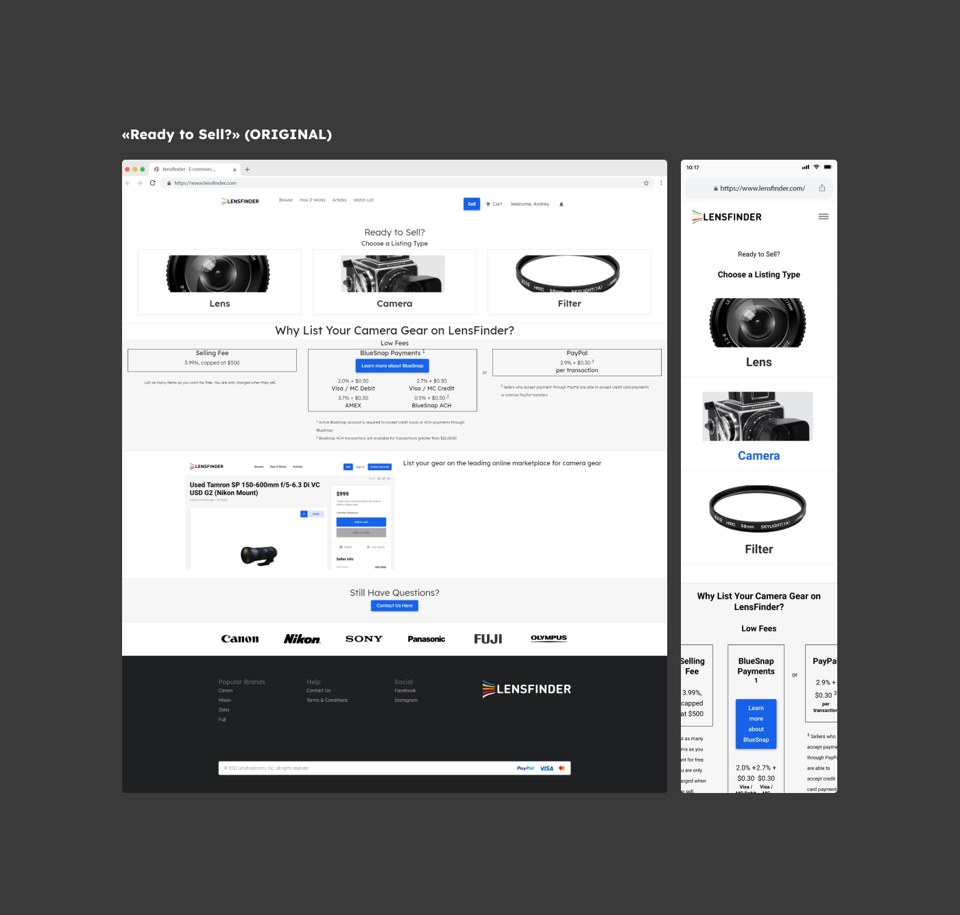
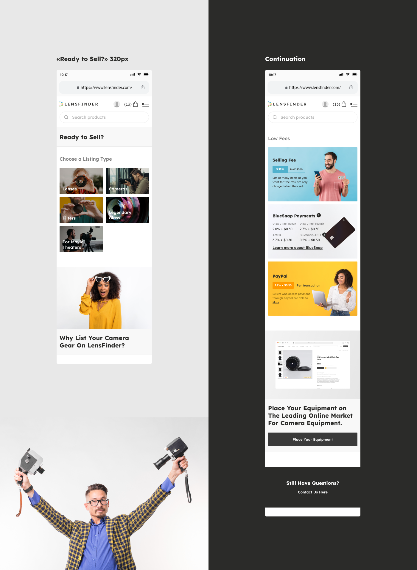
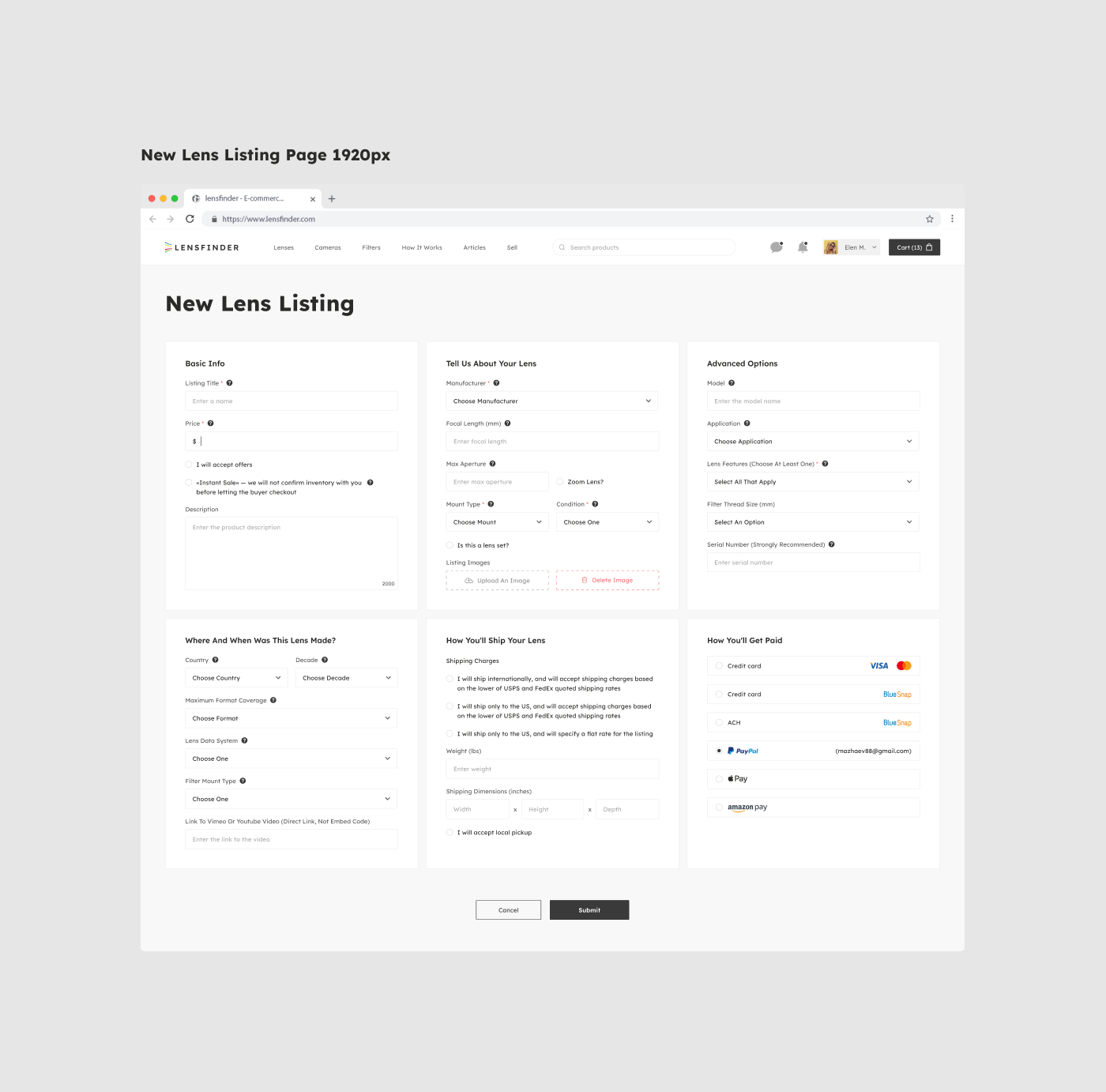
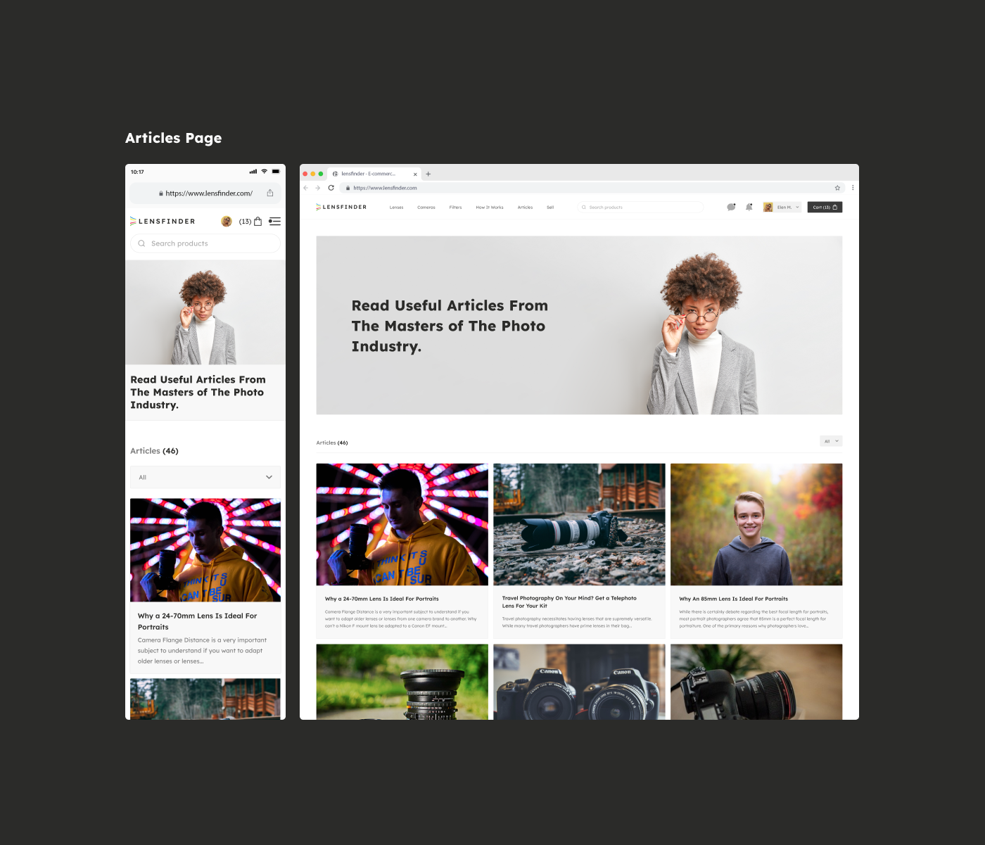
Next, I made the design of the «Ready to Sell?» page and a few more remaining pages.
When a project has such a large number of pages, the main thing is to create a system of margins, colors, and interactive objects. And follow these rules that you have created yourself.
RU
Далее я сделал дизайн страницы «Ready to Sell?» и еще нескольких оставшихся.
Когда в проекте такое большое количество страниц, главное создать систему отступов, цветов и интерактивных объектов. И следовать этим правилам, которые вы сами же и создали.


ENG
FINISH. My presentation is coming to an end. I have not shown you all the pages, but most of them. In addition to the design, I conducted various studies in search of more suitable solutions.
RU
ФИНИШ. Моя презентация подходит к концу. Я показал далеко не все страницы, но большую их часть. Помимо дизайна я проводил различные исследования в поисках более подходящих решений.
Appeal to designers (обращение к дизайнерам)
ENG
Don't be afraid to steal ideas from my project, just do it as an artist.
RU
RU
Не бойтесь воровать идеи из моего проекта, главное делайте это как художник.
An appeal to everyone else (обращение ко всем остальным)
An appeal to everyone else (обращение ко всем остальным)
RU
Если у вас есть ко мне вопросы или предложения, напишите мне любым удобным способом, ведь это так просто)
ENG
ENG
If you have any questions or suggestions, write to me in any convenient way, because it's so easy)
Telegram Slack Vk
Telegram Slack Vk


